In 2014, scientists from MIT discovered the brain processes an image in as little as 13 milliseconds.
In short, it’s better to use an image when discussing complex concepts. Visuals are more relatable than text. The past few years have proven it. Reporting tools have significantly reduced the burden of reading material.
This is great. After all, most B2B executives are overbooked. Between meetings and all-day conference calls, there’s no time to review long reports.
But, as every transaction and every site visitor creates data, expressing the data correctly can be a “life and death” decision. After all, you don’t want to miss a key insight your competitor uses to their advantage.

With data visualization tools, key details are conveyed in a non-time-consuming manner. It is more efficient and accurate than other means of data representation.
5 Business Graphs Every B2B Executive Needs to See
Company Dashboards
Company dashboards align teams to core business goals, tracking shared progress. This benefits morale and encourages teamwork.
Visuals are easier to follow when combined with animations, trend charts, and color-coded marks. Always remember to tie all relevant data to larger goals.
Account Revenue Reports
Start by identifying the best and worst performers by account. Use these when making informed decisions.

Focus on the how much people engage and usage rates. Update the ideal customer profile you want to focus on. Low-performers also present opportunities for improvement and growth.
Quarterly and Monthly Revenue Reports
Revenue reports provide a quick overview of the progress made towards goals.
Consider day-by-day breakdowns and revenue attributed to each department, product, and service. The reports can create greater insights into the trends that are guiding your business. They can also help you plan for the future, and understand the past.
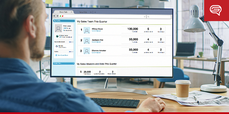
B2B Sales and Service Leaderboards
A little friendly competition among sales and customer service teams reinforces good behavior. It motivates them to improve their approach.
Tracking these data points identifies the highest performers and specific qualities to impart to others, improving the team’s overall process. This also highlights training opportunities and best practices. Comparing your teams is less about who is better and more about the synergy of the entire group.

Capacity and Resource Planning
Capacity and resource modules provide internal stakeholders with visually accurate representations of their employees. They also lend insight into the material requirements of each project. These modules help take care of scheduling and track budget requirements.
Data visualization tools are ideal for unifying relevant information.
Make your data easy to understand and analyze. Use data visualization tools not only to make your presentations more pleasing to look at, but to ensure that everybody is on the same page.
If you need assistance, let us know. At SlideGenius, we’ve helped countless people in your position to represent data in the most effective and communicative fashion. Just reach out for a free quote. We’ll be happy to help.


