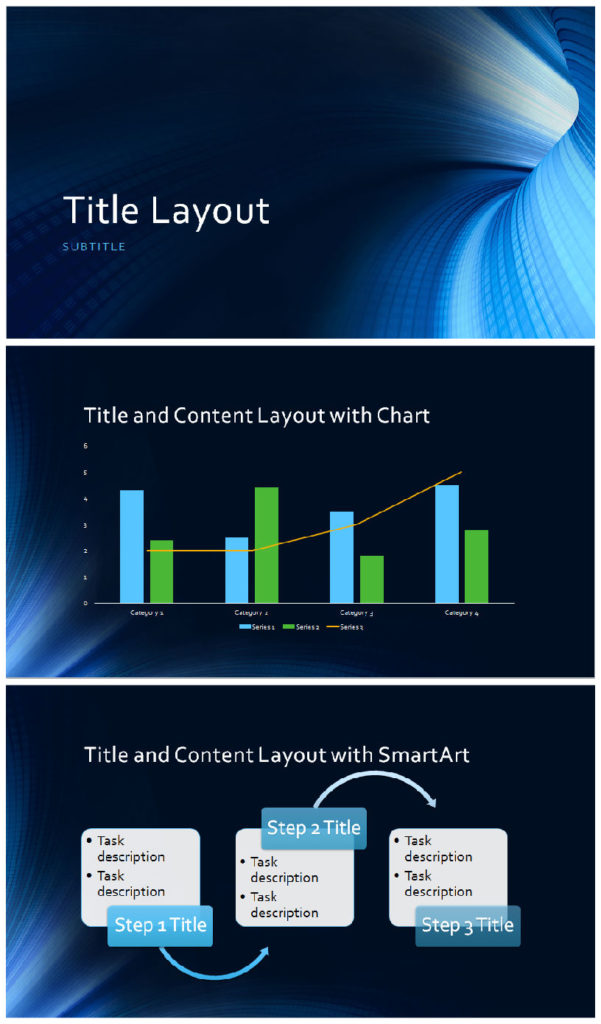
Creating a powerful and visually stunning PowerPoint presentation is a skill that can significantly impact how your message is received. To inspire your next deck, here are some sample slides that showcase creative design techniques, effective use of visuals, and compelling storytelling methods that can elevate your presentation to the next level.
1. Minimalist Design
Sometimes, less is more. A minimalist slide design focuses on simplicity and clarity, using clean lines, white space, and a limited color palette to create an elegant and professional look.
Why It Works:
- Keeps Focus on Content: The simplicity of the design allows your audience to focus on the key message without distractions.
- Enhances Readability: Minimalist slides with large text and high contrast are easy to read, even from a distance.
Example: Use a single bold image or word on a clean white background, with just one or two lines of text. This approach is perfect for presenting a key takeaway or summarizing a main point.
2. Full-Screen Visuals
Incorporating full-screen images or videos can create a strong emotional impact. Large visuals can set the tone, provide context, and instantly grab the audience’s attention.
Why It Works:
- Creates Impact: Full-screen images or videos make a bold statement and can communicate a message without the need for too much text.
- Evokes Emotion: Carefully chosen visuals can evoke emotions and reinforce your message in a way that words alone cannot.
Example: For a travel-related presentation, use a full-screen image of a breathtaking landscape as a backdrop, with a short, powerful phrase overlaying it.
3. Data Visualization
Presenting data visually through charts, graphs, and infographics can make complex information more digestible and engaging. Effective data visualization turns numbers into clear, actionable insights.
Why It Works:
- Simplifies Complex Information: Visuals make it easier for the audience to understand and retain data.
- Increases Engagement: Infographics and graphs add variety to your presentation, keeping the audience visually engaged.
Example: Replace a dense table of numbers with a colorful, easy-to-read bar graph or pie chart. Use icons and labels to further simplify the data.
4. Storytelling with Timelines
Timelines are a great way to present a sequence of events or a progression over time. They help structure your narrative and provide a visual representation of milestones or key developments.
Why It Works:
- Clarifies Progression: A well-designed timeline makes it easy for the audience to follow the sequence of events and understand how one step leads to the next.
- Adds Structure: Timelines break down complex stories into manageable parts, helping the audience keep track of the overall narrative.
Example: Use a horizontal or vertical timeline to show the development of a product from inception to launch, highlighting key milestones along the way.
5. Bold Typography
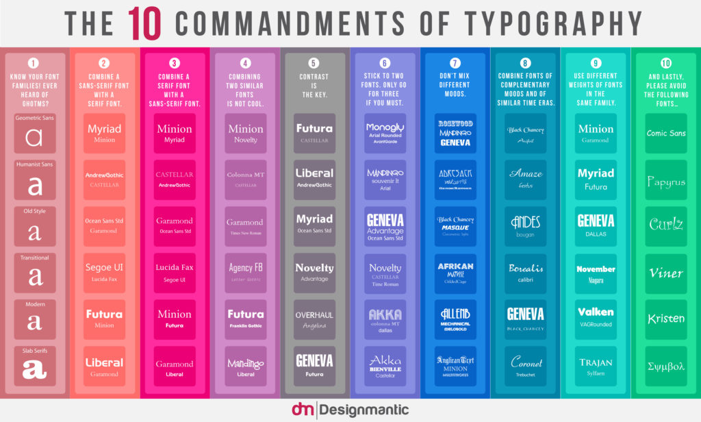
Typography can be a powerful design element in itself. By using bold, oversized fonts, you can create slides that are visually striking while also emphasizing key points.
Why It Works:
- Grabs Attention: Large, bold text immediately draws the eye and emphasizes important information.
- Conveys Emotion: The right typography can evoke certain emotions or associations that align with your message.
Example: For a slide introducing a new idea or product, use large, bold fonts to announce the concept, keeping the slide text-only and focused on a single impactful word or phrase.
6. Contrast and Color Blocking
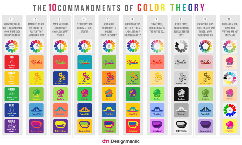
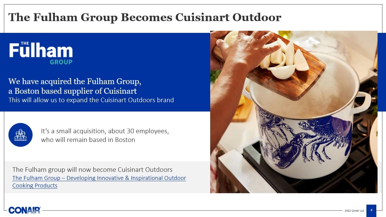
Using contrasting colors or color blocking can create visually dynamic slides that are both engaging and easy to follow. Bold color contrasts help different elements stand out from each other, making the slide visually appealing and clear.
Why It Works:
- Enhances Readability: Strong color contrasts improve the readability of text and make important elements pop.
- Creates Visual Interest: Color blocking adds a modern, stylish element to your presentation, helping to break up the flow and maintain engagement.
Example: Use contrasting colors, such as dark blue and orange, to highlight key sections of a slide. Color-blocking techniques can also be used to divide information into digestible chunks.
7. Infographics and Icons
Infographics and icons are a great way to present complex information visually. They can simplify abstract concepts, illustrate processes, or show relationships between ideas.
Why It Works:
- Simplifies Information: Icons and infographics allow you to represent ideas or data in a clear, visual way.
- Engages the Audience: Visuals are processed faster than text, helping to maintain audience attention and improve comprehension.
Example: Replace a bullet-point list with an infographic that uses icons to represent each point. For instance, use a lightbulb icon for ideas or a globe icon for global trends.
Final Thoughts
The key to creating impactful PowerPoint presentations is in the design choices you make. From minimalist slides to bold typography and infographics, these design ideas can inspire you to create a presentation that is both visually stunning and effective in communicating your message. By focusing on clarity, creativity, and the power of visual storytelling, you can elevate your presentation to a whole new level.

