6 PowerPoint ‘Hacks’ for Confused First Timers

PowerPoint hacks

powerpoint shortcuts

ppt tips

presentation tips

Rick Enrico

SlideGenius

We talk a lot about helping you achieve the perfect PowerPoint presentations. Sometimes, these things are easier said than done. Microsoft PowerPoint can be tedious for many first timers.

You can use these PowerPoint hacks and shortcuts to help you through this new process. Hopefully, it’ll help lower your stress levels, too.

While making your presentation

1. Learn the Shortcuts

Holding down the CTRL key in combination with other keys will help you lessen the use of your mouse.

Copy something from a document you’ve written earlier by pressing CTRL + C and Paste it to your slide with CTRL + V. This might seem basic for long-time Microsoft users, but it’s so helpful that we can’t risk letting beginners miss out on it.

You can also hold down SHIFT if you want to avoid skewing images, or select multiple objects. Likewise, the FUNCTION keys at the very top of your keyboard can also prove to be a huge help. One of the most helpful keys in PowerPoint is F5, which is a quick way to start your slide show.

Read up on all of the useful PowerPoint shortcuts and over time, you’ll be able to memorize the ones that are most useful.

2. Use Grid and Guidelines

Misaligned images or text boxes can be distracting to some audience members. Avoid having to squint to make sure everything’s in perfect order by using PowerPoint’s Grid and Guidelines function.

Hit CTRL+G to display the Grid and Guidelines dialog box.

3. Edit Images to Manage the File Size

The images you use can bloat the file size of your PowerPoint presentation. It’ll be hard to share your presentation the size is too large. Fix this problem by selecting an image (or multiple images), then choosing the Compress Pictures option under the Format tab.

While in the Format tab, you can also edit the images by choosing Corrections, Color, and Artistic Effects. Just make sure that you have permission to alter the pictures you’re using.

During your presentation

4. Hide the Pointer

As we’ve tackled, audience members can be easily distracted by the smallest thing. Even a small, white pointer.

You can hide the pointer by pressing CTRL + H. Don’t worry, it’ll show up again if you press A.

5. Shift to a Black Screen

It’s important that you don’t let the slides do the talking for you. If you feel like you’re losing your audience to the screen, just press B or the period keys.

Go back to your presentation by pressing N to move on to the next slide, or P to come back to the previous one.

6. Skip to Any Slide

If anyone in the audience raises a point you discussed in a specific slide, you can skip to it by pressing the slide number then hitting enter.

For example, if Slide #5 holds the answer, just press 5, enter, and you’re there. This tip will be even more effective if you have handouts of your slides printed out with you.

Consider this guide a starting point to your PowerPoint efficiency. Remember that as with everything, being an effective PowerPoint user will take time. Just be patient!


Reference

25 PowerPoint™ Tips.” Jolene Morris. Accessed June 08, 2014.

Unleash Your Inner Designer: Master the Art of Customizing PowerPoint Templates

PowerPoint templates are a great starting point for presentations, but customizing them can take your presentation from average to extraordinary. With some simple design techniques, you can unleash your inner designer and make your slides unique, professional, and aligned with your brand. Here’s how to master the art of customizing PowerPoint templates.


1. Customize the Slide Master

The Slide Master controls the overall look of your presentation, including layouts, fonts, and colors. Editing the Slide Master ensures that all slides have a consistent design, saving you time by making global changes to your presentation’s appearance.

Why It’s Important:

  • Ensures Consistency: Changes made to the Slide Master are applied across all slides, ensuring that your presentation has a unified look.
  • Saves Time: Rather than editing each slide individually, you can make changes in one place that apply to all slides.

How to Do It:

  • Go to the View tab and select Slide Master.
  • Make changes to the fonts, colors, and layouts on the Slide Master. These changes will apply to all the slides in your presentation.

2. Adjust the Color Scheme

Most templates come with a default color palette, but customizing it to match your brand colors or theme can make your presentation stand out. Choosing the right color scheme also enhances readability and visual appeal.

Why It’s Important:

  • Reinforces Branding: Using your brand’s color scheme ensures your presentation is aligned with your brand identity.
  • Improves Visual Impact: A cohesive and appealing color scheme enhances the overall aesthetics of your presentation.

How to Do It:

  • Go to the Design tab, select Variants, and choose Colors > Customize Colors.
  • Adjust the color palette to reflect your brand’s colors or the theme of your presentation.

3. Use Custom Fonts

Fonts play a major role in the tone and professionalism of your presentation. Replacing default fonts with custom fonts that align with your brand can give your presentation a fresh, modern look.

Why It’s Important:

  • Enhances Readability: Using clean, professional fonts makes your presentation easier to read and understand.
  • Adds Personality: Fonts can convey different emotions and set the tone for your presentation, whether formal, casual, or creative.

How to Do It:

  • Select the Home tab, click the font dropdown, and choose a custom font for your titles and body text.
  • Use contrasting fonts for headings and body text to create a clear visual hierarchy.

4. Incorporate High-Quality Visuals

Templates often come with placeholder images that are generic. Replace these with high-quality visuals that are relevant to your content and audience. Whether you use stock photos, custom graphics, or icons, your images should complement the message you’re delivering.

Why It’s Important:

  • Increases Engagement: High-quality visuals capture attention and make your presentation more engaging.
  • Supports Your Message: Relevant visuals help illustrate your points and make complex information easier to understand.

How to Do It:

  • Use the Insert tab to add images, icons, or illustrations to your slides.
  • Ensure that the images are high resolution and aligned with the overall theme of your presentation.

5. Edit Slide Layouts

Most templates come with pre-designed slide layouts, but you can customize these to fit your specific needs. Tailoring the layout of each slide helps you present information clearly and attractively.

Why It’s Important:

  • Improves Information Flow: Customizing layouts ensures that each slide is designed to present information in the clearest way possible.
  • Adds Variety: A mix of layouts keeps your presentation visually interesting and prevents monotony.

How to Do It:

  • Select the Layout dropdown in the Home tab to choose from existing layouts.
  • Modify the size and position of text boxes, images, and other elements to create a more effective design.

6. Add Branded Elements

Incorporating branded elements such as your logo, company tagline, or brand patterns can elevate the professionalism of your presentation. These elements reinforce brand recognition and help your presentation feel cohesive.

Why It’s Important:

  • Builds Brand Recognition: Including your logo and other brand elements reinforces your brand identity throughout the presentation.
  • Enhances Professionalism: Branded presentations show attention to detail and convey a polished, professional image.

How to Do It:

  • Add your company logo to the Slide Master so it appears consistently on each slide.
  • Incorporate other branded visuals, such as patterns, icons, or watermarks, to create a cohesive design.

Final Thoughts

Customizing PowerPoint templates allows you to create a presentation that is uniquely yours, aligning with your brand and delivering your message in a visually appealing way. By editing the Slide Master, adjusting the color scheme, incorporating custom fonts and visuals, and adding branded elements, you can elevate your presentation from standard to standout. With these techniques, you’ll unleash your inner designer and make your next presentation more engaging and memorable.

The Perks of Having the Right PowerPoint Background

Powerpoint

powerpoint background

The ideal PowerPoint background is something that looks simple and clear. This helps your audience focus on key points on the slide rather than get distracted by an over-embellished deck. An effective background often utilizes design principles like white space to avoid drawing attention to itself and instead highlight the real objective of your presentation.

Ill-designed backgrounds are often those that have too much clutter on it. These present elements on the deck that aren’t necessary to your core message. While an occasional frame or color might actually boost he audience’s interest in your slides, reserve the design for the points that matter.

To help give you an idea, the right PowerPoint background has these two qualities:

1. Right Contrast

Your audience should be able to read your text clearly. This is why you should use colors that provide a nice contrast between the slide’s background and foreground. By using dark text against a lightly colored background, you would be able to enhance your presentation’s readability.

Just a word of caution: If you are presenting in a room that is not well lit, do the opposite of the advice above. Choose a dark background and make your texts light-colored.

It would help to run through a test of the presentation in the designated venue beforehand. Apart from gauging the venue’s lighting, you will also be able to also check the projector’s settings. If you fail to make the necessary adjustments, the impact of the colors may be diminished by the projector.

2. Consistent Look

Consistency is important as it tells the audience that they are still viewing the same presentation during your entire talk. Being consistent with the design of your slides, however, doesn’t have to limit your creativity. It is just that you are eliminating unnecessary details or distractions from the slides.

One cause of inconsistency is the use of multiple colored slides. A presentation with multiple colored slides would be an assault to anyone’s retina. According to Creative Content Expert‘s Tara Hornor, poor color choices are among the things that hamper a design. Make sure to limit the number of colors to just two or three. This way, your PowerPoint presentation would look more professional and a lot less ridiculous.

A corporate logo on each slide can also contribute to your slide’s consistency. If you don’t feel like adding a logo on every slide as it could look obtrusive, you may choose to place it on first and last slides instead.

Conclusion

Ultimately, as you work on your PowerPoint presentation, your choice of background is always an important consideration. It may seem like a minor detail but the right background can make a whole lot of difference between an impressive, professional-looking presentation and a mediocre one.

It may seem like a minor detail but the right background can make a whole lot of difference between an impressive, professional-looking presentation and an ill-designed one.


Reference

10 Troublesome Colors to Avoid In Your Advertising.” Site Point. May 08, 2013. Accessed May 30, 2014.

The First Slide: What It Needs to Be and What It Has to Do

first slide

PowerPoint slide

presentation

If you want to maximize your slide presentation to establish better brand recall, start at the very beginning – the first slide. Naturally, it is the first thing that your audience will see even before you say a word. So design it in a way that stands out from the rest of your slides. It will help your logo and company name make an impression on your audience, and retain your brand in their memory long after your presentation ends.

It will help your logo and company name make an impression on your audience, and retain your brand in their memory long after your presentation ends.

What your First Slide Needs to BE

As you prepare you presentation, it’s important that you develop a first slide that will generate interest in support of everything you are about to say. It should have a visual element that features key aspects of your organization that is consistent with the key concept of your presentation.

It could be a photo or graphic image that stimulates people’s curiosity. As this is an excellent opportunity to draw attention to your business, make sure to make the most of it. When people come in the room and see your first slide, they should be compelled to want to be interested in you what you have to say.

However, it doesn’t always have to be flashy to pique the audience’s interests while informing them of your brand. According to business guru Guy Kawasaki, in his famous 10-20-30 rule, your first slide should often be the Title Slide, which contains your company name, address, your name and position in the company, your email, and work cell number.

Details like these may be straight to the point, but if you’re presenting to a crowd of busy VCs and investors, this is enough visual stimulus to let them in on your brand.

What your First Slide Needs to DO

With the right amount of texts and graphics, your first slide can communicate much more than what it appears to relate to the audience. Your audience should be able to digest the information you are sharing quickly and precisely. They should get an idea about your business even before you start to talk about what you have to offer.

It is important that each slide in your presentation be well-designed and engaging. The first slide, however, is crucial in igniting the spark that will make people want to hear what you have to say and get to know more about your business. Design it right and it can help you set the stage for an awesome and successful presentation.

The Final Word

Ultimately, while the first slide isn’t the entire presentation itself, it’s still an introduction to the rest of your pitch. In the same way that you need to make a good first impression through your physical appearance and speech, you’ll need a deck to match.

Start your pitch right with a winning opening slide. Impress people from the get-go. Don’t let any opportunity pass.


Reference

The Only 10 Slides You Need in Your Pitch.” Guy Kawasaki. Accessed May 28, 2014.

Presenting Perfection: How to Avoid Five Common PowerPoint Design Blunders

bullet points

powerpoint presentation

Pwerpoint design mistakes

It’s perfectly normal to make mistakes when creating PowerPoint presentations – the first few times. According to software consultant, Wendy Russell, there are ways to learn the basics of PowerPoint. But when you’re failing repeatedly without seeing the errors of your ways, you may need to be jolted back to reality.

There’s a reason why your audience members tend to stifle a yawn or stare blankly at the open window whenever you deliver a presentation: You have poorly designed PowerPoint slides.

Here are five of the most common PowerPoint design mistakes are probably guilty of:

1. Too Many Details

Slide decks are your visual tools to help you get your message across. When you put too many information details on a slide – be it in the form of text, charts, or images – you run the risk of overwhelming your audience.

Ideally, slides should convey only once concept at a time. To avoid the problem, many professional presenters follow the 6 x 6 rule. This requires limiting the number of lines in a slide to six and keeping the number of words per line to six.

2. Poor Use and Choice of Images

Using images can help you explain an idea in a much simpler way. Inappropriate and low-quality images can create the opposite effect, though. Don’t just include any photos or clipart for the sake of having images up there. Be sure that there are clear connections between the images you choose and the points you are making.

Additionally, check if the images are of good quality by testing it out on a white wall. There are times that images would seem great on your monitor screen yet look bad when blown up and projected on a large screen.

3. Abuse of Effects and Other Fancy Features

If you think using too much animation, transitions, and sound effects can improve your presentation, you couldn’t be more wrong.

When it comes to special effects, less is more. Your audience will not be impressed with bullet points that constantly spin around, zoom in, blink, make sounds, etc. Try to make everything as simple as possible. The end result would be more powerful.

4. Several Bullet Points That Appear at Once

This is where you can apply animation appropriately. You see, having five to six bullet points appear on the slide at one time can be overwhelming to read.

The best thing to do is to reveal the points one at a time. This way, your audience will be able to focus better on each one. It would also keep them from reading ahead and tune you out.

5. Failing to Proofread

Nothing will make your PowerPoint presentation look more amateurish than typographical errors and spelling mistakes.

Apart from this, BBC education correspondent, Sean Coughland, cites online entrepreneur Charles Duncombe’s study in saying that bad grammar does cost companies millions. They won’t just distract your audience, but will also leave a bad impression, which may lead to a drop in revenue.

So always make sure to read your slides a couple times before declaring it good to go.

Conclusion

Remember, a good presentation can save a bad presenter. But a bad presentation would be hard to salvage even by the best presenter.

It would even make him look ridiculous and unprofessional. So which one would you rather be: a bad presenter backed by a well-designed presentation or a great presenter with a disastrous presentation?

It’s time to check what you’ve been doing wrong and apply the necessary changes on your next slides.

References

Coughlan, Sean. “Spelling Mistakes ‘cost Millions’ in Lost Online Sales.” BBC News. July 14, 2011. Accessed May 22, 2014.
Russell, Wendy. “Ready to Learn to Use PowerPoint?” About.com Tech. Accessed May 22, 2014.

Deliver a Winning Speech with an Engaging PowerPoint Presentation

Oral presentation

powerpoint designs

powerpoint presentation

A compelling speech, when paired with an engaging PowerPoint presentation, can captivate an audience and make your message unforgettable. PowerPoint serves as a visual aid that enhances your narrative, helps you communicate complex information more clearly, and keeps your audience engaged. However, not all PowerPoint presentations are equally effective, and creating one that supports your speech without overshadowing it requires a thoughtful approach.

Here are essential tips to deliver a winning speech using an engaging PowerPoint presentation:


1. Structure Your Slides Around Key Points

Your PowerPoint should act as a guide to the key points of your speech. Avoid cluttering slides with unnecessary details. Instead, use each slide to reinforce the core messages you want your audience to remember.

How to Do It:

  • Limit Text: Use bullet points or short sentences to highlight the key message of each slide.
  • One Idea Per Slide: Focus on a single point or concept per slide to avoid overwhelming the audience.
  • Clear Headings: Each slide should have a clear, concise title that sums up the key point you’re discussing.

Example: If your speech is about the benefits of a new product, have one slide focus on “Increased Efficiency” and another on “Cost Savings” rather than listing all benefits on one crowded slide.


2. Use Visuals to Enhance Your Message

PowerPoint allows you to use images, charts, and diagrams to illustrate complex ideas and make them more digestible. Visuals should complement your speech, not distract from it. They help your audience retain information and make abstract ideas more concrete.

How to Do It:

  • High-Quality Images: Use relevant, high-resolution images that support the content of your speech. Avoid generic stock photos that don’t add value.
  • Data Visualization: Instead of presenting raw numbers, use charts, graphs, and infographics to show trends or comparisons.
  • Avoid Overloading: Keep visuals simple. Avoid cluttered graphs or too many images on one slide.

Example: If discussing sales growth, present a clean line graph that shows growth over time rather than a table full of data points.


3. Engage the Audience with Interactive Elements

Incorporating interactive elements such as polls, quizzes, or Q&A sessions in your PowerPoint can turn your audience into active participants, increasing engagement and keeping their attention.

How to Do It:

  • Real-Time Polls: Tools like Mentimeter or Slido allow you to add live polling to your PowerPoint, engaging the audience by letting them participate in real-time.
  • Interactive Q&A: Dedicate a slide for audience questions, encouraging participation throughout the presentation.
  • Clickable Elements: Create slides with clickable elements that guide the audience through different sections of your presentation or highlight key insights.

Example: During a presentation on employee satisfaction, you could poll the audience to ask what they think are the top factors influencing job satisfaction, then reveal the research findings on the next slide.


4. Master Transitions and Animations

Using transitions and animations can enhance your presentation, but overusing them can be distracting. The key is subtlety—use transitions and animations sparingly and purposefully to guide the audience’s focus without pulling attention away from your speech.

How to Do It:

  • Consistent Transitions: Use simple transitions (e.g., Fade or Appear) between slides for a professional and smooth flow.
  • Strategic Animations: Use animations to reveal bullet points or elements one at a time, helping you control the pacing and focus of your message.
  • Avoid Overcomplication: Don’t use excessive motion, flashy transitions, or effects like “Bounce” or “Spin,” as they can look unprofessional and be distracting.

Example: If you’re revealing a series of steps or a process, use a “Fade” animation to show each step one by one as you explain it in your speech.


5. Maintain a Consistent Design and Theme

A consistent design helps unify your PowerPoint and gives it a professional, polished look. Consistency in fonts, colors, and layouts creates visual harmony and ensures your slides don’t distract from your message.

How to Do It:

  • Use a Consistent Color Scheme: Stick to 2–3 primary colors throughout the presentation. These colors should align with your brand or the tone of your speech.
  • Uniform Fonts: Choose one or two fonts and stick with them for titles and body text. Make sure the fonts are large enough for readability (minimum 24pt for body text).
  • Use Slide Masters: PowerPoint’s Slide Master function helps you apply consistent design elements across all slides, saving you time and ensuring cohesion.

Example: If you’re representing your company, use your brand colors and font styles consistently across all slides, reinforcing the professionalism and identity of your organization.


6. Practice Timing and Pacing

Your PowerPoint should flow seamlessly with your speech. Practicing with your slides allows you to time transitions, animations, and the overall pacing of your presentation, ensuring that the PowerPoint enhances, rather than disrupts, your narrative.

How to Do It:

  • Rehearse with Slide Timing: Run through your presentation multiple times to ensure the slides sync with your speaking pace. Avoid lingering too long on any one slide or rushing through key points.
  • Use Speaker Notes: PowerPoint’s speaker notes can help you keep track of what to say on each slide, ensuring you don’t forget any important details.
  • Anticipate Questions: Be prepared for questions or interactive elements so that you can smoothly handle audience engagement without breaking the flow of your presentation.

Example: Rehearse the timing of when to change slides while delivering your speech so that the visual support is aligned with your spoken content—this makes the presentation feel more natural and professional.

Jazz Up Your Sales Presentation With a Label Tag Created in PowerPoint

label tag

PowerPoint shape

sales presentation

Using images to represent ideas is one of the best ways to enhance PowerPoint presentations. A product label tag, for example, is great in designing your deck during a sales presentation. According to Entrepreneur, in such presentations, it’s essential to establish your identity and address your customers’ needs.

If ever you need a tag to back up your points and differentiate yourself from the competition, you can always search for custom images of these tags on the Internet and tweak them to your advantage.

Or better yet, create one that you can easily customize using the Shape functionality in PowerPoint. This tutorial will show you how to do it using the Shape and Text tools in PowerPoint 2010.

Drawing the Frame

First, assuming that your PowerPoint is already open, create a new, blank slide. Then, draw the label using the Rectangular shape with a rounded border. You can find this in the Insert tab under Shapes.

label tag

After this, select the Oval shape from the Shapes option to create a small circular shape. Put this near the top portion of the rectangle to serve as the label’s tag hole.

Filling with Color

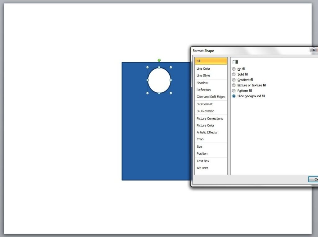
Fill the circle with the same color as that of the slide background. Do this by right-clicking on the shape and selecting the Format Shape option. Click Fill and then select Slide background fill.

label tag2

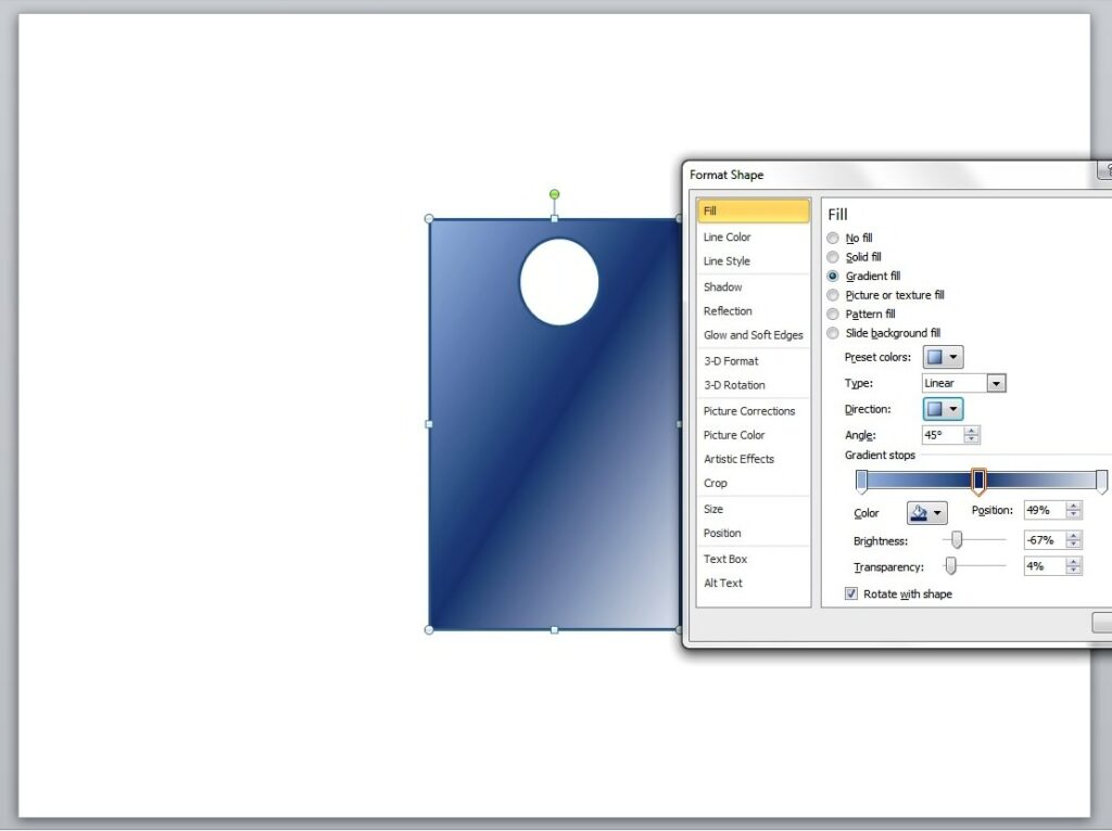
To give the label some depth, you may want to fill it with gradient color. To do this, click Fill from the Format Shape option and select Gradient fill. Depending on your preference, you may adjust the Gradient type, direction, color, brightness, and other qualities.

label tag3

Final Details

To create the label’s string, select the curve line from the Shapes option. Draw a line from the small circle and then click twice until you reach the label’s border. You may manipulate the string to give it a more natural look. Simply click on it and drag any of the visible points accordingly.

label tag6

Lastly, you’ll have to group all the shapes in a single label. Select all the elements and then right click on the label. Next, click on Group (and the other Group option that will appear) and

Next, click on Group (and the other Group option that will appear) and Voila! You now have your very own product label tag that you can use for your sales presentation. For added impact, think about adding some text inside the tags.

label tag7

Conclusion

An impressive deck is often eye-catching and unique, but more importantly, it should always be there to support you when you need to pitch to the crowd. Experiment with PowerPoint and add a tag to your slides. It’s simple and interesting. With just a few clicks using the Shapes tool, you’ll already have a tag-shaped image that you can spice up with text or gradients for depth.

Having trouble with your deck design? Our SlideGenius experts are always ready to help. Contact us today for a free quote!

Reference

Making Sales Presentations.” Entrepreneur. February 24, 2013. Accessed May 15, 2014.

About SlideGenius

SlideGenius.com is your business Power Point presentation expert. Based in San Diego, California, SlideGenius has helped more than 500 international clients enhance their presentations, including those of J.P. Morgan, Harley-Davidson, Pfizer, Verizon, and Reebok. Call us at 1.858.217.5144 and let SlideGenius help you with your presentation today!

Creating a PowerPoint Timeline Using SmartArt

PowerPoint slide

shapes

SmartArt

Timeline slide

Last time, we created a basic timeline using shapes and tables. Today, we’re going to create another one but only this time, we’ll take advantage of the SmartArt feature in Microsoft PowerPoint 2010.

SmartArt is useful for creating representations of a sequence of events in PowerPoint. This sequence of events can be a project milestone or an event timeline (which we’ll get back to in a bit).

The SmartArt Advantage

Basically, what SmartArt does is take the power and functionality of PowerPoint Shape on a different level.

It allows you to mix and match shapes and text in order to create diagrams and other custom graphics. Using it strategically lets you create slides that both communicate your message and capture your audience’s attention.

Getting Started

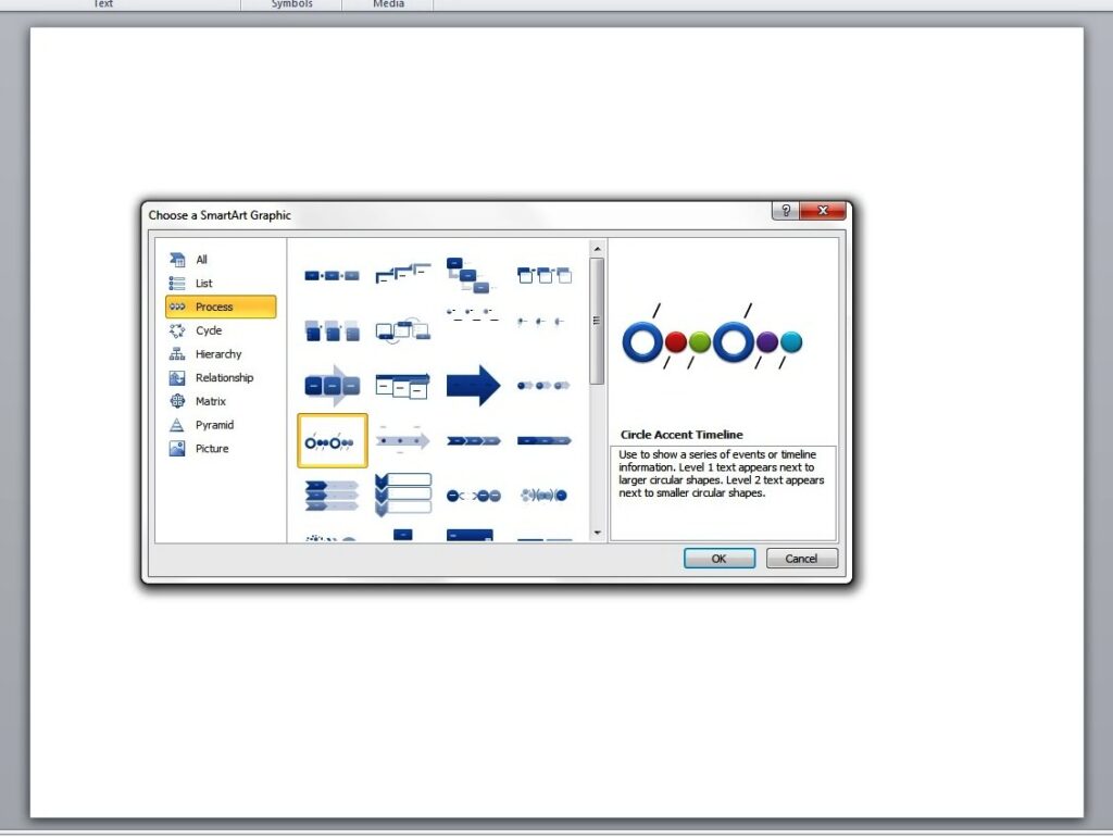
Now let’s create a basic timeline with the help of SmartArt. You can start by opening a blank PowerPoint slide. Point the cursor to the Insert tab and click on SmartArt. Then select Basic Timeline.

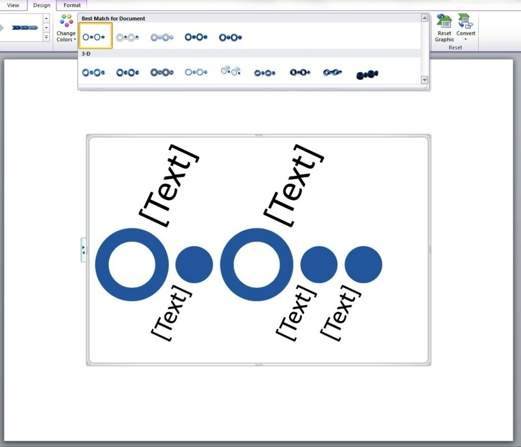
This is under the Process folder or the Circle Accent Timeline. As you hit OK, you will have to enter the necessary elements. (“Level 1 text appears next to larger circular shapes. Level 2 text appears next to smaller circular shapes.”)

PowerPoint timeline

Enhancing the Look

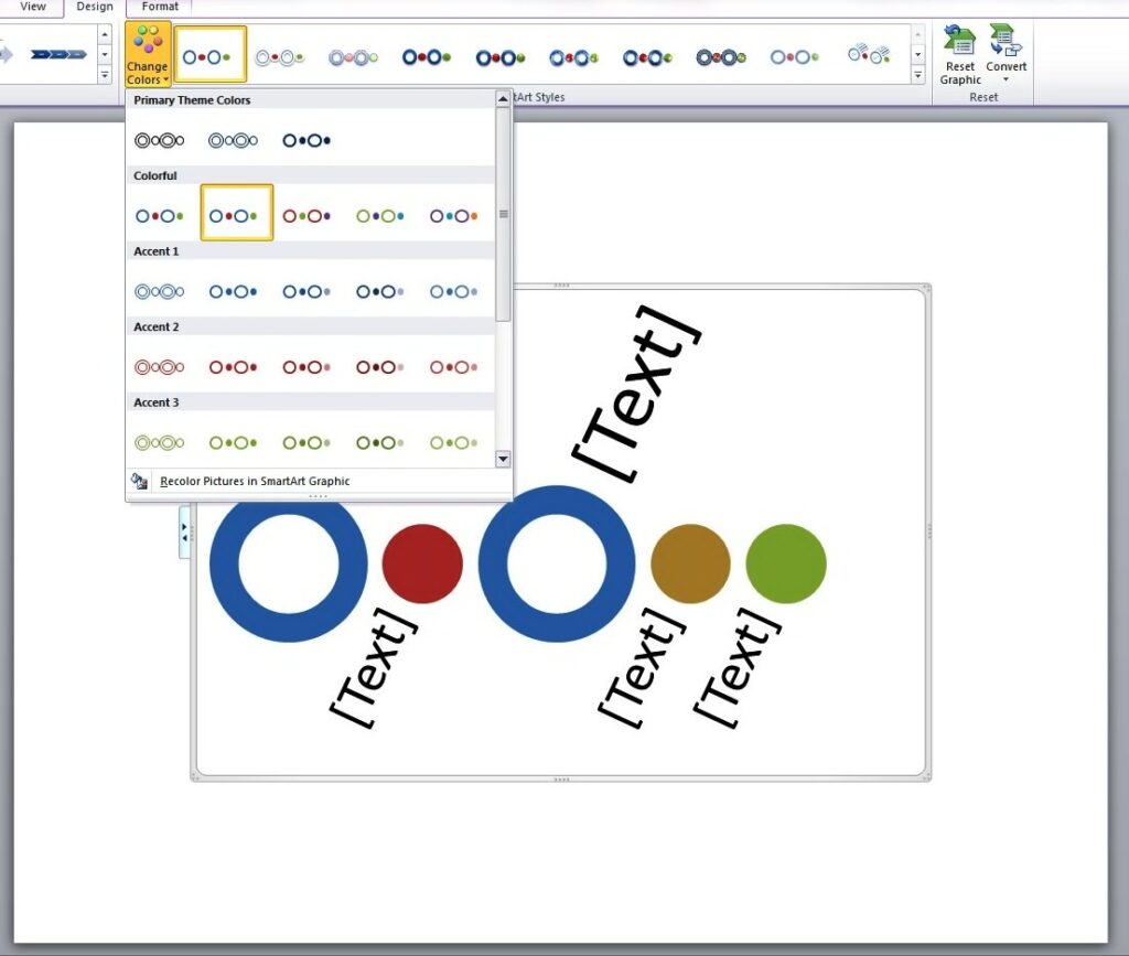
You may change the color of the graphic by clicking on the Design tag and picking the colors and effects that you want for your timeline.

timeline2

The different shape effects that you may choose include shadow, cartoon, 3D effect and more.

template2

Adding your content and doing a bit of tweaking completes the process. With some practice, you will soon be able to create a more complex PowerPoint timeline design.

SmartArt is an excellent functionality in PowerPoint that provides you with a wide range of visual options. Keep in mind, though, that it is still up to you to determine the appropriate graphic that matches your content. Because at the end of the day, SmartArt is simply a PowerPoint tool at your disposal that you can wield to your advantage.

References

Learn More about SmartArt Graphics.” Office Support. Accessed May 14, 2014.
“Basic PowerPoint Timeline Creation: Shapes and Tables.” SlideGenius, Inc. May 09, 2014. Accessed May 14, 2014.

About SlideGenius

SlideGenius.com is your PPT presentation design guru for your business. Based in San Diego, California, SlideGenius has helped more than 500 international clients enhance their presentations, including those of J.P. Morgan, Harley-Davidson, Pfizer, Verizon, and Reebok. Call us at 1.858.217.5144 and let SlideGenius help you with your presentation today!

What Makes an Effective PowerPoint Presentation?

content

PowerPoint Design

powerpoint presentation

powerpoint presentation specialists

An effective PowerPoint presentation can make a lot of difference in facilitating a business meeting or making a sales pitch.

Can you imagine spending the entire time speaking in front of an audience without something to attract their attention? Nothing beats having a visual aid to back you up, not to mention keep your audience awake.

Of course, you need to work on making your PowerPoint powerful enough to communicate your message effectively. So what makes a presentation effective?

Design

In terms of PowerPoint presentation design, the main consideration should be legibility. One of the most common mistakes that many presenters make is stuffing their slides with entire blocks of texts. PowerPoint presentation specialists would advise you to avoid this.

Apart from making the slides look illegible and boring, it creates the impression that you are not prepared. This could put a dent on your professionalism and credibility.

In general, the layout isn’t meant to detract the viewer’s gaze. It should be able to highlight your points. Keep the text large enough for easy reading, with the color contrasting well with the background.

If you’re using images, make sure they don’t detract from the message. They should work to support the text, not overpower it. According to Inc.com‘s Eric Markowitz, consistency is essential in establishing a visually engaging deck. Make sure you know your brand, and you stick to it.

Content

Regardless of the message you want to communicate, you need to make sure that the content is presented clearly. The best way to do this is by organizing whatever you have to say into three main points.

Whatever details you want to include, they should all lead to those points.

Creating an outline of your main points can help you organize the flow of your PowerPoint presentation. It can also help you determine the parts of your talk where slides are necessary so you can avoid overusing them. Presentation slides are extremely useful.

Overusing them, however, might confuse your audience.

Delivery

Whatever you do, remember to talk to your audience and not to your slides. As a mark of a lazy presenter, reading the slides can tune your viewers out. The important thing is to engage your audience by maintaining eye contact as much as possible.

Use your slides only as supporting tools. Just take your main points to heart (without disregarding the amount of time you spend on each of them) and you’re good to go.

PowerPoint is an essential tool for business communicators. It can make your life so much simpler.

Conclusion

No matter how animated you can be or how skillful you insert humorous lines in your script, you need a visual tool to bring your ideas to life.

Hopefully, these three elements should be able to point you to the right direction in creating an effective PowerPoint presentation.

Reference

Markowitz, Eric. “5 Tips for a Great PowerPoint Presentation.” Inc.com. 2011. Accessed May 8, 2014.

The Power of Professionalism: Unleashing the Full Potential of Your Presentations with a PowerPoint Designer

powerpoint presentation

presentation tips

slides

storytelling

There’s more to creating a PowerPoint presentation than merely choosing a template and inserting stock images. Sure, you can do all those and perhaps more (like adding some custom animations). But these might not be enough to get your message across.

Look, you may know how to drive a car, but it doesn’t automatically qualify you to be in NASCAR, right?

Admittedly, there’s nothing wrong about doing the heavy lifting yourself. When you’ve taken the time to maximize its features, you’d discover that PowerPoint is indeed a powerful tool that you can use to your advantage.

Certain situations, however, really do call for that professional touch. It isn’t a question of aesthetics, but more of a storytelling concern.

Storytelling Advantage

A professional PowerPoint designer understands that stories are what draw an audience to the idea he’s presenting. This means he has to rely on his storytelling skills to communicate effectively. And by storytelling, we don’t mean the way you’d read a tale to little kids before bedtime.

It’s more of how a director spins a yarn on the big screen. After all, the nitty-gritty of putting together a PowerPoint presentation is pretty much like what goes on behind the glitz and glamor of the movies.

You may have the benefit of a strong star power or striking cinematography, but if the storytelling fails to engage the audience, the movie falls flat. And when this happens, the audience can be very unforgiving.

Design Knowledge

As with producing a movie, making a presentation involves a number of elements. In both cases, making all the disparate elements go well together can help you tell a cohesive story.

For example, the use of colors to highlight some points will only work if you align the text in a way that’s comprehensible to your audience. These may be minor details but someone who isn’t familiar with design may miss out on their significance.

Professional PowerPoint designers know when to use (or not to use) the right design elements to support the story they want to tell. They have a great eye for detail that allows them to come up with successful slides. They understand that effective presentation design isn’t just about slapping images on every slide.

Conclusion

There are many different elements that go into making a PowerPoint presentation, and only a professional can bring them all together seamlessly. To pull through with a winning presentation, it’s important that your content, delivery, and design go hand-in-hand.

Without one, you definitely can’t succeed with the other. And that’s what professionals are there for. If you’re running short on time, or you simply want an expert’s opinion, contact a presentation partner you can trust. The returns on this investment will be worth it.


References

Top 10 Websites for Presentation Images.” Presentation Magazine. Accessed May 6, 2014.