Aflac Uses SlideGenius to Present a New Data-Heavy Sales Strategy to Its Team

Aflac

Custom Designed Presentations

data

PowerPoint Agency

PowerPoint Design

PowerPoint design experts

PowerPoint specialist

presentation

Presentation Agency

Presentation Company

Presentation Consultation

Presentation Designers

Presentation Firm

statistics

United States

Aflac, a leading provider of supplemental insurance in the United States, is known for its innovation and forward-thinking approach to business. To keep up with evolving market trends, Aflac recently revamped its sales strategy, focusing heavily on data-driven insights to enhance performance and efficiency. With a complex strategy packed with data, metrics, and new initiatives, Aflac needed a presentation that would not only communicate this information clearly but also engage their sales team effectively. For this crucial task, they turned to SlideGenius, a trusted expert in presentation design.

The Challenge: Making Complex Data Digestible

Sales strategies are often packed with numbers, charts, and analysis, and Aflac’s new approach was no exception. The challenge for Aflac was clear: how do you take a data-heavy strategy and present it in a way that is both engaging and easy to understand for a diverse sales team?

The presentation had to strike a balance between delivering detailed insights and keeping the audience’s attention. They needed to ensure that key metrics, trends, and strategic initiatives were communicated effectively without overwhelming the team. The solution? A highly visual, well-organized, and interactive presentation that simplified complex data while keeping it impactful and engaging.

Why SlideGenius?

With a reputation for crafting compelling presentations, SlideGenius was the natural choice for Aflac. As a leader in custom PowerPoint presentation design, SlideGenius has helped numerous companies across industries translate their data, insights, and strategies into clear and visually engaging slides. Aflac knew that SlideGenius had the expertise to create a presentation that could transform raw data into a narrative that resonated with their sales force.

The SlideGenius Approach: Data Simplified Through Design

To help Aflac present its new data-heavy sales strategy, SlideGenius focused on three core elements: visual storytelling, data visualization, and engagement.

1. Visual Storytelling

Aflac’s new sales strategy needed to be more than just a collection of charts and numbers—it had to tell a story. SlideGenius crafted a cohesive narrative that walked the sales team through the data step by step. Each slide was carefully designed to build on the previous one, guiding the audience through key insights and actionable takeaways.

Instead of simply showing numbers, SlideGenius used impactful visuals and graphics to explain the “why” behind the data. This storytelling approach ensured that the sales team not only understood the strategy but also connected with it on a deeper level, seeing how each data point contributed to their overall success.

2. Data Visualization

The heart of Aflac’s sales strategy was data—sales trends, customer demographics, performance metrics, and market insights. Translating this data into an easily digestible format was critical. SlideGenius employed advanced data visualization techniques, such as dynamic charts, infographics, and interactive graphs, to turn raw data into clear, understandable visuals.

Each visualization was tailored to match Aflac’s brand identity, making the presentation not only informative but visually consistent with the company’s image. By focusing on clean and modern design, SlideGenius ensured that the data wasn’t overwhelming but rather complemented the narrative of the strategy.

3. Engagement Through Interactive Elements

To keep the sales team engaged, SlideGenius incorporated interactive elements throughout the presentation. Clickable data points allowed team members to dive deeper into specific metrics or areas of interest without interrupting the flow of the presentation. Interactive timelines and diagrams provided a hands-on way to explore the new sales initiatives in detail.

These interactive elements empowered the sales team to explore the strategy at their own pace, ensuring that each member fully grasped the material before moving forward. This level of engagement is critical in retaining attention during data-heavy presentations.

The Results: A Winning Presentation

Thanks to SlideGenius, Aflac’s sales team was able to fully grasp the new data-heavy sales strategy without feeling overwhelmed by the complexity of the information. The feedback was overwhelmingly positive: the clear visuals, organized flow, and interactive elements kept the team engaged and allowed them to absorb the material effectively.

By breaking down complex data into digestible segments and presenting it in a visually compelling way, SlideGenius helped Aflac ensure that every member of the sales team left the presentation with a clear understanding of the strategy—and the confidence to implement it successfully.

Why Aflac and Other Companies Choose SlideGenius

Aflac’s success story with SlideGenius highlights the importance of expert presentation design when it comes to communicating complex information. Here’s why Aflac and other leading companies trust SlideGenius:

  • Expertise in Data-Heavy Presentations: SlideGenius specializes in transforming dense, data-heavy content into visually engaging presentations that are easy to understand.
  • Tailored Solutions: Each presentation is customized to meet the specific needs of the company and audience, ensuring that the message is communicated effectively.
  • Visual Appeal and Branding: SlideGenius ensures that every presentation aligns with the company’s brand identity, creating a polished and professional look that resonates with audiences.
  • Engagement Focus: With a focus on interactive and dynamic elements, SlideGenius designs presentations that keep audiences engaged from start to finish.

Final Thoughts

For Aflac, presenting their new sales strategy was more than just an information dump—it was about rallying their sales team around a shared vision. SlideGenius’ expertise in presentation design helped them deliver a complex, data-heavy strategy in a way that was clear, engaging, and actionable.

If your business is looking to elevate its presentations—whether for internal teams, clients, or investors—SlideGenius offers the perfect blend of design, strategy, and storytelling to ensure your message hits home. For more information on custom presentation design, visit SlideGenius or explore ready-made templates at SlideStore.


How to Humanize Your Virtual Presentations

audience

body language

Custom Designed Presentations

Powerpoint

PowerPoint Agency

PowerPoint Design

PowerPoint design experts

PowerPoint specialist

presentation

Presentation Agency

Presentation Company

Presentation Consultation

Presentation Designers

Presentation Firm

Virtual presentations

webinar

In the age of remote work and virtual meetings, it’s more important than ever to humanize your virtual presentations. Engaging a remote audience requires extra effort to create a connection and keep viewers engaged. Here’s how to add a human touch to your virtual presentations and make them more interactive and personal.


1. Make Eye Contact with the Camera

In a virtual presentation, eye contact helps create a sense of connection with your audience. While you can’t see your viewers directly, looking into the camera can simulate the feeling of eye contact and make your presentation feel more personal.

Why It’s Important:

  • Creates a Connection: Eye contact builds rapport and makes the audience feel like you’re speaking directly to them.
  • Increases Engagement: When the audience feels seen, they’re more likely to stay focused and engaged.

How to Do It:

  • Position your camera at eye level to maintain natural eye contact throughout the presentation.
  • Avoid looking at your screen too often; focus on the camera as if you’re speaking to an individual.

2. Use Storytelling to Build Empathy

Telling stories is a powerful way to create an emotional connection with your audience. Whether you’re sharing a personal experience, a customer success story, or a relatable challenge, storytelling helps humanize your message.

Why It’s Important:

  • Builds Emotional Connections: Stories resonate with the audience on a deeper level, making your message more memorable.
  • Engages the Audience: Storytelling keeps viewers interested and can help illustrate complex points in a relatable way.

How to Do It:

  • Start your presentation with a relevant story that aligns with your message.
  • Use personal anecdotes or real-life examples to make abstract ideas more tangible.

3. Encourage Interaction with Polls and Questions

Virtual presentations can feel one-sided if the audience isn’t involved. Break up your presentation by encouraging interaction through polls, Q&A sessions, or live chat.

Why It’s Important:

  • Fosters Engagement: Asking questions or conducting polls keeps your audience involved and attentive.
  • Creates a Two-Way Dialogue: Interaction humanizes the presentation, making it feel less like a monologue and more like a conversation.

How to Do It:

  • Use platforms that allow for live polling, like Zoom or Microsoft Teams, to gather audience feedback in real-time.
  • Ask open-ended questions throughout the presentation and invite viewers to share their thoughts in the chat.

4. Be Authentic and Relatable

Virtual presentations can sometimes feel detached. To combat this, embrace authenticity and vulnerability to make yourself more relatable to your audience.

Why It’s Important:

  • Increases Trust: Authenticity builds trust and rapport, making your audience more likely to engage with and trust your message.
  • Humanizes the Experience: Showing your human side helps the audience connect with you on a personal level, even through a screen.

How to Do It:

  • Don’t be afraid to show your personality or admit small mistakes; it makes you more relatable.
  • Use a conversational tone rather than overly formal language to create a more approachable presentation.

5. Personalize the Content

Tailoring your presentation to the specific interests and needs of your audience helps you establish a personal connection. The more relevant your content, the more engaged your audience will be.

Why It’s Important:

  • Keeps the Audience Engaged: Personalizing your content makes it more relevant and engaging for your viewers.
  • Shows Empathy: Tailoring your presentation to your audience’s challenges or interests demonstrates that you understand their needs.

How to Do It:

  • Research your audience in advance and customize examples or stories that align with their industry, challenges, or interests.
  • Use the audience’s feedback or questions to guide your presentation in real-time.

Final Thoughts

Humanizing your virtual presentation is essential for building connections, engaging your audience, and delivering an impactful message. By maintaining eye contact with the camera, using storytelling, encouraging interaction, and being authentic, you can create a virtual experience that feels personal and relatable. These strategies will help you leave a lasting impression, even from a distance.

Carmine Gallo’s Rule of Three: Incorporating the Most Persuasive Number in Communications

audience

Carmine Gallo

Custom Designed Presentations

Herman Cain

PowerPoint Agency

PowerPoint Design

PowerPoint design experts

PowerPoint specialist

presentation

Presentation Agency

Presentation Company

Presentation Consultation

Presentation Designers

Presentation Firm

presenting

Rule of Three

In the world of communication and storytelling, simplicity and clarity are often the keys to success. One of the most powerful tools for achieving this is the Rule of Three—a concept that is deeply rooted in human psychology and communication. Carmine Gallo, a renowned communications coach and author, emphasizes the effectiveness of the Rule of Three in his books and teachings. According to Gallo, incorporating three key points, ideas, or messages is the most persuasive and memorable way to communicate with your audience.

Let’s explore how you can incorporate the Rule of Three into your presentations, speeches, and written communication to make your message more compelling, memorable, and persuasive.

What is the Rule of Three?

The Rule of Three is a writing and speaking principle that suggests that concepts or ideas presented in threes are inherently more satisfying, effective, and memorable. This principle is deeply ingrained in human communication, with examples found in literature, speeches, and marketing.

  • Three is simple: The human brain processes information best in small, manageable chunks. Grouping ideas in threes helps break down complex information into more digestible parts.
  • Three is memorable: People tend to remember three points more easily than four or five. When you present three ideas, your audience is more likely to retain them.
  • Three is persuasive: Whether it’s a marketing message, a speech, or a pitch, delivering information in groups of three often feels more complete and convincing.

Examples of the Rule of Three in Practice:

  • Political Slogans: “Life, Liberty, and the Pursuit of Happiness.”
  • Marketing Campaigns: “Reduce, Reuse, Recycle.”
  • Storytelling: “Beginning, Middle, End.”

In his book The Presentation Secrets of Steve Jobs, Gallo shows how the Apple co-founder frequently used the Rule of Three to simplify and drive home product messaging, making presentations memorable and impactful.

Why Three is the Magic Number in Persuasion

1. Cognitive Ease

The Rule of Three works because our brains are wired to process and retain information in threes. Research shows that humans have a limited short-term memory capacity, and three is the optimal number of items we can process without being overwhelmed. When ideas are presented in threes, they create a natural rhythm that makes them easier to follow and understand.

  • Simplifies Complexity: By breaking down complex ideas into three main points, you make it easier for your audience to grasp and retain your message.
  • Enhances Clarity: It avoids overloading your audience with too much information, helping them focus on the core message.

2. Creates a Pattern

Humans are naturally attracted to patterns, and three creates a sense of completeness and structure in communication. When you present ideas in threes, it feels like a complete, well-rounded argument or story.

  • Triads are Satisfying: Triads (groups of three) create a sense of rhythm and flow, making your communication more pleasant and compelling to listen to or read.
  • Creates Anticipation: When you establish a pattern, such as introducing two points and building toward a third, the audience anticipates a conclusion, making your final point more impactful.

3. Boosts Memorability

The Rule of Three helps your audience remember your key points long after the presentation or conversation ends. This is critical in business communication, where you want your ideas to stick in your audience’s mind.

  • Recall is Higher: Studies show that when people are given three ideas, their ability to recall those ideas is higher compared to when more points are presented.
  • Resonates with Audiences: The Rule of Three resonates with people because it aligns with how we naturally categorize and understand information.

How to Incorporate the Rule of Three in Communications

1. In Presentations

Incorporating the Rule of Three in presentations makes your content more digestible and helps keep your audience engaged. Structure your presentation around three main ideas or sections to create a clear, memorable framework.

  • Three Main Points: Before designing your slides, identify the three most important messages you want your audience to take away. For example, if you’re pitching a product, your three points might be: “Innovative features, market demand, and competitive pricing.”
  • Three Supporting Examples: When making a claim, back it up with three supporting facts, stories, or statistics. This provides enough evidence to be convincing without overwhelming your audience.
  • Three Key Takeaways: Conclude your presentation with three actionable takeaways. This reinforces your message and ensures that your audience leaves with a clear understanding of the most important points.

Example:

In Steve Jobs’ famous iPhone introduction, he used the Rule of Three to unveil the product by saying, “An iPod, a phone, and an internet communicator.” This powerful triad made the audience understand immediately that the iPhone combined three revolutionary functions.

2. In Public Speaking

In speeches, the Rule of Three can add rhythm, cadence, and impact to your words. Whether you’re delivering a keynote or a motivational speech, using triads in your structure makes your points more persuasive and memorable.

  • Three-Part Structure: Begin by outlining your three key points. For example, in a leadership speech, you might structure your talk around “Inspiration, Empowerment, and Action.”
  • Repetition in Threes: Repeat key phrases three times for emphasis. This creates a memorable rhythm and drives home the point. For example, Martin Luther King Jr.’s iconic speech includes the phrase “I have a dream” repeated in threes.
  • Storytelling in Threes: When telling stories or anecdotes to illustrate your points, keep the narrative in three parts: setup, conflict, and resolution.

Example:

In his famous Gettysburg Address, Abraham Lincoln used the Rule of Three in his opening line: “Government of the people, by the people, for the people,” cementing his message in the minds of his audience.

3. In Writing and Marketing

In marketing copy, the Rule of Three simplifies your message and makes it more appealing to consumers. Whether it’s crafting headlines, product descriptions, or campaign slogans, using triads is a highly effective tactic for grabbing attention.

  • Three Key Benefits: When describing a product or service, focus on three main benefits. For example, a fitness app might highlight “Easy tracking, personalized workouts, and real-time feedback.”
  • Three-Part Slogans: Craft slogans and taglines that incorporate three ideas. Slogans like “Just Do It” and “Think Different” have the power of simplicity, but adding a third element can create even more impact, such as “Stop. Think. Decide.”
  • Three Calls to Action: End your marketing content with three clear calls to action. For example, on a landing page, you might direct your audience to “Sign up, Learn more, or Contact us.”

Example:

In a successful Apple marketing campaign, the slogan “Light. Years ahead.” follows the Rule of Three by introducing a triad concept, leaving an impactful message that highlights the product’s innovation.

Final Thoughts

Carmine Gallo’s Rule of Three offers a simple yet incredibly powerful framework for making your communication more effective and persuasive. By organizing your message into three key points, you can simplify complex ideas, enhance clarity, and boost memorability. Whether you’re delivering a presentation, writing a marketing campaign, or speaking to an audience, the Rule of Three helps you cut through the noise and make your message stick.

Incorporating this principle into your communication can transform your ability to persuade and influence, making your message more impactful and ensuring that your audience walks away remembering what matters most.

It Doesn’t Matter, Any Tequila!

audience

Custom Designed Presentations

PowerPoint Agency

PowerPoint Design

PowerPoint design experts

PowerPoint specialist

presentation

Presentation Agency

Presentation Company

Presentation Consultation

Presentation Designers

Presentation Firm

presenting

professional presentation

Sure it’s funny, but think if it wasn’t about tequila, and instead it was about your business. You obviously wouldn’t be laughing.

If you’re looking for a house to live in, would you choose one by saying this to your realtor, “It doesn’t matter, any house?”

How about when finding a spouse? Or what about when your choosing a major in college?

Any semi-rational person would not. Houses, spouses, and careers are all monumental aspects to someone’s life and because of that, people tend to weigh out the pros and cons thoroughly when it comes to any decision.

Much like houses, spouses and careers are huge aspects to someone’s life, the way the world identifies with your company is one of the most crucial aspects to its success. When you are presenting yourself, or more importantly your company, to an audience of buyers, sellers, investors, or whoever, it is imperative to come off as a professional, valuable, and effective entity.

Impressions you give

Most people will judge whether or not they like you, dislike you, find you interesting or boring in a matter of minutes, sometimes even seconds. These minutes are what can lead to earning or losing new clients or sales. Knowing that your presentations have this much significance, a rational person wouldn’t say “It doesn’t matter, any presentation.” In fact, they would focus on making that presentation the best it could possibly be.

This is where you bring in professional presentations designers, like SlideGenius. SlideGenius is headquartered in San Diego, California with over 500 Worldwide Clients. The “Geniuses” (presentation experts) see on average over 200 presentations per month and have years of professional experience creating captivating PowerPoint presentations for a wide variety of clients.

Bringing in Professionals

The Geniuses can update an existing presentation or build one from scratch, leveraging your brand. SlideGenius works with you to ensure that the message you want to get across to your audience is communicated as effectively as possible, while leaving your audience impressed with a polished, professional presentation.

 If you do not have a professionally designed PowerPoint Presentation you are undeniably leaving business on the table. Many sales people have reported an increase of up to 25-50% in closed sales simply by providing a highly visual presentation.

When it comes to your business, don’t take just anything. Take the best, and be the best.

Work Cited:
Http://www.ispot.tv/ad/7tlp/hornitos-plata-tequila-any

Public Speaking Lessons to Take Away from “The King’s Speech”

audience

Colin Firth

Custom Designed Presentations

Fear of Public Speaking

Lionel Logue

PowerPoint Agency

PowerPoint Design

PowerPoint design experts

PowerPoint specialist

presentation

Presentation Agency

Presentation Company

Presentation Consultation

Presentation Designers

Presentation Firm

Presentations

public speaking

running

The King's Speech

Released to huge acclaim from audiences and critics in 2011, The King’s Speech details King George VI’s struggle to overcome his stammer and fear of public speaking, and his relationship with his unconventional speech therapist Lionel Logue.

While it’s a very captivating movie, it also has a lot of practical application as a guide to public speaking, and there are many lessons to learn from the challenges King George VI overcame during his journey in becoming an effective public speaker.

Confidence is Key

The primary struggle of The King’s Speech is King George VI’s struggle to learn to trust his voice. Throughout the film, he learned to become comfortable in his own skin and accept his faults, which translated to overcoming his stutter.

Confidence is imperative to giving an effective presentation, especially during an investor or interview presentation where instilling confidence in one’s audience is a must. It’s difficult to fake sincere confidence, which emanates throughout your presentation in a variety of ways, but if you can’t find confidence in your ability to speak in public, a good substitute is to reassure yourself with confidence for what you’re presenting.

During the film, a primary reason “Bertie” developed his stammer and fear of public speaking was because he got caught in a cycle of negative reinforcement, where previous public speaking failures caused him to lose confidence in himself, and resulted in him continuing to give poor speeches because of it. After a bad presentation, it’s important to learn from your mistakes, then forget about the bad performance and move forward.

Realize There is Room for Improvement

Chances are you’re not the greatest presenter or public speaker on the planet. There is always room for improvement. However, for those who struggle with public speaking, the greater challenge isn’t realizing you have a problem, but openly addressing it.

Whether you seek to improve your public speaking privately, with a college course or elsewhere, the most important factor is that you are addressing the fact that public speaking is a challenge for you. Running and hiding from it will do nothing but make the problem worse.

One of my favorite moments in The King’s Speech was the conversation between “Bertie” and his speech therapist when he admitted he needed help:

“Lionel Logue: What was your earliest memory?
King George VI: I’m not… -here to discuss… -personal matters.
Lionel Logue: Why are you here then?
King George VI: Because I bloody well stammer!”

Practice

Every great presenter, especially those whose skill appears to be effortless and relaxed, became great through practice and repetition.

In Malcolm Gladwell’s popular book, “Outliers,” he presents the “10-hour rule” as the reason for success behind Bill Gates’ wealth and business success and the enormous popularity of the Beatles. He theorizes that these two entities had approximately 10,000 hours of exposure to their craft, which is what made them become so legendary.

Practice and experience produces success. Great presentations aren’t improvised. If you want to “wow” an audience, you have to put in the work.

Rehearse your presentation until it’s ingrained in your memory–to the point of monotony. Orchestrate your talking points with your visual aid.

Check out ‘The King’s Speech’ if you haven’t seen it yet. It’s a captivating film where you can find lessons ingrained within the challenges overcome by this tongue-tied monarch.

The Need for Data Visualization in Presentations

Custom Designed Presentations

data

Data Visualization

PowerPoint Agency

PowerPoint Design

PowerPoint design experts

PowerPoint specialist

presentation

Presentation Agency

Presentation Company

Presentation Consultation

Presentation Designers

Presentation Firm

professional presentation

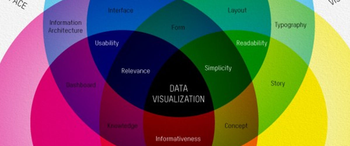
In today’s information-driven world, data plays a crucial role in decision-making. However, raw data alone can overwhelm or confuse an audience, especially during presentations. Data visualization is the solution. It transforms complex data sets into visual formats that are easier to understand, interpret, and act upon. Charts, graphs, infographics, and maps make large amounts of information digestible, enabling you to convey key insights quickly and effectively.

Here’s why data visualization is essential in presentations:


1. Simplifies Complex Information

Raw data can be intimidating, especially in large quantities. Data visualization helps simplify complex information, allowing the audience to grasp key points without having to sift through numbers.

Why It’s Important:

  • Improves Understanding: Visual representations of data are easier to interpret, making complex information more accessible.
  • Clarifies Patterns: Charts and graphs can reveal trends, correlations, and outliers that might be missed in raw data.

Example: Instead of showing a spreadsheet filled with sales data, a line graph can illustrate the upward trend in sales over the last year, making it easier for your audience to spot patterns.


2. Engages Your Audience

Presenting data in a visual format helps break up text-heavy slides and keeps your audience engaged. Visuals are more stimulating than rows of numbers and can capture attention more effectively.

Why It’s Important:

  • Enhances Engagement: Visuals are processed faster by the brain than text, keeping your audience more focused and attentive.
  • Increases Retention: People are more likely to remember information presented visually than through text or spoken word alone.

Example: Using a pie chart to show market share distribution among competitors grabs attention more effectively than listing percentages in bullet points.


3. Highlights Key Insights

Data visualization helps presenters emphasize the most important data points and insights. By visually highlighting trends or critical metrics, you can guide your audience’s attention to the key takeaways.

Why It’s Important:

  • Focuses Attention: Visuals direct the audience to the most significant data points without requiring them to sift through irrelevant information.
  • Increases Persuasiveness: Well-designed visuals can strengthen your argument by making data more compelling and easier to understand.

Example: A bar chart comparing the revenue growth of two products can make it obvious which product is performing better, allowing the audience to quickly grasp the comparison.


4. Makes Data More Persuasive

Numbers can be powerful, but they are even more impactful when presented visually. Data visualization allows you to build a more convincing narrative by backing up your points with clear, compelling data.

Why It’s Important:

  • Builds Credibility: Visualizing data makes your information look more professional and trustworthy.
  • Increases Persuasion: Seeing data in a chart or graph format can make your argument more convincing to the audience.

Example: Showing a decline in customer complaints via a line graph over time reinforces the success of a customer service initiative.


5. Saves Time

Data visualization allows you to communicate more information in less time. Instead of explaining data point by point, a chart or graph can instantly convey key trends or comparisons, making your presentation more efficient.

Why It’s Important:

  • Increases Efficiency: Visuals convey a lot of information at a glance, saving time for both you and your audience.
  • Improves Focus: You can present the core insights without overwhelming your audience with data overload.

Example: A heatmap showing regional sales performance allows the audience to instantly see which areas are underperforming without the need for lengthy explanations.


Final Thoughts

Data visualization is essential for making your presentation clear, engaging, and persuasive. It simplifies complex information, grabs attention, highlights key insights, and saves time for both presenters and audiences. Whether you’re presenting financial reports, marketing metrics, or operational data, using visual aids like graphs and charts will help you deliver your message effectively.


The Do’s and Don’ts of Slide Design

Slide design plays a critical role in the success of any presentation. Well-designed slides enhance your message, making your content more engaging and easier to understand. However, poor slide design can confuse or distract your audience, taking away from the effectiveness of your presentation. To ensure that your slides are helping, not hindering, your message, it’s important to follow a few key design principles.

Why You Need Props at Your Next Presentation

audience

Custom Designed Presentations

Italy

Marco Montemagno

metaphors

PowerPoint Agency

PowerPoint Design

PowerPoint design experts

PowerPoint specialist

presentation

Presentation Agency

Presentation Company

Presentation Consultation

Presentation Designers

Presentation Firm

Presentations

props

Props in Presentations

When you hear the word “prop” do you think of those cotton horse heads on a stick that the actors pretend to ride around on?

The truth is props are universally profiled as cheesy theatrical objects, much like the horse on a stick, good only for middle-school plays. Because of this, props are obsolete in the eyes of the typical presenter, and that’s a problem.

While by definition, the word “prop” does refer to theatrical property, its purpose is overlooked. Any given prop is used to add realism to a given story and to help advance the narrative in a more palpable way. This idea is directly transferable and applicable to any corporate presentation, PowerPoint presentation, or sales pitch.

By thinking of props as relics of the past, we are blinding ourselves of the many creative and effective ways to utilize props in today’s world.

Here’s my favorite example:

Italian entrepreneur and television host Marco Montemagno is the renowned founder of digital domination summit.Digital Domination Summit is a free online event, featuring prerecorded video messages & video interviews from up to 30 leading authorities on how to do business in the digital world”. Montemagno’s also hosts live talks that are are known to be among the most engaging and intriguing throughout of Italy and Europe for that matter. He focuses on the topic of Internet culture. His talks revolve around showing Italians why the Internet should be embraced and not feared. Montemagno presents to audiences of up to 3,000 people in cities including Milan, Rome, and Venice. In spite of his goal to bridge a divide between his technical expertise and the everyday language of his audience, Montemagno uses devices meant to engage his listeners, namely props.

Montemagno’s audience members get a pen and paper before taking their seats. During the presentation, he asks them to turn to the person to their right and in 30 seconds sketch their portrait. He then asks them to write the title of their favorite song, movie, etc. They pass the paper around and repeat the process until the paper has changed hands up to five times. Each audience member then takes home a piece of paper that once belonged to someone else. The exercise is intended to demonstrate how information is shared among individuals across networks.

Montemagno shows us a unique and creative medium through which to apply props. He takes a complex subject, and simplifies to an experience that every member of the audience can feel, and therefore remember vividly. This is what props are useful for, helping the audience feel, understand, and remember. If you manage to get your audience to go through these three sensations about  you and your PowerPoint presentation, you will find your business reaching new heights!

3 Reasons Why You’ll Benefit from Using Props:

 Your presentations will be more memorable. Sure, you can repeat the same description of your product 12 times, and increase audience retention, or you can just bring out the actual product, explain it once, and get the same effect.

You can apply them as effective metaphors. Using props as metaphors are great way to get your audience’s attention in a matter of a few seconds.

You will create emotional impact. While facts and stats will tell, emotion will sell!

References:

“Digital Domination Summit 2013.” Wired UK. June 28, 2013.

Gallo, Carmine. “Using Props to Improve Your Presentations.” Bloomberg.com. January 27, 2009.

“How Do Props Help a Presentation?” Manner of Speaking. September 25, 2011.

Putting Your Presentation before Your PowerPoint.SlideGenius. December 9, 2013.

Ten Tips for Using Props in a Presentation.Manner of Speaking. September 28, 2011.

What Kind of Voice do you Have?

ALWAYS

audience

Custom Designed Presentations

PowerPoint Agency

PowerPoint Design

PowerPoint design experts

PowerPoint specialist

presentation

Presentation Agency

Presentation Company

Presentation Consultation

Presentation Designers

Presentation Firm

Quality Clarity

Work Cited

Have you ever met someone who is ALWAYS obnoxiously loud when they talk? How about someone who is too quiet? Or maybe someone with a ridiculously deep voice? Similarly, have you ever wondered what people think of your voice?

Voice volume, melody, strength, variety, and overall quality is an essential factor when it comes to how people view us. In any situation, while at a party, in the movie theater, or more importantly, while giving a presentation, people around us are constantly judging how we move, what we say, and how we say it.

Specific to presentations, some believe that our content is most important. While content may be the foundation of the presentation, your delivery is what will decide what the audience think of you, and consequently how they act on your presentation.

Here are three categories of voice that you should focus on to better your next corporate presentation:

Volume

It’s relatively obvious that if your audience can’t hear you, what you’re saying will be of no value. On the other hand, you don’t want to be “that guy” that comes out screaming with unnecessary enthusiasm. Actually in that case, the entire audience is just thinking of ways to kill you, or at least shut you up, which is probably not the takeaway you want to leave them with. Volume should be appropriate in strength and intensity and should be varied in order to add emphasis and dramatic impact to your speeches. Inaudibility is often associated with unintelligibility. If you want to communicate with your audience, you must project your voice. A great way to judge your level is testing whether or not the person sitting in the last row can hear you.

Monotonous vs. Melodious

You are either monotonous or melodious. When you speak about something, it is important to focus on conveying life, color, and melody. We have all had the one professor in school or conference speaker whose sentences come out flat, wooden, and without variety. How wide would you say your vocal range is? Any good speaker will vary their speech within every few sentences and sometimes just for specific words or phrases. Think of your favorite song, and imagine how many peaks from high to low and there are in any given 5 seconds. Those changes in pitch are what make you like the song and bob your head and sing along. While you may not want your audience to bob or sing at what you’re saying, you sure do want their attention, so it is important to make sure you have the right pitch and tune. If you think your voice might be squeaky, harsh, high-pitched, or flat, then you should work on your pitch. This will help express the necessary emotion and conviction needed to keep your audience interested.

Quality & Clarity

The essence of your speaking sound is your voice quality. It expresses emotional color. Your voice coloring is what you use to convey your feelings, and these feelings should be positive when you address an audience. Your thoughts are a form of energy that you transmit to others. Through the quality of your voice, you actually establish the tone of your relationship with an audience or with an individual to whom you’re speaking.

Speaking in a clear, smooth, and enthusiastic voice will help create a unique and useful bond of friendship and acceptance with your listeners. Conversely, if your voice is nasally, raspy, or lifeless, you are doing something wrong. The primary cause of bad voice quality is tension; both emotional and physical.

A useful route to developing your voice quality and clarity lies in the awareness of the different roles you play during a usual day. As a parent, employee, supervisor, friend, lover, shopper, seller, you inherently cultivate unique personality traits and voice levels. To improve your voice quality, you must become aware of stress, muscle tension, and relaxation in each of these roles you live with.

When it comes time to present, in any medium follow these next few tips and ensure a reduction of tension condition:

  1. Relax your throat
  2. Gargle water
  3. Take deep breaths
  4. Smile, for a whole minute before your presentation

If you reduce the tension in your voice, a pleasant tone will likely result which will in turn reel in your audience. Remember that the emotions and vocal colorings you express with your voice can arouse similar emotions in others.

Work Cited:

“Your Speaking Voice.”

How to Incorporate the Audience into Your Presentation

audience

audience incorporation

Craft Constructive Questions

Custom Designed Presentations

Formulating Questions

PowerPoint Agency

PowerPoint Design

PowerPoint design experts

PowerPoint specialist

presentation

Presentation Agency

Presentation Company

Presentation Consultation

Presentation Designers

Presentation Firm

presenting

Incorporating your audience into a presentation fosters engagement and ensures they stay connected to your message. Here are effective ways to include your audience:

1. Ask Questions

  • Why it works: Asking direct or rhetorical questions draws the audience into the conversation and makes them think critically about your content.
  • How to apply: Start with an open-ended question to gauge the room’s knowledge on the topic or to introduce key points. You can also use polling software (e.g., Poll Everywhere or Slido) to collect live feedback.

2. Encourage Participation

  • Why it works: Active participation keeps the audience attentive and helps break up the passive delivery of information. It also makes the presentation more interactive and memorable.
  • How to apply: Involve the audience in small group discussions or activities related to the presentation’s topic. For instance, have them brainstorm ideas or provide their own experiences.

3. Use Storytelling with Audience Relevance

  • Why it works: Sharing personal stories or relatable examples makes your content more relatable. Tailoring stories to your audience’s experiences or field of interest makes it easier for them to connect with your message.
  • How to apply: Incorporate examples or scenarios that are familiar to the audience’s industry or background. This personalization helps them visualize the problem or solution you’re addressing.

4. Ask for Opinions or Insights

  • Why it works: This not only engages the audience but also makes them feel valued as part of the conversation. It opens the door for them to share their knowledge and ideas, contributing to a dynamic presentation.
  • How to apply: Throughout your presentation, pause to ask for feedback or input, particularly on controversial or thought-provoking topics. Let them vote on solutions or share their experiences with the subject matter.

5. Use Real-Time Polls or Quizzes

  • Why it works: Interactive tools like polls and quizzes allow the audience to engage directly with your presentation, giving them a sense of participation.
  • How to apply: Use tools like Kahoot, Mentimeter, or Zoom’s built-in polling feature to run real-time quizzes or get instant feedback on key questions. These can break the monotony and re-energize the audience.

6. Invite Volunteers

  • Why it works: Bringing a few audience members up to participate in a demo or activity makes the presentation more dynamic and entertaining. It also encourages others to pay attention, as they may be the next to interact.
  • How to apply: Create moments in your presentation where a task or example can be demonstrated by a volunteer. This could involve helping with an experiment, providing an opinion, or participating in a role-play scenario.

7. Use Eye Contact and Body Language

  • Why it works: Maintaining eye contact and using open body language makes the audience feel like you’re speaking directly to them, fostering a sense of connection and inclusivity.
  • How to apply: Make an effort to look at different sections of the audience throughout the presentation. Use gestures to emphasize points and create a more engaging visual presence.

8. Field Questions at Key Moments

  • Why it works: Allowing for questions or comments at intervals keeps the conversation flowing and ensures the audience stays engaged throughout the presentation.
  • How to apply: Instead of leaving all questions for the end, pause after major points to invite questions. This provides clarity and gives the audience a chance to contribute.

Incorporating these strategies into your presentation makes the audience feel involved, turning a monologue into a conversation. The more engaged the audience, the more impactful your presentation will be.

Winston Churchill: Orator of the Century

audience

Custom Designed Presentations

PowerPoint Agency

PowerPoint Design

PowerPoint design experts

PowerPoint specialist

presentation

Presentation Agency

Presentation Company

Presentation Consultation

Presentation Designers

Presentation Firm

Winston Churchill

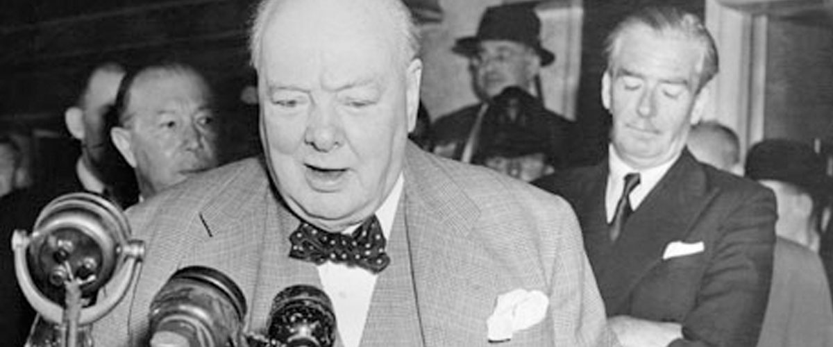
Widely regarded as one of the greatest wartime leaders of the 20th century, Winston Churchill inspired Great Britain and the Western world to stand up, and fight against the strongest military empire of the century. You can agree that convincing millions of people to support you in any cause is an almost impossible task. Churchill was very tactful when it came to give convincing speeches. In fact he famously said, “Tact is the ability to tell someone to go to hell in such a way that they look forward to the trip.”

First, and perhaps most importantly, becoming a great speaker is a matter of practice and persistence, not natural talent. Even Churchill himself was not born a great presenter. He actually had a slight stammer and a lisp (that made him sound drunk) when he was young. He spent hours on end crafting his speeches, perfecting every word. Churchill himself said “Continuous effort – not strength or intelligence is the key to unlocking our potential.”

With that, here are four lessons Winston Churchill can teach us about perfecting our speeches and professional powerpoint presentations:

Speak in crisp and direct sentences.

As ugly and inconvenient as what you say may be, be straightforward in what you say and your audience will respect you. Winston says, “If you have an important point to make, don’t try to be subtle or clever. Use a pile driver. Hit the point once. Then come back and hit it again. Then hit it a third time – a tremendous whack.”

Churchill’s examples of this:

“An appeaser is one who feeds a crocodile, hoping it will eat him last.”

“A politician needs the ability to foretell what is going to happen tomorrow, next week, next month, and next year. And to have the ability afterwards to explain why it didn’t happen.”

Be eloquent and rhythmic in your vocabulary.

By this, I don’t mean stuff big words everywhere just to sound fancy. What I mean is that you should make the simplest form of whatever you’re saying into the most professional way it can be said. Churchill also had a melodious flow to his speeches, keeping the audience on their toes at all points throughout. At any rate, bettering your vocabulary can also be a very helpful activity for bettering your vocational skills. Learning 5 new words a day might be a great way to start…

Repeat, Repeat, Repeat.

Churchill utilizes repetition in almost ever single one of his speeches. He would consistently use phrases or words over and over again in the same breath to highlight a point.

Churchill’s examples of this:

“Victory at all costs, victory in spite of all terror, victory however long and hard the road may be; for without victory, there is no survival.”

“We shall go on to the end, we shall fight in France, we shall fight on the seas and oceans, we shall fight with growing confidence and growing strength in the air, we shall defend our Island, whatever the cost may be, we shall fight on the beaches, we shall fight on the landing grounds, we shall fight in the fields and in the streets, we shall fight in the hills; we shall never surrender.”

Ironical humor.

Churchill was known for his wit and word play. While wit seems like a more “born-with-it” sort of concept, one will surely develop it by knowing a certain concept through and through. Once you master a specific idea or issue, you will have the necessary background to react quickly and wittily to questions or comments you are confronted with. This ultimately comes down to practice; know what you are talking about and you will know what to say at all times.

Churchill’s examples of this:

 “If you have ten thousand regulations you destroy all respect for the law.”

“We have always found the Irish a bit odd. They refuse to be English.”

As one of the most revered leaders and orators in history, Winston Churchill changed the world with both his voice and his actions. Following and epitomizing Churchill in your next professional powerpoint presentation will be a great way to improve yourself as a public speaker and powerpoint expert.


Reference:

Winston Churchill Quotes.BrainyQuote.