Design Hacks for Designers on a Deadline

design

design 101

infographics

tips and tricks

Graphic design is expanding. Every year, new designers emerge—many of which are equipped with skills that match, if not surpass, that of established professionals. If you don’t want to be replaced, strive to be more valuable. Identify yourself from the crowd by being consistent with the quality of your work. Excellence is important for artists like you since your job entails producing creative outputs that spark the imagination. To be a great designer, you need to make sure that your designs don’t stagnate and lose their luster over time.
Quality is indeed number one in the list of things that should define you as an artist. However, it doesn’t end there. Since the design marketplace teems with designers who produce exceptional work, quality is no longer enough. You need to add another ingredient to the mix.

The Missing Piece in the Puzzle

What design skill is so important that, without it, you won’t be able to outshine others in your field? Why, speed, of course. With the upsurge of client demands, there’s nothing more sought-after today than a designer who can produce quality work within a short time frame. Time is money—the faster you work, the more you’ll earn. It’s as simple as that.
Still, we’re no strangers to the conjecture that quality takes time. You can argue that speed comes at the expense of quality, but if you give it enough thought, you’ll see that this isn’t really the case. There’s a difference between a fast output and a rushed one, and obviously, you should aim for the former. Lighten your workload by applying some tricks of the trade that will enable you to work faster.
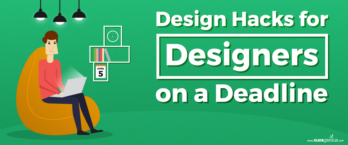
The following infographic provides some advice on becoming a better and faster designer. Integrate these hacks into your work process, and never miss a deadline again!

Resources:

Beachy, William. “How to Become a Faster Graphic Designer.” Go Media. June 24, 2015. gomedia.com/zine/insights/how-to-become-a-faster-graphic-designer
Cousins, Carrie. “How to Become a Faster, More Efficient Designer.” Design Hack. June 21, 2016. designshack.net/articles/freelancing/how-to-become-a-faster-more-efficient-designer
Merimee, Jordan. “7 Essential Productivity Tips and Hacks for Designers.” Shutterstock. October 24, 2016. www.shutterstock.com/blog/productivity-tips-hacks-designers
Vukovic, Peter. “15 Ways to Design Better and Faster.” 99 Designs. n.d. 99designs.com/blog/tips/15-ways-to-design-better-and-faster
“A Designer’s Time Is Money.” Affordable Printing. February 11, 2014. www.affordableprinting.co.uk/2014/02/11/designers-time-money
“Top 5 Hacks to Brainstorm a Perfect Design with a Tight Deadline.” Fohlio. n.d. learn.fohlio.com/top-5-hacks-to-brainstorm-a-perfect-design-with-a-tight-deadline
7 of PowerPoint 2016’s Best New Features

Microsoft PowerPoint

PowerPoint 2016

Powerpoint tips

Here are seven of PowerPoint 2016’s best new features that significantly enhanced user experience and presentation design:

1. PowerPoint Designer (Design Ideas)

  • What it is: This feature uses AI to automatically suggest layout ideas based on the content in your slide. It instantly offers professional-looking designs that save time and enhance slide aesthetics.
  • Why it’s great: It allows users with limited design skills to create visually appealing presentations with ease. You simply insert your content, and the tool suggests layout options.

2. Morph Transition

  • What it is: The Morph transition enables smooth animation between slides. It lets you create fluid transitions by automatically moving objects from one slide to the next.
  • Why it’s great: It’s ideal for storytelling or when you want to create continuous flow animations. This can be used for objects, text, and images, creating dynamic presentations without needing complex animation skills.

3. Real-Time Collaboration

  • What it is: PowerPoint 2016 introduced real-time co-authoring, allowing multiple users to work on the same presentation simultaneously.
  • Why it’s great: Teams can collaborate more efficiently, whether they’re in the same office or working remotely. This feature ensures everyone is working on the most up-to-date version.

4. Tell Me Feature

  • What it is: “Tell Me” is a smart search bar located at the top of the PowerPoint ribbon. It allows you to type in tasks or commands you’re looking for, and PowerPoint helps you find them quickly.
  • Why it’s great: This feature is especially useful for users who are unfamiliar with where certain tools or features are located within the software.

5. Ink Equations

  • What it is: PowerPoint 2016 lets you insert complex math equations by handwriting them directly into a slide using a stylus or your mouse.
  • Why it’s great: This is a great feature for educators, students, or professionals who need to quickly insert mathematical expressions without typing them out.

6. Enhanced Presenter View

  • What it is: Presenter View now shows the next slide, speaker notes, and a timer on your monitor while the audience only sees the current slide.
  • Why it’s great: This allows for better pacing and control during presentations, giving you confidence in what’s coming next without revealing too much to the audience.

7. Screen Recording

  • What it is: PowerPoint 2016 has a built-in screen recording tool that allows you to record your screen directly into a slide. It captures screen actions, along with audio and video, if necessary.
  • Why it’s great: It’s ideal for creating tutorial videos or demonstrations without needing to switch to third-party screen recording software.

These features made PowerPoint 2016 a versatile tool for creating visually appealing, collaborative, and interactive presentations, empowering both novice and advanced users to elevate their presentation game.

Public Speaking Fear: Getting Rid of It in a Jiffy

powerpoint designer

presentation

presentation design

presentation tips

public speaking

Public Speaking Fear

Rick Enrico

SlideGenius

stage fright

Let’s face it: public speaking is frightening. Even the best speakers experience jitters before they go onstage. They just hide it really, really well—or they’re so used to stage fright that it’s no longer an issue after their warmup exercises.

Audience members pick up on signs of discomfort when you as a speaker have a hard time onstage: excessive sweating, stuttering, shortness of breath, etc. When they do, you become more conscious about what you’re doing, and the anxiety starts to build up. Does that mean you’re not ready? Possibly.

There’s no denying that some people, to no fault of their own, have a hard time dealing with high-stress situations—and you can bet that giving a speech in front of a crowd is stressful. Imagine the scenario: You’re minutes away from being called onstage. Your presentation is ready, perhaps designed by a PowerPoint design agency. The lights focus on your spot. But backstage, butterflies are abuzz in your stomach; your knees are shaking, and your palms are sweaty. You feel a bit lightheaded. Dizzy even.

These are uncontrollable responses to nervousness. While completely natural, especially in the context of public speaking, they’re still something that faze lots of people—80 percent of the US population, in fact. However, there are people easily debilitated by the mere thought of speaking in public. Those who suffer from a specific social anxiety disorder, glossophobia, feel nauseous and are prone to having panic attacks, which is why they try to stay away from doing it as much as possible.

For those who need to speak in public, though, how do you deal with stage fright? The ways to do it vary from person to person since each individual handles stress differently. Check this infographic to learn a few tricks to calm down and nail that speech.

https://www.slideshare.net/SlideGenius/public-speaking-fear-getting-rid-of-it-in-a-jiffy

Resources:

Hagen-Rochester, Susan. “Got Public Speaking Jitters? Experts Say Embrace the Fear.” Futurity. April 8, 2013. www.futurity.org/got-public-speaking-jitters-experts-say-embrace-the-fear

McClafferty, Alex. “12 ‘Fear of Public Speaking’ Symptoms and How to Beat Them.” Forbes. January 12, 2015. www.forbes.com/sites/alexmcclafferty/2015/01/12/fear-of-public-speaking/#b4fe7fd37a0c

Morgan, Nick. “Why We Fear Public Speaking and How to Overcome It.” Forbes. March 30, 2011. www.forbes.com/sites/nickmorgan/2011/03/30/why-we-fear-public-speaking-and-how-to-overcome-it/#4848c54fea43

Jamieson, Jeremy P., Matthew K. Nock, and Wendy Berry Mendes. “Changing the Conceptualization of Stress in Social Anxiety Disorder: Affective and Physiological Consequences.” Clinical Psychological Science. 2013. journals.sagepub.com/doi/pdf/10.1177/2167702613482119

Looking Back on the Birth of PowerPoint

infographics

Powerpoint

powerpoint history

It’s hard to imagine life without the comforts of modern technology that people know today: smartphones, 24/7 Internet access, computers that basically provide anything and everything with the push of a few buttons, and the like. Now, you’d think that innovation is an everyday occurrence, but that wasn’t the case in the mid-1900s, especially for businesses.

Back in the early 60s, Roger Appeldorn invented the first overhead projector. It had a simple principle of using light reflected upon mirrors to display data printed on transparencies (a.k.a. foil or viewgraph), paper-sized sheets of cellophane. The bulky instrument became a mainstay in meeting rooms, but the processes to create one sheet of transparency were tedious and time-consuming (inkjet printing was still a new thing). If not printed, then presenters would handwrite data to be projected on the transparencies. That is, until the 90s. What happened?

Microsoft PowerPoint happened.

Its revolutionary and innovative approach to creating presentations gave it an edge over its more than thirty competitors. Its timing with the booms of both the Apple and Windows operating systems—primitive as they were—cemented its growth. And its fundamental function hosted other uses it wasn’t intended for, like classroom operations and simple public speaking exercises (and not-so-simple ones like the TED Talks). Yes, it’s that flexible.

Today, PowerPoint is at its latest version: PowerPoint 2016, as part of the Microsoft bundle Office 2016. More than two decades since the first version was published, PowerPoint is at its prime—with no signs of slowing down anytime soon. Although it has seen its share of competitors, the presentation designer software remains as strong as ever, if not stronger.

So how did this juggernaut of a program come to fruition? How about a teaser? For starters, did you know that PowerPoint didn’t start as an internal project of Microsoft? The following infographic will take you through decades across the technological history to the go-to presentation software that is—and will always be—Microsoft PowerPoint.

https://www.slideshare.net/SlideGenius/looking-back-on-the-birth-of-powerpoint

Resources:

Akanegbu, Anuli. “Vision of Learning: A History of Classroom Projectors.” EdTech Magazine. February 28, 2013. www.edtechmagazine.com/k12/article/2013/02/vision-learning-history-classroom-projectors

“Life Before the Web – Running a Startup in the 1980’s.” The Zamzar Blog. July 13, 2016. blog.zamzar.com/2016/07/13/life-before-the-web-running-a-startup-in-the-1980s

PowerPoint as a Communication Tool When Rebranding a Business

Branding

communication

Powerpoint

powerpoint designer

presentation

presentation tips

rebranding

Rick Enrico

SlideGenius

PowerPoint is an effective communication tool when rebranding a business, as it allows for clear visual storytelling, presenting complex ideas in a simplified, engaging way. During a rebrand, key stakeholders, employees, and clients need to understand the new brand identity, its values, and its visual elements. Here’s how PowerPoint can play a vital role in this process:

1. Visualizing the Brand Identity

  • Why it matters: PowerPoint presentations enable businesses to visually demonstrate the new brand’s logo, color schemes, fonts, and design elements. Visuals are crucial in communicating the changes in a brand’s identity effectively.
  • How to use it: Create slides that show before-and-after comparisons of logos, packaging, or marketing materials. Use the slides to showcase how these new visual elements align with the company’s refreshed identity and mission. This visual comparison helps the audience understand the shift in tone and aesthetic.

2. Articulating the Brand Story

  • Why it matters: Rebranding involves more than just a visual change—it also means conveying a new or refined brand story. PowerPoint can help narrate the evolution of the brand, from where it began to what it stands for today.
  • How to use it: Use PowerPoint’s narrative flow to tell the brand’s journey in stages, from the old brand identity to the newly redefined one. Add key messages that explain the brand’s vision, mission, and goals, using storytelling to engage stakeholders emotionally.

3. Highlighting Market Research and Insights

  • Why it matters: A successful rebrand is often driven by market insights and customer feedback. PowerPoint can be used to showcase the research behind the rebranding decisions, offering a transparent view of the data that influenced the change.
  • How to use it: Present graphs, charts, and infographics to explain customer sentiment, competitor analysis, and market positioning. This builds trust among employees, clients, or partners by showing that the rebranding is grounded in concrete data.

4. Educating Employees and Stakeholders

  • Why it matters: Internal stakeholders need to understand how to implement the rebrand consistently. PowerPoint presentations are an efficient tool for conducting training sessions on how to apply the new branding across various platforms.
  • How to use it: Create training decks that provide guidelines on using the new brand elements, including templates for emails, internal documents, and social media posts. Use slides to offer practical examples of what to do—and what not to do—when applying the new brand.

5. Communicating Brand Strategy and Future Goals

  • Why it matters: PowerPoint can help communicate the strategic direction of the rebrand, highlighting how it aligns with the company’s long-term goals. It offers a structured way to convey key milestones and next steps.
  • How to use it: Use the presentation to map out future marketing campaigns, product launches, or partnerships that align with the new brand. Showcase the brand’s evolving role in the market, using timelines and roadmaps to outline future initiatives.

6. Creating Investor and Client Buy-in

  • Why it matters: PowerPoint presentations can be used to pitch the rebrand to investors or clients, providing a professional and polished way to showcase the potential benefits of the new brand.
  • How to use it: Create a deck that highlights the rationale behind the rebrand, its anticipated impact on business growth, and how it will improve customer engagement. Use statistics and market projections to show the value of the rebrand to investors or partners.

7. Driving Consistency Across Multiple Channels

  • Why it matters: For a rebrand to be successful, consistency across all channels is crucial. PowerPoint can serve as a brand guideline document that is shared with all departments.
  • How to use it: Develop a comprehensive PowerPoint that acts as a style guide for the new brand. Include detailed instructions on how to apply the branding across print, digital, and social media platforms. This ensures uniformity in the way the brand is presented externally.

By using PowerPoint as a communication tool during a rebrand, businesses can ensure that they visually communicate their new identity, explain the rationale behind the changes, and educate key stakeholders on how to apply the brand consistently across channels. This combination of visual storytelling and structured messaging is crucial for ensuring that the rebrand is well-received and effectively implemented.

Pantone’s Color of the Year and How You Can Use It for Business

design

Greenery

Infographic

infographics

Pantone

pantone color of the year

Rick Enrico

SlideGenius

Pantone calls itself “the world-renowned authority on color,” and perhaps rightfully so. The company has been in business since 1963, when its founder devised the Pantone Matching System, a standard scheme for identifying and communicating different shades and hues.

At the turn of the millennium, the company launched the project, “Color of the Year.” For seventeen years now, Pantone’s color forecasting has been a self-fulfilling prophecy. Different industries worldwide refer back to it when releasing new trends.

The Art of Color Forecasting

Although Pantone’s Color of the Year is widely anticipated and supported by a number of industries, the science behind it is still obscure. As Pantone senior vice president Ron Potesky said, “The complexity of the logic behind Color of the Year is greater than interior design or fashionit’s a forecast, a reflection of what’s happening in the world.”

The process of color forecasting is not a simple one, although it’s highly subjective in nature. For months on end, the Pantone team gathers what they call “proof points” from all over the world. They go to car shows, runways, decorator showcases, and other important events that define culture and lifestyle. They try to make sense of meaningful overlaps so they can distill the mood and state of the times into a single color.

Pantone’s yearly selection serves no direct purpose to the consumer world, but its influence can be observed in many sectors. Owing to its longevity and the power of social media, the project has reinvented itself as an authority in color trend selection.

If you’re into the colors game, check out this infographic about Greenery, Pantone’s 2017 Color of the Year.

Colors and business always go hand in hand. The consumer world is about trust and persuasion, and it’s hard to accomplish either or both if your brand is portrayed in a dull and dismal way. Choose a vibrant and fresh palette this yearone that includes Greenery, perhapsand you might just see your customers showing more interest in your business.

Back up your skills with a well-designed PowerPoint presentation by letting our team to assist and offer you a free quote!

Resources:

Beals, Rachel Koning. “Nature and New Beginnings Inform Pantone’s 2017 Color of the Year: Greenery.” Market Watch. December 8, 2015. www.marketwatch.com

Budds, Diana. “Pantone’s New Color of the Year Is Weird and Perfect.” Facto Design. December 8, 2016. www.factodesign.com

Friedman, Vanessa. “Color of 2017? Pantone Picks a Spring Shade.” New York Times. December 8, 2016. www.nytimes.com

Hazzard, Tracy Leigh. “Why Pantone’s Color of 2017 Matters to Your Business.” Inc. December 9, 2016. www.inc.com

Hua, Karen. “Pantone’s Color of the Year 2017 Is Inspired by Nature and Influences Design.” Forbes. December 9, 2016. www.forbes.com

Pasquarelli, Adrianne. “How Pantone Picks Its Color of the Year.” Advertising Age. December 22, 2015. adage.com

Stewart, Jude. “Pantone’s 2017 Color of the Year: Greenery!” Print Mag. December 8, 2016. www.printmag.com

Stock, Kyle. “How Pantone Is Still Turning Color into Money.” Bloomberg. August 27, 2015. www.bloomberg.com

Weiss, Dyanne. “Does Pantone’s Color of the Year Influence Marketing?” Chron. n.d. smallbusiness.chron.com

“Color Can Influence Emotions in a Way that Few Other Mediums Can.” Digital Skratch. n.d. digitalscratch.com

“Color Psychology: How Does Color Affect Us?” Pantone. n.d. www.pantone.com

“Color Psychology: The Emotional Effects of Colors.” Art Therapy. n.d. www.arttherapyblog.com

“Introducing Greenery.” Pantone. n.d. www.pantone.com

“Shinrin Yoku.” Shinrin Yoku. n.d. www.shinrin-yoku.org

Looking for creative presentations that can leverage your business? Enjoy free PowerPoint templates from SlideStore! Sign up today.

Making Your Presentation Stand Out with Powerful Design

design

infographics

Powerful Design

presentation

presentation design

Rick Enrico

SlideGenius

Once you’re onstage, the stars are you and your presentation. Of course, your training got you there in the first place: charisma, clear and loud voice, likable aura—public speaking skills polished over and over again until they’re perfect, almost like second nature, and suited to your needs—and appropriate for every crowd imaginable.

But what about your presentation? Is it tailored to your audience? There’s a risk you don’t want to take when, despite how good you are as a speaker, your presentation is not as appealing: you don’t get your message across as effectively as you want, vis-à-vis death by PowerPoint.

Since humans are visual creatures, our brains process imagistic information faster and more efficiently than text. This is a benchmark you should take advantage of when creating visually appealing and enticing slides, a tip awesome presentation designers always live by. Check this infographic for tips on how to charm your audiences, arrest their attention, and, most importantly, get your message across.

https://www.slideshare.net/SlideGenius/making-your-presentation-stand-out-with-powerful-design

Visuals play an important role when arresting attention. In a world of eight-second attention spans and faster everything—connectivity, accessibility, and even loading times—people would rather spend more of their time on different, more valuable things.

Come to think of it, it’s a cyclical cause and effect: everything is faster, so people expect things to be even faster, ergo the short attention spans. Kind of a messed-up Pygmalion effect, only for things instead of persons.

With that happening, there’s now two steps to do: get their attention and retain it. Good, proper, and creative use of visuals can already do the first, and they can certainly take care of the second, especially when your topic goes from “something that makes them curious” to “something that genuinely piques their interest and makes them ask questions.”

There’s a beauty that certain senses can solely appreciate. Music to the ears. Caress on the skin. For the eyes, it’s appealing design. Beauty. Make something that both you and your audience will appreciate. In turn, they will appreciate you.

Resources:

Golden, Felicia. “The Power of Visual Content: Images vs. Text.” eyeQ. February 11, 2015. www.eyeqinsights.com/power-visual-content-images-vs-text

McSpadden, Kevin. “You Now Have a Shorter Attention Span than a Goldfish.” Time. May 14, 2015. www.time.com/3858309/attention-spans-goldfish

Looking for creative presentations that can leverage your business? Enjoy free PowerPoint templates from SlideStore! Sign up today.

Finding the Perfect Topic for Your Business Presentation

business presentation

Powerpoint

presentation

Rick Enrico

SlideGenius

Finding the perfect topic for a business presentation is essential to engage your audience and communicate your message effectively. Here are steps and considerations to help you select the ideal topic:

1. Understand Your Audience

  • Why it matters: Knowing your audience’s needs, interests, and level of knowledge helps you choose a topic that resonates with them.
  • How to apply:
    • Are you presenting to investors, colleagues, or clients? Investors might be interested in financial projections, while clients may care about product benefits.
    • What is their level of familiarity with the topic? Tailor your subject matter to ensure it’s not too basic or overly complex.

2. Identify the Purpose of Your Presentation

  • Why it matters: Defining your objective guides you toward a relevant topic. Are you informing, persuading, educating, or inspiring?
  • How to apply: If the purpose is to persuade investors, focus on a topic like market trends or growth strategies. If it’s to inform employees, you might choose process improvements or new product launches.

3. Align the Topic with Your Expertise

  • Why it matters: Presenting on a topic you know well builds credibility and confidence.
  • How to apply: Choose a subject within your field of expertise, where you can provide valuable insights, data, and practical solutions. For example, if you’re a marketing expert, presenting on customer acquisition strategies might be ideal.

4. Focus on Relevance and Timeliness

  • Why it matters: Relevant topics address current challenges, trends, or opportunities within your industry, keeping the presentation fresh and impactful.
  • How to apply: Look at industry trends, emerging technologies, or new regulations affecting your business. For example, a presentation on sustainability in business could be timely in the context of global environmental concerns.

5. Explore Common Business Presentation Themes

  • Popular Topics:
    • Financial Analysis and Forecasting: Investors and stakeholders often want insights into financial growth, projections, and performance.
    • Innovation and Technology: Discussing how emerging technologies like AI, blockchain, or automation are shaping your industry can spark interest.
    • Customer Experience: Addressing how to improve customer satisfaction and retention is highly relevant across industries.
    • Leadership and Organizational Change: Presenting on how leadership strategies drive growth, or how organizations can manage change effectively, can appeal to business leaders.
    • Sustainability and Corporate Social Responsibility (CSR): With increasing focus on ethical practices, presenting on how businesses can integrate sustainability into operations can attract a wide audience.

6. Solve a Problem or Address a Challenge

  • Why it matters: Offering solutions to pressing challenges can make your presentation highly valuable and actionable for your audience.
  • How to apply: Identify a common pain point your audience faces. For example, if speaking to a group of startups, a topic like bootstrapping strategies or scaling a business on a budget may be highly relevant.

7. Incorporate Data and Case Studies

  • Why it matters: Presentations supported by real data, trends, and case studies add credibility and help illustrate key points.
  • How to apply: Select a topic where you can back up your arguments with statistics, industry reports, or case studies. If you’re discussing the impact of digital marketing, showcase successful campaigns or data-driven results to support your points.

8. Brainstorm and Evaluate Ideas

  • Why it matters: Exploring multiple ideas allows you to compare and select the most compelling topic.
  • How to apply: Write down a list of potential topics. For each one, ask yourself:
    • Is it relevant to my audience?
    • Does it align with my expertise?
    • Can I support it with data and real-world examples?

9. Test Your Topic

  • Why it matters: Testing the idea helps you gauge audience interest and make necessary adjustments.
  • How to apply: Share your topic idea with a few trusted colleagues or peers. Get feedback on whether it seems engaging, relevant, and informative.

By following these steps, you’ll ensure that your business presentation topic is not only engaging but also aligned with your audience’s needs and the purpose of your presentation.

Design that Speaks: Styling PowerPoint Background Designs that Work

design

PowerPoint Background Design

PowerPoint Design

Powerpoint tips

Rick Enrico

SlideGenius

Designs add depth to content. They are useful for PowerPoint presentations, especially when words alone aren’t explicit enough.

Ideally, PowerPoint pitches should consist of a limited amount of words. Therefore, being expressive is a challenge. Usually, they only contain keywords but because designs impose tone or suggest interpretation, they become more comprehensible.

Studies suggest that elements of art have several different connotations to them. However, they are seldom obvious. It’s common to people that yellow is a happy color or that red looks romantic. But for the average majority, that’s just about it.

Using Psychology in Design

Many know psychological interpretations of art elements such as color, but only a few use this knowledge to their advantage; or at least see them as advantageous.

The ability to understand psychology in design and creativity, and use them in presentations is powerful. “When design and behavior match, the design will be superior,” said Simon Norris in an article. The more psychological effects a slide possesses, the more value it has.

PowerPoint background designs, as much as content does, play a crucial role in persuading audiences. They can influence how others think about you and how they react to you.

One of the secrets in creating a successful business pitch is by connecting with your audience. By appealing to their emotions, you help them remember the idea of your message.

Create effective PowerPoint pitches by incorporating knowledge on useful art psychologies. Know how various elements of art can be used to attract audiences through this infographic.

https://www.slideshare.net/SlideGenius/design-that-speaks-styling-powerpoint-background-designs-that-work

Resource:

“Visual Communication and The Psychology of Design.” SuperGraphics. www.supergraphics.com/blog/visual-communication-and-psychology-design

Looking for creative presentations that can leverage your business? Enjoy free PowerPoint templates from SlideStore! Sign up today.