Pointers for Planning a Successful Webinar

custom powerpoint

pitch deck

presentation tips

Rick Enrico

SlideGenius

webinar

Webinar Presentation

Webinar Tips

Preparation is a critical step in any type of campaign, including hosting webinars. To produce a successful one, you need to lay out all the steps leading to the actual event. It might be tempting to jump straight to the promotion stage, especially if you have a winning topic and a celebrated speaker, but no excuse can justify skipping the planning part. Without a solid plan in place, you may run the risk of delivering a lackluster presentation that will only prove to be a waste of time, effort, and money.

Planning a webinar may seem like a daunting task, but it’s necessary if you want a worthwhile output. Part of the process is creating a checklist that will solidify your strategy. You don’t have to worry about the technicality of it all. With the abundance of tools you have at your disposal, you can plan an online seminar even with limited technological expertise. And besides, every bit of effort you make will be worth the rewards you’ll reap in the end.

Can a Webinar Help Reach Your Business Goals?

You’d think the answer to that question is an unwavering yes, but it actually depends on the goals you aim to achieve. While it’s true that webinars are an effective marketing tool, they only work in certain contexts. So, before planning one, make sure it will leave a positive impact on your business.

What exactly are webinars for? For one, they’re a good training and outreach tool. You can use them to share your expertise to your target audience. Webinars are also effective for getting the word out to your customers when rolling out a new product. When done right, it can help you move customers further down the sales funnel and reposition yourself as an industry thought leader.

Resources:

Berdeal-Skelly, Michelle. “6 Tips to Planning a Successful Webinar.” Find and Convert. October 14, 2014. www.findandconvert.com/2014/10/6-tips-to-planning-a-successful-webinar

Gilbert-Knight, Ariel. “10 Steps for Planning a Successful Webinar.” TechSoup. September 2, 2016. www.techsoup.org/support/articles-and-how-tos/10-steps-for-planning-a-successful-webinar

Sibley, Amanda. “10 Things That Take a Webinar From Good to Great.” HubSpot. January 3, 2014. blog.hubspot.com/marketing/webinar-planning-list#sm.0000w6nx4vstbcwkqnc12umt2kzcx

“15 Tips for a Successful Webinar.” MegaMeeting. n.d. www.megameeting.com/15_Successful_Webinar_Tips_Part1.html

Looking for creative presentations that can leverage your business? Enjoy free PowerPoint templates from SlideStore! Sign up today.

Working with an Awful-Looking PowerPoint Template

Powerpoint

powerpoint template

Powerpoint tips

presentation design

presentation tips

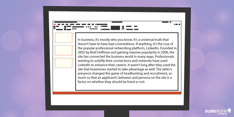
Corporate PowerPoint templates are notorious for their impracticality and ineffectiveness. This is because they’re usually created by people with limited knowledge or experience in design. If you are guilty of this sin, then you should hire a slide design professional who can amp up your template’s look and feel. The aesthetics of your presentation can reflect the amount of dedication you put in it, so make sure you create a template that is engaging and attractive.
The general goals of a presentation are to communicate a message, make a point, and sell an idea. A bad template can undermine these goals and inhibit you from delivering an effective presentation. Here are some of the most common components of an awful-looking presentation template, alongside some tips on how to rectify them.

6 Elements of a Bad PowerPoint Template and How to Fix Them

What do bad presentation templates have in common? They all lack a unifying idea that marries content and design. Awful-looking presentations are ambiguous, and from this major flaw springs others. Although the following elements seem inconsequential, they can still leave a great impact on your template’s final look, usability, and effectiveness.
PowerPoint Template Mistakes: Inadequate Features

1. Inadequate features

A good presentation template should be flexible enough to meet the company’s needs. Otherwise, it will be of no use. Include the fundamental features in your template, but don’t stop there. Make sure you include not only an opening and ending slide but also transition slides, master slides, and other standard slides that can enhance your message. Apart from this, you should also provide a guidebook that will instruct and direct the presenters as to the proper uses of the template. Provide demonstration videos and actual presentation samples if necessary.

2. Lack of visual elements

One of the worst things you can do to a presentation template is to deprive it of an emotional element. Templates that are riddled with unnecessary bullets and large walls of text do nothing but insult the audience’s time and attention. Don’t encourage presenters to bombard their presentations with lengthy passages. Set presentation guidelines that limit ideas to one per slide. To add an emotional trigger, encourage the use of visual tools like graphics and videos. Let the presenters bring their ideas to life through emotive and photographic elements.
PowerPoint Template Mistakes: Poor Color Contrast

3. Weak color palette with poor contrast

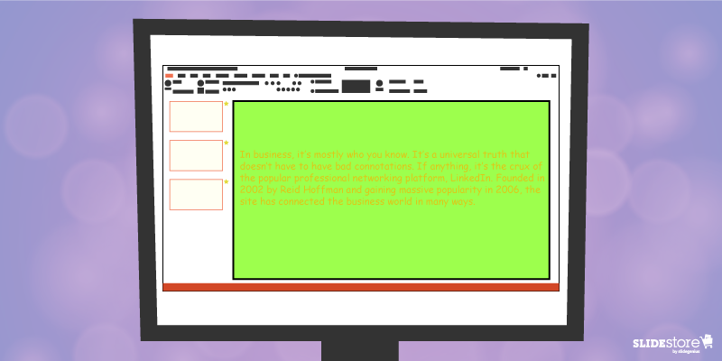
Many things can go wrong with your chosen palette. For instance, you might choose a color theme that may not reflect your brand. The colors may not be appropriate to the image you want to project and the message you want to communicate. Another thing that may go awry is the color contrasting of the fonts and backgrounds. As you know, weak contrast results to poor readability, which will render your text invisible, and thus, worthless. To avoid this problem, always calculate the effect of a certain font color on the background. Finally, be careful about the inclusion of weak and/or daring colors in your theme. Weak colors can weaken your design, and daring colors can disorient your audience.

4. Unreadable typography

Typography is one of the most important elements of a presentation since it can set the stage for the content. There are two important aspects of typography: size and style. You need to get these two right to achieve an effective presentation. Make sure the standard font size you set is not lower than 44 points. This size is large enough to command attention but not too large that it looks ludicrous. You also need to consider the font style. Traditional serif fonts look formal and professional while sans serif fonts are more modern and clean-looking. Use what’s appropriate for your presentation.
When you use custom fonts, make sure they’re installed in external computers. The thing about custom fonts is that they can mess up the layout of your slides if the computer you’re using doesn’t support them. Embed the true type fonts into the presentation to avoid this fiasco.
PowerPoint Template Mistakes: Use of Clip Art

5. Cheesy effects

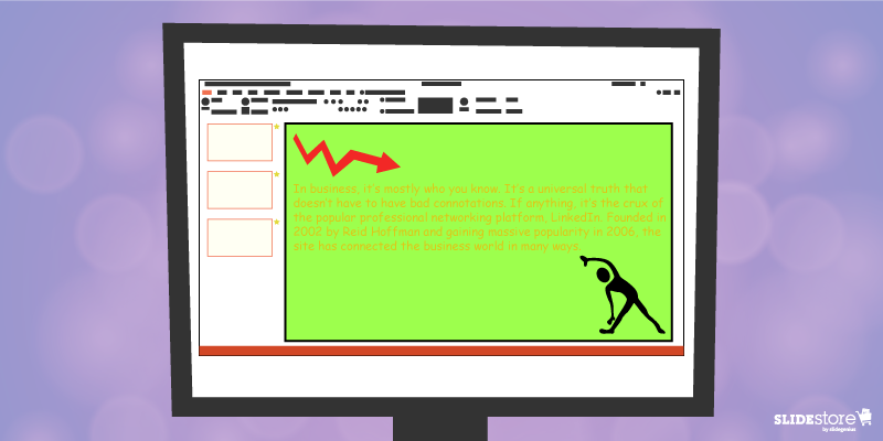
Perhaps the biggest PowerPoint nightmares are the cheesy effects, which include transitions, sound effects, and animations. It’s understandable if you want to spice up your template, but find better ways to do that other than adding inappropriate effects to your presentation. However, if you feel like you need to use the said effects because they offer a functional purpose, make sure to use them sparingly. Instead of the default sound effects from the PowerPoint library, embed background music from external resources. As for animations and transitions, make sure they add value to your content. Use only what’s absolutely crucial for the presentation.

6. Use of clipart and stock photos

Visual elements are generally good, but there are certain design taboos that you should avoid. We’re talking about clipart and clichéd stock photos. No matter how hard you try, you won’t find a reason compelling enough to justify the use of clipart in your deck. Nothing screams “lame” louder than mediocre symbols in a modern corporate presentation. The same thing goes for stock images. There are many staged and cringeworthy photos that will only lessen the value of your template if you’re careless enough to use them. If you’re going to use photos, go for genuine-looking ones that can trigger emotional reactions from the audience.
If you address these bad design habits that plague many PowerPoint presentations today, you will save your company major headaches. Fix these problems and watch as your presentation templates reach a different level of beauty, usability, and effectiveness.

Resources:

Chibana, Nayomi. “Color Theory for Presentations: How to Choose the Perfect Colors for Your Designs.” Visme. December 28, 2015. blog.visme.co/how-to-choose-a-color-scheme
Godin, Seth. “Really Bad PowerPoint.” Type Pad. January 29, 2007. sethgodin.typepad.com/seths_blog/2007/01/really_bad_powe.html
Hristov, Boris. “Reality Check: Is Your Company’s PowerPoint Template Bad?” Medium. January 19, 2016. medium.com/@borishristov/reality-check-is-your-company-powerpoint-template-bad-bf6ff82780ef#.4kkk8wijb
Mancini, Sunday. “4 Common PowerPoint Template Mistakes.” Ethos 3. May 26, 2016. www.ethos3.com/2016/05/4-common-powerpoint-template-mistakes
Panzironi, Michelle. “7 PowerPoint Mistakes That Make You Look Old.” Forbes. January 16, 2016. www.forbes.com/sites/propointgraphics/2016/01/16/7-powerpoint-mistakes-that-make-you-look-hella-old/#41da1a5234e7
“10 Tips for Designing Presentations That Don’t Suck: Part 1.” Work Front. February 2, 2017. resources.workfront.com/project-management-blog/10-tips-for-designing-presentations-that-dont-suck-part-1
“10 Ways to Spot a Lame Corporate PowerPoint Template.” PowerPoint Ninja. n.d. www.powerpointninja.com/templates/10-ways-to-spot-a-lame-corporate-powerpoint-template
“Choosing the Right Fonts for Your PowerPoint Presentation.” Documents with Precision. March 10, 2016. www.documentswithprecision.com/choosing-right-fonts-powerpoint-presentation

Fundamental Elements of a Strong PowerPoint Slide

Powerpoint

PowerPoint Design

Powerpoint tips

slide elements

Creating strong PowerPoint slides requires attention to clarity, design, and engagement. Here are the fundamental elements of a well-designed PowerPoint slide:

1. Concise and Focused Content

  • Why it matters: A strong slide should deliver one key message or idea. Overloading slides with too much information distracts the audience and makes it harder for them to retain important points.
  • How to apply: Limit your slide to 3-5 bullet points or key ideas. Use short, direct sentences or phrases, and avoid long paragraphs. Each slide should support a single concept, allowing the audience to focus on the message without becoming overwhelmed.

2. Clear and Readable Text

  • Why it matters: If your audience cannot easily read the content on your slides, they’ll lose interest quickly. Legibility is essential for effective communication.
  • How to apply: Use large, sans-serif fonts like Arial or Calibri, with a minimum font size of 24 points for body text and 36 points for headings. Stick to consistent fonts and colors across all slides. Ensure there is sufficient contrast between the text and background, making it easy to read even from the back of the room.

3. Visual Balance and Design

  • Why it matters: An aesthetically pleasing slide keeps the audience’s attention and ensures your content is well-organized. Too much clutter can distract from the message.
  • How to apply: Utilize white space to give your slides a clean, organized look. Limit images and design elements to only those that enhance your message. Align your text, images, and visuals neatly to create visual balance on each slide. A consistent layout across all slides contributes to a professional appearance.

4. Engaging Visuals

  • Why it matters: Images, icons, and charts can convey ideas more powerfully than text alone, helping to increase understanding and retention.
  • How to apply: Incorporate relevant visuals like photos, icons, or infographics that support your message. Use charts and graphs to present data visually, but make sure they are simple and easy to understand. Avoid generic or irrelevant images that don’t add value to the presentation.

5. Consistent Branding

  • Why it matters: Consistent branding helps reinforce your message and creates a professional, cohesive presentation. It ensures that your slides reflect your company or personal brand.
  • How to apply: Use your brand’s colors, fonts, and logo consistently throughout the presentation. Stick to a color palette that complements your brand and is easy on the eyes. Make sure your slides align with your brand’s style guidelines for consistency.

6. Minimal Transitions and Animations

  • Why it matters: While transitions and animations can add engagement, overusing them can be distracting and make your presentation feel unprofessional.
  • How to apply: Use simple transitions and animations, like fade-ins or appear, sparingly and only to highlight key points. Avoid flashy effects like bouncing text or excessive movement, which can distract from your core message.

7. Actionable Call to Action (CTA)

  • Why it matters: A clear call to action helps direct the audience to the next steps, especially in business or sales presentations. It turns passive listeners into engaged participants.
  • How to apply: Place the CTA in a prominent spot on the final slide, using bold text or a contrasting color. Use specific, actionable language like “Sign up today” or “Contact us for more information” to drive engagement.

By focusing on these core elements, you can create effective, engaging, and professional PowerPoint slides that communicate your message clearly and resonate with your audience.

3 Ways Animation Can Make or Break Your Presentation

animation

PowerPoint animation

presentation design

presentation tips

Ever since the birth of Microsoft PowerPoint, presentations have taken a turn for the better: user-friendly interface, easy-to-use buttons, and simple settings to name a few, rendering the whole task of creating presentations simpler and less time-consuming. Best of all is how the software gives you extras and bonuses to liven up to your slides with a few clicks and adjustments.
Like the other elements of a visual aid, and especially with PowerPoint, animations can mean the difference between bland slides and zesty ones. Proper use of transitions can arrest attention and provide suspense. Effects can highlight and emphasize points. Motion paths in action can guide viewers’ eyes to where they should be looking next. There are many upsides to using animations.
However, as with any upside, there are bound to be repercussions—two sides of the same coin, if you will. In this case, there are cons to using animation, ones that have a lasting impact even after your talk.
Animations make or break your PowerPoint. They can be the wowing element or the disappointment that makes your audience members shake their heads. Before you pepper your slides with too many special effects, ask yourself the three following questions:

PowePoint Presentation Animation: Important or Whimsical

Important or Whimsical

Do you have a point to emphasize or a concept you wish to illustrate beyond just showing an image? Or do you want your text to sparkle or your object zoom in and out? Perhaps you want a “breaking glass” effect every time you go to the next slide?
If you answered affirmatively on the first question, then you know how to use animation to your advantage. Using it when and because it’s necessary is the first step to acknowledging the fact that it’s more than just for dramatic flair. When employed correctly, it makes certain points stand out among the rest of your content.
If you’re of the last two questions, though, then it’s time to rethink how you approach animation. Any excess for no reason is detrimental not just to your slide but also to your whole presentation. You risk looking amateurish when you try to retain your audience’s attention with special effects instead of wowing them with your message, content, and/or design.

PowePoint Presentation Animation: Arrest or Divert Attention

Arrest or Divert Attention

New PowerPoint users tend to be excessive on the animations. But just because they think it’s great doesn’t mean their audiences will do too. The worst-case scenario is that you turn off your viewers with the sheer number of animations and stop listening.
This point is very much aligned with the one above, only this one tends to encompass a more focused area: does it draw and retain attention on the objects that need to be emphasized? If yes, then the animation served its function. If it doesn’t, then consider changing the animation settings or, as is often recommended, simply avoid it.
In relation to animations on your presentations, the speaker, to whom the audience should pay attention, bears the greater weight when the special effects work or not. Your presentation is not a crutch, so if it draws away the audience’s attention from you, then your talk is compromised. The message is not effectively communicated. They’re reading—or reeling or wondering why you used that transition or fade effect—when they should be listening. In that short period, their attention drifted; their focus changed. The best way to avoid that is simplifying the prevailing thought of your animation use.

PowePoint Presentation Animation: Enhancement or Distraction

Enhancement or Distraction

Overall, the main question you want to answer before putting animations on your slides is, “Will my animations enhance the audience’s experience or distract them from the main point?” If every element you have becomes a waiting game for you and your audience, then your slides, if not your whole visual aid, take away from the whole experience—and possibly diminish it. They can’t concentrate on your message, and they may feel they just wasted their time.
On the other hand, if you used animations smartly and properly, carefully planning what effects to put on major points and objects and properly executing the appropriate animation, then your audience will more likely remember your talk because it’s memorable. It informed them and sparked their genuine interest.
All in all, PowerPoint animations are powerful tools; like any other, depending on the speaker (or the presentation design agency), it can be used in a good way or a bad way. If the animations work well in conjunction with the other elements of your slides—the perfect harmonization of your content, design, effects, and skills as a speaker—then you’ve got on your hands a powerful visual aid. You educate people more efficiently and more effectively. And that’s one of the best goals a public speaker could have.

Resources:

Cournoyer, Brendan. “PowerPoint Animation Tips: Dos and Don’ts for Business Presentations.” Brainshark. March 7, 2012. www.brainshark.com/ideas-blog/2012/March/powerpoint-animation-tips-for-business-presentations
Newbold, Curtis. “Top 12 Most Annoying PowerPoint Presentation Mistakes.” The Visual Communication Guy. September 24, 2013. www.thevisualcommunicationguy.com/2013/09/24/top-12-most-annoying-powerpoint-presentation-mistakes
Noar, Adam. “10 Essential PowerPoint Hacks for More Exciting Presentations.” PresentationPanda.com. July 4, 2016. www.presentationpanda.com/blog/essential-powerpoint-hacks
Russell, Wendy. “PowerPoint Presentations – the Good, the Bad and the Ugly.” ThoughtCo. February 18, 2016. www.thoughtco.com/powerpoint-presentations-good-and-bad-2767094
Sartain, JD. “PowerPoint Animation Tips: Don’t Be That Person Whose Slides Are Deathly Boring.” PCWorld. February 10, 2015. www.pcworld.com/article/2859249/powerpoint-animation-tips-dont-be-that-person-whose-slides-are-deathly-boring.html
Vanderlee, Carly. “The Seven Deadly Sins of PowerPoint.” Bridgeable. August 20, 2014. www.bridgeable.com/the-seven-deadly-sins-of-powerpoint
“Animation–Help or Entertainment?” Training Zone. August 23, 2001. www.trainingzone.co.uk/develop/talent/animation-help-or-entertainment

7 of PowerPoint 2016’s Best New Features

Microsoft PowerPoint

PowerPoint 2016

Powerpoint tips

Here are seven of PowerPoint 2016’s best new features that significantly enhanced user experience and presentation design:

1. PowerPoint Designer (Design Ideas)

  • What it is: This feature uses AI to automatically suggest layout ideas based on the content in your slide. It instantly offers professional-looking designs that save time and enhance slide aesthetics.
  • Why it’s great: It allows users with limited design skills to create visually appealing presentations with ease. You simply insert your content, and the tool suggests layout options.

2. Morph Transition

  • What it is: The Morph transition enables smooth animation between slides. It lets you create fluid transitions by automatically moving objects from one slide to the next.
  • Why it’s great: It’s ideal for storytelling or when you want to create continuous flow animations. This can be used for objects, text, and images, creating dynamic presentations without needing complex animation skills.

3. Real-Time Collaboration

  • What it is: PowerPoint 2016 introduced real-time co-authoring, allowing multiple users to work on the same presentation simultaneously.
  • Why it’s great: Teams can collaborate more efficiently, whether they’re in the same office or working remotely. This feature ensures everyone is working on the most up-to-date version.

4. Tell Me Feature

  • What it is: “Tell Me” is a smart search bar located at the top of the PowerPoint ribbon. It allows you to type in tasks or commands you’re looking for, and PowerPoint helps you find them quickly.
  • Why it’s great: This feature is especially useful for users who are unfamiliar with where certain tools or features are located within the software.

5. Ink Equations

  • What it is: PowerPoint 2016 lets you insert complex math equations by handwriting them directly into a slide using a stylus or your mouse.
  • Why it’s great: This is a great feature for educators, students, or professionals who need to quickly insert mathematical expressions without typing them out.

6. Enhanced Presenter View

  • What it is: Presenter View now shows the next slide, speaker notes, and a timer on your monitor while the audience only sees the current slide.
  • Why it’s great: This allows for better pacing and control during presentations, giving you confidence in what’s coming next without revealing too much to the audience.

7. Screen Recording

  • What it is: PowerPoint 2016 has a built-in screen recording tool that allows you to record your screen directly into a slide. It captures screen actions, along with audio and video, if necessary.
  • Why it’s great: It’s ideal for creating tutorial videos or demonstrations without needing to switch to third-party screen recording software.

These features made PowerPoint 2016 a versatile tool for creating visually appealing, collaborative, and interactive presentations, empowering both novice and advanced users to elevate their presentation game.

Save Your Deck: Methods to Recover an Unsaved PowerPoint File

powerpoint file recovery

Powerpoint tips

powerpoint tutorial

Sheer panic—that’s probably your first reaction when you realize that you couldn’t save the PowerPoint file you were working on. Maybe the power went out, or your computer unexpectedly crashed. Perhaps you were too preoccupied that you didn’t think to hit “Save.” Whatever the reason, you’ve suddenly lost hours of hard work and have no clue how to get it all back.
Luckily, there’s no reason to stress over losing an unsaved PowerPoint file. Using the latest versions of PowerPoint, you can easily retrieve and recover all your hard work. Follow these steps to recover a PowerPoint file you accidentally lost:

Need a Presentation Designed?
Click Here To View Our Amazing Portfolio!

Method One: Recover Unsaved Presentations

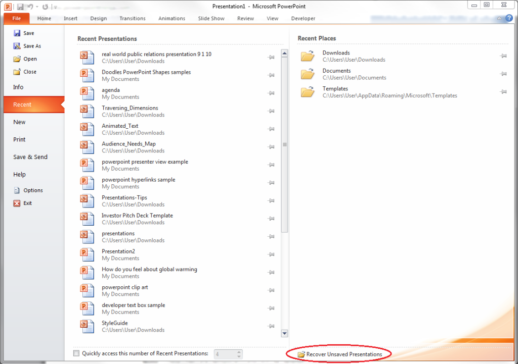
If you were interrupted before saving your PowerPoint file, you could simply look for it in the Microsoft Unsaved Files folder. Go to the File tab, make sure you’re on Recent, and click on Recover Unsaved Presentations. The icon is right below the list of folders under Recent Places.

Recover-Unsaved-Presentations

Everything in the Unsaved folder is a temporary file. Make sure you recover and save everything you need because you might lose it after a few days.

Method Two: AutoRecover

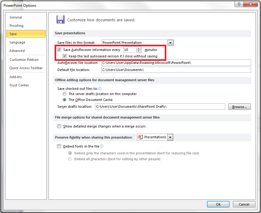
If you’ve been periodically saving your work but was interrupted before you could save specific changes, you can retrieve your PowerPoint file using the AutoRecover function. First, check if you have it enabled. Go to the File tab, click on Options and go to Save. Make sure your options are similar to those in this picture:
PowerPoint-Files-AutoRecover
If you don’t have AutoRecover enabled, there’s no other way to retrieve the changes you made to your PowerPoint file. You will have to redo your work from the last save. But if everything looks good, you can then follow these steps:
1.) Copy the file destination path in the same dialogue box.
PowerPoint-Files-AutoRecover-02
2.) Open Windows Explorer, paste the path on the address bar, and hit Enter.
PowerPoint-Files-AutoRecover-025
To avoid losing crucial information, ensure AutoRecover is enabled every time you create a PowerPoint deck.

Need a Presentation Designed?
Click Here To View Our Amazing Portfolio!

ConclusionSGBlog_SaveYourDeck_Supporting image_SG01_JE-01

Retrieving an unsaved PowerPoint file is a no-brainer as long as you know these basic recovery methods.
You can either open the “Recover Unsaved Presentations” found in the “Recent Places” or use the AutoRecover function to check where that unsaved document must be hiding.
Learn these tricks by heart so you don’t have to worry about getting your presentation back!

Making Your Presentation Stand Out with Powerful Design

design

infographics

Powerful Design

presentation

presentation design

Rick Enrico

SlideGenius

Once you’re onstage, the stars are you and your presentation. Of course, your training got you there in the first place: charisma, clear and loud voice, likable aura—public speaking skills polished over and over again until they’re perfect, almost like second nature, and suited to your needs—and appropriate for every crowd imaginable.

But what about your presentation? Is it tailored to your audience? There’s a risk you don’t want to take when, despite how good you are as a speaker, your presentation is not as appealing: you don’t get your message across as effectively as you want, vis-à-vis death by PowerPoint.

Since humans are visual creatures, our brains process imagistic information faster and more efficiently than text. This is a benchmark you should take advantage of when creating visually appealing and enticing slides, a tip awesome presentation designers always live by. Check this infographic for tips on how to charm your audiences, arrest their attention, and, most importantly, get your message across.

https://www.slideshare.net/SlideGenius/making-your-presentation-stand-out-with-powerful-design

Visuals play an important role when arresting attention. In a world of eight-second attention spans and faster everything—connectivity, accessibility, and even loading times—people would rather spend more of their time on different, more valuable things.

Come to think of it, it’s a cyclical cause and effect: everything is faster, so people expect things to be even faster, ergo the short attention spans. Kind of a messed-up Pygmalion effect, only for things instead of persons.

With that happening, there’s now two steps to do: get their attention and retain it. Good, proper, and creative use of visuals can already do the first, and they can certainly take care of the second, especially when your topic goes from “something that makes them curious” to “something that genuinely piques their interest and makes them ask questions.”

There’s a beauty that certain senses can solely appreciate. Music to the ears. Caress on the skin. For the eyes, it’s appealing design. Beauty. Make something that both you and your audience will appreciate. In turn, they will appreciate you.

Resources:

Golden, Felicia. “The Power of Visual Content: Images vs. Text.” eyeQ. February 11, 2015. www.eyeqinsights.com/power-visual-content-images-vs-text

McSpadden, Kevin. “You Now Have a Shorter Attention Span than a Goldfish.” Time. May 14, 2015. www.time.com/3858309/attention-spans-goldfish

Looking for creative presentations that can leverage your business? Enjoy free PowerPoint templates from SlideStore! Sign up today.

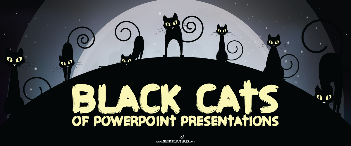
Black Cats of PowerPoint Presentations

Halloween

Powerpoint

presentation tips

Rick Enrico

SlideGenius

Sometimes, in the middle of reviewing a PowerPoint presentation, there comes the anxiety wherein people ask themselves if the slides are enough or overdone. Some even come to a point where they struggle critiquing their work because they spent too much time on it. After so much time and effort, you may wonder if you’ve been efficient or just wasteful.

If, at the end of the day, despite all efforts to make a great presentation, it still doesn’t feel right to say it’s a job well done, here are some signs to help you make that call.

Black Cats of PowerPoint Presentations: clown juggling

Unlucky 7

In rare cases, presentation taboos may be excused when necessary but international speaker and presentation skills expert, John Zimmer, says having too many bullets and texts make no sense when crafting a pitch.

According to him, PowerPoint presentations that follow the 1-7-7 rule, or slides that consist one heading, seven bullets, and seven words, promise boredom and apathy on the part of the audience. Same point goes for the 1-6-6 rule.

Avoid this by using fewer bullet points. When used sparingly, bullets can be effective to communicate ideas and points because they offer convenience to the audience. Bullets help save more time and space to allocate new information. Too many of them, however, does the opposite of that value.

Minimize your use of words. Use communicative graphics and pictures that can replace texts. It’s best to do this in slides that contain messages that you would like your audience to remember.

In this case, the 4-by-5 rule might just be right for your presentation. Unless you’re enumerating from a list, then four bullets and five words are ideal to keep your presentation informative and snappy.

Black Cats of PowerPoint Presentations: reaper

The Scripture

One way to know if something isn’t easy to understand is when you read it repeatedly. There are several reasons why this happens. Usually, it means you’re having an idle moment or your phrases or sentences need to be simplified.

When reading, experts say an average person renders 50 – 300 WPM (words per minute). However, when reading technical content, the statistics go down to 50 – 75 WPM.

Sometimes, slides look like pages of ancient text, which contain too much information and take more time to read compared to the normal ones. When comprehending a script, use simpler but appropriate words and sentences to lessen the reader’s strain and lag. If you can’t process your messages easily, then how can you expect your readers to do so? Only use words with deeper meaning when necessary.

Pause after a certain amount of words to give time for them to absorb everything.

Also, speaking from an active voice welcomes a continuous reading process. Use present or passive tenses instead of progressive tenses. They’re easier to read and make ideas seem more simple.

Lastly, though it’s advised to keep one thought in one slide, you can opt to break your sentences in the middle and proceed to the next. Maintain the dominance of the white background. It also pays to maintain a breathing room for your eyes.

Black Cats of PowerPoint Presentations: fortune teller

Magic Decks

When you present a deck with numerous slides in a considerably long time, do you wonder if your audience recall everything?

A research conducted in 2012 by cognitive neuroscientist, Dr. Carmen Simon, examined how many slides people can remember from a text-only, standalone PowerPoint presentation. After 48 hours, results showed that 1,500 participants remembered an average of four slides out of the presented 20.

The study revealed that visuals played a significant role in keeping the slides memorable. It was also found that similar-looking slides are easier to remember. The distinctiveness of every other fifth slide in Simon’s presentation were significant help as well.

Marks help remember. Use pictures or designs not only to illustrate, but also to keep slides more interesting and easier to recall. It’s best to use them strategically. Use markings on slides that need more emphasis.

Conclusion

Your deck doesn’t have to be all-telling. You can just make books if that’s the case. A good deck must contain all significant points and ideas for the presenter to collaboratively explain with. In a PowerPoint presentation full of information, points become harder to highlight. Use words sparingly so that your audience would actually pay attention to your content.

Be strategic when creating your slides to make them more engaging. When making presentations, discover ways to be more conscious on your creative and communicative processes. It pays to understand your audience’s interests with regards to these aspects.

Lastly, know that sometimes, complex solutions only solve basic problems. Before you start with another PowerPoint presentation, invest your time in getting to know more about creating effective presentations. This way, you end up creating your presentation in a lesser hassle pace and with more peace of mind.

Resources:

Zimmer, John. “PowerPoint Math: The 1-6-6 Rule. Manner of Speaking.” Manner of Speaking. www.mannerofspeaking.org/2010/03/04/powerpoint-math-the-1-6-6-rule

Simon, Carmen. “The Results Are In: How Much Do People Really Remember from PowerPoint Presentations?” Brainshark. February 12, 2013.

Nelson, Brett. “Do You Read Fast Enough To Be Successful?” Forbes. June 4, 2012 www.forbes.com/sites/brettnelson/2012/06/04/do-you-read-fast-enough-to-be-successful/#5d9d3eca58f7

Thomas, Mark. “What Is the Average Reading Speed and the Best Rate of Reading?” Health Guidance. www.healthguidance.org/entry/13263/1/What-Is-the-Average-Reading-Speed-and-the-Best-Rate-of-Reading.html

PowerPoint Photo Album Feature: Add Multiple Images at Once

The Photo Album feature in PowerPoint allows you to quickly insert and organize multiple images into a presentation, making it ideal for photo-heavy slideshows, portfolios, or presentations that require visual documentation. This feature automates the process of adding images and offers various customization options to enhance the visual layout.

Here’s how to create a photo album in PowerPoint:


1. Access the Photo Album Feature

PowerPoint’s Photo Album feature streamlines the process of adding multiple images into your presentation at once.

Why It’s Important:

  • Saves Time: Instead of inserting images one by one, the Photo Album feature allows you to add them in bulk and arrange them automatically.
  • Organizes Images: You can easily customize the layout and sequence of the images to create a cohesive visual narrative.

How to Do It:

  • Go to the Insert tab in the ribbon.
  • Click on Photo Album, then select New Photo Album from the dropdown menu.

2. Add Images to the Photo Album

Once the Photo Album dialog box appears, you can add the images you want to include in your presentation.

Why It’s Important:

  • Quick Image Insertion: You can select multiple images at once, making it faster to populate your slides with visuals.
  • Flexibility: You can add images from your computer, online sources, or even scan them directly into PowerPoint.

How to Do It:

  • In the Insert Picture From section, click File/Disk to browse and select the images you want to include.
  • Select multiple images by holding down the Ctrl key and clicking on each one, then click Insert.

3. Customize the Photo Album Layout

PowerPoint allows you to customize how the images are arranged in your photo album, including options for layout, frame shapes, and captions.

Why It’s Important:

  • Tailors the Presentation to Your Needs: Whether you want a simple grid layout or more elaborate framing, PowerPoint offers flexibility in how your images are presented.
  • Adds Visual Interest: Applying different layout options or frame shapes can make your photo album more engaging.

How to Do It:

  • In the Album Layout section, choose from various layouts, such as Fit to Slide, 1 picture per slide, or 4 pictures per slide.
  • You can also select different frame shapes, such as Rectangle, Rounded Rectangle, or Soft Edge Frame.

Example: Use a grid layout for a portfolio of product images, or display one image per slide if you want each photo to stand out individually.


4. Add Captions to Images

Adding captions to your images can provide context, titles, or descriptions that enhance the viewer’s understanding of the visuals.

Why It’s Important:

  • Provides Context: Captions allow you to explain or title each image, adding valuable information to your slideshow.
  • Improves Engagement: Captions help draw attention to specific details or themes in your images.

How to Do It:

  • Check the box next to Captions below ALL pictures in the Photo Album dialog box.
  • After creating the photo album, you can edit the text for each caption by clicking directly on it within the slide.

Example: If you’re showcasing a series of event photos, use captions to provide dates, locations, or descriptions of what’s happening in each image.


5. Rearrange Images in the Photo Album

You can rearrange the order of images within the Photo Album to ensure that they are displayed in the desired sequence.

Why It’s Important:

  • Controls Flow: The order in which images appear can affect the overall narrative or message of your presentation.
  • Optimizes Visual Storytelling: Rearranging images allows you to group similar visuals together or create a logical progression in your slideshow.

How to Do It:

  • In the Photo Album dialog box, use the Up and Down arrows to rearrange the order of the images.
  • You can also remove or add additional images by selecting them and using the appropriate buttons.

6. Edit the Photo Album After Creation

Even after creating the photo album, you can go back and make edits to the layout, images, or captions at any time.

Why It’s Important:

  • Allows Flexibility: If you need to add new images, change the layout, or modify captions, PowerPoint gives you the flexibility to update the photo album as needed.

How to Do It:

  • Go to the Insert tab, click on Photo Album, and select Edit Photo Album.
  • Make changes to the layout, add or remove images, or adjust the order as necessary.

Final Thoughts

PowerPoint’s Photo Album feature is a quick and easy way to insert and organize multiple images into a presentation. With customizable layouts, captions, and frame options, you can create visually engaging slideshows that highlight your images effectively. Whether you’re presenting a portfolio, documenting an event, or showcasing product visuals, the Photo Album feature saves time and enhances visual impact.

PowerPoint Tip: Creating Custom-Shaped Placeholders

Custom-shaped placeholders can add a creative and professional touch to your PowerPoint presentations. By moving beyond the standard rectangular placeholders, you can better align your designs with your brand’s visual style or create more engaging and dynamic slides. Custom placeholders allow you to insert text, images, or other content into unique shapes, giving your presentation a fresh, modern look.

Here’s a step-by-step guide on how to create custom-shaped placeholders in PowerPoint:


Step 1: Add a Shape to Your Slide

To create a custom-shaped placeholder, start by adding a shape to your slide. PowerPoint provides a wide range of shapes, from circles and triangles to stars and custom polygons.

How to Do It:

  1. Go to the “Insert” Tab: In the PowerPoint ribbon, click on the Insert tab.
  2. Click “Shapes”: From the Shapes dropdown, select the shape you want to use as a placeholder (e.g., circle, hexagon, arrow).
  3. Draw the Shape: Click and drag on your slide to create the shape in your desired size.

Step 2: Convert the Shape into a Placeholder

To make the shape act as a content placeholder (for text, images, or videos), you need to convert it into a placeholder.

How to Do It:

  1. Right-Click the Shape: Once your shape is added to the slide, right-click on it.
  2. Choose “Format Shape”: This opens the Format Shape pane on the right-hand side of the screen.
  3. Adjust Fill and Outline: In the Format Shape pane, go to the Fill options and choose No Fill if you want to make the placeholder transparent. You can also adjust the Outline color and thickness as needed.
  4. Assign a Content Type: Go to the Home tab, click on Arrange, and choose Convert to Placeholder. Select the type of content (e.g., text, image, video) that will be placed in the custom-shaped placeholder.

Step 3: Insert Content into the Custom-Shaped Placeholder

Now that your shape is a placeholder, you can easily insert content like images, text, or videos directly into it.

How to Do It:

  1. Click the Placeholder: Click on the shape, and you’ll see an option to insert content based on the placeholder type you assigned.
  2. Insert the Content: If it’s an image placeholder, PowerPoint will prompt you to upload an image. If it’s a text placeholder, you can begin typing directly into the shape.

Step 4: Adjust the Placeholder Layout

Once you’ve added content to the custom-shaped placeholder, you can still make adjustments to its size, position, and layout.

How to Do It:

  • Resize the Shape: Drag the corners or edges of the shape to resize it without distorting the content.
  • Reposition the Shape: Click and drag the shape to move it to different parts of the slide.
  • Apply Custom Formatting: You can further enhance the placeholder by applying custom formatting such as shadows, 3D effects, or color gradients from the Format tab.

Step 5: Save as a Custom Template (Optional)

If you plan to use the custom-shaped placeholders in multiple presentations, consider saving your slide as a template for future use.

How to Do It:

  1. Go to the “File” Tab: Click on File and select Save As.
  2. Choose “PowerPoint Template”: From the dropdown menu, choose PowerPoint Template (.potx).
  3. Save: Save the file so you can reuse the custom-shaped placeholders in other presentations.

Final Thoughts

Creating custom-shaped placeholders in PowerPoint is an excellent way to elevate your slide design and make your presentations more engaging. By following these steps, you can easily add creativity to your slides while keeping them functional and visually appealing. Whether you’re inserting images, text, or video content, custom-shaped placeholders give you the flexibility to present information in a fresh and dynamic way.