Presentation Tips: 5 Quick Steps to Audience Engagement

audience

audience engagement

audience interaction

audience participation

presentation tips

When delivering presentations, nothing is more important than connecting with your audience.

It doesn’t matter if you’re trying to close in on a deal or proposing a new project to the higher-ups. You can’t say that your ideas have been well-received if the audience can’t engage with your pitch. It’s not enough to pique their interest with a few video clips or anecdotes.

Before focusing on the spectacle, you must ensure your presentation is perfectly executed. Your ability to present with clarity and certainty is essential to audience engagement.

Need a Presentation Designed?
Click Here To View Our Amazing Portfolio!

Here are quick presentation tips to make sure your audience has an engaging experience:

Learn your presentation inside and out

I’m sure you’ve sat through a presentation where the speaker constantly stammered through their speech, trying hard to remember what to say next. No matter how attractive their material was, the uncertainty in their delivery probably proved to be distracting. To avoid being in a similar situation, you must learn every detail of your presentation.

Audience engagement rests in your ability to command attention. You can’t do that if you’re reading from your slides or fidgeting with note cards. The audience needs to see that you know what you’re saying. Take the time to rehearse your presentation as much as you can. You can also try the memory palace technique to memorize your key points.

Condense your PowerPoint deck

By now, we’re all familiar with “death by PowerPoint.” There’s no easier way to disengage an audience than by presenting them with slides loaded with too much information. If your slides are complete with indecipherable charts and text, take a step back and focus on your visuals.

Instead of filling your PowerPoint deck with bullet points and text, try to illustrate your points. Use images and other multimedia elements to articulate your ideas.

When dealing with data, you must decide which ones are the most relevant to your core message. Several online tools can help you with data visualization.

Tailor your presentation to the audience

Very few presenters consider the perspective of their audience. Their presentations often sound like generic spiels because of this.

How do you connect with something you’ve heard a million times before?  To stand out, you need to remember that the audience isn’t a homogeneous group. The people sitting in your audience are individuals with unique perspectives and opinions. In other words, audience engagement relies on your ability to personalize your message.

To get inside their heads, you need to ponder four important questions. Answering these will give you the necessary context to create a presentation that will pull your audience in:

  • Who are they?
  • Why are they coming?
  • What action do you want them to take?
  •  Why might they resist your message?

Keep everyone interested by creating soft breaks.

Audience engagement would be much easier if it weren’t for our short attention spans. With so many tasks begging for attention these days, it’s no surprise the average adult’s attention span is only a few minutes short.

As hard as you try to simplify your message and learn more about the audience, it’s hard to contend with everyone’s shifting attention.

That’s why presentation expert Carmine Gallo emphasized the importance of the 10-minute rule. If you lose the attention of your audience, you can re-engage them by creating “soft breaks” after every 10 minutes or so. Give them a chance to pause and digest new information by incorporating videos, demonstrations, and other activities.

Try to create an interactive environment by posing questions they can answer through polls or a show of hands. If you want to, you can also call up other people from your team to share a new perspective with the audience.

Deliver your presentation with passion and enthusiasm

Finally, lead by example. If your presentation delivery falls flat, your audience will quickly pick up on that. You can’t expect them to feel enthusiastic about the ideas you’re sharing if you’re mumbling through your presentation.

You need to show how passionate you are about your subject matter. That’s the only way to deliver a message that will make others feel the same way.

It isn’t hard to deliver a presentation that engages and connects with an audience. In five easy steps, you can easily ensure that your message sticks and stays with everybody.

Need a Presentation Designed?
Click Here To View Our Amazing Portfolio!

Featured Image: Steven Lilley via Flickr

Bullet Points and Why They Matter to Your Presentation

content

Powerpoint

presentation tips

Many articles online provide profound insights on how to charm your audience, retain attention when speaking in public, or create the best presentation for the right purpose. And for the most part, there have been similarities that can be seen in almost every piece. One of the many from presentation experts is: “Don’t ever use bullet points. You don’t need them.”

What warranted the general avoidance? Is it because it’s primarily considered the reason for death by PowerPoint (DbP)? If you consider bullet upon bullet in different slides, then sure, you can call the whole thing as walls of text. Given that humans favor the visual over the textual, audiences will be bored by all the reading.

But did you know “death by bullet points” exists? Symptomatic, not synonymous, to DbP, overuse and misuse of bullet points have always been every audience member’s nightmare. And it has happened more than once, much to the annoyance of the crowd. Does that mean that bullet points should be avoided?

Not necessarily. Bullet points are useful in specific situations, and in the proper context, they’re your best tool. Here are a few reasons why they matter.

Optical Break Bullet Points

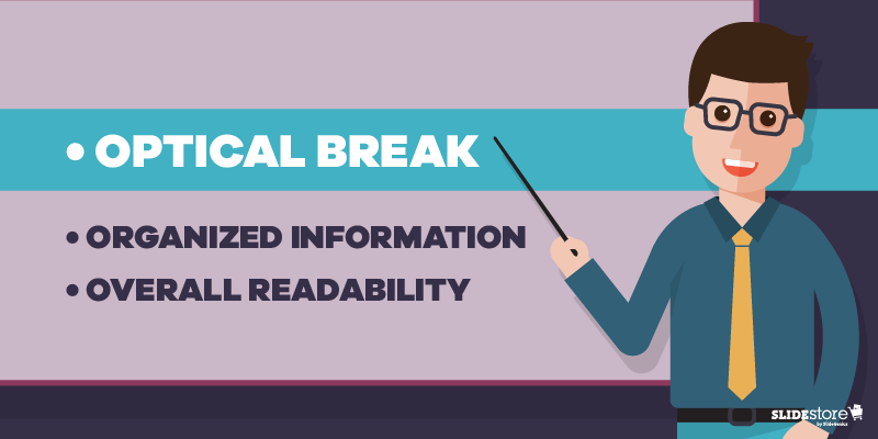
Optical Break

Reading can be strenuous for the eyes, especially when you have a big block of text in one slide. While seeing this word wall can be intimidating for some, others would just outright not read it. Those who attempt will find themselves blinking more since their eyes dry out from, unsurprisingly, not blinking (because they’re reading).

Bullet points put line breaks on long passages, not just with the negative space from the background but also with clear markers on where a specific item begins and ends. Shorter bits of text are more welcome since they’re easier to understand, digest, and remember. Any form of relaxation is pleasant for your eyes.

Organizing information | Bullet Points

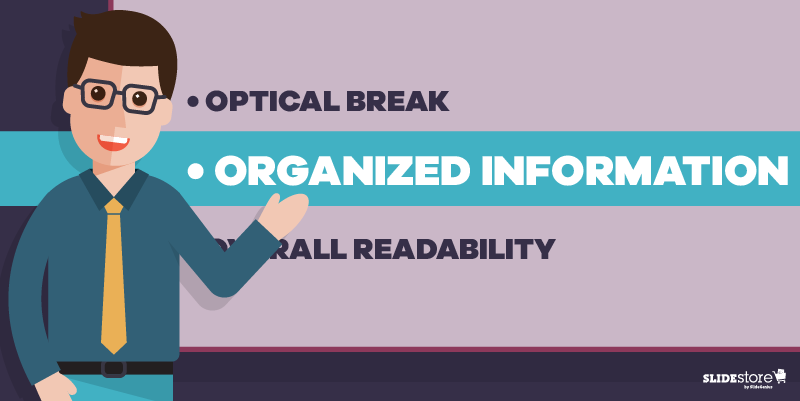
Organized Information

In the same way that your eyes need a break, your brain also needs a breather when trying to comprehend a long paragraph—much less a lengthy sentence. This is where bullet points shine.

Dissect the text, then separate and summarize the main points. Those summations can then be what you can put on your bullets. That brevity is already a big plus; how much more if they’re fascinating?

Think of bullet points as the “too long; didn’t read” (TL;DR) version, the abridged edition, of your long paragraph. By bulleting the main points, you can shorten a sixty-word section to merely a fraction of that, saving your audience’s time. Plus, they get to listen to you more.

Overall readability | Bullet Points

Overall Readability

Which would you rather see: a big block of words or a bulleted list? Which of the two is cleaner and easier on the eyes and is therefore more readable? Most, if not all, would say the latter, especially when the layout is planned properly. With the former, you risk instances of misreading since there are too many words and lines all bunched up in one place.

Keep your slides neat and tidy by having few words—and relatively fewer bullet points—in them. Prevalent enough is the 6×6 rule, stating that you should have no more than six bullets with six or fewer words each in a slide. There’s also the “three words and four bullets per slide” rule.

The Last Bullet Point

There’s a reason why bullet points are overused, and consequently are now being mistreated for it. Just like the Comic Sans fiasco, most people are tired of seeing bullets in almost every presentation they attend. However, that’s not a reason to ignore and neglect the importance and benefits of using this tool.

Of course, you should always exercise moderation; there is such a thing as death by bullet points. A good way to avoid that is by not overloading your slides with bullets, which can be just as bad as a wall of text. In short, know when and when not to use them.

Your slides are your visual aid, so making them clean is on you—and for your audience.

Resources:

Bruce, Robert. “8 Quick Tips for Writing Bullet Points People Actually Want to Read.” Copyblogger. February 7, 2012. www.copyblogger.com/writing-bullet-points

Clark, Brian. “Little Known Ways to Write Fascinating Bullet Points.” Copyblogger. October 23, 2006. www.copyblogger.com/little-known-ways-to-write-fascinating-bullet-points

Crerar, Paula. “PowerPoint Bullet Points: Do We Need Them?” Brainshark. January 24, 2012. www.brainshark.com/ideas-blog/2012/January/powerpoint-bullet-points-do-we-need-them

Paradi, Dave. “How to Write Powerful Bullet Points.” Think Outside the Slide. n.d. www.thinkoutsidetheslide.com/how-to-write-powerful-bullet-points

“10 Ways to Avoid Death by Bullet Points.” Presentitude. March 4, 2015. www.presentitude.com/10-ways-avoid-death-bullet-points

“Comic Sans: Why All the Hate?” Snapily. January 8, 2013. www.snapily.com/blog/comic-sans-why-all-the-hate

The Don’ts to Hosting an Excellent Webinar

presentation design

webinar

Webinar Tips

Isn’t it great to venture back to the time when seminars were held in a large place, audience members lined up to enter and get a good seat, with the speaker in the same building, talking straight to them? Given today’s hustle-and-bustle way of life, it’s already difficult to host a seminar, much less get people to attend. Technology, though, has a solution: a web seminar or webinar.

Since its start in May 1996 with NetMeeting, the webinar has evolved. It’s no surprise that it’s now considered as one of the best marketing tactics around. You reach and engage your audience even in remote areas. More options are now available to the host that make it easy to pull off.

However, if you think it’s that simple to host a webinar, then you’re mistaken. There are a lot of bad things you can do to fail, like the following. These shortcomings will guarantee you a bad and poorly presented webinar, so it would be prudent to avoid these.

Avoiding Three Basic Flops to Host a Great Webinar | No Internet Connection

Not Checking Connection

It’s a commonly known fact that webinars are done online—the Internet connecting hundreds to thousands of people from different corners of the globe to a single spot. While the number of attendees doesn’t do much to hamper the flow of the web presentation, your connection to the world wide web may and will be compromised quickly since you’re consuming a great chunk of bandwidth with video and audio streaming.

Therefore, it’s a good idea to secure a strong and stable Internet connection, or at least be aware of what can happen when your connectivity is weak and cannot handle something as demanding as a webinar. You know how YouTube videos suddenly stop playing to buffer and load? Don’t let your audiences experience that.

But what if there was an unforeseen emergency? A backup ISP is usually the best answer. The times when technology will fail you may be hard to predict, but that doesn’t mean you can’t prepare contingency plans.

Avoiding Three Basic Flops to Host a Great Webinar | Outdated Equipment

Skimping on the Hardware

Don’t underestimate a webinar’s demand for hardware. If YouTubers and streamers need hundreds of dollars for specialized equipment, expect to shell out the same amount just to get the gears rolling.

First off, you’re going to need a webinar platform. There are good subscription services for this. Next, you need a computer capable of multitasking, since you’d be running a lot of programs (platform and presentation, among others) simultaneously. Then, as above, a good ISP and a heavy-duty modem/router with matching bandwidth. Lastly, the bunch purchase of high-quality webcam, speakers, and microphone. Those preinstalled on laptops are often not good enough; rather, you want those specialized ones that may be a bit costly but are worth it.

Once more with the backup plans, you’d want extras as well. If that means another platform, computer, and extra accessories, then so be it. At least you’re prepared when any one of those fails at the last minute.

Avoiding Three Basic Flops to Host a Great Webinar | PowerPoint Animations

Being Reckless with PowerPoint Animations

Of course, you’re expected to have a beautifully designed presentation deck. You, a presentation designer, or a presentation design agency should take care of that. However, don’t get overzealous with how you craft your presentation pitch deck.

The basics, such as using less text to make way for powerful images and making font sizes larger, among others, should still be followed. There is no excuse for shirking away from the essentials. But present in PowerPoint, and absent in normal images or infographics, are animations that display specific elements with a nifty twist. Even a normal presentation shies away from too much object movement.

But should a webinar avoid it too? Not really, but there are more considerations. For one, animations seldom go smoothly online since there are circumstances out of your control. Your animations may show up nicely on your end, but your audiences may experience “jumpiness” on theirs.

Instead, only use animation on objects that really need it: a point you need to emphasize instantly or to show progression or any sort of movement that will arrest attention. The lesser your PowerPoint animations are, the better. In the same way that too much effects can break your deck, webinars can also be more conducive to learning with minimal special effects.

Conclusion

Don’t even attempt these gross neglects of basic steps. Presentation technology may have made life easier to live in, but it will be useless without a decent amount of human effort to operate it.

Hosting a webinar with slides is simpler now, with the Internet carrying the burden of many menial tasks, but that doesn’t mean you can just be willy-nilly about it. Without a solid plan, you’re bound to fail. Take the time to prepare. Then wow your audience with an unforgettable web seminar. Leave them wanting for more.

Resources:

Agron, Mike. “Ultimate Planning Checklist for Successful Webinars.” Content Marketing Institute. May 13, 2016. www.contentmarketinginstitute.com/2016/05/planning-checklist-webinars

Courville, Roger. “3 Reasons PowerPoint Animations May Suck in Your Webinar (and What to Do About It).” EventBuilder. February 13, 2013. www.eventbuilder.rocks/3-reasons-powerpoint-animations-may-suck-in-your-webinar-and-what-to-do-about-it

Majumdar, Arunima. “14 Tips to Create and Present a Highly Effective Webinar.” eLearning Industry. February 20, 2014. www.elearningindustry.com/14-tips-to-create-and-present-a-highly-effective-webinar

Shelley, Brian. “11 Steps to Make Sure Your Next Webinar Is a Total Flop.” HubSpot. February 7, 2013. blog.hubspot.com/blog/tabid/6307/bid/34149/11-Steps-to-Make-Sure-Your-Next-Webinar-Is-a-Total-Flop.aspx

Shewan, Dan. “How to Do a Webinar Your Audience Will Love.” WordStream. March 16, 2016. www.wordstream.com/blog/ws/2014/08/26/how-to-do-a-webinar

Sibley, Amanda. “10 Things That Take a Webinar from Good to Great.” HubSpot. January 3, 2014. blog.hubspot.com/marketing/webinar-planning-list

Skrivanko, Mary Ann. “Webinars – History and Trends.” InsiderHub. June 30, 2015. www.insiderhub.com/webinars-history-and-trends

Wasielewski, Jarek. “Top 4 Do’s and Don’ts of Webinars.” ClickMeeting. October 1, 2014. blog.clickmeeting.com/topdos-donts-webinars

Product Demo 101: Learning the Basics

custom powerpoint

pitch deck

presentation tips

product demo

Rick Enrico

Sales Demo

SlideGenius

What’s one of the best ways to convert potential clients into paying customers? Aside from presentations where you get to wow your audience, there’s another scenario where you can achieve the same results. Imagine it: You already have a prototype of the product you’re trying to market, and you’re looking for people who will gladly take your offer; you think an amazing deck won’t be enough, so you decide to take things up a notch and do a demo.

High Quality, Fast, PowerPoint Design
Get a FREE Design Quote Today!

However, you don’t know the first thing about product demos. Sure, you’re a rock star when it comes to presentations and public speaking, but demonstrations can be different. For one, instead of handling two important elements—yourself and your deck—you add one more: your product. And balancing that act can be stressful, especially when you’ve got hundreds of eyes staring at you and you know that a lot is at stake. Another is that there’s a new dynamic in audience engagement, a level that places you closer to them—and them to you and your product.

Look at the bright side, though. If you do remarkably well, then you’re sure that your audience will take a good, long, hard look at your product. And when they like what they see, they might just want to have your offer. Then, you’re on your way to closing deals left and right. But that is if you do remarkably well.

So, how do you go from A to Z of a product demo? What can you expect from showing off your product in front of a live audience? Are there even benefits to doing so? How do you even begin preparing and how do you start off a demo? Let the following infographic tutor you on the basics of a product demo, and the dos and don’ts during the proverbial curveballs during your time onstage.

Resources:

Kokemuller, Neil. “The Purpose & Benefits of a Product Demonstration.” Chron. n.d. www.smallbusiness.chron.com/purpose-benefits-product-demonstration-55113.html

Presenting Your Business Pitch with Confidence

business

business pitch

custom powerpoint

pitch

pitch deck

presentation

presentation tips

Rick Enrico

Self-Confidence

SlideGenius

Not everyone has what it takes to be an entrepreneur. There’s a wide set of skills and traits you have to possess in order to become an effective business leader. Among those traits is self-confidence, a natural magnet that can draw people to you and make them want to listen to what you have to say. As such, it’s an invaluable skill during a business pitch.

High Quality, Fast, PowerPoint Design
Get a FREE Design Quote Today!

To entice potential investors, you need to appear and sound confident while pitching your idea. Investors are naturally drawn to leaders with high self-esteem because it signifies strength of character, another trait necessary to lead a business venture forward. As Larina Kase, a psychologist and author, said, “True confidence is not thinking that you’ll get a great result. It’s knowing that you can handle any result.” When the path towards success is dark and murky, confidence can carry a strong business leader through.

Self-Confidence: The Top Trait You Need for a Business Pitch

How to Boost Your Confidence for a Business Pitch

There are things you can do to pump up your spirits before facing investors and presenting them your business model. Here are seven of them:

1. Look and sound the part

The thing about confidence is that you don’t need to have it to look the part. You can carry yourself with poise even if you’re feeling intimidated or scared inside. There are a few things you can do to package yourself for success: dressing well, correcting your posture, minding the pacing of your speech, using precise language, and smiling. In other words, by making a conscious effort to look confident, you can make a good impression.

2. Exude conviction from every pore

To sell a business idea, you should be able to show investors how passionate and committed you are. They’ll try to gauge whether you really know what you’re doing, so make sure that you remain composed but enthusiastic throughout your business pitch. Make the investors believe in your potential to succeed. To achieve this effect, you have to communicate a certain aura that tells investors how confident you are about your product. This means avoiding uptalk and articulating a statement with a declarative—not an inquisitive—tone.

Self-Confidence: The Top Trait You Need for a Business Pitch

3. Know your key differentiator

To identify your business’s primary selling point, ask yourself what your edge is as opposed to competitors. Why should investors choose you over businesses similar to yours? You must have something unique to offer to make your business pitch stand out. Apart from this, you should also be able to explain what your worth is to investors. How can they benefit from your business? What gains can they expect, and when?

4. Find an external manifestation of success

Perhaps the best way to gain self-confidence is to find an external manifestation of your business’s capability to survive and succeed. It’s easier to sell a business idea if you have something tangible to back it up. An example of an external validation of success is a solid customer base that raves about your product. A sizable social media following that has positive things to say about your company is also a good proof that you’re breaking ground. Determining your niche is crucial during the first stages of business development because if you sell to the wrong customers, your business is bound to flop. On the other hand, with the right audience, you can improve your revenue and boost your credibility, which will ultimately attract investors towards your business.

5. Solve problems before they appear

Amateur entrepreneurs who only want to impress investors often make the mistake of acting like they’re immune to disasters. They’re hiding behind the assumption that their business model is so perfect, it can’t possibly be taken down by any future problem. As a general rule, before you present your business pitch to an investor, you should think through the possible challenges that you may encounter along the way. If possible, look for various solutions for each issue so that if one fails, you’ll have a backup to fall on. Set up contingency plans for when things don’t go as planned. By making sure that you’re prepared for the ugly as well as the good, you’ll be able to present yourself as a competent leader who can weather the storm when the worse comes to the worst.

Self-Confidence: The Top Trait You Need for a Business Pitch

6. Rehearse and refine your business pitch

Preparation is key to any speech. As with any other field, achieving a certain level of self-confidence takes time and an immense amount of effort. Research also plays a major role on how competent and confident you will appear in front of a panel. Make sure that your presentation has no loopholes and that everything goes as planned.

7. Worry less and just do your part

Fussing over the aspects of your business pitch that you can’t control will only stress you out. Instead of worrying over the negative aspects of your situation, just focus on the positive. Don’t zero in on your weaknesses as that will only distract and discourage you. Instead, strive to turn your weak spots around and let go of the things you can’t change. Optimism can go a long way in boosting your self-confidence, so try to appreciate the good parts as much as you can.

Above all else, smile even if you don’t feel like it. As Christine Clapp, a public speaking expert at George Washington University, said, “Smiling not only makes your voice more pleasant to listen to; it also conveys confidence…. You will appear friendly, approachable, and composed.” That reason alone should be enough for you to flash a smile during a business pitch.

If you follow the aforementioned tips, you’ll be closer to improving your self-esteem. Just be patient and remember that confidence is built over time. With determination, you can stand in front of a panel of investors and present your business in the best light possible.

Resources:

Connick, Wendy. “How to Find Your Unique Selling Proposition (USP).” The Balance. June 19, 2017. www.thebalance.com/how-to-find-your-unique-selling-proposition-usp-2917402

Landrum, Sarah. “10 Secrets to Sounding Confident.” Fast Company. July 20, 2015. www.fastcompany.com/3048748/10-secrets-to-sounding-confident

Lobb, Jennifer. “How to Pitch Your Business Like the Pros on Shark Tank.” Nav. December 28, 2016. www.nav.com/blog/how-to-pitch-your-business-like-the-shark-tank-pros-15102

Whitmore, Jacqueline. “9 Ways to Show More Confidence in Business.” Entrepreneur. September 30, 2014. www.entrepreneur.com/article/237634

“How to Give Investors Confidence in Your Business Idea.” Virgin Startup. n.d. www.virginstartup.org/how-to/how-give-investors-confidence-your-business-idea

Looking for creative presentations that can leverage your business? Enjoy free PowerPoint templates from SlideStore! Sign up today.

Presentation Design No-No’s That You Can Fix

design tips

presentation design

presentation design tips

The way presenters design their pitches has evolved. As Microsoft PowerPoint launches new features that boast of contemporary design and high-end technology, users become more aggressive and innovative in creating their slides. Pitches have become more promising, ultimately helping businesses attain their goals.
Despite the progression, some presenters still fail to provide a visually-appealing pitch that can entice their audiences. Ugly typefaces, tacky transitions, and pixelated images continue to surface, making a presentation look horrible, or worse, unprofessional.
Fortunately, with a little imagination and research, bad presentation design choices can be improved. One can still live up to the standards of modern design through good old PowerPoint elements that have seemed to fade away over time. Challenge the world of presentation design and project an appealing PowerPoint by trying out the following design tips.
Improving Three of the Most Common Presentation Design Mistakes

Clip Art: Tweak It

Clip art is dead. In December 2014, Microsoft retired its clip art gallery and gradually added several PowerPoint features such as Shapes, Icons, and Online Pictures. Gone are the days of cartoons in presentations as designers and presenters now prefer custom images when visualizing a point. Apart from communicating a message more clearly, the dawn of vectors and photographs allowed PowerPoint users to create a more personable and contemporary-looking deck.
Many websites offer free and editable stock images, which you can download without signing up. Modify them according to your need and make sure that they suit your presentation’s message. Wrong use of stock photography can show your lack of authenticity and creativity, and that can ruin the overall look of your presentation design.
If you are, however, keener on using objects and illustrations, PowerPoint’s Shapes and Icons are a great way to add more life to your presentation. Choose from a broad range of predesigned elements by clicking “Insert” in PowerPoint’s Home tab, which now has the “Screenshot” option as well.
Improving Three of the Most Common Presentation Design Mistakes

Comic Sans: Imitate It

People dislike Comic Sans so much that a petition was put up to ban it. The website Comic Sans Criminal, however, explained that all fonts have a personality and a purpose and that using Comic Sans is only appropriate when:

  • your audience is under 11 years old;
  • you’re designing a comic; or
  • your audience is dyslexic and has stated that they prefer the typeface.

Considering its purpose, Comic Sans isn’t that bad at all. In fact, a number of educators and designers prefer its “true a” form—or an “a” with a circle and a stick—since it is known as the basic model of the letter.
If you’re looking for a “true a” as well, use Comic Sans alternatives instead. HVD Comic Serif is a close substitute if you’re in need of an easygoing, comical typeface. For corporate presentations, Hattori Hanzo Light Italic is a good pick.
Play around with fonts and typefaces to find one that suits your brand and personal style. Keep in mind that two or three choices are enough. Overdoing it may risk the aesthetic of your slides, making your content hard to read and understand.
Improving Three of the Most Common Presentation Design Mistakes

Bullet Points: Limit Your Use

Bullet points are essential in keeping PowerPoint presentations organized. However, when used inappropriately, they can be detrimental to presentation design and its effectiveness. According to Brainshark, bullet points are ideal when updating a previous discussion or explaining simple points. Apart from allowing your audience to scan your content more easily, these symbols allow them to concentrate on other parts of your speech.
However, to quote Ray Bradbury, “Too much of anything isn’t good for anyone.” Having too many bullets in your presentation doesn’t only make your content look disorganized but also leads your audience away from your point. To deliver an impactful speech, develop a great script that you can match with bullets and attention-grabbing visuals. Maintain a balance between the two to avoid a cluttered presentation.
You can also use headlines to construct your ideas. Headlines provide a snappy feel that engages and informs your audience. Simplify your points to guarantee the attention of your audience and the success of your pitch.
Good ol’ PowerPoint design elements may not be the rave today, but they can make a comeback in your presentation through creativity and resourcefulness. Go back to the basics of presentation design and allow yourself to innovate. Use alternatives while keeping your message and audience in mind. With this, you’ll be on your way to delivering a one-of-a-kind speech that your audience will remember.

Resources:

Belknap, Leslie. “Why Bullet Points Kill Presentations.” Ethos3. April 7, 2015. www.ethos3.com/2015/04/why-bullet-points-kill-presentations
Crerar, Paula. “PowerPoint Bullet Points: Do We Need Them?” Brainshark. January 24, 2012. www.brainshark.com/ideas-blog/2012/January/powerpoint-bullet-points-do-we-need-them
Gabrielle, Bruce. “PowerPoint Clip Art Is Dead. Now What?” Speaking PPT. February 16, 2015. speakingppt.com/2015/02/16/clip-art-dead
“6 Alternatives to Comic Sans (With a True ‘A’). Keri-lee Beasley. March 14, 2015. kerileebeasley.com/2015/03/14/6-alternatives-to-comic-sans-with-a-true-a

Are Mind Games Still the Secret to an Effective Sales Talk?

custom powerpoint

pitch deck

presentation tips

Rick Enrico

Sales Talk

Sales Tips

SlideGenius

If you’ve been in direct sales, then you know what it’s like to: 1) get the initial attention of a potential buyer, 2) maintain said attention on you, 3) promote your product, 4) keep the customer from walking away, 5) end your spiel, 6) somehow manage to induce your prospect to purchase your offer, and 7) thank your buyer and end the transaction. Rinse and repeat. Of course, this may be a gross, basic oversimplification of the whole process, but the main steps are there.

Let’s face it: even if trained salespeople have gone through the cycle hundreds of times, it’s statistically impossible that they have a 100 percent success rate. The next best thing is to reduce the number of naysayers. But how does that work when people are turned off by sales talk? By playing on their psyche.

Let’s be clear: this isn’t manipulating their minds into buying what you’re offering but rather talking to them and making them see the benefits of having your product. For that, you must know what you’re about to go up against.

Sales Talk 101: Talking to Your Customers with Sales Conversation

Types of Customers

Depending on who you talk to, there are generally four types of customers. Retail expert Rick Segel segregates them as The Director (likes to take charge), The Analytical (analyzes the finer details), The Relater (knows someone from everywhere), and The Socializer (loves to build relationships).

In a HubSpot article, Leslie Ye classifies customers as Assertive, Amiable, Expressive, and Analytic. While there are obvious similarities between Segel’s and Ye’s lists, i.e., Assertive and The Director and Amiable and The Socializer, the difference is that Ye has the Expressive that lean more on how a purchase affects customers and those around them.

With those laid down, how do you sell to them? The following are the bottom lines.

Sales Talk 101: Talking to Your Customers with Sales Conversation

Appeal to Emotions

Knowing how to deal with diverse customers is the basic of sealing a deal. By pleasing them despite their very different natures, you satisfy a golden rule in sales: making them happier. And that leads to better experiences. Basically, good customer service equals great customer experience.

For your part, flexibility is always welcome. With the multitude of people coming through the door, you’re bound to find yourself in a conversation with your potential client, and you’re expected to be able to cater to their personalities. Got an Assertive type? Cut to the chase, lay the down the facts, and don’t waste their time. Got the Socializer? Then by all means, socialize with them. Engage them in a friendly conversation and build that relationship.

In those ways, you can show them that you’re not taking a one-track-mind approach and considering only the profit of a sale. Make them feel that their trust and loyalty are the best things you can have.

Sales Talk 101: Talking to Your Customers with Sales Conversation

Appeal to Aspirations

There are people who buy because of impulse, while there are those who carefully plan their expenses. Despite these—or perhaps because of these—sellers often don’t consider the far future and are only concentrated on the moment.

Rather than doing that, though, when you’re having a conversation with your potential buyer, cater to their present needs and show how your product can provide a “better” future. After that, maybe they can present an easier manner of how people around them work or a more efficient way of doing things just because of their simple purchase. By meeting that expectation, you enrich how people view themselves and give them the opportunity to do something good.

This subconscious aspiration to be respected—that sense and level of self-esteem—is always good to enrich because this is one way you get your clients to trust you.

Conclusion

Over the years and after many refinements in the art and techniques of selling, most people have their defenses up. They turn a deaf ear to blatant sales talks and a blind eye to obvious schemes. In short, don’t underestimate your potential clients.

People are more aware of the mind games, so these don’t work anymore. So, what do you do? Be human when you do your sales talk. Instead of putting up a wall between seller and buyer, do your best to connect with your customer. Being honest and genuine are traits most people look for in a relationship, so why don’t you start that chain? You’ve nothing to lose and much more to gain.

Resources:

Corbett, Barr. “The Best Sales Pitch Ever.” Fizzle. November 16. www.fizzle.co/sparkline/the-best-sales-pitch-ever

Dachis, Adam. “How to Plant Ideas in Someone’s Mind.” Lifehacker. October 21, 2014. www.lifehacker.com/5715912/how-to-plant-ideas-in-someones-mind

Segel, Rick. “4 Types of Customers and How to Sell to Each of Them.” Business Know-How. n.d. www.businessknowhow.com/marketing/personalities.htm

Ye, Leslie. “How to Sell to 4 Different Personality Types.” HubSpot. December 13, 2016. blog.hubspot.com/sales/how-to-sell-to-different-personality-types

“Mind Games: Can We Use Psychology to Grow Sales?” Pharmacy Magazine. July 31, 2015. www.frontshop.co.za/mind-games-can-we-use-psychology-to-grow-sales

“The Rule of Esteem – How Praise Releases Energy.” Westside Toastmasters. n.d. www.westsidetoastmasters.com/resources/laws_persuasion/chap12.html

Looking for creative presentations that can leverage your business? Enjoy free PowerPoint templates from SlideStore! Sign up today.

4 Ways to Promote Your Business in a Trade Show

custom powerpoint

Demo

pitch deck

presentation

presentation demo

product demo

Rick Enrico

SlideGenius

trade show

If you’ve been to the more mainstream conventions of recent years, like Electronic Entertainment Expo (E3), Mobile World Congress, and The International Consumer Electronics Show (CES), then you know what the experience is like. Right off the gate, you have long lines of participants waiting to get in. Upon entering, you’re greeted with any of the following: booths filled to the brim with products and memorabilia, guests carrying freebies and whatnot from other exhibits, etc. You can hear multiple voices and gimmicks coming from everywhere. There are too many sights ahead and overhead.

Mind you, these are major events, with conglomerates from all over the world sending their representatives for the chance to present in one the industry’s biggest stages. If you’re in a relatively smaller fair, though, do you need to be well-advertised?
[sg-blog-modules module=one]
Yes—or at least emulate how the big names draw people to their booths. A primary benefit of this type of gathering is that you can interact with your potential customers face to face—arguably the best way to engage them—instead of through different schemes, screens, and means.

Before that, however, you must get their attention. How? By employing the following.

Grabbing Attention for Your Booth in a Trade Show | Demo vs Actual Games

Demos

When you have a working model of your product or service, you’re in a prime position to show potential consumers a demonstration of how it works: its strengths and unique traits that make it different from competitors’ offers. The best thing is that they get to see it firsthand and up close, if not outright experience the quality-of-life improvement.

Alternatively, you could let them try it themselves. A free trial can give potential customers a taste of how to handle your item and immediately experience the help you’re offering. When you leave them wanting for more, you’ve got them hooked.

Games

Small activities that get the blood pumping and let participants win are good icebreakers for you. The point is enjoying their presence. The more you let them feel that they’re important to your booth—and by extension your company—the more you pique their interest and start and deepen bonds. Even new relationships can go deeper than usual when customers have fun with you.

That’s the main point of this activity. You seek to leave a very good first impression upon your booth visitors. When that release of dopamine, serotonin, and possibly adrenaline hits them, that triggers a connection that they remember from your exhibit and your brand.

Grabbing Attention for Your Booth in a Trade Show | Desktop Presentation vs Projector Presentation

Photo Opportunities

When people visit your booth and have fun, you want to have a record of that. And they will too. Taking photographs is a good way of providing yourself with a good reminder of each customer, but you can take it one step further. Share those pictures on your social media platforms (don’t forget your hashtags) and tag them.

Better yet, ask if they can upload it on their own pages. And lucky you if they do. It’s like a visual representation of word of mouth: the more their personal connections see your stuff and how the poster enjoyed your booth, the more curious they become. They can also become leads given time and the proper attention.

Live Social Media Updates

People usually tweet and post updates about everything, especially when in a state of euphoria. What follows is a long series of statements about how great the event is and how nice the people are, which are often accompanied by pictures to hype everything up.

You could do the same. By giving your online audience a sneak peek, you not only update those who couldn’t come but also give an idea, or at least some level of expectation, on what future participants can experience the next time you’re going to a trade show.

Grabbing Attention for Your Booth in a Trade Show | Trade Show Presentation

Your Afterparty

At the end of the day, you’re going to look back on how and why those people went up to your booth and listened to what you have said. If you’re wondering why so many visited your spot, then think no more. Your attention grabbers worked beautifully. You may soon see more visitors because other attendees saw how fun your booth is. Isn’t that your end goal? To have people know about your venture?

Will traditional means of promotion cut it? Don’t expect your competitors to skimp on the basics—since they don’t expect you to cut corners on the same. When you’re all on equal footing, the deciding factor becomes the extra mile you’re willing to take to hook people in, to show them and let them experience something memorable, and to make them come back.

Are you willing to do it?

Resources:

Biala, Susan. “How to Boost Your ‘Happy Hormones’.” Best Health Magazine. October 2014. www.besthealthmag.ca/best-you/mental-health/how-to-boost-your-happy-hormones

Fusion, Jennn. “Trade Show Promotional Ideas.” Chron. n.d. smallbusiness.chron.com/trade-show-promotional-ideas-1444.html

Hovde, Kristin. “5 Trade Show Promotion Ideas for More Engagement.” TSNN. August 24, 2014. www.tsnn.com/news-blogs/5-trade-show-promotion-ideas-more-engagement

James, Geoffrey. “Give a Great Product Demo: 5 Rules.” Inc. May 24, 2012. www.inc.com/geoffrey-james/give-a-great-product-demo-5-rules.html

Kaufenberg, Jackie. “19 Ways to Integrate Social Media into Your Next Tradeshow or Event.” Vivid Image. August 13, 2014. www.vimm.com/social-media-tradeshow

Thimmesch, Mike. “10 Top Tips for Trade Show Promotions.” Skyline. November 16, 2011. www.skylinetradeshowtips.com/10-top-tips-for-trade-show-promotions

Wyse, Susan E. “7 Tips to Market Your Business Effectively at Trade Shows.” Snap Surveys. April 10, 2012. www.snapsurveys.com/blog/7-tips-market-business-effectively-trade-shows

“12 Trade Show and Event Promotion Mistakes to Avoid.” Skyline E3. February 7, 2017. www.skylinee3.com/blog/12-trade-show-and-event-promotion-mistakes-to-avoid

Looking for creative presentations that can leverage your business? Enjoy free PowerPoint templates from SlideStore! Sign up today.

Props for Presentation: Yay or Nay?

presentation tips

props for presentation

public speaking tips

When you think of theater, you imagine a stage, a backdrop, and the multiple stage properties that actors use to bring a story to life. Props help not only the troupe but also the audience in reliving the experience of the characters and injecting a different sense of realism in a manner that only plays and musicals can deliver, and not just imagining how everything unfolds.

In a similar vein, you could liken a presentation to a stage play. You prance around onstage, tell a story, and evoke emotions and solicit responses from your audience. And… you use props? Is it even necessary? Here are the pros and cons of incorporating them into your speeches.

Impact

Pro: Props are powerful tools you could use to concretize points and provide nonabstract examples to an idea. Kind of like giving a face to a name. If anything, that concept of “concreteness” can make a thought clearer, more compelling, and more conducive to learning. Provide a good model or a situation that perfectly illustrates every aspect of the abstract concept.

Con: However, a bad example may end up making the subject even more complicated and confusing. Instead of explaining the finer points, a mismatch of properties and attributes between your example and the idea you’re trying to explain could lead to their total disregard. Avoid false analogies.

Visibility

Pro: The moment your audience sees your prop, one of two events will happen: if you show it immediately, you make them curious of how it relates to your point; if you wait until the perfect time, then there’s a sudden realization of, “So that’s how that works.”

Con: Of course, your audience needs to see it first, from the people in the first row to the back of the room, even the ones just standing up near the exit. So, should it be a medium- to large-sized object? Those are plausible, but if you’re uncomfortable and look awkward using your prop, then that’s just a cringe-fest for viewers. If it’s too small, then the impact that everyone should have felt is now limited to only a few in front of you. You could prevent the latter with video projection on a screen, but otherwise, consider the size of your prop and the stage. Don’t waste your efforts with props only you can see and appreciate.

Functionality

Pro: Look at this one in two ways: whether your prop works or not and whether it’s practical or impractical. For the former, make sure it doesn’t malfunction during the most important part of your speech. Planning even the littlest details down to the letter is a good way to impress your audience with your prop, especially when it’s a complex piece of equipment or a simple tool used to simplify a complex concept. For the latter, show how it could also function in their lives. More than just a demo, this is an application of its practicality.

Con: Again, here are two ways to look at it: accidents or any unwanted incidents because your prop failed and undesired impressions because of how clunky or how awkward it looks when being used.

As a final point, does having a prop work? Are you comfortable enough with using an object and explaining how it relates to your main point? There are proponents of the notion, and they even recommend going the extra mile. The results are worth the effort.

Verdict

A prop is a tool, and as such, it can be used to have a good effect or a bad one. It all depends on how you use it. This one falls squarely on your shoulders.

However, there are general reminders you must ask before you plan on using whatever prop you need:

  • Are you sure it will impact your audience with the intended effect?
  • Will it be big enough so that everyone in the venue can see it?
  • Have I tested it properly and won’t fail me while I talk?
  • Is it even a good idea to use props here?

If your answers to the questions above are all yes, then by all means, use one. By then, the only concern you have is if it will drive your point home. Take care of that, and you’ll have an effective presentation in store for your audience… if you can pull it off. Isn’t that a good challenge?

Resources:

Gallo, Carmine. “Using Props to Improve Your Presentations.” Bloomberg. January 28, 2009. www.bloomberg.com/news/articles/2017-06-13/synchronous-global-recovery-masks-a-deepening-asset-imbalance

Grant, Anett. “How to Use Props to Make Your Presentation More Powerful.” Fast Company. July 28, 2015. www.fastcompany.com/3048857/how-to-use-props-to-make-your-presentation-more-powerful

Linehan, Dave. “How to Use Props in Presentations.” DaveLinehan.com. November 17, 2015. www.davelinehan.com/props-in-presentations

Miller, Fred E. “Props for Presentations: Seen and UnSeen!” No Sweat Public Speaking. October 13, 2009. www.nosweatpublicspeaking.com/props-for-presentations-seen-and-unseen

Miller, Fred E. “Using Props in a Presentation.” No Sweat Public Speaking. September 21, 2009. www.nosweatpublicspeaking.com/using-props-in-a-presentation

Weinstein, Yana and Megan Smith. “Learn to Study Using … Concrete Examples.” The Learning Scientists. August 25, 2016. www.learningscientists.org/blog/2016/8/25-1

Zimmer, John. “How Do Props Help a Presentation?” Manner of Speaking. September 25, 2011. www.mannerofspeaking.org/2011/09/25/how-do-props-help-a-presentation

Zimmer, John. “Ten Tips for Using Props in a Presentation.” Manner of Speaking. September 29, 2011. www.mannerofspeaking.org/2011/09/29/ten-tips-for-using-props-in-a-presentation

“How to Use a Prop When You Are Presenting.” Time to Market. n.d. www.timetomarket.co.uk/presentation-tips/confident-presentation-tips/how-to-use-a-prop-when-you-are-presenting

How Can I Become an Effective Webinar Host?

public speaking tips

webinar

webinar host

Webinar Tips

It’s understandable why some people refuse to host webinars to boost their marketing campaign. The experience can be stressful when undertaken the wrong way. First-timers who aren’t confident enough to believe that they have what it takes to pull off the event can find the experience nerve-wracking. Like most presentations, webinars require careful planning. Hosts are expected to devote ample time to ensure that everything goes well—and the implications of that fact alone are enough to give anyone cold feet.

However, if there’s one reason why businesses should still consider hosting a webinar, it’s that the pay-off is well worth the hassle. A webinar provides a whole range of functionalities that other types of media and social platforms can’t offer. For instance, webinars are a quick and surefire way to forge new connections and generate trust from potential clients in your target niche. Also, compared to live seminars, webinars are more practical and regulated because they cost less, demand less time, and can be controlled from start to finish.

If you leave out webinars from your campaign, you’ll miss out on a lot of opportunities. To keep abreast with the latest technology, you need to host effective webinars.

The Secrets of Successful Webinar Hosts

There aren’t many webinar hosts out there who can draw their target audience’s attention from the start and sustain it until the end. However, those who are skilled enough to do this aren’t hard to emulate. In fact, their strategies when analyzed are easy to understand. Below are some of the secrets of successful webinar hosts.

1. They craft attention-grabbing headlines

Coming up with a catchy headline is winning half the battle. Your potential attendees have no way of knowing exactly what they’ll be getting out of your webinar, so it’s important that the title of your event packs enough information without sacrificing fun.

2. They learn their way around webinar technologies

You’d think it’s obvious, but many webinar hosts still don’t realize that getting the hang of webinar technologies before an event is an absolute must. They wait until the last minute before doing a test run. By leaving out this important step, they take value from their overall experience and the audience’s. The result is dissatisfaction on both ends.

Even on the onset, you should be involved in deciding which webinar tool to use. Consider all possible factors when making this decision. Also, make sure that your provider is willing to train your team so that you can make the most of your webinar experience. Knowing how webinar technologies work will enable you to provide clear instructions to your audience. Equipped with this knowledge, you can walk them through the various features and functionalities of the tools you’re using.

3. They put audio over everything else

In a live presentation, the way you carry yourself onstage is as important as the way you sound. You need to keep the audience invested not only in what you say but also in the way you say it. The same can be said about webinars, although audio-related factors are way more important in this platform than visual ones. Depending on the type of event you’re hosting, the audience sometimes don’t get the chance to see you face-to-face. The only connection you have with them is your voice. This is why it’s imperative that you get a good external mic and a soundproof room to aid in audio quality. On top of this, you should make sure to use a confident and conversational tone to keep your audience engaged.

4. They hold the audience’s attention to the last minute

Don’t be too naïve to assume that your audience will stay with you from beginning to end. People’s attention spans are getting shorter and shorter. With so many distractions that technology offers, you have no choice now but to compete for your audience’s attention. It would serve you well to add interesting elements like lively videos, good humor, captivating narratives, intriguing facts, and relevant questions into your presentation.

5. They practice and practice some more

One way to make sure that your webinar is seamless is by doing a test run. As they say, practice makes perfect. By reviewing your performance before going live, you give yourself a chance to polish the whole thing and minimize errors. Don’t wait until the last minute before you try out the webinar tools you’re going to use. Test them ahead of time—ideally at the same time you review your content and delivery. Practicing your act will help lessen your stress and give you more confidence.

6. They take marketing seriously

The most successful webinars are those that are marketed optimally. There’s only one way for you to attract a wide audience, and that is to promote the webinar ahead of time. Explore different social media platforms and start online discussions to promote the event. By maximizing all marketing opportunities, you can also maximize audience reach.

7. They review feedback to better themselves

No matter how good you are, there is always an opportunity for learning—a room for improvement that you may have overlooked before. That’s why after delivering a webinar, you should review your performance and take whatever feedback you can, whether good or otherwise. By doing this, you can become a better webinar host.

Webinars are here to stay, so the wise thing to do is tame the platform while it’s still not overused. With the aforementioned tips, you can become a better webinar host and expand your brand reach.

Resources:

Carucci, John & Sharan, Sharat. “How to Ensure Webinar Audio Quality.” Dummies. n.d. www.dummies.com/careers/business-communication/webinars/how-to-ensure-webinar-audio-quality

Dietrich, Gini. “14 Steps to Hosting a Successful Webinar.” Convince and Convert. n.d. www.convinceandconvert.com/content-marketing/14-steps-to-hosting-a-successful-webinar

Pappas, Christoforos. “Hosting a Winning Webinar: The Ultimate Guide.” eLearning Industry. August 22, 2015. elearningindustry.com/hosting-winning-webinar-ultimate-guide

Pappas, Christoforos. “Top 7 Tips to be a Successful Webinar Host.” eLearning Industry. October 5, 2015. elearningindustry.com/top-7-webinar-tips-successful-webinar-host

Warren, Gabriela. “How to Organize and Host a Webinar.” Lifewire. September 20, 2016. www.lifewire.com/how-to-organize-and-host-a-webinar-2377237

Weller, Nathan B. “The 15 Best Webinar Software Products from Around the Web.” Elegant Themes. January 17, 2015. www.elegantthemes.com/blog/resources/the-15-best-webinar-software-products-from-around-the-web