Vibrant Visions: Mastering Color and Typography in Design

design crash course

design principles

infographics

PowerPoint Design

Design is a crucial part of all presentations. With visuals that stand out, you can leave a more memorable impression on your audience. People respond to visual stimuli a lot more, and great design can help your audience process and retain information. Aside from integrating pictures and illustrations into your slides, you can also experiment with color and typography.

DesignMantic came out with 2 infographics that can serve as a design crash course for those looking to improve their PowerPoint decks. In it, they outline some useful tips to guide your color and font choices.

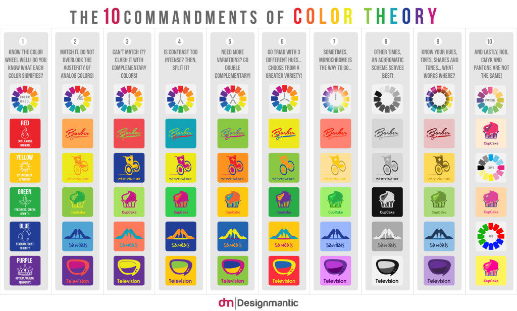
Design Crash Course 1: The 10 Commandments of Color Theory

This infographic breaks down everything you need to know about color theory. Aside from helping you choose colors that match the mood of your presentation, it also offers tips and tricks on how to come up with a solid palette.

Courtesy of Designmantic.com; click on image for full view

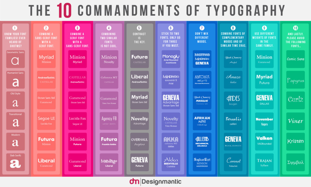
Design Crash Course 2: The 10 Commandments of Typography

Typography turns the written word into a visual treat. For this infographic, DesignMantic breaks down everything you need to know about combining different fonts together. As you know, choosing the correct font type is crucial in PowerPoint design. Like color, it can contribute in setting the over-all mood of your presentation.

Courtesy of Designmantic.com; click on image for full view

Get more design tips and PowerPoint ideas by reading back on some of our previous blog posts. To create the best slides for your presentations, always keep your core message in mind. Allow the purpose of your presentation to guide the choices you make when it comes to color and font type. Your designs should elevate the core message of your presentation. It should to highlight the goals you want to achieve, instead of distracting the audience. In other words, presentation design is both aesthetic and functional.

If you need more help, don’t hesitate to contact us and consult with our PowerPoint design experts.

Featured Image: Cropped from DesignMantic infographic

Helpful Infographics for Your Online Marketing Plan

infographics

online marketing

visuals

Anytime you browse through different social media channels, you probably always come across graphics that detail facts you probably never knew before. These images usually have cute and eye-catching drawings or designs. As we mentioned in the past, infographics are a growing trend. They offer an element of fun while conveying key facts and data. A good infographic can condense useful stats and information without overwhelming viewers.

To illustrate how effective they really are, we looked around the Internet to find some infographics that can help your online marketing strategy. Here are 5 that we think are particularly well-designed and informative:

How to Sell Without Selling

This infographic by Stride shares details and statistics you’ll need to improve your online marketing strategy. As its title suggests, it offers useful information on how to connect with consumers that are looking to be engaged, rather than to hear sales talk.

by Stride via Daily Infographic
20 Captivating Marketing Statistics

Here’s another set of enlightening data for entrepreneurs. These statistics were gathered by WebDAM.

WebDAM via BufferApp
A Well-Balanced Blog 

In this infographic, LinkedIn breaks down the different components you need for a successful blog.

LinkedIn Marketing Solutions via HubSpot
Email Cheatsheet

Email marketing is one of the best ways to engage with your target audience. As Marketo points out in this infographic, a majority of consumers prefer receiving marketing communications through their inbox. Don’t waste a good opportunity by keeping in mind some useful tips they offer.

Marketo via BufferApp
It’s All About the Images 

We all know how powerful visuals can be. In fact, an image can make a huge difference in how your content is perceived and received by consumers. In this infographic, MDG Advertising offers great advice on how you can get the most mileage from your image-based content.

MDG Advertising via JeffBullas.com
The Ridiculously Exhaustive Social Media Design Blueprint 

And since images are important to online marketing, Tent Social created a cheat sheet to tell you the perfect dimensions to use when sharing pictures in different social media platform:

Tent Social via BufferApp

How to Make a Simple Infographic Using PowerPoint SmartArt

infographics

PowerPoint Design

powerpoint tutorial

Infographics are a powerful way to present complex information visually. While you might think you need advanced graphic design software to create infographics, PowerPoint’s SmartArt feature allows you to design simple, effective infographics quickly and easily. Here’s how to create an infographic using SmartArt in PowerPoint.


1. Choose the Right SmartArt Graphic

The first step in creating an infographic is selecting a SmartArt layout that best fits your data. PowerPoint offers a wide range of layouts for different types of information, such as lists, processes, or hierarchies.

Why It’s Important:

  • Matches Your Data: Choosing the right layout ensures that your data is presented clearly and logically.
  • Simplifies Design: SmartArt offers pre-designed templates that make the process fast and easy.

How to Do It:

  • Go to the Insert tab and select SmartArt.
  • Choose from the categories such as List, Process, Cycle, or Hierarchy based on the type of data you’re presenting.

2. Input Your Data

Once you’ve selected your SmartArt layout, the next step is to input your data. You can enter text directly into the SmartArt or use the text pane for a more structured input.

Why It’s Important:

  • Organizes Information: Entering data into the SmartArt ensures that your information is structured and visually balanced.
  • Clarifies Your Message: Well-organized data helps convey your message more effectively.

How to Do It:

  • Click on the SmartArt graphic to open the text pane.
  • Input your data in the provided fields, using concise text to avoid clutter.

3. Customize the Design

PowerPoint allows you to customize your SmartArt by changing colors, shapes, and fonts to match your presentation’s theme or your company’s branding.

Why It’s Important:

  • Enhances Visual Appeal: Customizing the design makes your infographic more visually engaging.
  • Reinforces Branding: Using your brand’s colors and fonts ensures consistency across all marketing materials.

How to Do It:

  • Click on the SmartArt Tools tab and use the Change Colors and SmartArt Styles options to customize your design.
  • Adjust fonts and sizes to make your infographic more readable and visually appealing.

4. Add Visual Elements

To make your infographic more engaging, consider adding icons or images that complement your data. Visual elements help break up text and make your infographic more dynamic.

Why It’s Important:

  • Increases Engagement: Adding visuals makes your infographic more interesting and easier to understand.
  • Supports the Message: Icons and images help illustrate points and reinforce key messages.

How to Do It:

  • Go to the Insert tab, select Icons or Pictures, and choose relevant visuals to enhance your infographic.
  • Place icons or images near the corresponding text to maintain a clear and organized design.

5. Adjust the Layout

Once you’ve input your data and customized the design, you may need to adjust the layout to ensure that everything is properly aligned and visually balanced.

Why It’s Important:

  • Improves Readability: A well-organized layout ensures that your infographic is easy to follow.
  • Enhances Aesthetics: A balanced design makes your infographic more visually appealing.

How to Do It:

  • Drag and resize the SmartArt elements to create more space between sections or adjust the proportions.
  • Use PowerPoint’s alignment tools to ensure that your infographic elements are evenly spaced and aligned.

Final Thoughts

Creating a simple infographic in PowerPoint using SmartArt is an easy and efficient way to visually represent data. By choosing the right layout, inputting clear and concise information, and customizing the design with visuals and colors, you can create an engaging infographic that enhances your presentation. With PowerPoint’s intuitive tools, even non-designers can create professional-looking infographics in just a few clicks.

3 Quick Ways to Turn Information into Visuals

infographics

information

PowerPoint Design

powerpoint ideas

visualization

As we know, it’s easier for our brains to process visual information. As Dr. John Medina writes on his website, “vision trumps all other senses.”

Within seconds of exposure, pictures beat sentences and words for recall. And in memory tests where people are shown hundreds of photos, they can remember 90% three days later – and 63% after a year.

So if you want to make your presentations memorable, you need to learn how to turn all your data and information into visuals that your audience can easily digest and understand. We’re living in the multimedia age. Today, there’s much more emphasis on images and graphics than there is on the written word. According to MarketingProfs, these are 3 quick methods that you can try to make your information more memorable:

Videos

What can be more engaging than watching something play out before your very eyes? Showcase product demos or customer testimonials through short video clips. You can even try your own hand with a short informative skit through animation. Get started by making use of free tools like Masher, Animoto, and Adobe Voice. If you’d rather just share a video you found through YouTube, you can check this tutorial to learn how you can add one directly to your PowerPoint slides.

Infographics

Another great way to visualize information is through the use of infographics. As we mentioned in the past, they’re an effective way to condense data in a way that’s easy to understand. Infographics are a fun combination of quirky illustrations and hard-hitting facts. To make one yourself, keep these pointers in mind and explore online tools like Visme and Piktochart. With a bit of creativity and customization, you can also make use of PowerPoint SmartArt.

Heat Maps

You’ve probably seen heat maps used in the weather report, where color intensity is used to pinpoint the temperature all over the country. For a presentation, you can also make use of a heat map to visualize data about your website. If, for example, you’re presenting about your online marketing methods, you can make use of Crazy Egg and Clicktale to make your own heat map. These sites will pull information from your websites and pages to show which areas have the most activity.

What other methods do you use to turn the information you have into eye-catching and interesting visuals? Share your thoughts through our social media channels linked below.

READ MORE: Three Ways to Visually Present Information (Without Spending a Fortune) – MarketingProfs

Featured Image: Armando Maynez via Flickr

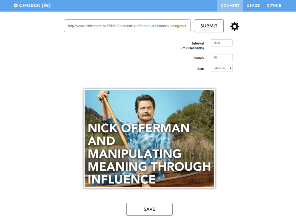
GIFDeck: Turn Your SlideShare Presentation into a GIF Animation

online tools

Powerpoint

presentation tools

Presentations

As we know, presentations can make great content marketing materials. And thanks to SlideShare, you can easily upload your decks online and gain a wider audience.

However, if you’ve been a longtime SlideShare user, you may have run into a small problem. While it’s easy to embed your entire presentation into a blog post or a web page, it’s harder to share them through Twitter or email without losing its visual quality. If you want to send an interesting SlideShare presentation to your friend via email, you’ll have to copy the link and they’ll have to open it themselves.

[sg-blog-modules module=two]

That’s why it’s important to translate your deck into a GIF, where it can self-present to an audience that doesn’t have your physical presence to get information from. Here’s how you can create a presentation GIF:

This is where GIFDeck Comes in.

This new Internet tool allows you to turn any SlideShare presentation into a GIF animation. You can attach your GIF to emails, or post it directly on Twitter. Best of all, the website is pretty straightforward. You don’t have to go through several complicated steps in order to achieve the results you want.

To do this, simply paste the SlideShare URL of your choice and hit Submit.


Here’s one of the presentations on our SlideShare profile converted into GIF:


Looks cool? Visit GIFDeck and give it a try!

Some Helpful Tips

  • Click on the icon beside the Submit button to customize your GIF. But be wary that any adjustments you make can affect the size and quality of your animation.
  • For more readable slides, change the interval at around 2000 milliseconds or more. Again, keep in mind that doing this will give you a larger GIF file size. Try to find the perfect balance between readability and an optimal file size for sharing.
  • If your presentation is particularly long, convert only the first 10 or so slides. Use it as a little “teaser” to encourage readers to click and visit your link.

Conclusion

A program like GIFDeck can prove efficient when you don’t have the time to present your PowerPoint to your audience. However, this can also be a test of how well you can create a compact, self-presenting deck. At the same time, remember that a GIF may not always be the best vessel for  your presentation.

Your deck isn’t there to speak for you, but when the occasion calls for it, you may need a deck that presents your key points without need for further explanation.

Need the guidance of a professional in the field to help you out? Our SlideGenius experts are ready to cater to your presentation dilemma.

Contact us today for a free quote!

 
[sg-blog-modules module=one]
Featured Image: Screencap from the GIFDeck website 

How to Create Doodles with PowerPoint Shapes

PowerPoint Design

powerpoint shapes

powerpoint tutorial

PowerPoint isn’t just for serious business presentations—it’s also a surprisingly powerful tool for creating fun and creative visuals, including doodles. By using basic PowerPoint shapes and the drawing tools, you can create custom illustrations that add personality and flair to your presentation.

Here’s how to create doodles using PowerPoint shapes:


1. Use Basic Shapes to Build Your Doodle

PowerPoint’s Shapes tool offers a variety of simple shapes—such as circles, squares, and lines—that you can combine to create doodle-like illustrations.

Why It’s Important:

  • Encourages Creativity: Using basic shapes allows you to experiment with different combinations to create unique visuals.
  • Makes Custom Illustrations Accessible: Even if you’re not a skilled artist, you can create doodles using PowerPoint’s simple shapes.

How to Do It:

  • Go to the Insert tab and click Shapes to access a wide variety of shapes.
  • Start with basic shapes like circles for heads, lines for arms and legs, or triangles for hats, then layer and adjust them to create your doodle.

Example: Use a series of ovals, circles, and rectangles to create a simple doodle of a person or an object, such as a tree or house.


2. Customize Shape Colors and Outlines

To give your doodle a hand-drawn look, customize the colors and outlines of the shapes you use.

Why It’s Important:

  • Adds Personality: Customizing the colors and outlines makes your doodle look less like default shapes and more like an original drawing.
  • Enhances Visual Appeal: Choosing fun, vibrant colors adds a playful touch to your doodles.

How to Do It:

  • Select a shape, then go to the Shape Format tab to customize the Fill Color and Outline.
  • Choose No Fill for a transparent look or apply a solid color for a more vibrant doodle.
  • Use the Dashes option under the Outline settings to create a sketch-like, dotted, or dashed line.

Example: Use a light pencil-gray outline with no fill to create a pencil sketch effect or bright colors for a cartoonish style.


3. Combine Shapes into a Single Doodle

Once you’ve arranged your shapes to create a doodle, you can group them together into a single object. This allows you to move, resize, and edit the doodle as a whole.

Why It’s Important:

  • Simplifies Editing: Grouping the shapes makes it easier to move and resize the entire doodle without having to adjust individual elements.
  • Maintains Consistency: Grouped shapes stay together, ensuring that your doodle remains intact even if you make adjustments to the slide layout.

How to Do It:

  • Select all the shapes you’ve used in your doodle by holding down Ctrl and clicking on each one.
  • Right-click and choose Group to combine the shapes into a single object.

Example: After creating a doodle of a cloud using several overlapping circles, group the shapes together so you can resize or move the entire cloud as one object.


4. Add Hand-Drawn Effects with the Freeform Tool

If you want to add more detail or create a truly hand-drawn look, use PowerPoint’s Freeform Shape or Scribble tool to draw custom lines and shapes.

Why It’s Important:

  • Adds Customization: The Freeform tool allows you to draw more intricate, freehand shapes that can’t be created with standard shapes.
  • Creates a Hand-Drawn Look: Using the Scribble tool can replicate the organic, uneven lines of a hand-drawn doodle.

How to Do It:

  • Go to Insert > Shapes and select Freeform Shape or Scribble.
  • Click and drag to draw freehand shapes or lines. Use the Shape Format tab to customize the color and outline of your drawing.

Example: Use the Freeform tool to draw custom squiggles, curves, or abstract shapes that give your doodle a playful, hand-drawn feel.


5. Animate Your Doodles

To add an extra element of fun to your doodles, you can animate them using PowerPoint’s animation tools.

Why It’s Important:

  • Enhances Engagement: Animating your doodles makes your presentation more dynamic and visually interesting.
  • Emphasizes Key Points: Animations can help highlight or introduce important elements of your doodle at the right moment.

How to Do It:

  • Select your doodle and go to the Animations tab.
  • Choose an animation effect such as Fade, Bounce, or Zoom to bring your doodle to life.

Example: Animate a doodle of a lightbulb to “pop” onto the screen when introducing a new idea or concept in your presentation.


Final Thoughts

Creating doodles with PowerPoint shapes is a fun way to add originality and creativity to your slides. By experimenting with basic shapes, colors, outlines, and hand-drawn effects, you can make your presentations more engaging and visually appealing. Don’t forget to group your shapes and add animations to complete the effect!
PowerPoint Action Buttons: One-Click Wonders

powerpoint action buttons

powerpoint tutorial

shape tool

Action buttons in PowerPoint provide an easy way to add interactivity to your presentations. With just one click, these buttons can take your audience to another slide, launch a website, or play a video.

Here’s how to use PowerPoint action buttons effectively:


1. Insert Action Buttons

Action buttons are pre-designed shapes that you can insert into your presentation to trigger specific actions when clicked.

Why It’s Important:

  • Enhances Interactivity: Action buttons make your presentation more dynamic and engaging.
  • Simplifies Navigation: They provide easy navigation between slides or external content without needing to exit the presentation.

How to Do It:

  • Go to the Insert tab, click Shapes, then scroll down to Action Buttons.
  • Choose the appropriate button shape, such as Home, Next, or Back, and place it on your slide.

2. Assign Actions to Buttons

After adding an action button, you can assign an action to it, such as moving to the next slide, linking to a website, or starting a video.

Why It’s Important:

  • Streamlines Presentation Flow: You can use action buttons to create smooth transitions between slides or multimedia elements.
  • Improves User Experience: Action buttons make your presentation more interactive and user-friendly.

How to Do It:

  • Right-click on the action button and select Action Settings.
  • Choose an action, such as Hyperlink to a slide, Run a Program, or Play Sound, then click OK.

3. Use Action Buttons for Navigation

You can use action buttons to help your audience navigate through your presentation, especially if it’s non-linear (e.g., a quiz or interactive module).

Why It’s Important:

  • Simplifies Complex Presentations: For presentations that don’t follow a linear path, action buttons can guide your audience through different sections.
  • Improves Interactivity: Letting your audience choose where to go next keeps them engaged.

How to Do It:

  • Use Next and Back buttons to allow your audience to move between sections of your presentation.
  • Use Home buttons to return to the main menu or starting slide.

4. Create Custom Action Buttons

If you don’t want to use the default action button shapes, you can create your own by assigning actions to any object, such as a picture or icon.

Why It’s Important:

  • Enhances Design Consistency: Custom action buttons allow you to maintain your presentation’s design aesthetic.
  • Adds Creativity: You can use custom buttons that fit the theme or style of your presentation.

How to Do It:

  • Select any shape or image in your presentation.
  • Right-click and choose Action Settings, then assign an action to the object just like you would with an action button.

5. Test Your Action Buttons

Before presenting, test your action buttons to ensure they work correctly and guide your audience smoothly through the presentation.

Why It’s Important:

  • Avoids Technical Glitches: Testing ensures that your action buttons function properly during the live presentation.
  • Improves User Experience: Ensuring smooth navigation makes your presentation more professional and polished.

How to Do It:

  • Click Slide Show to enter presentation mode and try clicking each action button to ensure it performs the correct action.

Final Thoughts

Action buttons are a simple yet powerful way to add interactivity and smooth navigation to your PowerPoint presentations. By incorporating action buttons, you can create a more engaging and dynamic experience for your audience while keeping your presentation flow intuitive.

6 Presentation Books to Read over Labor Day Weekend

powerpoint books

presentation books

presentation reading list

presentation tools

It’s been a difficult work week, and you can’t wait for the three-day weekend. Whether you’re planning to soak up the sun or stay at home to relax, Labor Day weekend is the perfect opportunity to crack open a few presentation books.

These 6 titles are fun and refreshing, offering new perspectives to the oft-repeated tips. Sit back and give yourself an opportunity to be inspired by new ideas.

Six presentation books to read over Labor Day weekend:

Labor Day Reading List - Presentation Books

1.) The Art of Explanation: Making Your Ideas, Products, and Services Easier to Understand

Coming up with a new idea is only half the battle. The next part is explaining your work to an audience, and getting them to see your entire vision. In The Art of Explanation, Lee LeFever covers the different ways you can successfully communicate your big ideas. This book is the perfect read for entrepreneurs, educators, and anyone who wants to improve their presentation skills.

2.) Confessions of a Public Speaker

Anyone who has experienced stage fright or anxiety will find comfort in Confessions of a Public Speaker. Scott Berkun utilizes humor and quick wit to relay presentation secrets he learned from over 15 years as a professional public speaker. His lessons are told through anecdotes of his own thrilling performances and embarrassing mistakes. This is a book novice presenters can relate to and enjoy. Reading it won’t feel like work at all.

3.) Moments of Impact: How to Design Strategic Conversations that Accelerate Change

Chris Ertel and Lisa Kay Solomon remind readers that action happens only after effective communication takes place. To get there, Moments of Impact imparts a simple process that can help collaborators solve issues and avoid misunderstandings. If you’ve ever left strategic meetings feeling more frustrated than enlightened, this is the perfect book to read and share with the rest of your team.

4.) Thinking Fast and Slow

If you’ve been too bogged down at work to come up with fresh ideas, Daniel Kahneman’s Thinking Fast and Slow might come in handy. The Nobel Prize winning author introduces readers to the world of the brain. He explains the two “systems” that drives the way people think. The first system is more intuitive and emotional, while the second one focuses on deliberation and logical thinking. This book is perfect for anyone who is willing to try a new approach to decision-making and brainstorming.

5.) The Sketchnote Handbook: The Illustrated Guide to Visual Note Taking

We’ve talked a lot about the importance of visuals in explaining difficult concepts and new ideas. This is why images are important to PowerPoint presentations. In The Sketchnote Handbook, Mike Rohde takes the same concept and applies it to note taking. Do you have a hard time recalling new information? That can change with visual note taking. And you need to be an artist to do it. All you need is a pen, a notebook, and some creativity.

6.) Show and Tell: How Everybody Can Make Extraordinary Presentations

Giving great presentations is easier said than done. I’m sure every presenter—even the ones that have bored you to death in the past—aim to engage their audience with an interesting discussion. If you want to make sure you’re giving all that you can, take note of the tips and tricks that Dan Roam covers in Show and Tell.

Which of these presentation books intrigue you? Grab your favorite title and learn something new over the weekend.

Featured Image: Simon Cocks via Flickr

Engage and Empower: Innovative PowerPoint Tools and Tutorials for Interactive Presentations

audience interaction

powerpoint tools

powerpoint tutorial

Presentations

Interactive presentations can elevate your content by making your audience feel more involved and engaged. PowerPoint offers several built-in tools and features that allow you to create dynamic, interactive slides. From hyperlinks to embedded polls, you can transform a passive presentation into an interactive experience.

Here’s how to use PowerPoint tools to make your presentations more interactive:


1. Hyperlinks and Action Buttons

Hyperlinks allow you to create clickable links within your presentation that direct the audience to another slide, a website, or an external file. This can be especially useful for interactive quizzes, navigational menus, or reference material.

How to Do It:

  • Highlight the text or select the object you want to hyperlink.
  • Go to the Insert tab and click Hyperlink.
  • Choose whether the link will direct to another slide, a webpage, or a file.

Example: Use hyperlinks to create a table of contents slide that allows your audience to jump to specific sections of the presentation.


2. Polls and Quizzes

You can make your presentation more engaging by incorporating polls or quizzes that gather live feedback from your audience. Tools like Mentimeter or Poll Everywhere can be embedded directly into PowerPoint, allowing you to display real-time results.

How to Do It:

  • Create a poll or quiz using an interactive tool like Mentimeter.
  • Insert the poll into PowerPoint as a live interactive element by embedding the code or using the tool’s PowerPoint add-in.

Example: Use a poll to gauge audience opinions on a topic, then display the results live during the presentation.


3. Interactive Zoom

PowerPoint’s Zoom feature allows you to create a more dynamic and interactive navigation experience within your presentation. With Zoom, you can jump between sections, zoom into content, and return to the overview slide, making your presentation feel more fluid.

How to Do It:

  • Go to the Insert tab, then click on Zoom.
  • Choose whether you want to create a Summary Zoom, Section Zoom, or Slide Zoom.
  • Customize the zoom functionality to allow smooth transitions between content.

Example: Use Summary Zoom to create an interactive outline of your presentation, allowing you to navigate between different sections based on audience preferences.


4. Trigger Animations

Trigger animations allow you to set specific actions to occur when an object is clicked. This can be useful for interactive infographics, quizzes, or decision trees.

How to Do It:

  • Select the object you want to animate.
  • Go to the Animations tab and choose an animation.
  • In the Timing section, click Triggers and choose which object will trigger the animation.

Example: Use trigger animations to reveal additional information when a button or object is clicked, creating an interactive learning experience.


Final Thoughts

Interactive presentations can engage your audience and empower them to participate in the content. By using PowerPoint’s innovative tools, such as hyperlinks, polls, zoom, and trigger animations, you can create a more dynamic and memorable presentation. Test these features ahead of time to ensure they function smoothly during your live presentation.

Presentation Software: Adobe Voice for iPad

adobe voice for ipad

presentation software

review

Thanks to Adobe’s presentation software, you can create a video pitch in just a few easy steps. In fact, you can even do it right on your iPad.

Adobe Voice for iPad is pretty straightforward. Through combining images, animations, music, and voice overs, you can easily create video presentations to be shared online. Adobe calls it a “storytelling app” that encourages people to use visuals to share their stories.

Templates and customization options

Upon opening Adobe Voice, you will be prompted to choose a template that will help give your video presentation structure. Most presenters forget to give their deck a concrete beginning, middle, and end, which just leads them to ramble through their pitch.

However, by maintaining a clear structure in your deck, your slides can prompt you as you go along.

Begin building your slides by adding icons and images from the app’s library, or from your own Camera Roll. Adobe also gives you access to licensed music that you can use for your presentations. All of this is pretty easy to do because the app’s interface is simple and user-friendly.

Voice recording

The attractive thing about Adobe Voice is the fact that you can easily add voiceovers to any of your slides. For some presentation software, this step can get quite tedious. For Adobe Voice, all you have to do is hold a button and talk into your iPad.

This makes it convenient to share video presentations that you won’t be able to guide with your physical presence. While the slides aren’t made to replace you, instances like uploading your presentation online need a deck that can stand on its own.

Online sharing

When you’re done, the app allows you to share your presentation through e-mail or social media sites like Facebook and Twitter. Since the app is connected to Adobe’s Creative Cloud, you can also retrieve a link to view your presentation in any device.

All in all, Adobe’s new presentation software can be a great addition to your arsenal. Adobe Voice for iPad makes all the steps of creating a presentation easier. It gives you a template to outline your ideas and provides plenty of choices for design. Most importantly, it allows you easily distribute your video presentation for others to see.

Adobe Voice for iPad is free at the Apple store, but requires a subscription to Creative Cloud. Download the app here.

Featured Image: Adobe Voice Website