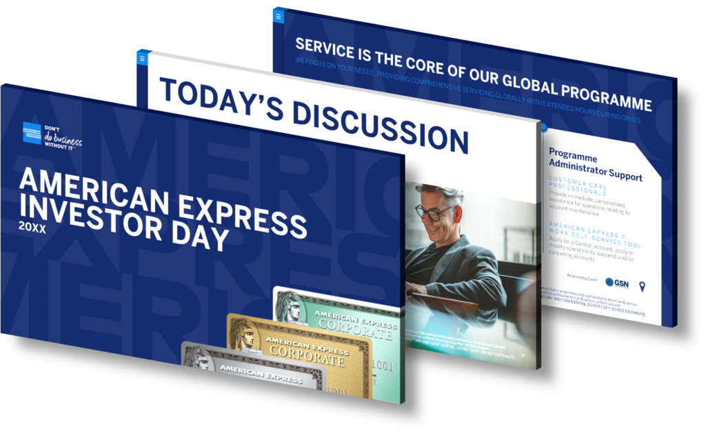
How can IoT sales teams elevate board presentations with industry-specific embedded charts for investor meetings?
Internet of Things (IoT) sales teams can significantly enhance board presentations for investor meetings by incorporating industry-specific embedded charts. These charts provide a visual representation of data, which can help clarify complex information, highlight trends, and support strategic decision-making.
Visualizing IoT Data
IoT generates a vast amount of data that can be challenging to understand without proper visualization. By using industry-specific embedded charts, sales teams can effectively illustrate this data, making it easier for board members and investors to grasp. This can include data on connected devices, user behavior, system performance, and more.
Customization and Flexibility
Embedded charts allow for significant customization, enabling sales teams to tailor their presentations to the specific interests and requirements of their audience. This flexibility can enhance the relevance and impact of the presentation, leading to more engaged and informed discussions.
Dynamic Data Representation
Unlike static charts, embedded charts can provide dynamic, real-time data representation. This means that the data in the charts can be updated in real-time as the IoT devices collect and process data. This feature can be incredibly useful during investor meetings, as it allows for up-to-the-minute insights and discussions based on the latest data.
Storytelling with Data
Finally, sales teams can use embedded charts to tell a story with their data. By arranging charts in a logical sequence and using them to highlight key points, sales teams can create a compelling narrative that guides investors through the presentation and helps them understand the strategy, performance, and potential of the IoT business.
In conclusion, industry-specific embedded charts can be a powerful tool for IoT sales teams during board presentations for investor meetings. They can simplify complex data, provide real-time insights, and help create a compelling narrative. The result is a more effective presentation that can engage investors and help drive strategic decisions.
View Our Presentation Portfolio

How can Big Data CEOs use customizable templates for Chevron charts to boost stakeholder engagement in virtual meetings?
Big Data CEOs can leverage customizable templates for Chevron charts to enhance stakeholder engagement in virtual meetings in numerous ways. These templates offer a visually appealing and easy-to-understand method of presenting complex data, thereby fostering improved communication and engagement.
Facilitating Clear Communication
Customizable Chevron chart templates allow CEOs to present complex data in a clear and digestible format. This clarity is critical during stakeholder meetings, where CEOs must communicate strategic plans, progress reports, or data analysis. The intuitive step-by-step structure of a Chevron chart allows stakeholders to easily follow along, fostering better understanding and engagement.
Improving Presentation Aesthetics
A well-designed Chevron chart can add a professional and aesthetically pleasing element to presentations. This not only captures the stakeholders’ attention but also keeps them engaged throughout the meeting. Customizable templates offer CEOs the freedom to align the chart’s design with their company’s branding, reinforcing a cohesive visual identity.
Enhancing Data Interpretation
Big data can be challenging to digest and interpret. However, by presenting this information through Chevron charts, CEOs can facilitate easier data interpretation. Each stage of the Chevron can represent different data points or stages of analysis, making it simpler for stakeholders to comprehend the presented data and its implications.
Saving Time and Effort
Customizable templates for Chevron charts also save CEOs time and effort when preparing for stakeholder meetings. Instead of creating charts from scratch, they can use and modify these templates to suit their needs, allowing them to focus more on the meeting’s content and less on its design elements.
In conclusion, by improving communication, enhancing aesthetics, simplifying data interpretation, and saving preparation time, customizable templates for Chevron charts can significantly boost stakeholder engagement in virtual meetings for Big Data CEOs.
View Our Presentation Portfolio

How can cloud conference planners use interactive visuals to maintain brand identity in corporate presentations?
Cloud conference planners can use interactive visuals to maintain brand identity in corporate presentations in several ways. Such visuals not only make a presentation more engaging but also represent the brand’s image and tone consistently. This can be achieved through the following methods:
1. Consistent Branding Elements: Ensure all visuals include consistent branding elements such as the company logo, color scheme, and typography. This can be done by creating a brand style guide, which can be used to maintain consistency across all conference presentations.
2. Customized Templates: Design customized presentation templates that reflect the organization’s brand. This helps to maintain a common theme across all presentations and promotes brand identity.
3. Interactive Infographics: Infographics are a powerful tool to convey complex data in a simple, easy-to-understand manner. Additionally, making these infographics interactive can increase audience engagement and reinforce brand identity.
4. Use of Branded Images and Videos: Include branded images and videos in the presentation. These can serve as powerful visual aids that can enhance understanding and reinforce the brand image.
5. Brand Storytelling: Storytelling can be an effective way to convey the brand’s values and mission. Use interactive visuals to tell the company’s story in a compelling manner.
At SlideGenius, we specialize in creating high-quality, interactive visuals that effectively communicate your message and uphold your brand identity. We work closely with you to understand your brand, your audience, and your objectives to create a presentation that resonates with your audience and leaves a lasting impression.
View Our Presentation Portfolio

How can IoT firms elevate board presentations with interactive data visuals for impactful corporate conference overviews?
IoT firms can significantly elevate their board presentations by integrating interactive data visuals to provide impactful corporate conference overviews. This can be achieved through a variety of ways:
1. Use of Interactive Charts and Graphs
Interactive charts and graphs are a compelling way of presenting complex data. They allow viewers to interact with the data, enabling a deeper understanding of the information being presented. SlideGenius can create custom interactive charts and graphs that visually represent your data in a way that is both engaging and easy to understand.
2. Integration of Real-Time Data
IoT firms manage vast amounts of data in real-time. Incorporating this real-time data into your presentations can provide viewers with a more accurate representation of your company’s current standing and future projections. SlideGenius can seamlessly integrate your real-time data into your presentations, making them more dynamic and relevant.
3. Use of Animated Infographics
Animated infographics can bring your data to life, making it more engaging and memorable. They can be used to illustrate trends, show changes over time, and explain complex concepts in a simple and visual way. Our team at SlideGenius can create custom animated infographics that effectively communicate your data and capture your audience’s attention.
4. Incorporation of Interactive Dashboards
Interactive dashboards allow viewers to explore data at their own pace. They can drill down into specific details, adjust parameters, and view different scenarios. This gives viewers a greater sense of control and engagement with the data. SlideGenius can design and build interactive dashboards that are tailored to your specific needs and goals.
By incorporating these elements into your presentations, you can make your data more engaging, memorable, and impactful. SlideGenius has extensive experience in creating high-quality, interactive presentations for IoT firms. Our team of expert designers and developers will work with you to create a presentation that not only looks great, but also effectively communicates your data and message.
View Our Presentation Portfolio

How can legal sales teams elevate board presentations using customizable circular charts for investor meetings in PowerPoint?
Customizable Circular Charts: A Powerful Tool for Legal Sales Teams
Legal sales teams can significantly elevate their board presentations using customizable circular charts in PowerPoint, especially for investor meetings. These charts, also known as pie charts or donut charts, are a compelling way to visually represent data in a clear and engaging manner. They are particularly effective in showing relative proportions or percentages of information, making them suitable for financial and statistical data commonly presented in investor meetings.
Breaking Down Complex Data
One of the most significant challenges in legal sales presentations is the complexity of the data involved. Customizable circular charts can break down complex data into easily digestible pieces. By presenting data visually, it becomes easier for the audience to understand and remember the information. This visual approach is much more impactful than merely listing numbers or statistics.
Highlighting Key Points
Customizable circular charts allow legal sales teams to emphasize key points or data sets. By using different colors, sizes, and other design elements, teams can draw attention to the most important pieces of information. This can be particularly useful when presenting to investors, as it helps to highlight the company’s strengths and competitive advantages.
Engaging the Audience
Visuals like circular charts are also a great way to keep the audience engaged. They add variety and visual interest to the presentation, breaking up the monotony of text-heavy slides. This can help to keep investors’ attention and make the presentation more memorable.
Customizability for Specific Needs
Finally, the fact that these charts are customizable means that they can be tailored to meet the specific needs of the presentation. Legal sales teams can adjust the colors, labels, sizes, and more to align with the company’s branding or the presentation’s theme. This high degree of customizability makes these charts a versatile and powerful tool for any legal sales presentation.
Conclusion
In conclusion, customizable circular charts are an incredibly effective tool for legal sales presentations. They can simplify complex data, highlight key information, engage the audience, and be customized to meet specific needs. By leveraging these charts, legal sales teams can elevate their board presentations and make a powerful impression on investors.
View Our Presentation Portfolio

How can SaaS CEOs ensure brand consistency and collaboration in PowerPoint sales pitches to attract new clients?
As a SaaS CEO, ensuring brand consistency and collaboration in your PowerPoint sales pitches is essential to attract new clients. Here are several strategies and tips you can employ to achieve this.
Brand Consistency
Brand consistency revolves around maintaining a uniform identity throughout your pitches to strengthen your brand’s position and character. Here are a few suggestions:
- Utilize a Style Guide: A style guide is a document that outlines your brand’s design standards. It includes specifics about your logo, fonts, colors, and tone of voice. Consistently using these elements in your PowerPoint presentations can help reinforce brand recognition.
- Professional Templates: Use professional, branded PowerPoint templates. These templates should incorporate your brand’s color scheme, fonts, and other visual elements. It saves time, promotes consistency, and provides a high-quality aesthetic.
- Consistent Messaging: Ensure that your company’s value proposition and key messages are consistently articulated throughout the presentation. This helps to reinforce your brand’s narrative and increases the chances of it sticking in the minds of your potential clients.
Collaboration
Collaboration is crucial in developing effective sales pitches. It ensures that everyone is on the same page and that the final product is a collective effort. Here’s how you can foster collaboration:
- Use Collaborative Tools: Use PowerPoint’s collaborative features that allow multiple team members to work on a presentation simultaneously. It provides real-time updates, allowing for instant feedback and faster iterations.
- Regular Meetings and Revisions: Regular team meetings can be used to discuss progress, provide feedback, and make necessary revisions. This promotes open communication and collective decision-making, leading to a more robust final product.
- Role Assignment: Assign specific roles to team members, such as research, design, content writing, and final editing. This ensures a smooth workflow and that every aspect of the presentation is taken care of by an expert.
SlideGenius can help SaaS CEOs achieve brand consistency and collaboration in their PowerPoint sales pitches. With a team of expert designers and writers, SlideGenius can create compelling, brand-consistent presentations that attract new clients.
View Our Presentation Portfolio

How can legal firms securely present complex financials in PowerPoint for earnings calls to engage business executives?
Legal firms can present complex financial data securely in PowerPoint for earning calls by following a strategic approach which includes data visualization, clear messaging, and secure sharing. This process is made much easier with SlideGenius, a professional PowerPoint presentation design service.
Data Visualization
One of the most effective ways to present complex financial data is through data visualization. By transforming raw data into charts, graphs, or infographics, you can help business executives quickly understand the information. SlideGenius offers custom-designed PowerPoint slides that can turn complex financials into visually engaging presentations.
Clear Messaging
Clear, concise messaging is key when presenting financial data. Avoid overwhelming your audience with too much information at once. Instead, break down complex data into digestible pieces. Our team at SlideGenius can help you craft powerful narratives and key messages that resonate with your audience.
Secure Sharing
When it comes to sharing your presentations, security is crucial, especially for legal firms handling sensitive financial data. SlideGenius’ services include secure file sharing options to ensure your data remains confidential. Additionally, you can add password protection to your PowerPoint presentations or restrict editing access to certain users for an added layer of security.
Engaging Design
Finally, to engage business executives, your presentation should be visually appealing and professionally designed. SlideGenius designers are experts in creating high-impact PowerPoint presentations that capture and hold your audience’s attention.
With SlideGenius, legal firms can confidently and securely present complex financials in PowerPoint for earnings calls. We help you communicate clear and engaging messages while ensuring the utmost security of your data.
View Our Presentation Portfolio

How can legal sales teams elevate board presentations with custom data visuals for impactful financial insights?
Legal sales teams can significantly elevate their board presentations by incorporating custom data visuals to present financial insights more impactfully. There are several ways to do this, all of which SlideGenius can assist with.
Firstly, understand that data visualization is a powerful tool that enables you to present complex financial data in a simple and understandable way. It helps to break down intricate information into easily digestible visuals, which can enhance the comprehension of the data presented. This is especially useful for sales teams dealing with vast amounts of data.
SlideGenius can help you create custom data visuals that are tailored to your specific needs. Our team of experts uses a combination of charts, graphs, and other visual aids to represent your data in a meaningful and engaging way. These visuals can be customized to align with your brand’s identity, ensuring that your presentations are not only informative but also visually appealing.
Secondly, dynamic visuals can be used to highlight key financial insights. Instead of presenting raw numbers, SlideGenius can help you design animated visuals that can guide your audience’s focus towards the most important pieces of data. This can help emphasize the points you want to drive home, making your presentation more impactful.
Thirdly, using custom data visuals for your financial insights can also serve as a storytelling tool. By presenting your data visually, you can create a narrative that guides your audience through the information, making it easier for them to understand and remember. SlideGenius understands the power of storytelling and can help you weave your data into a compelling narrative that resonates with your audience and enhances your presentation.
In conclusion, leveraging custom data visuals in your board presentations can greatly enhance the effectiveness of your financial insights. By breaking down complex information into understandable visuals, highlighting key points with dynamic visuals, and using data to tell a story, you can elevate your presentations and make them more impactful. SlideGenius is here to help you achieve this with our expertise in creating custom data visuals.
View Our Presentation Portfolio

How can AI sales teams boost stakeholder engagement in virtual events using collaboration tools for impactful presentations?
AI sales teams can significantly enhance stakeholder engagement in virtual events by leveraging collaboration tools for impactful presentations. Here are a few ways how:
Personalized Experiences
AI can analyze the historical data and behavior of attendees to create personalized experiences. This means the content, including presentations, can be tailored to individual preferences and interests, which increases engagement.
Interactive Sessions
Collaboration tools such as live chat and polling can be used to make the presentation interactive. AI can help in analyzing the collected data in real-time to provide instant insights, which can be used to adapt the presentation as per the audience’s response.
Meeting Optimization
AI can optimize the meeting schedules based on the availability and preferences of the stakeholders. This ensures maximum participation and engagement. Plus, AI can ensure seamless transitions between different segments of the virtual event, maintaining the flow of the event and keeping the audience engaged.
Automated Follow-ups
Post-event, AI can send personalized follow-ups to the attendees, including key takeaways from the presentation. This reinforces the messages from the presentation and keeps the engagement alive even after the event.
Enhanced Accessibility
AI can provide real-time translations and transcriptions during the presentation. This makes the presentation accessible to a global audience, increasing overall engagement.
To sum up, AI sales teams, with the aid of collaboration tools, can create a more engaging, personalized, and interactive virtual event experience. This not only boosts stakeholder engagement but also enhances the impact of the presentations.
View Our Presentation Portfolio

How can energy sector CEOs use 3D PowerPoint charts to boost stakeholder engagement in virtual client pitches?
3D PowerPoint charts can be an excellent tool for energy sector CEOs to enhance stakeholder engagement during virtual client pitches. The use of these charts can add depth and visual appeal to presentations, making them more engaging and easier to understand.
One of the primary ways 3D charts can boost engagement is by making complex data more digestible. In the energy sector, CEOs often need to present detailed information about energy consumption, production, and sustainability efforts. 3D charts can depict these data in an interactive and visually compelling way, transforming raw numbers into visual stories. The three-dimensional aspect adds a level of depth that can help stakeholders better grasp trends and patterns.
Additionally, 3D charts can create a more immersive experience for stakeholders. Instead of simply looking at static 2D charts, stakeholders can interact with the 3D charts, rotating them to view data from different angles. This interactivity can make stakeholders feel more involved in the presentation, thereby increasing their engagement.
Moreover, 3D charts can also aid in emphasizing key points or trends. By adjusting the perspective, size, and color of the 3D elements, CEOs can draw attention to the most important data points or trends that they want their stakeholders to focus on. This can guide the narrative of the pitch and ensure that the key messages are conveyed effectively.
In conclusion, energy sector CEOs can use 3D PowerPoint charts to present data in a more engaging, understandable, and visually appealing manner. However, it’s important to use 3D charts judiciously and ensure they enhance the presentation rather than distract from the key message. SlideGenius can assist in creating professional, effective 3D charts for your next virtual client pitch.
View Our Presentation Portfolio

What strategies can SaaS CEOs use to leverage interactive pie charts for impactful investor communication in earnings calls?
Interactive pie charts can be a powerful tool for SaaS CEOs to use in earnings calls, due to their ability to visually display information in a way that’s easy to understand. Here are several strategies to effectively leverage these charts:
1. Highlight Key Data Points
Using interactive pie charts can effectively highlight key data points. Use different colors to distinguish between sections of the pie chart, allowing investors to quickly grasp the most important data. You can also interactive features to show more detailed information when a section of the chart is clicked.
2. Use for Comparison
Pie charts are an excellent tool for comparing different segments of data. For example, you can illustrate the market share of different products, or the proportion of revenue from different regions. This can help to highlight areas of strength and potential areas for improvement.
3. Simplify Complex Data
Complex data sets can be overwhelming and difficult to understand when presented in raw form. Pie charts can simplify this data by presenting it in a visual format, making it easier for investors to comprehend. This can be particularly useful when discussing financial results, user growth, or other key performance indicators (KPIs).
4. Show Trends Over Time
By using a series of pie charts, you can depict changes over time. This can be particularly useful for showing growth or decline in specific areas. Investors will appreciate this visual representation of trends, making the data more memorable.
5. Provide Context
Context is crucial in earnings calls. Use pie charts to provide context, such as how your company’s performance compares to past results or industry averages. This will help investors understand where your company stands relative to others and its own past performance.
6. Make it Interactive and Engaging
An interactive pie chart can engage investors more effectively than a static image. Ensure that your pie chart has interactive features, such as the ability to click on sections to reveal more detailed data. This will encourage investors to engage with the data, leading to a deeper understanding of your company’s performance.
Remember, the goal is to communicate your company’s performance clearly and effectively to investors. By using interactive pie charts strategically, you can achieve this goal and make your earnings calls more impactful.
View Our Presentation Portfolio
