Presentation design has come a long way since PowerPoint first launched in 1990. Clip art and bullet points are a thing of the past. For 2014, trends point toward eye-catching visuals, digestible content, and audience participation.
The following are the six presentation design trends we’ve observed during the first half of the year.
Trend #1: Simplifying content with one-liners and illustrations
There’s no denying it: attention spans have become shorter in the postmodern age. We’ve all gotten used to ‘instant gratification and quick fixes‘. Google can pull up the information you need in mere seconds. Your smartphone can quickly give you directions when you’re lost on the road. The same ease should be applied when you’re sharing information through slides.

Simplify slides by using one-liners and illustrations that emphasize your key points. Also, limit yourself to discussing only one concept per slide. We’ve seen Steve Jobs do it, but some people still make the mistake of including too much information.
Audiences are easily distracted if they can read every word you say on your slides. They’ll skip right ahead of you and zone out while waiting for you to finish talking.
Trend #2: Using full images as backgrounds
Visuals are a great way to capture wandering attention. The Internet is a great source for pictures that can help enhance your presentation design. And because the technology for photography has improved, you can make use of full images as backgrounds.
If you know where to look, the Internet can provide you with pictures that are coherent with the core of your presentation.
Take these slides as an example, and observe how the background images are balanced by the text and color choices.
Trend #3: Filtering images through photo-editing programs
Stock photography is a great option for presenters looking to enhance their slides with professional-looking images. However, a lot of it looks distant, staged or cheesy. The same is true for most photos available for free use on the Internet.
According to The New York Times’ Jena Wortham, thanks to the popularity of Instagram, editing photos to create a more authentic and nostalgic feel has become the norm.
Run the images you want to use through filters so your slides can have a personal but polished touch.

If you’d like to try this trend, there are plenty of photo-editing programs available aside from Instagram.
You can try web-based editors like PicMonkey, Fotor, or Pixlr. Photoshop is a classic, but it can be quite complicated for a first-timer. Whatever program you decide to use, just keep in mind that the photos in your slides should look unified. As much as possible, edit your images using the same filters and techniques.
Trend #4: ‘Flat Design’
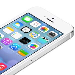
Apple’s release of iOS7 made “flat design” a mainstream concept. Before iOS7, the icons in your devices had a more texture and “real” look to them. Now, designers are opting for a more minimalist aesthetic that focuses on simple shapes and vibrant colors.
With the impending release of iOS8, you can expect this trend to continue in presentation design.
Trend #5: ‘Geometric Design’
We’ve seen geometric design dominate the fashion industry last year. Now, we’re seeing the same trend in presentation design. Because of its clean lines and sharp edges, geometric shapes and patterns allow for interesting accents that still look professional.
Trend #6: Technology integration for audience interaction
Audiences these days are clamoring to be part of the presentation process. Audiences prefer to converse with the presenter, instead of being spoken at. Technology allows you to integrate audience participation in your presentation design. Apps like Presentain and SlideKlowd allows the audience to get involved with your presentation through their mobile devices.
With a swipe of a finger, they can ask questions, answer polls, and send follow-up requests.
References
“GEOMETRIC FASHION 2013: Shape It Up!.” Runway Style Media. July 28, 2013. Accessed June 18, 2014.
Weatherhead, Rob. “Say It Quick, Say It Well – the Attention Span of a Modern Internet Consumer.” The Guardian. February 28, 2014. Accessed June 18, 2014.
Wortham, Jenna. “A Stream of Postcards, Shot by Phone.” The New York Times. June 03, 2011. Accessed June 18, 2014.
Featured Image by Steve Snodgrass via Flickr. Sample slides from the SlideGenius portfolio.


