The flow of a good PowerPoint should feel like watching a film. A pitch shouldn’t just be slide after slide of information. Including a narrative can make your topic engaging and relatable to the audience. Film creates that narrative by editing frames. This process also applies to presentation transitions in PowerPoint slides.
Cut, Fade, and Wipe are three subtle effects that are widely used in editing film and on transitions in PowerPoint.
Slides and Frames
These three can be found under the Transitions tab and are the most versatile ones to use.
Treat each slide like a frame in a film to direct the eyes of the audience. The audience will use these transitions as clues to put the presentation together in their minds. A beginning, middle, and end to a presentation can be hinted at using these effects. You can find these under the Subtle category. These transitions can make moving to the next slide less distracting.
The icons are arranged according to the subtlest effect from left to right. The first icon begins with no effect or None. Clicking on this icon does not place any effect on a slide. The rest of the subtle effects use more complicated animations, and can be customized further under Effect Options.
Cut
The animation immediately cuts to the next slide, similar to how cuts work in film. This allows you to navigate through slides quickly. Unnecessary slide animation can hinder a presentation that’s exceeding the scheduled time. Use a simple transition effect like Cut to reduce lag between slides.
Fade to Black
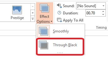
This effect causes the whole screen to slowly fade, revealing the next slide. Additionally, Fade to black to the next slide under Effect Options.
Transitions>Fade>Effect Options>Through Black
Fade out to black is a film editing technique that’s traditionally used to conclude movies. During a pitch, the transition can give the speaker time to pause and slow down the pace of their speech.
While Cut gives the impression of energy, Fade gracefully transitions to the next slide. A presentation can also end using this transition to signal the audience that they’ve reached the end.
Wipe
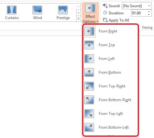
This effect causes the screen to fade in from any direction. This dynamic, yet subtle transition can direct the eye of the audience. You can access additional animations under the Effect Options icon.
Transitions>Wipe>Effect Options>From Right…
The unpredictable motion of the slides adds an element of surprise to your presentation. But using too many words with this transition can easily overwhelm the eyes. So minimize this transition to keywords or single phrases.
Storytelling Through Slides
Play around with the Cut, Wipe and Fade transitions. Observe some films which make use of interesting editing techniques. Convey action in your slides and use a combination of the Wipe and Cut transitions. The Fade transition animates slowly, adding intrigue and building up anticipation for the next slide.
Create a presentation that tells a story today.
References
Chandler, Gael. Film Editing: Great Cuts Every Filmmaker and Movie Lover Must Know. Studio City, Calif.: Michael Wiese Productions, 2009. 193.
Featured Image: “Film” by Leo Hidalgo from flickr.com


