Using charts is tricky for business presentations. More often than not, they tend to overload your slides with numbers and distract your audience from your main findings.
Similar to using spreadsheets, these are tools used to analyze data before presenting them. However, charts have one advantage over spreadsheets: They can visually compare and show relationships between numbers and information, making them more understandable for the audience. This also lets you hold their interest long enough to get your point across.
If you absolutely need to use charts, these are the four basic types that can help simplify an otherwise long and boring topic.
1. The Organizational Chart
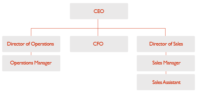
This chart is used to explain relationships between members of a group.
Here, information is displayed in a top-to-bottom format, with the executive or manager at the top. The chart branches out to show direct and indirect relationships between staff, managers, and executives.
This gives everyone a clear picture of who reports to whom and who is responsible for what.
While the organizational chart explains structures, it doesn’t show how a company operates. You can use flowcharts to explain how your company does business with others. You can also use these to talk about any other type of business procedure.
2. The Flowchart
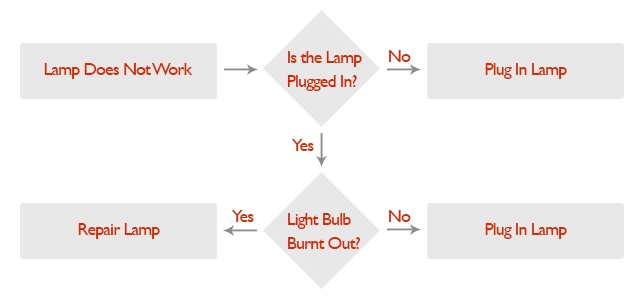
The flowchart is more linear, sometimes circular, in nature.
It’s best for explaining processes, especially during business presentations. The flowchart builds a clear picture of where something begins, what happens in between, and where it ends.
When using this chart, start with the first step. When an order comes in, what step follows next? Is there a step where the request is evaluated? Arrange them sequentially, and add if-and-then statements if something goes wrong with that step.
The more complicated a process is, the harder it is to illustrate with a flowchart. Stick to the basics and keep your illustration simple to avoid confusing your audience with too many numbers.
3. The Line Graph
One of the simplest to create and the easiest to understand, line graphs show progressions and can also forecast results.
If you were to track, for example, the increase and decrease of your company’s earnings per year, simply plot the period of time you need to measure on the horizontal X-axis. The vertical Y-axis will be used to measure the amount gained or lost.
After plotting the data, simply connect the points with a line to show their progression. You can even use it to compare similar types of data by using different colored lines.
Line graphs are great at comparing progressions, but if you want to accurately show increases and decreases in value, bar graphs are perfect for the job.
4. The Bar Graph
While they can also show comparisons over time like line graphs, bar graphs are used for measuring larger changes.
The two main variants for bar graphs are horizontal and vertical graphs. Both rely on rectangles to show how much one thing is worth against another. For example, if you were to measure the net worth of similar companies with a vertical bar graph, you could arrange the company names in the horizontal X-axis, and set the values in the vertical Y-axis. The higher the rectangle displayed, the more valuable the company is. For horizontal graphs, these are more appropriate for data with longer labels. The usage is the same with a vertical graph, except that the X and Y axes are reversed.
Which Chart Should You Use?
Instead of you simply talking about information with a slide full of text, these charts can conveniently illustrate your data.
It can be about procedures, your organizational structure, or even the progressions and comparisons between information.
While these four graphs can illustrate and compare several things at once, they can overload your slides if they contain too much information. Keep only the most essential processes and state only the most important individuals in any organizational structure.
It’s best to limit your comparisons to at least three things to make your presentation easier to understand.
Check out and share our infographic!
References:
“Types of Graphs – Bar Graphs.” Types of Graphs. n.d. www.typesofgraphs.com/bar.html
“Types of Graphs – FlowCharts.” Types of Graphs. n.d. www.typesofgraphs.com/flow.html
“Types of Graphs – Line Graphs.” Types of Graphs. n.d. www.typesofgraphs.com/line.html
“Types of Graphs – Organizational Chart.” Types of Graphs. n.d. www.typesofgraphs.com/organizational.html

