Leave Your Mark: Apply Personal Branding in Presentations

first impression

personal branding

planning

presentation guide

Rick Enrico Blog

SlideGenius

Attracting audience attention is one of the most difficult tasks in a presentation. It’s likely that they’ve already heard what you have to say from other speakers, and in different media. You might think your pitch is unique, but its general thought may be similar to what others have thought of before.

So how do you apply personal branding in presentations? And how do you make sure you look better than the competition? Setting yourself apart is important in making and leaving a good impression.

Don’t pass by unnoticed. Market yourself and your pitch in three ways:

Keep Your Friends Close, and Your Competition Closer

Studying your audience is a necessary prerequisite to effective communication. Aligning your own vision with your target market’s interests guarantees their attention. To do that, you’ll have to do a bit of research on your part and look up your audience’s preferences.

But getting people’s to stay tuned isn’t enough. Reel them further in and assure them that you’re the best by searching for your competitors as well. We don’t mean backbiting and sabotage, though. We’re talking about looking at premises similar to yours and seeing how you can spin it into something novel and unique. One way of achieving that is taking on the idea from a different angle than those already used before.

Influence & Co. CEO and co-founder, John Hall, cites ways on how to take a unique approach to your brand. These include looking at your company strengths, qualifications, and insight. Another is by looking at your competition’s weaknesses and framing it as your strength. These give you and your presentation a distinct image and a memorable characteristic.

Create a Relatable Narrative

Once you’re sure of your strategy, the next step is figuring out how to deliver your message. Among the most successful methods is framing your presentation in a narrative, preferably one your audience can relate to. People can follow the flow of your speech better when it has a beginning, middle, and end. Incorporating familiar tropes and images also keeps them interested.

However, remember that in relating a story, you have to apply the conversational tone. This establishes rapport and eases built up tension before and during a presentation. Avoid using too much jargon or foreign words, and explain each point thoroughly without talking down to your audience.

Talk to your audience as you would an esteemed friend. They’ll return the favor by responding in the same way.

Gain Believers through Quality

The final and best option to distinguish your presentation over everyone else’s is to be on top of your game. This is a foolproof technique to appear credible and relevant before, during, and after your presentation.

Make a good first impression by maintaining your confidence and composure. Come in prepared and ready to present. Acquaint yourself with the venue and the audience so you know how to set the mood. Don’t get lax with your exposition, though.

An audience will be impressed with consistency in how you handle yourself, especially when you encounter unexpected hurdles mid-speech. Keep your energy up until the end of your presentation. It’s also good to reserve some extra energy in case your audience has further clarifications for you.

No one wants to listen to a drained speaker. Project as much of your liveliness as you can to best engage your listeners.

Conclusion

People are always on the lookout for originality. It may seem tough when plenty of people have had the chance to make their mark. However, it’s not entirely impossible, either. You have to strategically organize your content to be different from your competitors’, converse with your audience, and improve the quality of your performance.

Distinguishing yourself from other presenters isn’t so hard when you know where to start. Strong personal branding also needs to be backed up by a professional PowerPoint presentation. Contact our SlideGenius experts today for a free quote!

References

“4 Ad Agency Secrets for Better Brand Building.” Women on Business. October 11, 2015. Accessed October 14, 2015. www.womenonbusiness.com/4-ad-agency-secrets-for-better-brand-building
Hall, John. “Setting Yourself Apart in a Competitive Industry.” Forbes. October 18, 2012. Accessed October 14, 2015. www.forbes.com/sites/johnhall/2012/10/18/setting-yourself-apart-in-a-competitive-industry

” by See-ming Lee on flickr.com

Halloween’s Takeaway Lessons for Presentations and Marketing

Bloomberg Rankings

Custom Designed Presentations

data

Ginger Bread Man

Halloween

Huffington Post

planning

Powerpoint

PowerPoint Agency

PowerPoint Design

PowerPoint design experts

PowerPoint specialist

PPC

Presentation Agency

Presentation Company

Presentation Consultation

Presentation Designers

Presentation Firm

Presentations

Roller Coaster Riders

Work Cited


I say Halloween, what do you think of? Costumes, candy and cavities? Most people do.

The fact of the matter is Halloween is one of the most commercially influential holidays throughout the year. It is crucial to be able to see it as more than just a holiday for young kids to trick-or-treat. In just analyzing 2013’s Halloween’s sales and marketing activity, you’ll be able to tailor the way you present and/or market your company to increase sales for the season, and respectively apply the same tactics to any other holiday in the near future.

Here are a few facts and stats about this year’s Halloween:

1. This year, according to Bloomberg Rankings, it seems Americans are spending less Halloween costumes, candy and decorations

2. Almost 75% of Americans who celebrate Halloween said that the state of the U.S. economy had no impact on their Halloween plans

3. Nearly 33% of “Halloween celebrators” found inspiration for their costumes online

4. About 50% of adults in the western U.S. planning to wear costumes this year, which was the most out of any other part in the country

5. Despite the above fact, the overall number of people above the age of 18 who celebrated Halloween dropped from 71% percent to 65%

6. Americans spent an average of $20.99 per person on Halloween decorations

So what’s the takeaway?

Don’t be most people, do your research with plenty of time before the season hits. Use the information, and market accordingly. Marketing for this may include giving a PPC marketing, online campaigns, or maybe even a professional PowerPoint presentation to pitch. For that reason, it is crucial to prepare yourself for any avenue of marketing by having the necessary data about your potential customers.

 Whether you business runs on sale for adults, teens or children, laying out the bullet points, like we did here, will help you understand how your market reacts to any event and will consequently let you prepare your corporate presentations or pitches with a more complete and well-rounded background. 

 I’ll leave with Huffington Post’s hilarious list of 2013’s best costumes: http://www.huffingtonpost.com/2013/10/29/best-halloween-costumes-o_n_4170143.html


Reference:

Murray, Brent. “The Scary Truth About Halloween: Oh, My!Bloomberg.com. October 31, 2013.

What Breaking Bad Can Teach Us about Closing a Presentation *No Spoilers!*

AMC

audience

Breaking Bad

Custom Designed Presentations

Lost

planning

PowerPoint Agency

PowerPoint Design

PowerPoint design experts

PowerPoint specialist

presentation

Presentation Agency

Presentation Company

Presentation Consultation

Presentation Designers

Presentation Firm

Q&A

TV

Vince Gilligan

Walter White

Breaking Bad, AMC’s hit crime drama we’ve all come to know, love, and mournfully wave goodbye too, ended two weeks ago in a (without giving too much away) justified, epic climax after five seasons of watching Walter White (A.K.A. Heisenberg) turn from sheepish high school chemistry teacher to roaring meth kingpin.

For those of you who haven’t seen BrBa to its bitter-sweet end, I won’t go into details. What I will say of it is that I was thoroughly pleased with its conclusion, but not altogether satisfied, which is exactly what a great ending should be.

Ending our presentations requires the same careful planning. The show’s infamously meticulous Executive Producer Vince Gilligan put a great amount of thought and effort into the show’s final chapter, and that’s because he knows what his audience is going to remember.

There’s a famous saying in the sports world: “You’re only as good as your last game.” From this, we can take away that we’ll be remembered for our most recent victory and defeat. Our significance is who we are today. For a TV show–and for a presentation–the finale, or the closing, will be what is most remembered.

Even if the first 90 percent of your presentation is brilliant, but the last 10 percent is a total wash, guess what they’ll remember from the presentation? The horrific ending. Fair? maybe not, but definitely the reality.

So how to make sure your audience is left with the perfect ending? Here’s a few things Breaking Bad executed flawlessly that we can work into our presentations.

Leave Your Audience Wanting More

I previously stated that Breaking Bad’s ending was fantastic, yet not entirely satisfying. This is because, to me, the show ended at its peak, which I believe is precisely what Gillian planned. The series had a great story arc that resolved all issues, but we all still wanted the show to go on.

You don’t want your audience counting the minutes until you stop talking by the time you’re on the later half of your presentation. In fact, you should end the presentation saying everything you need to say, but your audience wants to keep listening. This will not only have them leaving with a favorable impression of you, but it will keep you and your presentation on their minds, ultimately leading to your information being better retained.

Don’t leave loose ends

There’s a big difference between a show ending at its peak and one that ends open-ended and often confusingly (I’m looking at you, Lost).

Just like this confusing promotional poster, Lost's conclusion left watchers scratching their heads.
Just like this confusing promotional poster, Lost’s conclusion left watchers scratching their heads.

Make sure everything in your presentation is adequately addressed and all questions answered. Many presentations leave their audience almost more confused that when the presentation started. A great way of ensuring your audience understood what you had to say is to leave time at the end for a Q&A session. At SlideGenius, we recommend to allot an equal amount of time for your Q&A session as for your presentation.

Hammer home your message

Just like Bogdan's eyebrows, our endings
Just like Bogdan’s eyebrows, our presentation’s message in our conclusion should be apparent and unavoidable.

Breaking Bad brought it all back out of the wood works for the finale. Characters we hadn’t seen in a couple seasons come back to life to be part of this modern-day western, and the episode even opens with Walter White back in his early meth-cooking days, where he still lies to his wife about having to work late at the car wash for its egotistical owner Bogdan. Don’t just end, recap. Remind them of your key points and overall message. Ending on your last point will likely reinforce the idea that the last point is the oly thing to take away, when it’s usually just one of many that you made.

Captus is Ready to Crush Their Competition

Custom Designed Presentations

data

LSR

planning

Powerpoint

PowerPoint Agency

PowerPoint Design

PowerPoint design experts

PowerPoint specialist

presentation

Presentation Agency

Presentation Company

Presentation Consultation

Presentation Designers

Presentation Firm

Though Captus

Captus provides proven military-grade analytics to big data in the commercial sector.


 The company is an essential component in the field of analytics. Anyone could see that both their product and service were both top-of-the-line. Even then, Captus knew what most seem to overlook, which is that it doesn’t matter how good your product or service is, if you cant convince anyone to buy it, its practically useless. 

For that very reason they knew they not only deserved, but required top-of-the-line branding. Investing in the way you look as a company is one of the most crucial elements for sales.Their professional PowerPoint presentation, designed by SlideGenius, effectively showed Captus’s product, process and key capabilities, which in turn made it very easy for their audiences to understand their holistic concept and solution.By developing a very high-quality professional PowerPoint presentation, Captus was able to display the issue their worked was based off of in a useful way.

The issue they worked on was that acquiring detailed information from multiple databases takes a huge amount of effort and time.

The presentation thoroughly emphasized the benefits of choosing Captus over their competition by focusing on the core differences Captus offers.

 Though Captus already had a self-made PowerPoint presentation, they knew that in order to set themselves apart from their competition they need to be be better, not just in their product or service, but in the way they are seen by others. Being different and being better is what led them to invest in, and now officially have, a chic, insightful, and effective tool for branding and pitching themselves.

“Employing proven defense and space technology, Captus brings real intelligence capabilities to serious businesses by providing complete data management and analysis solutions, not just pretty visualizations.” Now, both their product and their brand are not only unique in their own industry, but effectively maximized.  

To find out how you can start developing your brand and presentation more effectively sign up for a 15-minute discovery call with Slidegenius!

The Importance of StoryBoarding: You Wouldn’t Make a Movie Without Writing a Script

audience

Custom Designed Presentations

planning

PowerPoint Agency

PowerPoint Design

PowerPoint design experts

PowerPoint specialist

presentation

Presentation Agency

Presentation Company

Presentation Consultation

Presentation Designers

Presentation Firm

SlideGenius

Word Count

Imagine trying to create a movie without a script or a plan—chaos would ensue. Just as filmmakers need to visualize their scenes and script each shot, presenters need to map out their presentations to ensure clarity, flow, and impact. This is where storyboarding comes in. Storyboarding allows you to organize your ideas visually before diving into creating slides, helping you deliver a more cohesive and engaging presentation.

Here’s why storyboarding is crucial to crafting a winning presentation:


1. Clarifies Your Message and Structure

Storyboarding forces you to think about the main message you want to convey and how best to organize your content. By planning each slide’s purpose and its relationship to the overall presentation, you ensure that your message is clear and structured logically.

Why It Matters:

  • Improved Flow: Storyboarding helps you ensure that each slide follows logically from the last, leading to a coherent narrative that guides your audience seamlessly from point to point.
  • Avoids Overwhelm: Without a storyboard, it’s easy to overwhelm your audience with too much information. Planning ahead allows you to streamline your content, focusing only on the essential information.

Example: A marketing presentation might begin with a slide introducing the problem, followed by slides that present data, explain solutions, and end with a call to action. Storyboarding this sequence ensures clarity and flow.


2. Visualizes the Design Early

Storyboarding allows you to experiment with design concepts, including layouts, images, and text placement, before committing to creating slides. This ensures that your design complements your message and helps you achieve a polished and professional final presentation.

Why It Matters:

  • Consistency: Storyboarding helps you maintain visual consistency across slides, including the use of fonts, colors, and images. This cohesiveness makes your presentation look more professional.
  • Design Choices: You can plan where to place key visuals, such as graphs, infographics, or images, to support your message and avoid overcrowding your slides.

Example: By storyboarding a financial report presentation, you can plan where graphs and data visualizations will be placed, ensuring they’re spaced out effectively and not crammed onto a single slide.


3. Helps with Time Management

Presentations often have strict time limits. Storyboarding allows you to plan how much time you’ll spend on each section and slide, ensuring you don’t run over your allotted time. It helps you balance content between slides, keeping your presentation concise and impactful.

Why It Matters:

  • Stays Within Time Limits: Storyboarding helps you allocate time to each section, ensuring you give enough attention to important points without going overboard.
  • Reduces Last-Minute Changes: A well-thought-out storyboard saves time in the slide creation process. It reduces the need for last-minute adjustments that often arise when slides are created without proper planning.

Example: If your storyboard indicates you’ve planned too much content for a 10-minute presentation, you can adjust early on by condensing points or breaking content into multiple presentations, saving you time during final preparation.


4. Simplifies Collaboration

When working on a team project, storyboarding helps everyone align on the presentation’s direction and content. It provides a clear visual outline, ensuring that each team member knows what’s expected, and that the overall presentation remains cohesive.

Why It Matters:

  • Encourages Feedback: A storyboard provides a tangible framework for team members to review and offer feedback before creating slides. This ensures any issues are addressed early in the process.
  • Divides Responsibilities: Storyboarding allows team members to divide work efficiently, with each person responsible for specific sections or slides based on the plan.

Example: In a product pitch, the marketing team might focus on early slides that introduce the problem, while the engineering team focuses on solution slides. A storyboard ensures these sections fit together seamlessly.


5. Prevents Design Overload

Without a storyboard, it’s easy to focus too much on flashy graphics and animations rather than the content itself. Storyboarding allows you to focus on the message first, ensuring that any design elements you add later serve a purpose and don’t detract from the message.

Why It Matters:

  • Content-First Approach: Storyboarding ensures you focus on the message before getting caught up in design elements, preventing unnecessary or distracting animations, transitions, or visuals.
  • Design with Purpose: By outlining each slide’s purpose in your storyboard, you ensure that any design or visuals enhance the message rather than overwhelm it.

Example: When storyboarding a sales presentation, you can decide where to place emphasis on key stats or figures, ensuring that any animations or transitions are used sparingly and effectively to highlight those points.


Final Thoughts

Storyboarding your presentation is essential for organizing your ideas, ensuring a smooth flow of content, and creating a professional, visually appealing deck. Just like a movie script, a storyboard helps you visualize and structure your narrative, keeping your audience engaged from start to finish. Whether you’re working solo or collaborating with a team, investing time in the storyboarding phase can dramatically improve the quality and impact of your final presentation.

3 AngelList Startups Revolutionizing the World of Presentations

Custom Designed Presentations

David House

Innovation

PC

planning

PowerPoint Agency

PowerPoint Design

PowerPoint design experts

PowerPoint specialist

presentation

Presentation Agency

Presentation Company

Presentation Consultation

Presentation Designers

presentation experts

Presentation Firm

Presentations

Startups

video

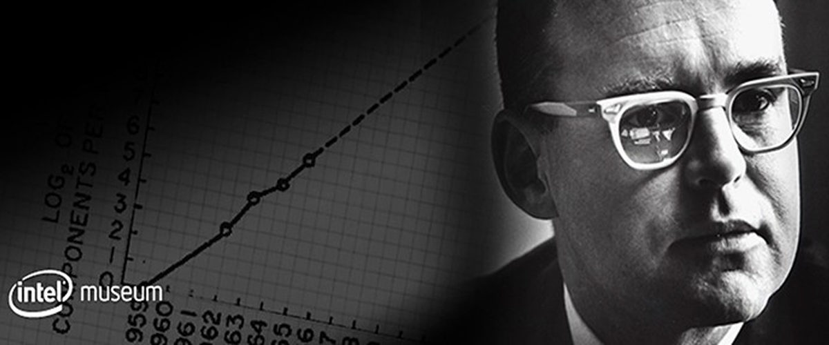
In 1965, Intel co-founder Gordon E. Moore wrote a predictive paper in which he described the phenomenon that the number of components in integrated circuits had doubled every year since their inception, and predicted that they would continue to do so. David House, another Intel exec at the time, then established the law that the number actually doubles approximately 18 months. Moore’s Law, as it is now famously called, is not only uncannily accurate, but is now serves as a long-term planning guide for the entire semiconductor industry.

What can we learn from this? We can understand that times are changing, and FAST! This is true in almost every industry, including the world of presentations.

We have gone from speeches from balconies, to hand written poster boards, to professional PowerPoint, to presentation experts working as PowerPoint consultants. While the presentational industry may not be doubling exactly every 18 months, it sure is growing quickly.

AngelList has quickly emerged as an indispensable resource for connecting entrepreneurs with investors, and has now become a unique platform for the presentational industry. The work AngelList does has given rise to several innovative start-ups rapidly changing the work presentation designers are doing. Presentate, 9slides, and GoAnimate are three currently revolutionizing the field of presentation design.

Presentate is a new online presentation software that works great in almost any resolution, on any desktop computer, tablet, or smart phone. With Presentate, you won’t have to worry about your PowerPoint coming out misshaped or with the wrong font or link. Your layout will be the same everywhere you open it. Their site has a fun example of how it works … I guarantee you’ll be entertained, at least for a minute.

9SLIDES is another innovative communication that “allows users to capture and share experience of ‘being there’ in the presentation room with a remote audience, anytime, anywhere.” The app is used for interviews, better transparency through inter-company communication, effective training, and interactive demonstrations. “Your audience can watch it on a PC, Mac or even iPad without downloading any app.” 9SLIDES’s concept as a whole is ultimately bringing the world an effective medium to share videos along with corporate presentations in a synchronized format.

GoAnimate is a do-it-yourself animated video website that believes it “might be for fun, to make a presentation, to illustrate historical scenes, make a demo video, or produce a piece of professional training.” With that they realize “producing video can be difficult, time-consuming and expensive. And sometimes it still comes out dark and blurry, with muffled sound.” Because of this issue, GoAnimate was created to minimize difficulty, hassle, and expense of video design and implementation. They have a sleek concept and pride themselves on being the fastest and easiest way to make a video!

Each of these start-ups is uniquely contributing to the prevailing advances in the presentation industry. We wish them the best, and know they will continue to impress us!

presentate         9SlidesNewLogo         goanimate