Choosing the Right Template for Your Presentation Type

powerpoint templates

PowerPoint tip

powerpoint tutorial

presentation design

Rick Enrico

SlideGenius

template colors

Your PowerPoint is your presentation visual aid. That’s why it should reflect your character as an organization or individual, from the deck’s content all the way down to the design. However, some presenters tend to overlook this aspect of PowerPoint and craft a deck that doesn’t match the message they want to convey.

If you want slides that will win your audience over, it’s best to have customized PowerPoint templates created specifically for your brand. However, if you’re pressed for time and budget, using templates with premade layouts can still do the trick, but that doesn’t mean choosing a generic design, though.

Choose the right PowerPoint template for your pitch by keeping three things in mind:

Make It Memorable

Compared to less strict occasions, presenting in a formal setup may call for a particular design. You’ll want to draw attention to your deck without being too loud or overly embellished. Experiment with various color schemes that will fit the essence of your pitch.

A combination of warm colors can attract your viewers’ gaze. On the other hand, cool colors will put them at ease. Although using these colors can evoke certain emotions in the viewer, the best way to get the audience to associate your brand with your deck is to use your company colors in your slides.

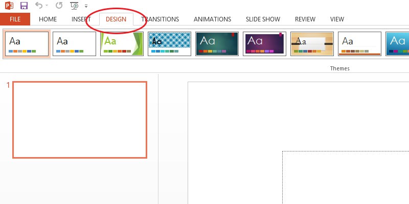
Select a template that already has your brand’s colors in it. If you can’t find one that exactly fits, you can change template colors without affecting the overall layout. PowerPoint provides an option under the Design tab that lets you do just that.

how to change color template in powerpoint

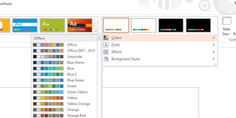
For Office 2013 users, simply click Colors under Variants group. A dropdown of various color combinations will appear. Change the template’s hues by clicking on the color scheme you want.

how to change powerpoint color scheme

Engage the Audience

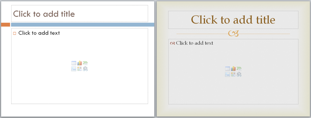
The success of your pitch lies in your audience’s response. Choose a template that resonates with your prospects to generate positive reactions. For example, most people want a deck with prominent visuals instead of blocks of text. In that case, you’ll be inputting more pictures and visual representations of data. Refrain from using templates that have elements such as frames and pre-installed illustrations. These graphics can clutter up your slide and distract your audience from your main point.

Leaving room for white space, or the absence of visible objects on your slide, relaxes the eyes and lets it focus on important points on your deck. Opt for cleaner slides you can overlap with big and bold images. If you’re planning to use images throughout your presentation, it’s best to do away with pre-installed graphics.

hot to change Format Background in powerpoint

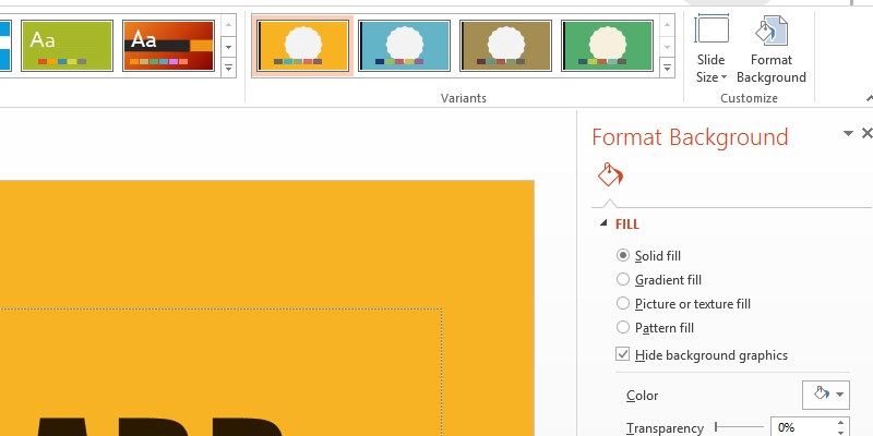
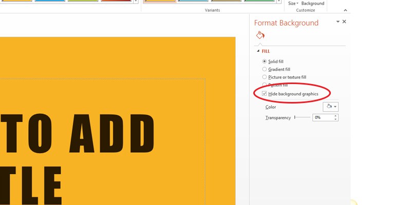
But if you’ve selected a template with illustrations and only want to remove them on a specific slide, take them out by going back to the Design tab.

Under Customize, click Format Background.

Select Hide background graphics to hide any pre-installed elements on the current slide.

How to Hide Background Graphics in powerpoint

Account for the Venue

Where your presentation is held can affect people’s perception of your pitch. Survey the area before the actual date of your presentation to get a good feel of what type of deck would suit the setting.

Consider things like lighting and the size of the place you’re presenting in. Your goal is to deliver your message in a readable and comprehensible deck. A template that’s already too bright in an open area may lose its visibility to any audience members sitting in the far back.

Conversely, a place where you can dim the lights gives you more leeway on saturating your template. Check that your slide elements are distinguished from their background. After all, contrast factors in greatly when it comes to readability. A slide with well-contrasted objects is visible from afar compared to slides with objects that are hardly distinct from one another. Use dark text on a light background, or vice versa, to highlight the slide object.

In Conclusion: Templates Can Work, If Used Well

A good template is the first step to a great deck design. Bright colors will grab attention, while subtler ones will relax the eyes. Avoid templates with distracting designs that will steal attention away from your key points. Choose a readable template that has high contrast to make your deck more viewer-friendly.

PowerPoint templates aren’t just a matter of playful design. Given the right template, you can interest and attract new clients. Make your pitch memorable with a deck that reflects your brand and fits the occasion.

References

Sibley, Amanda. “19 Reasons You Should Include Visual Content in Your Marketing [Data].” Hubspot. August 6, 2012. blog.hubspot.com/blog/tabid/6307/bid/33423/19-Reasons-You-Should-Include-Visual-Content-in-Your-Marketing-Data.aspx#sm.0001frknxr3k3dlkqq22lsqtd9h7a
“PowerPoint 2013: Modifying Themes.” GCFLearnFree.org. www.gcflearnfree.org/powerpoint2013/29

Featured Image: “Choice” by zhouxuan12345678 on flickr.com
www.flickr.com/photos/53921113@N02/5453214046
Design Ideas: How to Improve PowerPoint Templates

custom powerpoint templates

PowerPoint Design

powerpoint templates

Powerpoint tips

powerpoint tutorial

Using a PowerPoint template can save time and effort, but improving upon an existing template can help ensure that your presentation is unique, professional, and tailored to your specific needs. Here’s how to enhance PowerPoint templates and elevate your presentation design.


1. Customize the Color Scheme

Most PowerPoint templates come with a preset color scheme, but customizing these colors to match your brand or the theme of your presentation can make a significant difference.

Why It’s Important:

  • Enhances Brand Consistency: Aligning the color scheme with your company’s branding ensures a cohesive visual identity.
  • Increases Visual Appeal: A custom color palette that complements your content will make your slides more visually engaging.

How to Do It:

  • Go to the Design tab and click on Variants > Colors.
  • Choose Customize Colors to create a color scheme that fits your brand or presentation theme.

2. Use Custom Fonts

The fonts included in templates are often generic. Replacing them with custom fonts that align with your brand or add a modern touch can improve readability and visual appeal.

Why It’s Important:

  • Improves Readability: Selecting the right font ensures that your text is easy to read and fits the tone of your presentation.
  • Adds Personality: Custom fonts help differentiate your presentation from others using the same template.

How to Do It:

  • Highlight the text you want to change, then go to the Home tab and select a custom font from the dropdown menu.
  • Use sans-serif fonts for clarity and readability in body text and bold fonts for headings.

3. Incorporate High-Quality Visuals

Templates often come with generic images or icons. Replacing these with high-quality visuals, such as custom photos, branded icons, or professional graphics, can enhance the overall design.

Why It’s Important:

  • Improves Engagement: High-quality visuals capture attention and make your presentation more engaging.
  • Reinforces Your Message: Relevant visuals help illustrate key points and reinforce the overall message.

How to Do It:

  • Go to the Insert tab and choose Pictures or Icons to add relevant visuals.
  • Ensure images are high-resolution and appropriately sized for the slide.

4. Simplify Slide Layouts

Some templates may have overly complex or cluttered slide layouts. Simplifying these layouts can make your presentation easier to follow and more visually appealing.

Why It’s Important:

  • Enhances Clarity: Simplified layouts ensure that your audience can easily focus on the key message of each slide.
  • Reduces Distractions: A clean and organized design minimizes distractions and keeps the audience engaged.

How to Do It:

  • Remove unnecessary design elements, like background patterns or excessive text boxes.
  • Use white space effectively to create balance and focus on the most important content.

5. Add Consistent Branding

To ensure that your presentation aligns with your company’s brand identity, add consistent branding elements like your logo, taglines, and brand colors.

Why It’s Important:

  • Builds Brand Recognition: Consistent branding throughout your presentation helps reinforce your company’s identity.
  • Increases Professionalism: A branded presentation looks more polished and professional.

How to Do It:

  • Add your logo to the master slide so that it appears on every slide without manual repetition.
  • Use brand-approved fonts, colors, and graphics to maintain consistency across all slides.

6. Animate Purposefully

Many templates include animations by default, but not all animations are necessary or effective. Review and adjust animations to ensure they enhance the content rather than distract from it.

Why It’s Important:

  • Maintains Focus: Purposeful animation guides your audience’s attention without overwhelming them.
  • Improves Flow: Well-timed animations can help control the pace of your presentation, keeping the audience engaged.

How to Do It:

  • Use Fade or Wipe animations for a subtle, professional effect.
  • Avoid using too many animations on a single slide, and limit animation to key elements.

Final Thoughts

Improving a PowerPoint template by customizing colors, fonts, visuals, and layouts can make your presentation more engaging, professional, and aligned with your brand. Simplify unnecessary elements, add purposeful animations, and maintain consistent branding throughout to elevate your presentation from a basic template to a standout design.

Click to Add Title: Using PowerPoint Templates

powerpoint templates

Powerpoint tips

A PowerPoint template is a great place to start when you’re feeling clueless about how to design your slides. Once you’ve taken your pick, all you have to do is fill in the blanks and add your content. It’s quite a convenient method for those of us who weren’t given enough time to prepare for a presentation.

Despite this, we’ve all heard that PowerPoint templates aren’t always the best solution. Because of its preset format, working with a template can really stifle your creativity.

The placeholders automatically tell you where to text and images should go. Even if you decide to customize the template you chose from PowerPoint’s built-in gallery, you’ll only be able to change so much. After all your effort, your slides will look like other presentation decks, a standard headline on top with a bullet point list below it, or a picture on the right with some text beside it.

So how do you make your PowerPoint templates stand out when you’ve got very little time to think of a unique design? 

1. Look for unique templates at Microsoft.com

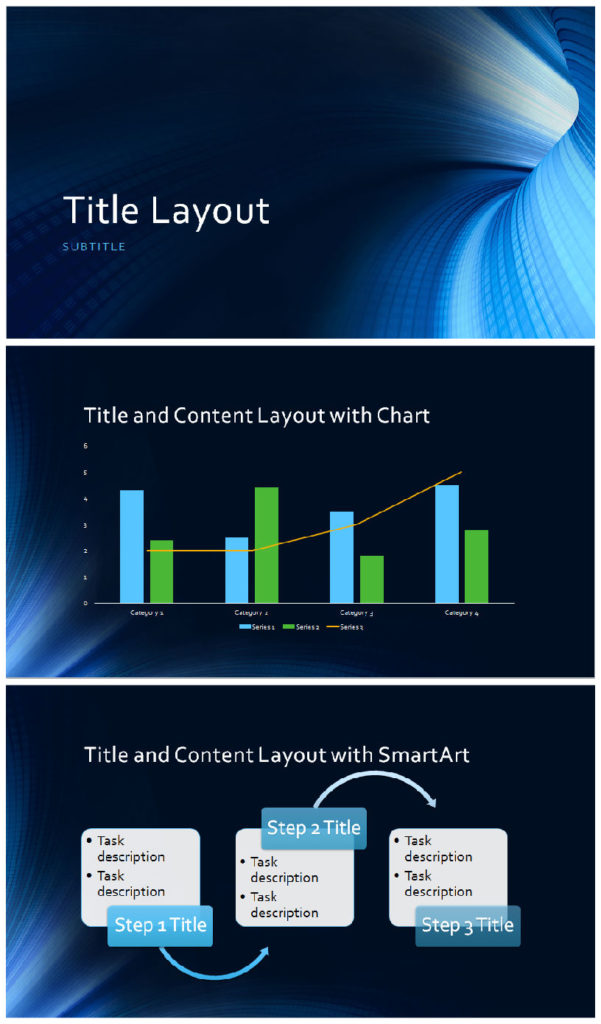
PowerPoint Template: Business Digital Blue (Download HERE)

The default templates in PowerPoint have been used to death in the business world. If you want to stand out without customizing each aspect of your slides, you can head on over to Microsoft.com and choose from a wide array of less common PowerPoint templates available there.

2. Change the layout

PowerPoint Template: Angles (Quote from Trade Show Institute | CC BY 3.0)

To avoid repetitive-looking slides, try to move around your placeholders and change up the layout. Try placing headlines at the bottom of your slides. Change up the position of your text. Better yet, minimize your use of bullet points and use images to illustrate your points instead. Be creative and experiment with the template at hand.

3. Integrate your brand colors

PowerPoint Template: Grid

One more thing you can do is change your template’s color scheme to something that mirrors your brand. This way, you don’t have to worry about integrating your company logo to your slides. Your brand will be well-represented throughout the presentation just by having the right colors.

The Final Word

Templates don’t have to be boring. You can change it up and apply your own style to it. Seek less used options online, either on the Microsoft site itself, or on other websites that provide quality templates you can use to your advantage. Tweak your layout by changing the placeholders and applying different color schemes on your slides. While you’re at it, why not integrate your brand colors to help impress your company identity on your audience throughout the presentation?

You can do all this yourself with a few clicks and the willingness to explore PowerPoint’s vast potential. Or, you could contact a presentation designer to help you get right off the bat. SlideGenius customizes templates to your liking. Contact us today for a free quote!

PowerPoint Templates: 4 Tips for Creating Your Own Design

powerpoint templates

Great content can easily be buried under mediocre PowerPoint designs. It’s likely that majority of your audience are visual learners, and the standard bullet point presentation will easily pass over their heads. Using PowerPoint templates that are tailored to support your content is a much better option.

You can choose to download PowerPoint templates online. You’ll find plenty of unique designs if you know where to look. However, if you want to make sure that your design perfectly complements your presentation, try these tips for customizing PowerPoint templates.

You don’t have to start from scratch.

Unless you’ve conceptualized how you want your presentation to look, starting out with a blank slide can be quite daunting. As is messing around with PowerPoint’s Slide Master function is time-consuming. Luckily, you don’t have to start from scratch with your PowerPoint templates. You can always start with any of the default PowerPoint themes or download from Microsoft.com and simply customize its color scheme and background.

Here are just some of the things you can do:

  • Instead of using solid colors for backgrounds, you can give your slides an interesting gradient effect. (Right Click on the slide and choose Format Background. In the dialog box, choose the Gradient Fill option.)
  • Use high-quality images as background for a few select slides. Choose images that are simple, with colors that match the rest of your slides. It should also go without saying that they have to be related to the theme of your presentation.
  • Use design programs like Pixie and Adobe Kuler to be able to choose colors schemes that are coherent with the rest of your PowerPoint template.

Give images a unified look with photo-editing tools.

The Internet has a wealth of images you can use for your PowerPoint templates. But choosing images from several sources can give your PowerPoint design a disjointed look. Some images might seem too saturated, while others might look too dark.

Give your pictures a unified look by making necessary adjustments and corrections with photo-editing tools. You can use Photoshop or web-based applications like PicMonkey. However, the best option, if you’re pressed for time is to just use PowerPoint. Simply click on the image you want to edit and go to the Picture Tools Format tab.

Be mindful of white space.

Whenever you want to design your PowerPoint templates, just keep in mind the importance of white space. Leave enough blank spaces to allow your content to stand out. Too much clutter isn’t only difficult on the eyes, it’s also distracting the audience from your message.

Find inspiration from other sources.

If you’re still feeling overwhelmed, you can source for inspiration from PowerPoint design experts.

View samples of our work here, and you’re sure to find something that will help your presentation.

There’s inspiration to be found everywhere. The best thing to remember when creating your own design—regardless if it’s for PowerPoint templates or something else—is to keep an open mind.

Reference

“The Visual (spatial) Learning Style.” Learning Styles. Accessed June 26, 2014. www.learning-styles-online.com/style/visual-spatial

Featured Image: “Yellow Green Orange fluorescent marker on white background” by photosteve101 on flickr.com

What Your PowerPoint Presentation Says About You

powerpoint presentation

powerpoint templates

Using a PowerPoint presentation in pitches, meetings, conferences, etc. is a great way to explain a concept.

The thing is, have you been using it properly? Whether you’re using it correctly or not, your presentation says a lot about you as a presenter.

Overreliance on Templates

Microsoft PowerPoint comes with templates ready for your presentation. Aside from these, there are also online templates you can download to the program.

These templates offer you the advantage of creating slides with consistent designs requiring minimal effort. All you have to do is copy-paste the information that you want to present.

With these benefits, it may seem like using ready-made templates makes more sense than resorting to unique, personalized ones. Well, if you’re a person who prefers to take shortcuts, then indeed it does. But if you are the type who won’t settle for less, then you know that cookie cutter templates don’t create as much of a lasting impact.

Too Much Text

The thing about slides is that they help presenters describe their ideas – visually. Using too much text to do so kind of defeats the idea.

Filling you slides with texts would leave your audience thinking either of these things: You are too lazy to sort out the most important details of your topic or, as speech trainer George Torok says, you plan to read from them. Both of which aren’t exactly putting you in a good light.

As much as your slides should be able to speak for themselves, there should be room left for your own voice. Allow yourself to explain your key points. Leave out details that you can say verbally. Your listeners will appreciate it more than seeing you read from a wordy slide.

Poor Choice of Images

Imagery can make it easier for you to explain your points. Be very careful, however, on your choice of images. Make sure that you only use high-quality photos that won’t become blurred or pixelated when projected on a large screen. Avoid using clip art as well.

Sure, images are extremely useful. But they also need to be relevant and of professional quality.  You can’t use just about any image that you find using Google search.

It gives the impression that you don’t care enough about the quality of your presentation and by extension, your audience. Instead, invest in stock images from sites that provide them for free. You can find a quality image that fits your pitch much better there.

Conclusion

Your PowerPoint presentation is an awesome tool. It provides you with a way to not just explain your message clearly but also to assert your professionalism and credibility.

This means you need to pay attention to the way you prepare your slide decks.

Otherwise, you’ll end leaving a not-so-good impression on your audience, which leaves the potential of a winning presentation untapped.


Reference

Annoy Your Audience: Read Your PowerPoint Presentation Slides.” Torok. Accessed June 09, 2014.


Featured image by eye-socket from DeviantArt