Recover Your Unsaved File in PowerPoint 2013

powerpoint 2013

Powerpoint tips

Unsaved work can happen for a number of reasons. It can happen when there’s a power failure or a system crash, or for whatever reason, maybe you just forgot to hit “Save.”
Don’t worry. Recovering an unsaved file is possible in PowerPoint. In fact, there’s more than one way to recover it. These features are enabled by default, so you’re guaranteed to get your file back.
Be warned that it’s generally not recommended to change these settings because you’ll never know when you need to save unsaved work again.
This guide will point you to where an unsaved file usually goes and what to do to recover it.

Unsaved Files

For owners of Microsoft Office 2010 and higher, recovering an unsaved file is made even easier. However, for users that have the older version of Microsoft Office, refer to this link.
This tutorial will be using PowerPoint 2013, meaning we can access the option also known as AutoRecover.
1. Go to the ribbon and click on File.
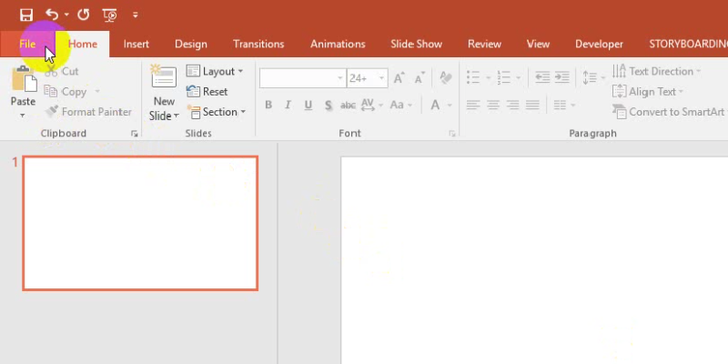
recover your unsaved file in PowerPoint 2013: Autorecover
2. In the second column that displays Recent Presentations, scroll down to the bottom and you’ll see a button that reads Recover Unsaved Presentations.
recover your unsaved file in PowerPoint 2013: recover unsave powerpoint
The files in this folder are only stored temporarily, so save your recovered file properly once you find it. Temporary files are deleted automatically from the system. Do not rely on recovery methods to save your work.
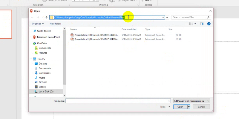
3. A dialog box labelled “Open” will appear which will contain your unsaved file.
recover your unsaved file in PowerPoint 2013: label
Click on the address bar as highlighted in the image. This will show the filepath, displaying the exact location of your file.
Copy and paste the filepath to Windows Explorer: C:\Users\<username>\AppData\Local\Microsoft\Office\UnsavedFiles
Don’t forget to replace <username> with yours when copying the filepath from this article:
You can retrieve an unsaved presentation using this method with ease.

Interrupted Changes

This next method is suitable when your changes were interrupted and you wish to restore the changes you made in your work.
1. Go to the ribbon and click on File> Options.
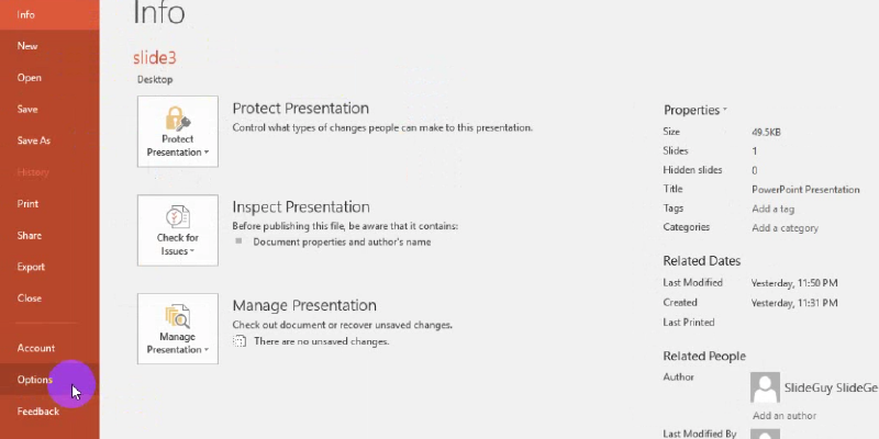
recover your unsaved file in PowerPoint 2013: interruptive changes
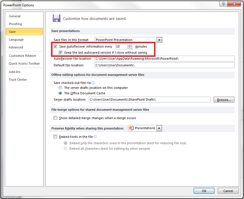
2. A dialog box called “PowerPoint Options” will appear. Go to Save and see if the boxes are checked ☑ in the highlighted image. If yes, then you may proceed to the next step.
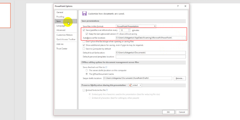
recover your unsaved file in PowerPoint 2013
These options need to be present to restore your file’s unsaved changes. You won’t be able to recover your file’s previous state when these aren’t checked.
3. Copy the filepath located in the box beside AutoRecover file location. The file can be directly accessed by pasting the filepath in Windows Explorer.
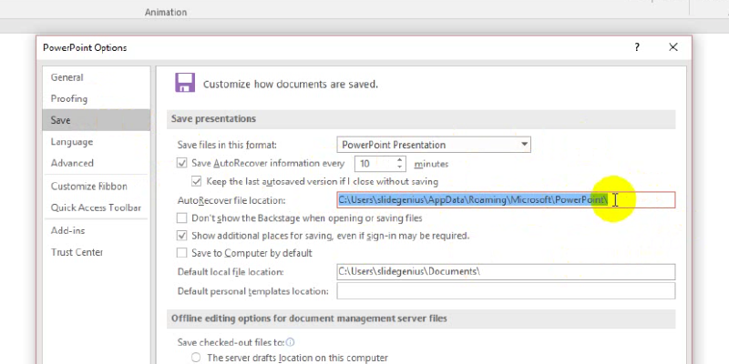
recover your unsaved file in PowerPoint 2013: autorecover file location
Since this tutorial uses PowerPoint 2013 and runs on Windows 8, the filepath looks like this:
C:\Users\<username>\AppData\Local\Microsoft\Office\UnsavedFiles
This filepath will lead you directly to your file. Save this as a separate PowerPoint file and pick up the changes from where you left off.

A Few More Pointers

Avoid relying too much on the recovery functions to save your work because they’re only hosted temporarily in their respective folders. If you leave them there, you’ll never be able to retrieve them after a certain period of time has passed. Always remember to save your files outside of these temporary file folders.
You also don’t want to risk damaging or corrupting your presentation save-states by changing the save settings in PowerPoint. It can be tempting to tweak the settings, but only advanced users should make these changes. In fact, changing these settings is highly discouraged because file recovery is placed there by default for good measure.
Save yourself from any potential headaches in the future and save your files properly.

Resource:

“Recovery of MS PowerPoint Content from Temp Files.” officerecovery.com. www.office-recovery.com/powerpoint.asp
Save Your Deck: Methods to Recover an Unsaved PowerPoint File

powerpoint file recovery

Powerpoint tips

powerpoint tutorial

Sheer panic—that’s probably your first reaction when you realize that you couldn’t save the PowerPoint file you were working on. Maybe the power went out, or your computer unexpectedly crashed. Perhaps you were too preoccupied that you didn’t think to hit “Save.” Whatever the reason, you’ve suddenly lost hours of hard work and have no clue how to get it all back.
Luckily, there’s no reason to stress over losing an unsaved PowerPoint file. Using the latest versions of PowerPoint, you can easily retrieve and recover all your hard work. Follow these steps to recover a PowerPoint file you accidentally lost:

Need a Presentation Designed?
Click Here To View Our Amazing Portfolio!

Method One: Recover Unsaved Presentations

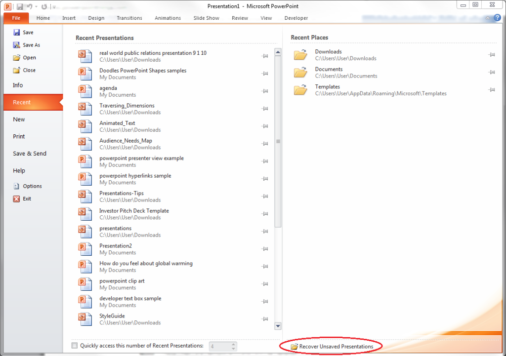
If you were interrupted before saving your PowerPoint file, you could simply look for it in the Microsoft Unsaved Files folder. Go to the File tab, make sure you’re on Recent, and click on Recover Unsaved Presentations. The icon is right below the list of folders under Recent Places.

Recover-Unsaved-Presentations

Everything in the Unsaved folder is a temporary file. Make sure you recover and save everything you need because you might lose it after a few days.

Method Two: AutoRecover

If you’ve been periodically saving your work but was interrupted before you could save specific changes, you can retrieve your PowerPoint file using the AutoRecover function. First, check if you have it enabled. Go to the File tab, click on Options and go to Save. Make sure your options are similar to those in this picture:
PowerPoint-Files-AutoRecover
If you don’t have AutoRecover enabled, there’s no other way to retrieve the changes you made to your PowerPoint file. You will have to redo your work from the last save. But if everything looks good, you can then follow these steps:
1.) Copy the file destination path in the same dialogue box.
PowerPoint-Files-AutoRecover-02
2.) Open Windows Explorer, paste the path on the address bar, and hit Enter.
PowerPoint-Files-AutoRecover-025
To avoid losing crucial information, ensure AutoRecover is enabled every time you create a PowerPoint deck.

Need a Presentation Designed?
Click Here To View Our Amazing Portfolio!

ConclusionSGBlog_SaveYourDeck_Supporting image_SG01_JE-01

Retrieving an unsaved PowerPoint file is a no-brainer as long as you know these basic recovery methods.
You can either open the “Recover Unsaved Presentations” found in the “Recent Places” or use the AutoRecover function to check where that unsaved document must be hiding.
Learn these tricks by heart so you don’t have to worry about getting your presentation back!

Presentation Resolutions: 3 Tips to Help You Progress This Year

2014

Business Overview Presentation

Custom Designed Presentations

PowerPoint Agency

PowerPoint Design

PowerPoint design experts

PowerPoint Experts

PowerPoint specialist

Powerpoint tips

Presentation Agency

Presentation Company

Presentation Consultation

Presentation Designers

Presentation Firm

presentation specialist

resolution

Rick Enrico

SlideGenius

As the new year begins, it’s the perfect time to set resolutions for improving your presentation skills. Whether you want to become more confident on stage, create more impactful slides, or engage your audience more effectively, making a few small adjustments can significantly improve your presentations.

Here are three tips to help you progress with your presentation skills this year:


1. Focus on Storytelling

Great presentations aren’t just about delivering information—they’re about telling a compelling story. This year, focus on developing your storytelling abilities to make your presentations more engaging, relatable, and memorable.

Why It Works:

  • Creates Emotional Connection: Storytelling helps your audience connect with your message on an emotional level, making it more memorable.
  • Simplifies Complex Ideas: Stories are an effective way to simplify complex information and make it easier for your audience to understand.

How to Apply It:

  • Think of your presentation as a narrative, with a clear beginning, middle, and end.
  • Use personal anecdotes, case studies, or customer stories to illustrate key points and make your presentation more relatable.

Example: Instead of just listing product features, tell the story of how one of your customers used the product to solve a significant problem.


2. Invest in Visual Design

Well-designed slides can elevate your presentation and make it more visually engaging. This year, focus on improving your slide design by keeping things simple, using high-quality visuals, and ensuring that your slides support your message rather than distract from it.

Why It Works:

  • Enhances Understanding: Clear, well-designed visuals help your audience understand and retain information more effectively.
  • Keeps the Audience Engaged: Visually appealing slides capture attention and keep your audience engaged throughout the presentation.

How to Apply It:

  • Use a consistent color palette and clean, professional fonts throughout your slides.
  • Limit the amount of text on each slide and use visuals such as images, graphs, or diagrams to convey information.

Example: Replace text-heavy slides with simple, bold visuals that reinforce your key points, allowing you to speak directly to the audience instead of reading from the slides.


3. Practice Your Delivery

Effective delivery is just as important as the content of your presentation. This year, focus on practicing your delivery to become more confident, articulate, and engaging when presenting. Practice helps you refine your timing, tone, and body language, all of which contribute to a more polished performance.

Why It Works:

  • Builds Confidence: The more you practice, the more comfortable you’ll feel when presenting in front of an audience.
  • Improves Timing: Practicing your delivery ensures that you stay on time and maintain a steady pace throughout your presentation.

How to Apply It:

  • Rehearse your presentation multiple times, either in front of a mirror or by recording yourself to assess your performance.
  • Focus on maintaining good posture, using hand gestures naturally, and varying your tone and pace to keep the audience engaged.

Example: Set aside time to practice your presentation with a friend or colleague who can provide feedback on your delivery and suggest areas for improvement.


Final Thoughts

Improving your presentation skills takes time and effort, but by focusing on storytelling, investing in visual design, and practicing your delivery, you can make significant progress this year. These resolutions will not only enhance your presentation performance but also help you connect more effectively with your audience and leave a lasting impression. As you set your goals for the year, remember that small, incremental improvements can lead to substantial growth over time.

Design that Speaks: Styling PowerPoint Background Designs that Work

design

PowerPoint Background Design

PowerPoint Design

Powerpoint tips

Rick Enrico

SlideGenius

Designs add depth to content. They are useful for PowerPoint presentations, especially when words alone aren’t explicit enough.

Ideally, PowerPoint pitches should consist of a limited amount of words. Therefore, being expressive is a challenge. Usually, they only contain keywords but because designs impose tone or suggest interpretation, they become more comprehensible.

Studies suggest that elements of art have several different connotations to them. However, they are seldom obvious. It’s common to people that yellow is a happy color or that red looks romantic. But for the average majority, that’s just about it.

Using Psychology in Design

Many know psychological interpretations of art elements such as color, but only a few use this knowledge to their advantage; or at least see them as advantageous.

The ability to understand psychology in design and creativity, and use them in presentations is powerful. “When design and behavior match, the design will be superior,” said Simon Norris in an article. The more psychological effects a slide possesses, the more value it has.

PowerPoint background designs, as much as content does, play a crucial role in persuading audiences. They can influence how others think about you and how they react to you.

One of the secrets in creating a successful business pitch is by connecting with your audience. By appealing to their emotions, you help them remember the idea of your message.

Create effective PowerPoint pitches by incorporating knowledge on useful art psychologies. Know how various elements of art can be used to attract audiences through this infographic.

https://www.slideshare.net/SlideGenius/design-that-speaks-styling-powerpoint-background-designs-that-work

Resource:

“Visual Communication and The Psychology of Design.” SuperGraphics. www.supergraphics.com/blog/visual-communication-and-psychology-design

Looking for creative presentations that can leverage your business? Enjoy free PowerPoint templates from SlideStore! Sign up today.

3 Business PowerPoint Building Lessons from IKEA Furniture

powerpoint presentation

Powerpoint tips

presentation

presentation techniques

Rick Enrico

SlideGenius

IKEA furniture can be one of the most stressful things to assemble, especially when collaborating with others. In fact, California State University professor and therapist Dr. Ramani Durvasula observed that couples end up arguing during two phases.

The first is while picking which items to buy, the second, while they assemble the items. Strangely enough, even presenters can learn a few things from building them. After all, Dr. Durvasula even said that the assembly process is about communication, collaboration, and respect.

It just so happens that these three are important components for building a convincing business PowerPoint presentation.

Let’s take a look at how these three presentation techniques can help you with your next pitch:

1. Communication Clarifies Confusing Instructions

Manuals are there for a reason.

After all, furniture needs to be assembled in a certain way to be useable. There will be times when IKEA’s instructions aren’t understandable.

This is no different from building a business PowerPoint presentation. Every presentation needs a solid idea, supporting points, and a call to action. To complicate things, clients will always want your pitch presented in a certain way. Some may want you to focus on the benefits of your proposal, others may prefer you emphasize costs.

Communicating with them in a clear and proper manner will clarify what they expect from your pitch. That way, you learn to filter the most relevant content to include in your business presentation and give clients exactly what they want.

2. Collaboration Gives Better Ideas

There are some pieces of IKEA furniture that need two people to assemble, similar to how business presentations often require a team effort.

Your market share info could come from your researchers, the slide templates from your creative team, and product information from your sales managers. This is where most of the arguments take place.

If someone simply gives orders to the team without understanding what the client expects, this can come off as unprofessional and disrespectful. Try to be more open to ideas that other members of your sales team could pitch in. It could be just the right fit for your presentation and give you what you need to outsell the competition.

3. Respect Helps Reduce Stress

It’s no secret that couples end up fighting whenever they build an IKEA piece. Some would just give instructions and leave the assembly to the other person, others would end up insulting each other.

These are all indicative of a lack of respect, which severely affects teamwork and builds stress. In building a PowerPoint, a certain amount of respect is needed, especially when a team is making it.

By understanding what each person can do, you enjoy a better team dynamic in building your pitch.

With respect, ideas flow faster from one person to another, making the collaboration more fun, especially if you are familiar with what your team can do. The most confident person could be assigned as the main speaker. A tech-savvy person could take care of getting the information your pitch needs. Meanwhile, a design-oriented person can take charge of assembling the slide deck.

Collaborating with each other and understanding what your client needs will keep your PowerPoint simple and effective without unneeded distractions.

Bonus Tip: Know When to Ask For Help

Stress will always be a part of assembling anything, from a piece of IKEA furniture to a business PowerPoint presentation.

Communicating with your clients and team members can clarify exactly what your pitch needs. The extra legwork even has the potential to make your ideas more relevant and convincing.

Collaborating with your team defines what each one will need to do, from getting information, to making the deck and presenting it. Respecting each other’s capabilities will make the whole process faster and less stressful. Of course, there will also be times when you need to ask for help.

When it comes to taking your PowerPoint to a professional level, consulting with a professional presentation designer will always be a wise investment.

References

Potkewitz, Hilary. “Can Your Relationship Handle a Trip to IKEA?” WSJ. April 22, 2015. Accessed August 13, 2015. www.wsj.com/articles/can-your-relationship-handle-a-trip-to-ikea-1429724227

Willett, Megan. “Assembling IKEA Furniture Is Apparently a Unique Form of Couples Therapy.” Business Insider. May 4, 2015. Accessed August 13, 2015. www.businessinsider.com/ikea-furniture-relationship-problems-2015-5

Featured Image: “tool chest DSC_0558” by el cajon yacht club on flickr.com

3 Cost-Effective PowerPoint Tips to Enhance Your Deck

artistic effects

Powerpoint tips

powerpoint tutorial

presentation

Rick Enrico

slide elements

SlideGenius

PowerPoint is designed to be a user-friendly tool. Because of this, anyone can easily access and operate the program to create a basic deck.

However, we’ve barely scratched the surface of this diverse presentation program.

There’s more to the visual aid than meets the eye.

Here are three tips on how to save time with PowerPoint to ease your design process:

1. Edit Your Images in PowerPoint

If you’re struggling with a third party program and you want to see your pictures alongside the actual slide layout, edit your images directly in PowerPoint.

Although this won’t give you the same flexibility compared to editing programs like Photoshop, it does give you options to enhance images in your slides. You can use this option for basic formatting, especially if you’re still beginning with design essentials.

A Format tab will appear once you’ve selected your desired object. Explore the options on this tab to transform your pictures into attractive slide elements.

One of the most common editing tools in PowerPoint is the Crop tool. It cuts your image down to size without adjusting its dimensions.

You can also select a number of designs for your image with Picture Styles. This frames your picture, and even changes its shape and angle.

Draw attention to key objects without needing to make the rest of your slide too plain. Tick Artistic Effects to make your images stand out from your background.

Editing straight in PowerPoint saves you time and money that would have taken to design your images in a separate platform.

2. Adjust Your Slide Size

Most presenters stick with the default slide dimensions on PowerPoint. Earlier versions were in the standard 4:3 square size. There worked best for presentations that will be printed later on.

This changed with PowerPoint 2013 onwards, where the default slide size used the 16:9 widescreen format. This configuration was used with visual content reserved only for on-screen presentations.

Other than that, these later versions now also let you adjust your slides to whatever size you choose.

PowerPoint 2013 users will find this option under the Design tab. Click Slide Size > Custom Slide Size to modify your slide according to the size you want it to be.

According to the guide, 4:3 is best used for decks to be printed or presented on different media. On the other hand, 16:9 is best for presentations that are going to stay on screen, particularly for formal conferences or business presentations.

Knowing which sizes are compatible with your presentation leaves out the trouble of printing slides that are too small, or presenting a deck that’s too big onscreen.

3. Check Out Their New Features

PowerPoint is a constantly evolving program.

Its developers are aware of the criticisms hurled against it, so the presentation aid’s been optimized to respond with even better features.

For example, just last year, Microsoft released two new add-ins for Microsoft 2016 – Designer and Morph.

Designer eliminates the hassle of customizing layouts and color schemes to fit your chosen background. Just insert an image in PowerPoint and the program will analyze what design goes best with it.

Morph also gives you an easier job at crafting transitions and basic animation.

Simply drag the object you want to animate along a path after clicking the Morph option, and the slide element will follow that path once you play the Slide Show.

Make sure to check the new add-ins for a cost-effective PowerPoint that improves both your experience and deck design.

Conclusion

PowerPoint is a deceivingly simple tool to use, but there are plenty of things yet to be discovered about its functions. Most of these will help you cut back on time and effort, while still producing a winning deck for your presentation.

Edit your images directly in PowerPoint using the options in the Format tab.

Adjust your slide size to match your presentation type.

Always update yourself with the latest PowerPoint add-ins to find out what can make your designing a breeze.

Need help with your presentation design needs? Contact our SlideGenius experts today for a free quote!

Reference

“What Slide Size Should You Use?” Presentitude. November 19, 2014. Accessed December 29, 2015. http://presentitude.com/slide-size-use

Three Principles for a Minimalist PowerPoint Design

powerpoint designs

Powerpoint tips

presentation

Rick Enrico

slide deck

SlideGenius

Here are three key principles for creating a minimalist PowerPoint design, ensuring clarity, professionalism, and impact:

1. Limit Text and Focus on Key Points

  • Why it works: Minimalist design emphasizes brevity and clarity. Too much text on a slide can overwhelm the audience, distracting them from the key message. By limiting your slides to a few key words or short phrases, you help the audience stay focused and make it easier for them to follow along.
  • How to apply: Aim for one main idea per slide, and limit your text to 3-5 bullet points or short phrases. Use your verbal delivery to expand on these points.
  • Supporting examples: According to Garr Reynolds in Presentation Zen, less text on slides encourages better audience engagement because they are not reading off the slides but listening to the presenter.

2. Use White Space Strategically

  • Why it works: White space (or negative space) gives slides breathing room, helping important content stand out and preventing clutter. It ensures that each element on the slide has room to be easily noticed without visual competition.
  • How to apply: Space out text, images, and other elements, avoiding overfilling slides with too many objects. Use wide margins and ensure there is enough blank space around your key elements to enhance focus and readability.
  • Supporting examples: The use of white space is central to minimalist design in many fields, and according to the Nielsen Norman Group, white space improves legibility and allows the audience to better absorb information.

3. Choose Simple, High-Impact Visuals

  • Why it works: In minimalist design, visuals are used to reinforce the message, not distract from it. Choosing simple, high-quality images or icons that directly relate to your content will make your presentation more memorable and visually appealing without overwhelming the audience.
  • How to apply: Avoid decorative images or complex diagrams. Instead, use single, impactful visuals that support the key message. Keep images and icons consistent in style and color to maintain a cohesive look.
  • Supporting examples: A minimalist slide deck for sales pitches or corporate presentations often includes sleek, high-resolution visuals paired with limited text, focusing on the core message. Research from HubSpot suggests that using relevant images can increase audience comprehension and retention.

By applying these principles, you can create a clean, professional PowerPoint design that communicates your message clearly and powerfully.

Display a Live Twitter Feed in PowerPoint 2016

Infographic

live feed

Powerpoint

PowerPoint Design

Powerpoint tips

Rick Enrico

SlideGenius

Tutorial

Twitter

twitter feed

Adding a live Twitter feed in your PowerPoint is one of the many ways to make your presentation more engaging. Fortunately, only a few presenters know how to insert a website in their presentation, which is why using this feature gives you the opportunity to take advantage of your listeners’ curiosity and make a good, lasting impression.

Apart from spicing up your presentation by making it interesting and more interactive, having a live Twitter feed lets you expand your ideas as you deliver your speech. You can show it during the first part of your presentation to encourage the audience to tweet about your talk, or with the help of a hashtag, put it at the end of your speech to show them the live tweets of the event.

To get a clear picture of how to successfully add a live Twitter feed in your presentation, here’s an infographic that will give you a step-by-step tutorial using PowerPoint 2016.

https://www.slideshare.net/SlideGenius/display-a-live-twitter-feed-in-powerpoint

3 Bullet Point Alternatives that Will Improve Your Deck

bullet point

PowerPoint taboos

Powerpoint tips

presentation

Rick Enrico

SlideGenius

visual design

PowerPoint is one of the standard presentation tools of our time. It’s undergone plenty of changes and has come a long way since its inception.

Throughout the course of innovation, some features have become outdated by the turnover of new design trends – this includes tacky transitions and flying word art. The bullet point stands as one of these features, taking its place beside Comic Sans in Jarek Wasielewski’s list of PowerPoint taboos on ClickMeeting.

[sg-blog-modules module=two]

The reason behind this is that bulleted lists are mistaken as a way of loading more text on a slide. Although they previously acted as a replacement for sentence chunks and long-winded paragraphs, bulleted slides tend to do the same thing and saturate its viewer with too much information.

Relieving your audience of the information overload on your deck can help them process your points better.

Avoid pushing your viewers’ limits with the bullet point, and opt for these timely alternatives:

1. Single-Text Slides

It may seem counterintuitive, but one of the solutions to the overflowing text of wild bullet points is also text.

By this we mean, one word per slide, or at the most, a phrase. The less words on your slide, the more room you have to expound on your points, and the more opportunity you have to draw attention to yourself as the speaker.

Your PowerPoint shouldn’t be a replacement for your stage presence, so don’t let it overshadow you. Only put in keywords that will serve as the takeaway for your further discussion. This also serves as consideration for your listeners, since people can only process so much information at a time, according to Psychology Today.

Make sure your audience retains most of your presentation by giving them single-text slides that only highlight important parts of your pitch.

2. Powerful Images

Images can also have the same effect as keywords. In fact, they may even have a greater impact. Karla Gutierrez of SHIFT eLearning stated that majority of the population are visual learners, meaning they process visual information more than simple text or verbal instruction.

Placing pictures related to your discussion instead of jotting down text in a bulleted list helps viewers associate your words and your slide with the emotions these images stir in them. Be creative in picking out the image you place on your deck. Consider basic graphic design principles to maximize the effect it will have on your audience.

These principles include white space, color, and contrast to emphasize a crucial aspect of an image and evoke feelings in the viewer. Depending on how they’re used, these elements can have different effects on people. Play around with your visual design to get the reactions and attention you want from your listeners.

[sg-blog-modules module=three]

3. Diagrams and Visual Data

Images are good for eliciting reactions from viewers, but if you want something that’s both informative and attractive, present visual data.

These include diagrams, bars, graphs, and pie charts, which can make hard information easier to digest for an audience member who doesn’t want to get overwhelmed by the numbers.

Don’t settle for bullets on your slides in presenting the figures. Visual data summarizes all those points neatly for you, giving you leeway to discuss the details.

However, presenting information visually still requires some graphic design on your part. Use warmer and more attractive colors to draw eyes towards your information and help them focus on it.

When it comes to diagrams and charts, labeling your data is essential. Don’t assume that your audience knows what the colors and lines stand for.

Putting up something like a legend for the viewers’ reference can greatly help them understand the information you’re presenting.

The Takeaway: Drop the Bullet

There are many ways to design your deck. Avoiding a slide deck faux pas can mean something as simple as cutting back on bullet points and opting for more timely alternatives.

Keeping a single keyword or phrase on your slides will help the audience remember these points better after your presentation. In the same way, putting images instead of words can help them associate the emotions created by the image with your speech.

If your purpose is both to attract and inform, use diagrams to summarize numbers into neat visual treats for the eyes. Still having trouble choosing the right design? Contact our SlideGenius experts today for a free quote!

Featured Image: “Success by Design: Negotiation Spread” by changeorder on flickr.com

How to Loop a GIF Background in PowerPoint 2013

animation

gif

powerpoint presentations

Powerpoint tips

Rick Enrico

SlideGenius

GIFs (Graphics Interchange Format) can bring motion and energy to your PowerPoint presentation. Whether you’re using a GIF as a background or as part of your content, looping it correctly ensures that the animation repeats smoothly throughout your presentation. Here’s how to loop a GIF background in PowerPoint 2013.


1. Insert the GIF into Your Slide

To use a GIF as a background or part of your presentation, you first need to insert it into your slide.

Why It’s Important:

  • Adds Dynamic Visuals: GIFs can add motion to your presentation, making it more visually engaging.
  • Provides Continuous Animation: A looping GIF keeps the motion going, maintaining the dynamic energy throughout your presentation.

How to Do It:

  • Go to the Insert tab, click Pictures, and select This Device.
  • Navigate to the location of your GIF, select it, and click Insert.

2. Set the GIF as the Background

If you want to use the GIF as a slide background, you’ll need to adjust its size and positioning to cover the entire slide.

Why It’s Important:

  • Creates a Visually Engaging Background: A GIF background can add movement and life to an otherwise static slide.
  • Enhances Presentation Design: A well-chosen GIF background can align with your theme and create a professional look.

How to Do It:

  • Once the GIF is inserted, drag the corners to resize it until it covers the entire slide.
  • Right-click the GIF, choose Send to Back, so it doesn’t cover other content on the slide.

3. Set the GIF to Loop Continuously

By default, GIFs in PowerPoint don’t always loop. To ensure that your GIF background loops seamlessly throughout the presentation, you need to adjust the settings.

Why It’s Important:

  • Ensures Smooth Playback: Setting the GIF to loop ensures that it plays continuously without restarting or pausing.
  • Keeps the Animation Going: A looping GIF maintains the motion throughout the duration of the slide.

How to Do It:

  • Click on the GIF to select it.
  • Go to the Playback tab in the ribbon, and under Video Options, check the box labeled Loop until Stopped.

4. Test the GIF in Slideshow Mode

Once you’ve set your GIF to loop, it’s important to test it in Slideshow mode to ensure that it works as intended.

Why It’s Important:

  • Avoids Technical Issues: Testing ensures that the GIF loops smoothly without interruptions during your presentation.
  • Ensures Consistent Motion: Make sure the GIF continues to loop without restarting or freezing.

How to Do It:

  • Press F5 or click Slide Show > From Beginning to start the presentation.
  • Watch the GIF to ensure it loops smoothly and doesn’t disrupt the flow of your presentation.

Final Thoughts

Looping a GIF background in PowerPoint 2013 is a simple yet effective way to add motion and energy to your presentation. By setting your GIF to loop continuously, you ensure that it plays smoothly throughout the duration of your slide, keeping your audience engaged and enhancing the overall visual appeal of your presentation. Just be sure to test the GIF in Slideshow mode to guarantee seamless playback.