Boosting Your Body Language for Better Presentations

body language

Confidence

eye contact

facial expressions

posture

presentation experts

Presentation Specialists

presentation storytelling

Preparing the content of your deck is only half the battle in delivering a presentation. You can have the most beautifully designed and eloquently written presentation in history, but if your public speaking skills are not up to snuff, then it will be all for naught. Your body language can tell a different story.

[sg-blog-modules module=one]

As the saying goes, “it’s not about what you say, but how you say it.”

Simply put, delivering a good presentation takes demonstrating good body language. Presentation experts will tell you, beyond simply knowing your content, it’s important to be able to show confidence and relatability in front of your audience. When your body language complements your content, then you’re sure to deliver a great presentation.

In this article, we’ll tackle the key aspects of body language that will boost your presentation skills to the next level.

Posture

Whether you’re sitting down or standing up, how you carry yourself greatly affects the entire mood of your presentation. You never want to be caught slouching, as it makes you look lazy and unprofessional.

Maintaining an upright and open posture presents a confident and charismatic stance to your audience. It also makes you feel more confident.

A good tip is to loosen up before your presentation. It’s meant to release all the nervous tension that may cause you to stand or sit in awkward positions.

Eye contact

Perhaps one of the most neglected steps in presenting is establishing a good connection with the audience.

The stronger the connection, the more receptive your audience will be to what you’re presenting. The quickest way to develop that is with eye contact. It sends a subtle message that you are paying attention to them, making you deserve their attention.

It may seem like a small detail, but it also subconsciously tells them how confident you are in your presentation.

Facial expressions

While we’re on the topic of connections, remember to be aware of your facial expressions.

When it’s appropriate, you’ll want to smile as much as possible. No one enjoys sitting through a presentation from someone who looks like they do not want to be there.

Remember that audiences tend to mimic or feed off the emotions of the presenter facing them.

With a smile on your face, you have the power to uplift the room you step in front of.

Gestures and Movement

As the presenter, it’s your mission to keep your audience engaged. Incorporating hand gestures and movement can be what makes the difference between a dull presentation and a captivating one.

Think of your arms and legs as storytelling tools. Hand gestures add emphasis to your speech while movement along the stage can guide the attention of your audience. And like any tool, you must handle these with care and precision. You need to strike a balance in your use of gestures and movements so that they come off as part of your natural motions and not overly rehearsed.

While presentation styles may vary from person to person, body language is universal. It’s a form of communication that speaks beyond words and potentially adds to the impact of your presentation.

To presentation specialists, using subtle hints in body language is an invaluable skill in communication and public speaking. With enough practice, you’ll be instinctively using your body language to deliver more dynamic presentations.

To learn more ways to elevate your presentations, you can contact us anytime! At SlideGenius, it’s our passion to design exceptional PowerPoint presentations. We believe that good business starts with a well-made presentation.

Let us handle the designs, while you can practice on your delivery!

[sg-blog-modules module=two]

Should You Distribute Handouts on Your Next Presentation?

handouts

information overload

Powerpoint

powerpoint presentations

presentation experts

presentation handouts

print collateral

print services

sales pitch

After each sales pitch, speakers can only hope their audience had taken something from their presentation—to have engaged the audience enough for the speaker to be remembered.

[sg-blog-modules module=one]

Distributing handouts is a great way to remind your audience of your topic’s key points. This is especially helpful if you have more information that you would like to relay, but can’t include in the presentation because of time constraint or layout/design reasons

These are especially useful for presentations with tons of details because it is impossible for your audience to take in that much information.

What does it contain?

While your PowerPoint is customized to contain the key points of your presentation, your handout provides an extensive explanation of the details bulleted in your deck and your contact information.

Handouts

Usually just a page or two—enough to thumb through, the handout’s content shouldn’t only cover the topics discussed in your presentation. You can also include related information, such as case studies and other print collateral, that supports and further explains your pitch.

Should you distribute them?

Presentations shouldn’t exhaust the audience, instead, this is where you deliver your core message in an engaging way.

Handouts

Adding the element of handouts strengthens your call-to-action, as these provide the resources they need to get in touch when they need to discuss purchasing decisions.

The advantages of handouts, however, come with downsides, including the possibility of creating a disconnect between you and the audience—serving as a distraction because the audience will be reading rather than listening.

In the end, it is up to you to whether to use print collateral during your presentation or not. After all, handouts only reinforce what you’ve already mentioned in your presentation. If you’re confident in your PowerPoint and you think it’s effective on its own, then there’s no need for them.

People can only take in so much before they experience information overload and by the time they do, they will be unable to retain half of what you’ve said.

Handing out print collateral for the first time? No need to worry. Apart from being PowerPoint experts, we also provide print services that attend to these specific needs.

[sg-blog-modules module=two]

References:

“Understanding Information Overload.” infoengineering. n.d. www.infogineering.net/understanding-information-overload.htm

Lampton, Bill. “Using Handouts to Reinforce Your Training Presentations.” Business Know-How. March 26, 2015. www.businessknowhow.com/growth/handouts.htm

The Good & the Bad: Presenting to a Generation X Audience

baby boomers

digital transformation

Gen Xers

Generation X

millennials

multigenerational

Powerpoint

presentation experts

sales pitch

The Pew Research Center released a study saying that millennials are dominating the U.S. labor force. That’s more than one in three people or 56 million millennials working or looking for work.

However, it’s those who were born between 1965 and 1981 (Generation X) that are changing the nature of work. Gen Xers are dominating the playing field, having founded more than half of all new businesses.

[sg-blog-modules module=one]

These are the people you should be presenting and marketing to.

America’s Neglected Middle Child

Despite the nickname, the appeal of Generation X has significantly risen due to their growing influence. People don’t hear much about them because all eyes are on the continuous rise of millennials and the slow retirement of baby boomers.

In a recent report provided by CNBC, however, it revealed that this generation is thriving, playing a critical—somewhat underappreciated—role in leadership while markets continue to grapple with digital transformation.

The Global Leadership Forecast 2018 showed that out of 25,000 leaders across 54 countries and 26 major industry sectors, Gen Xers account for 51% of leadership roles. And because they have an average of 20 years in the workforce, they are primed to quickly assume most executive roles.

The Advantages

Gen Xers have more money to spend than any other age group. Why? Because they are at the peak of their careers and income, which is why it’s no surprise that they have more cash to burn compared to the generations that preceded and succeeded them.

Apart from this, those who belong to this age group make up the majority of startup founders. This characterizes them as big thinkers who are unafraid to explore uncharted territory—always ready to absorb and try new ideas.

Lastly, they value authenticity. Be transparent with your presentation—be forward with your intentions. This age group holds strong family values, fueling their desire for safety and security. If your message reflects those values, then you’ll surely engage them.

The Drawbacks

Deemed as the “latch-key” generation, this age group doesn’t like being told what to do. They grew up in a time where they were left to their own devices while their parents were struggling to get new jobs because of a surge in nationwide layoffs.

Also, they’re not known to be the most tech-savvy, which is why you may want to keep it clean and simple on your customized PowerPoint presentation and focus on the execution of your delivery.

When marketing to a multigenerational crowd, not only will you have to tailor your topic to the appropriate audience, but your PowerPoint presentation has to be customized to suit their tastes, too.

Consider catering to Gen Xers. They may not be millennials, which make up the majority of the labor force, but they are at the peak of their careers and income. If you want to deliver an effective presentation to this age group, then make sure to look over this list of pros and cons to sell, compel, and inspire.

[sg-blog-modules module=two]

References:

“Survey Report: 2015 State of the Startup.” Sage. 2015. www.sage.com/na/~/media/site/sagena/responsive/docs/startup/report

Anovick, Paul and Merrill, Theresa. “Eight Effective Elements for Engaging a Multigenerational Audience.” American Management Association. October 18, 2011. www.amanet.org/training/articles/eight-effective-elements-for-engaging-a-multi-generational-audience.aspx

Neal, Stephanie and Wellins, Richard. “Generation X—Not Millennials—Is Changing the Nature of Work.” CNBC. April 11, 2018. www.cnbc.com/2018/04/11/generation-x–not-millennials–is-changing-the-nature-of-work.html

Fry, Richard. “Millennials Are the Largest Generation in the U.S. Labor Force.” Pew Research Center. April 11, 2018. www.pewresearch.org/fact-tank/2018/04/11/millennials-largest-generation-us-labor-force/

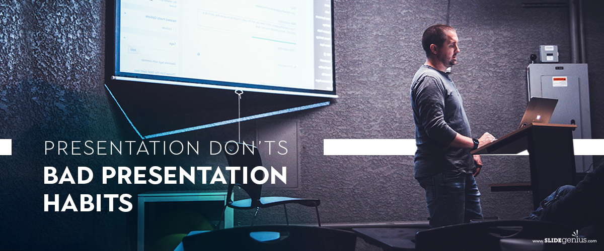
Presentation Don’ts: Bad Presentation Habits

handouts

Powerpoint

presentation experts

public speaking

slides

visual aid

Most blogs would provide tips on how to successfully engage your audience through public speaking and visual aids, effectively garnering more investors and potential customers.

Surely, you’ve seen and conducted numerous presentations, but as stated on a previous blog post, spectators will always remember the bad ones. Oftentimes, even more so than the core of the discussion itself.

[sg-blog-modules module=three]

Do you think there’s room for improvement in the way you conduct a presentation? Then, here are things you shouldn’t do during a sales pitch:

Starting with an apology

You’re late, missing a few of your discussion materials, your equipment malfunctions—these are just some of the things that can go wrong before you start your presentation. The usual reaction of speakers is to apologize in advance for how these mishaps may affect the presentation.

An apology sets a negative tone, which distracts your audience from what really matters—your presentation. Skip the minute-long explanation as to what the cause of the delay is and instead, handle it discreetly, take a deep breath, and start on a good note—begin how you usually would. This shows how you handle yourself under pressure.

Reading your slides/handouts

Eye contact and actively engaging with the audience is vital in making presentations effective. If your eyes are glued to either your slides or handouts, you won’t have a chance to interact with your listeners.

Glancing at your PowerPoint or notes is acceptable, but you must remember that knowing your material like the back of your hand is more favorable than relying on handouts because then, you’d be able to answer questions on top of your head.

Winging it

Stream of consciousness sometimes works on paper, but when you’re presenting in front of an audience, it isn’t recommended. If anything, this only makes you appear disorganized to your audience.

The more you stay off-topic, the less time you’ll have to focus on your presentation.

While winging it works for some, it’s better not to risk it and stick to what actually works: practicing. Instead of rambling on and on, which has the tendency to steer you away from your main point, practicing and internalizing your presentation helps you deliver information in a more concise and accurate manner.

Cluttering slides

Your slides should only contain the key points of your topic. When you present a wall of text, you’re wasting the usefulness of the tool. Remember: your slides are supposed to provide visual support to your claims.

If you don’t know which parts to retain, consulting with PowerPoint experts is the best way to go.

Forgetting to proofread the content of the presentation

Another problem is realizing that you have typos in your presentation when you’re already in front of your audience.

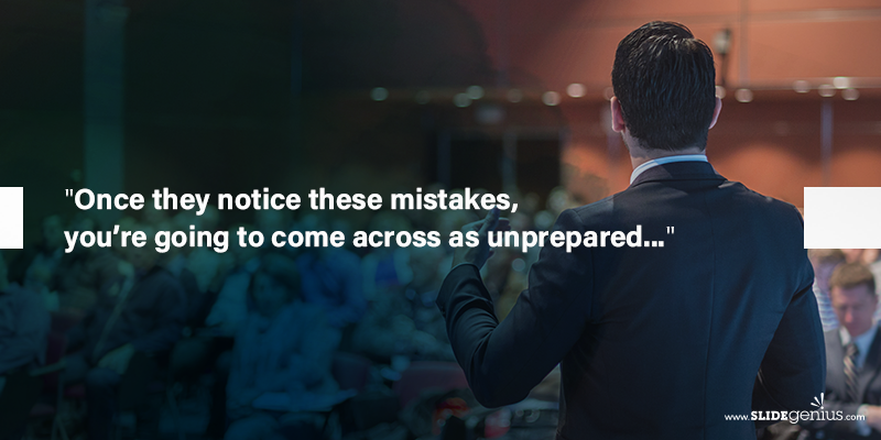
Once they notice these mistakes, you’re going to come across as unprepared or you’ve done your PowerPoint in a rush—both situations will not help you gain the customers you need.

Mistakes, when done repeatedly, become habits, and these are difficult to break when you’ve become accustomed to it. It’s better to take note of these tips before conducting another presentation so you can improve and be more effective.

[sg-blog-modules module=two]

References:

Morgan, Nick. “Should You Prepare Your Speech or Should You Wing It?” Forbes. October 25, 2016. www.forbes.com/sites/nickmorgan/2016/10/25/should-you-prepare-or-should-you-wing-it-the-perennial-public-speaking-question/#538f61b5c4fe

Spacey, Andrew. “How James Joyce Developed His Stream of Consciousness Novels. Owlcation. June 14, 2017. owlcation.com/humanities/Edouard-Dujardin-James-Joyce-and-Stream-of-Consciousness-Writing

Stachowiak, Dave. “Don’t Start Your Presentation Like This.” Coaching for Leaders. n.d. coachingforleaders.com/dont-start-like-this/

Public Speaking and Insincerity: What Ruins Authenticity?

credibility

establishing credibility

presentation experts

public speaking

As a speaker, you always need to establish your credibility the moment you step in front of your audience. You want their attention so you have to earn it by being confident and showing them that you know what you’re talking about.

A customized PowerPoint presentation is just half of your performance. Outdated facts and miscalculations aren’t the only factors that can affect your credibility as a presenter, but the way you talk can also ruin your authenticity as a speaker.

If you’re conducting a presentation soon, here are a few things you should remember NOT to do:

Yes, smiling keeps you physically and emotionally healthy, but when you overdo it, it can be unnerving. If your audience notices this, they will not perceive this as genuine warmth, but as insincere and mechanical.

Resist the urge to smile just for the sake of smiling and instead, do it when you’re talking about something you and your audience should genuinely smile about.

Most—if not all—speakers have gone through presentation anxiety once in their professional lives. It’s normal, but fidgeting is one of the things you should avoid during a sales pitch. Not only will this make you look uncomfortable, but your audience will sense a disconnect between what you’re saying to what you’re showing them right away.

If you pause as part of the natural flow of your talk, that’s fine, but if you stop talking in the middle of making a point, your audience will start to wonder if you’ve actually forgotten what you have to say. Not only will this make you look unprofessional, but it will seem like you’re not an expert on the topic.

Stop using filler words. Take a deep breath and relax.

Every speaker wants to show their enthusiasm when presenting in front of potential investors and customers, but too much of this energy can come off as anxiety rather than ease. These behaviors include jerky movements, rapid pacing, and talking too fast.

It’s understandable that you want to avoid putting your audience to sleep, but if you go overboard, it will look as if you’re talking at your audience instead of to your audience.

The same goes for being too stoic. Listeners might misconstrue your lack of energy as mechanical and disinterest.

When you’re an up-talker, your sentences end with a rise in pitch, making your declaratives sound like questions. This can be confusing to your audience because it will seem like you’re unsure of what you’re saying, whereas, your main goal is to convince them that what you’re offering is the best option.

You might not be aware that you’re doing these things, which is why you need to practice as much as you can. Ask your peers to provide feedback, as these will help you improve for the big day.

Once you finish your customized PowerPoint presentation, study it. Make sure you know it like the back of your hand—don’t memorize, internalize—and you’ll be sure to have a great presentation.

Clipping the Cliché: How to Have an Original Presentation

audience interaction

better presentation

caricature of a speaker

how to

original presentation

presentation experts

public speaking

Rick Enrico

SlideGenius

After preparing your speech’s content, it’s time to decide how to deliver your material. Poorly planned ways to grab attention can be detrimental to a presentation. But it’s still important to keep your audience’s tuned in to your every word.

One of the most effective ways to do this is to plan an overall creative performance. Because novelty promotes memory, your message will be memorable if it offers something new to your audience. Keeping them attentive without exaggerating is one of the trickier parts of planning an original presentation.

Here are some tips on establishing rapport:

Don’t Just Speak, Converse

The art of conversation isn’t exclusive to face-to-face interaction. Conversing is also applicable in a group setting, and, according to presentation trainer, Olivia Mitchell, can be more effective than simply talking about your topic. Plenty of speeches tend to be overly formal because the speaker sees the audience as an impersonal body.

Creating a story for your performance outline is one way of dispersing the stiffness of a presentation. But it also goes both ways. Letting your audience feel that you are also interested in their story gives them a sense of importance. Harvard Business Review’s Boris Groysberg and Michael Slind have noted that the conversational tone creates intimacy between speaker and audience, fostering trust and encouraging participation.

Treat your audience like a single person to speak with. Keep in mind that although you’re trying to deliver your pitch to them, you are also communicating on a personal level. Wait for a response or a reaction from your intended listener before moving on to the next point. This makes sure that you’ve gotten your point across.

Keep Up With the Times

Getting to know your audience is important in creating a good presentation. Creating connections during a performance is difficult when you aren’t up to date. Identifying your listeners’ learning preferences and interests is important in deciding how to present your content. People are more inclined to listen to something that’s relevant to them.

Relate to your audience by incorporating a few familiar references in your presentation. This also eases any built up tension at the beginning of your presentation. Build the impression that you‘re a relaxed, approachable, and credible speaker. Aim for that balance with both your verbal presentation and your visual content.

Think outside the box and make the hard facts palatable to your audience by presenting them creatively. Although it’s good to give an interesting performance, never compromise content for the sake of delivery.

Evolve to Involve

Engage your listeners in a different way. Instead of having them passively sit throughout your presentation, let them participate in some of the crucial parts of your presentation. As we’ve already established in earlier points, people appreciate feeling included. Take your presentation outside of just speech and visuals by letting your audience contribute to your performance.

This will also reinforce your central message. If getting your audience to stand seems uncalled for in the given situation, add a bit of humor to avoid monotony. Of course, keep things in moderation. Being too flashy becomes distracting after a time, and disregarding professionalism isn’t the preferable alternative to boring your audience.

Make sure you infuse just enough enthusiasm into your topic to convince them to listen to you.

Conclusion

Adding variety in the way you present is always a breath of fresh air for the seasoned audience. Invest in extra creative effort if you want your message to stand out. Getting to know your audience and conversing with them rather than mechanically offering your pitch ensures your listeners’ attention.

However, learn where to draw the line. Be interesting and original without reducing yourself into a caricature of a speaker. Gaining your audience’s respect is also an important part of presenting. In case you have any trouble reconciling these ideas, asking for help is always an option.

It’s important to keep how you create your presentation in perspective. Unsure on integrating creativity without overstepping your bounds? Seek the advice of a presentation guru.


References

Mitchell, Olivia. “Conversational Presenting.” Speaking about Presenting. Accessed October 7, 2015.www.speakingaboutpresenting.com/delivery/conversational-presenting
Fenker, Daniela and Hartmut Schutze. “Learning By Surprise.” Scientific American Global. Accessed October 7, 2015. www.scientificamerican.com/article/learning-by-surprise
Grossberg, Boris and Michael Slind. “Leadership Is a Conversation.” Harvard Business Review. June 1, 2012. Accessed October 7, 2015. www.hbr.org/2012/06/leadership-is-a-conversation


Featured Image: “Get Creative!” by JD Hancock on flickr.com

No Retreat, No Surrender: Post-Apocalyptic Presentation Survival Advice

powepoint designer

PowerPoint Design

PowerPoint Experts

powerpoint problem

powerpoint template

Powerpoint tips

presentation designer

presentation experts

presentation templates

presentation tips

problem solving

SlideGenius

Let’s be clear: delivering a business presentation is serious business, with high stakes. So next time you enter a room for a presentation, here’s a wild idea: be like a zombie. It might sound like crazy presentation survival advice, but hear us out.

According to authors Kenemore and Scott, zombies are the perfect soldiers because they can withstand massive amounts of damage and still plod forward.  Remember, it’s your responsibility to keep going no matter what happens to your speech, good or bad. So don’t discount using a zombie-like approach, neither retreating nor surrendering from taking over the stage.

Adopt a cold and calm attitude to protect your professional appearance and achieve victory.

Here’s how to decisively win presentations with the acumen of a zombie:

Forget Fear

Forget Fear
Fear is your worst enemy.

There’ll be no giving up once your reanimation has begun. You can never back out when faced with unexpected events during your pitch. Be brave enough to avoid disengaging at any point from your discussion. Reevaluate your approach and come up with another attack plan.

A lot of things can go wrong — negative feedback, a non-operational device, or corrupted files can come up while you’re presenting. Instead of panicking, focus on the solution and address the problem outright.

Just Attack

Just Attack
Don’t hesitate. Take the initiative.

You don’t have to literally eat human gray matter. All you need to do is occupy space in your audiences’ mind, and make sure it’s worth it. Focus on getting them interested in your material. Take the lead and display valuable and helpful chunks of information that quenches your viewers’ hunger for learning.

Plan a strategy on how you’ll give them a decisive and informative dose of data. Start with a hook that hints to your main topic. Expound on your core idea by incorporating stories, statistics, and other factual evidence. Drive the final point in with a clear purpose to reach your audience on a personal level.

Walk with Others

Walk with Others
Don’t take on the apocalypse alone.

Taking inspiration from the zombies’ creed, “no man left behind” is another tactic to step up the presentation game. Leaving no man behind, not even your listeners, builds solid engagement. Tailor your speech in a way that’s accessible for everyone. Research beforehand to ensure that your audiences’ needs and expectations are met.

Make them feel involved and give them the assurance of being taken care of until the very last slide of your PowerPoint deck.

You’ve Survived!

You've Survived!
You made it out of the presentation apocalypse.

Zombies can be the most feared adversary anyone could encounter. They have this unexplainable ability to survive in the face of a nonstop onslaught. As a presenter, learning the zombies’ stance can keep you ahead of the competition. “No Retreat. No Surrender.”

Inflict yourself with these zombie-like traits and you’ll have no problem facing unexpected events. Attack your audience, not with bullets, but with helpful data. Leave no man behind for solid audience engagement.

Cultivate these strengths and be prepared to deliver award-winning, death-defying PowerPoint presentations.


References

Kenemore, Scott. The Art of Zombie Warfare: How to Kick Ass Like the Walking Dead. New York: Skyhorse Publishing, 2010.

Quality Control: Handling Presentation Obstacles

PowerPoint Guru

ppt tips

Presentation Design Service

presentation experts

presentation ideas

Presentation Obstacles

Rick Enrico

SlideGenius

What separates an effective presentation from the rest isn’t always perfect execution. Sometimes, it depends on how the presenter deals with mistakes on stage. While errors are inevitable, minimizing the damage they cause should be your top priority. After all, the main point of any speech is to get your message across to the audience.

Getting affected by a small slip-up could ruin your whole performance. Don’t let self-consciousness discourage you and waste all your effort.

A Little Spontaneity is Good for You

People often prepare scripts to organize their thoughts and prevent mental blocks during a presentation. But depending too heavily on a script or your PowerPoint deck makes you appear mechanical and stiff. If you forget a word or misplace a slide, you could lose your train of thought and forget what you wanted to say.

To help you stay on track, get the gist of your presentation and assign keywords as takeoff points for each section. Using body language to emphasize your ideas feels more natural if you don’t tie yourself to a script. Make use of an animated yet natural presenting style to keep people interested and glued to your every word.

Make Yourself Accessible

A confident presenter establishes rapport with ease, but being too self-absorbed loses your audience’s interest. Aside from the obvious pet peeves that develop from blatant bragging, listeners will feel alienated or possibly offended by too much confidence. This is especially true for speakers who can’t relate to a crowd’s culture or experiences. Consider other aspects of your audience beyond their interests.

Look up their education, values, and history, and consider whether or not the language you use is appropriate for the event. The right amount of self-assurance results in a higher and more positive response rate to your presentation.

How Much Preparation is Too Much Preparation?

It’s often said that one can never be too prepared. In some cases, however, overthinking leads to self-sabotage. Trying to cover all blind spots by repeatedly going over your presentation allows you to avoid errors both big and small. But constantly questioning yourself and the quality of your content lowers your confidence and increases self-doubt.

Take a few minutes before climbing onstage to clear your mind of unnecessary panic. Be confident in the preparations you’ve made.

Conclusion

Different speakers can have different ways of handling problems that come their way. The best ones are those who move on from these hurdles and still manage to deliver. Ironically, trying to create a perfect presentation limits actual performance.

Pressure to be flawless increases stress and disrupts your way of thinking – the last thing you’d want before presenting. Be spontaneous but considerate of your audience. Stay prepared but know when to step back and relax. And lastly, though a bit clichéd, trust in your own ability to overcome any presentation obstacle.

Need help with your presentation? Check out our portfolio for inspiration, or contact our slide design experts for a free quote.

References

“Business Communication for Success, v. 1.0.” Flat World Knowledge. Accessed October 2, 2015. www.catalog.flatworldknowledge.com

Featured Image: Access” by Andre Goble from flickr.com

Psychological Biases: The Bandwagon in Sales Presentations

consumer decision making

decision making

PowerPoint Design

powerpoint designer

powerpoint designs

powerpoint expert

PowerPoint Experts

powerpoint template

presentation designer

presentation experts

presentation templates

presentation tips

sales presentations

slide genius

SlideGenius

We’ve already discussed the psychology of decision-making and examined the use of anchoring in sales presentations. In this post, we’ll focus on another psychological bias: the bandwagon effect.

If you have high regard for group thinking and conformity, then this brain quirk can help you sell more. Let’s see what makes this technique suitable for your pitch.

Defining the ‘Bandwagon’ Effect

Coined after the political term “jump on the bandwagon”, this refers to voters’ tendencies of choosing the most successful campaign to support. The bandwagon effect implies hopping onto a trend, joining a movement, or supporting something that everyone else has been doing.

According to Hubspot’s Emma Snider, social proof can be a powerfully persuasive tool. People have this natural tendency of following another’s actions regardless of their own beliefs. The likelihood of this increases when more of them begin adopting the idea or behavior.

Why Use This in Presentations?

All marketers aim to increase a product or service’s popularity, so they create marketing efforts for higher product demand at a faster rate. Using the bandwagon effect in presentations gives you the advantage in persuading your audience. It relates to your prospects’ emotions, which in turn increases the popularity of your product and consumer demand.

The idea of popularity introduces your product into the market, which makes people jump onto the bandwagon. It appeals to the human emotions of wanting what others already have, and of fitting in with the majority. Customers will take the word of their fellow consumers for it because they’re sure they aren’t out to sell them anything. Making it appear that there are more users tuned into your product or service reassures them of your quality.

How to Make The Bandwagon Effect Your Ally

You have to adapt to your audience’s needs like how chameleons adapt to their environment. With a handful of product innovations coming, the consumer society is now yearning for transparency, info-bites, and greater customer experiences with the products they use. Cater to these needs by using the bandwagon as social proof.

Introduce your product in a way that strengthens your credibility. Include testimonials from your valued clients or present a statistic that shows how many people have been using your offering.

Giving them quantifiable proof of your product standing and market value is the best way to turn them into buying customers.

Are You In or Out?

The bandwagon effect is one useful psychological bias that relates to consumer decision making.

Use the power of this phenomenon in influencing purchases and experience a breakthrough success in your business.

References

Kay, Magda. “How to Use Cognitive Biases for Effective Marketing.Psychology for Marketers. n.d. Accessed August 3, 2015.
Snider, Emma. “How to Use Psychological Biases to Sell Better and Faster.” Hubspot Blogs. January 31, 2015. Accessed August 3, 2015.

Featured Image: “Dueling Bandwagons” by Eric Kilby from flickr.com

3 Tips for Choosing the Perfect Images for Your Slide Design

powepoint designer

PowerPoint Design

powerpoint designs

powerpoint expert

PowerPoint Experts

powerpoint template

Powerpoint tips

presentation designer

presentation experts

presentation templates

presentation tips

slide design

A picture can tell a complete story without a single glyph of text. When making your slide design, push your deck to the next level with smart and appropriate use of stock photos. Use images for PowerPoint the right way to enhance your deck.

It might seem overwhelming at first to fit images into a visually appealing deck, but don’t worry. Nobody is expected to rely on pictures alone to get their message across. What we’ll be talking about is how to find the most suitable ones that best communicate your ideas to achieve your goals.

1. Search for the Good Ones

The first step is to find visually striking images, ones which are clearly for commercial use. Google is likely your first choice when looking for appropriate photos. More often than not, however, you’ll end up with common and visually unappealing results.

A good place to start when looking for images is Flickr, which has a practical search function. Flickr allows you to limit the results to ones you can edit or use for commercial purposes. One thing, though: make sure to give credit to the artists in your own work.

If you’re willing to pay a premium for amazing photos, use Shutterstock, or DepositPhotos for royalty-free images. This gives your PowerPoint an extra dose of uniqueness. With your search term, use specific keywords instead of broad ones. This will discount search results that are too common.

To circumvent problems with some monitors or projectors, avoid photos with intricate details and fine dots or lines.

2. Decide Which Images Fit

Design your slides in a way that best fits your brand. Your image choice is most effective when it conveys or complements your message without straying from your brand persona – all while still maintaining unity with each other.

Try to choose images with a color temperature or palette that fits your own company colors. They should also meld with your brand identity. For example, you don’t want to use images of young people on skateboards when you’re presenting about elderly care. Putting thought into your selection and layout saves you from presenting to a confused audience.

Your images should only be there to help your presentation. If they hinder, take them out for a simpler layout.

3. Edit Them to Your Needs

The supremacy of Adobe programs is undeniable, as evidenced by Photoshop being an industry standard in photo-manipulation and graphic design. Don’t fall into the trap of thinking that it’s only for experts in graphic design.

You can easily use Photoshop to crop your images to the proper size, or even change the brightness levels and color temperature. If you find striking images that have unnecessary elements or don’t have the right color, use Photoshop to correct and adjust them to your needs.

In Conclusion

The right choice of stock images can make your PowerPoint layout an aesthetic advantage. Getting the right ones with the proper copyright permissions will be your first priority. Ensure that you won’t be infringing on anyone’s rights for your own purposes.

Your next priority is making sure your choices are appropriate for your branding and your message individually, while ensuring that your branding and message complement each other. Every design decision should enhance your presentation, not distract from it.

If you must, use Photoshop to make edits such as cropping, brightening, or other forms of tweaking. Need more help with designing your slides? Our Presentation Experts are ready to take your call and provide a free quote!

References

Apply the Color Balance Adjustment.” Photoshop Help. Accessed September 14, 2015.
Images for PowerPoint: 5 Practical Tips to Improve Your Design.” SlideGenius, Inc. August 26, 2014. Accessed September 14, 2015.
Levels Adjustment.” Photoshop Help. Accessed September 14, 2015.