Avoiding a PowerPoint Penalty Flag

Business Overview Presentation

Christopher McComas

Custom Designed Presentations

Powerpoint

PowerPoint Agency

PowerPoint Design

PowerPoint design experts

PowerPoint Experts

PowerPoint specialist

Powerpoint tips

Presentation Agency

Presentation Company

Presentation Consultation

Presentation Designers

Presentation Firm

Rick Enrico

SlideGenius

sports

You can really use PowerPoint for just about anything…..

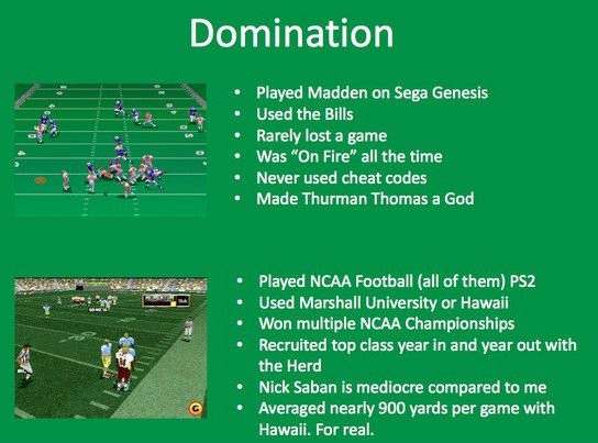
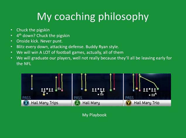
This past week’s story in the world of sports came from a man who submitted a PowerPoint presentation as his resume for an open coaching position for the University of North Dakota’s football team. Turns out he doesn’t quite have the standard credentials we were expecting to see. Christopher McComas, who currently works as an technician at Marshall University, made headlines this week as his application for the position went viral on the Internet. He listed out many his esteemed qualifications which included his many years of experience playing Madden and NCAA Football on his beloved Playstation.

The story of Christopher’s application became an Internet sensation. Between the lack of actual qualifications that are appropriate for a collegiate athletic position and his horribly put together powerpoint design, there are a few take aways we can learn from his errors.

 13385

Here are a few mistakes we noticed in Christopher’s presentation:

  • Formatting : Avoid using Comic Sans and boring templates, this shows a lack of effort and preparation.

  • Grammar/Spelling:  With bullet points people tend to think run on sentences are acceptable, but try to avoid this and utilize appropriate and professional language

  • Lack of Content: There is no significant or persuasive content within his presentations that supports his claim.

  • Organization:  There is no real structure – a presentation should have all three components: a title, a body and a takeaway.

northdakota13s-1-web

Though we wish Christopher the best of luck in his attempts to coach football at the University of North Dakota, one thing we can guarantee is that this PowerPoint is less than impressive and maybe next time he should just stick to the normal resume format for his next  job application.

Full Story: http://www.sbnation.com/lookit/2013/12/11/5202166/sb-nation-endorses-chris-mccomas-for-north-dakota-head-coach
The Top 5 Major PowerPoint Mistakes

Business Overview Presentation

Custom Designed Presentations

PowerPoint Agency

PowerPoint Design

PowerPoint design experts

PowerPoint Experts

PowerPoint specialist

Powerpoint tips

presentation

Presentation Agency

Presentation Company

Presentation Consultation

Presentation Creation

Presentation Designers

Presentation Firm

Rick Enrico

SlideGenius

Save yourself from a PowerPoint disaster with SlideGenius’s top five list of major PowerPoint presentation no’s of the year. Avoiding these common mistakes will have you going from PowerPoint amateur to professional in a matter of minutes – creating your most impressive presentation yet.

5. Paragraphs on Slides

Having giant paragraphs on your slide will guarantee you two things: a disinterested audience that won’t remember your content. We tell stories with words and images, having a ton of paragraphs up on your slides will distract your audience from listening to your points. Too much text  also provides you with more of an opportunity to read directly off of your slides, which of course is another major presentation no. You can avoid this by using bullet points as your primary text formatting- this allows you to broadcast important information without causing your audience to fall asleep.

4. Sound Effects per Animation

Sound effects cause too much chaos during any presentation and will divert your audience’s attention,  prevent this mistake by eliminating sound with your transitions. You can easily do this by making sure you’ve clicked “none” in the sound options in the animation box.

3 Using Elementary Fonts

While we all we’ll admit to using our longtime favorites Comic Sans or Garamond Script (yes they are pretty and cute) avoid using these types of fonts within a professional presentation. Stick with the most basic and easily legible fonts available so your audience can actually read your text without wondering if that letter is a g…or maybe a y?

2. Unusual Color Choices and Palettes

Skip choosing awkward color schemes that don’t match well and could possibly distract your audience by let’s say, blinding them. Avoid unusual color combinations such as red and green that are bright and disruptive. Keep your color scheme consistent throughout your entire presentation utilizing the same two or three colors. Also, avoid using those tempting patterned or textured powerpoint themes that will cause your font to be lost in the midst of an chaotic background.

1. Avoiding T.M.I.

T.M.I or Too Much Information is the ultimate general mistake when drafting up any PowerPoint presentation. Too much text, too many slides, and too much content will backfire on transcribing your ideas to your audience. Remember that the average adult thinking span is only five to seven minutes long, so keep all information simple and short -less is more! Tips to avoid this are having time limits and slide maximums (this should be around 15 slides) so you aren’t going overboard with your presentation.
Works Cited:

Keeping Your Audience in Mind : The 4 Essential Questions to Ask Yourself

audience incorporation

Business Overview Presentation

Custom Designed Presentations

PowerPoint Agency

PowerPoint Design

PowerPoint design experts

PowerPoint Experts

PowerPoint specialist

Powerpoint tips

presentation

Presentation Agency

Presentation Company

Presentation Consultation

Presentation Designers

Presentation Firm

Rick Enrico

SlideGenius

When preparing a presentation, keeping your audience in mind is crucial for ensuring that your message resonates. Here are the four essential questions to ask yourself:

1. Who Is My Audience?

  • Why it matters: Understanding your audience’s background, interests, and knowledge level allows you to tailor your message. Are they industry experts, general public, executives, or students? Each audience requires a different tone, level of detail, and presentation style.
  • Ask yourself: Are they familiar with the topic? What language or terminology should I use? Do they expect a high-level overview or detailed analysis?

2. What Does My Audience Want or Need?

  • Why it matters: People attend presentations expecting to learn something or solve a problem. Knowing their expectations ensures that your presentation provides value.
  • Ask yourself: What challenges or problems do they face? What are they hoping to learn from my presentation? How can I address their concerns or provide insights that will benefit them?

3. How Can I Engage My Audience?

  • Why it matters: Keeping your audience engaged ensures they stay attentive and retain the information you’re presenting. Engagement can be achieved through storytelling, interactive elements, or dynamic visuals.
  • Ask yourself: What techniques will keep my audience interested? Should I include stories, examples, or visuals? Should I encourage audience interaction through questions or activities?

4. What Action Do I Want My Audience to Take?

  • Why it matters: Every presentation should have a clear purpose, whether it’s informing, persuading, or motivating the audience to act. Identifying the desired outcome helps shape your closing statements and call to action.
  • Ask yourself: What do I want the audience to do after the presentation? Do I want them to adopt a new practice, make a decision, or further explore a topic?

By asking yourself these questions, you ensure that your presentation is focused, relevant, and engaging, increasing the chances of successfully connecting with your audience.

Our Best PowerPoint Recommendations of 2013

2013

Business Overview Presentation

Custom Designed Presentations

Powerpoint

PowerPoint Agency

PowerPoint Design

PowerPoint design experts

PowerPoint Experts

PowerPoint specialist

Powerpoint tips

Presentation Agency

Presentation Company

Presentation Consultation

presentation design

Presentation Designers

Presentation Firm

recommendation

Rick Enrico

SlideGenius

The developing art of PowerPoint changes year by year; bringing forth new ideas that create all around better presentations. We’ve compiled our list of the most effective and beneficial tips from 2013.

Stay Consistent.

Consistency is key when it comes to your companies branding – the basic marketing should be universal throughout your entire presentation. This uniformity should include your companies logos, color, background, theme and graphic styling. The consistency will help reflect your company’s mission and philosophy by remaining constant on all platforms and this will create a recognizable brand to customers and audience members alike- which builds trust and loyalty.

Back to Basics.

You tell a story with your presentation slides,  so think of your PowerPoint as a high school essay that starts with an outline; organizing your introduction, your main points, counterpoints and conclusion. Your presentation should include all of these concepts and flow through accordingly.

Outline Smart.

Every substantial project starts somewhere and your powerpoint presentation should always start with a storyboard. This tool keeps your slides on point and helps you follow your persuasive argument throughout the entire presentation. A storyboard efficiently allows you to write all your points and ideas down prior to starting your powerpoint, which organizes your ideas effectively.

Images Speak Louder than Words.

A picture is worth a thousand words. The images that you place within your slides should be carefully chosen to fit your presentation. Another tip to consider is  to chose high quality images, look for HD or downloadable high-res images when searched on the Internet for your content, these will look much more polished on a large projector.

Adrian Dennis

Applying the Right Tools.

Utilizing effective outside tools can be used to enhance many components of your presentation slides. Touching back on a few we’ve covered in the past include beneficial support sites including, The PowerPoint FAQ that answers all your common day PowerPoint questions.

Putting Your Presentation Before Your PowerPoint

Business Overview Presentation

Custom Designed Presentations

PowerPoint Agency

PowerPoint Design

PowerPoint design experts

PowerPoint Experts

PowerPoint specialist

Powerpoint tips

presentation

Presentation Agency

Presentation Company

Presentation Consultation

Presentation Designers

Presentation Firm

Rick Enrico

SlideGenius

When drafting up any big presentation it’s easy to get caught up and forget about the vital questions that you should be asking yourself. With everything that is contributed to a PowerPoint presentation remember the key points you really want your audience to focus on.

A common misconception when giving any PowerPoint presentation is making your slides the focus, rather than your message- or actual verbiage. This is done by reading directly off your slides and reciting the text word for word. What most people don’t understand is that your PowerPoint is there as a supplementary piece that is used to solely enhance and elaborate your message.

4-presentation-lessons-from-steve-jobs-iphone-4-press-conference


While most of us have the urge to initially focus on getting all of our main points physically written onto a presentation- keep in mind that the PowerPoint slides are suppose to highlight takeaways and provide the content which is used accompany your story. The worst mistake you can make as a presenter is reading your slides word by word, which results in your audience completely losing interest and attention. Remember that, “communication is a transfer of emotion” and this becomes vital in getting your audience to understand your points and ideas.

Before you become caught up in dedicating your time to sprucing up your PowerPoint with tons of facts and fancy themed templates, understand that your speech is equally as important. Your story and words are just as significant as any statistic or graphics you have on your slides, so don’t forget to adequately prepare for your verbal content.

Your presentation is your message. It is the sole reason you even stand up in front of an audience and give PowerPoint in the first place. Be careful not to lose sight of the most significant details in any presentation preparation and make sure your message is portrayed in the most clear and effective way possible.

Works Cited: http://sethgodin.typepad.com/seths_blog/2007/01/really_bad_powe.html

The Top 3 Ways to Win Over Your Boss with PowerPoint

Custom Designed Presentations

Leave Behind

Michael Scott

Powerpoint

PowerPoint Agency

PowerPoint Design

PowerPoint design experts

PowerPoint specialist

presentation

Presentation Agency

Presentation Company

Presentation Consultation

Presentation Designers

Presentation Firm

Steve Jobs

The Office

Use Metrics

Presenting to your boss, in any situation, can be a very nerve racking and stressful process. Of course some of the steps you can take to win them over would be to do your homework and prepare adequately, and dealing with bosses with extreme expectations, say for example The Office’s Michael Scott can be tricky. So how do you exactly ‘wow’ your boss with a great powerpoint presentation? Follow these specific steps for a presentation  that will leave your boss impressed.

michael_scott_office_steve-carrel

Keep A Specific Slide Maximum

You should plan on having no more than 15 slides- maximum! Too lengthy of a presentation will cause your boss to lose interest-fast and as Leonardo da Vinci once said, “Simplicity is the ultimate sophistication”.

Use Metrics

Utilizing the appropriate data while encompassing this information with graphs and charts is essential in broadcasting your knowledge on the particular subject. Double check your facts in research with other sources before presenting. Showing your analytical skills through graphics and visuals will allow for you as the presenter to elaborate on these ideas within your presentation.

Leave Behind

Always come with the essential materials, make sure you have a printable copy of your presentation and or a downloadable PDF for your boss to further review, this will also show them you are prepared. Professionally printed executive brochures will place you a step ahead of the rest.

Though everyone knows Michael Scott may be the most irrational boss that ever came across national television, he does encompass some ordinary superior traits we can all relate too. The more advanced your presentation skills are, the better impression you will leave on your boss, showing your technical, marketing and basic research skills.

Comment below and let us know what your favorite Michael Scott moments are!

Lessons from Buzzfeed: Why It’s Important to Map out the Basics

America

Buzzfeed

Custom Designed Presentations

Europe

Geography

PowerPoint Agency

PowerPoint Design

PowerPoint design experts

PowerPoint specialist

Presentation Agency

Presentation Company

Presentation Consultation

Presentation Designers

Presentation Firm

presentation preperation

Check out this recent post by the ever popular social sharing site, Buzzfeed. They asked some of their American staff writers to do a fairly simple task- fill in a blank map of Europe with the appropriate countries. Well, it turned out to be quite a disaster for most of the participants as all of them failed to fill out the countries in the correct boundaries. Many of them even wrote, “wow, so this is what my college education got me” along the borders of the Scandinavian countries they couldn’t label.

So how do we tie this back into presentation preparation? It’s simple as understanding basic concepts, like geography of our neighboring countries, should be understood before the big picture. Prior to any presentation – start simple as basic understanding, just like basic geography, is imperative in any powerpoint.

With any big presentation it is imperative to mark your basics first before jumping into the small details first, such as which bar graph to use or which font color to highlight your main points in. Prior to you even starting with your outline list all your main points that will be listed on your presentation slides. Getting your main ideas outlined first is imperative before working on the rest of your presentation.

This article speaks a basic truth that most Americans spend a decent percentage of their lives in an educational setting to learn fundamental values such as physics, grammar and world geography- which in this case seems to be a huge failure. Forgetting your main themes, and the whole purpose of your powerpoint presentation – never forget your purpose, and make sure this isn’t clouded in spending hours picking the perfect template or searching for the an attention grabbing quote.

You can read the full article here.

Selling Your Wife with PowerPoint: Why it Works

ABC

Custom Designed Presentations

Modern Family

PowerPoint Agency

PowerPoint Design

PowerPoint design experts

powerpoint slides

PowerPoint specialist

presentation

Presentation Agency

Presentation Company

Presentation Consultation

Presentation Designers

Presentation Firm

television

The universal question remains, “How do you win an argument with a woman?” 

Just like Phil and Claire Dunphy on ABC’S Emmy Award-winning show, Modern Familyit’s almost a daily struggle to prove who’s right and why. This timeless debacle has stumped husbands across the years as countless disagreements and failed persuasions have led to broken compromises.

We may believe that the common day PowerPoint presentation is merely just for business lectures but the marketing and persuasive ability of powerpoint slides may actually be one of the best explanation tools. When dealing with certain difficult issues such as mapping out your financial plans for the year, a PowerPoint presentation has the capability to share information in the most persuasive and simplest way possible; therefore allowing for more agreements- and fewer arguments.

1. Starting Off Your Presentation with an Attention Grabbing Quote

Just like in any persuasive essay or speech, the appeal of pathos (or emotion) when presenting your idea will catch your wife’s attention from the beginning. Your quote can also be a personalized statistic, say if you were trying to either sell or buy a substantial item or place that sums up a main purpose.

2. Utilize Visuals and Graphs

Images speak louder than words, too much text will cause anyone to lose interest fast. Using bar graphs and pie charts to explain your financial forecast or using graphics will make for any explanation to be easier and allow for more efficient points to be made. Talking numbers make for more confusion- but showing numbers allows for more information to be digested easily and this is essential in any great powerpoint presentation. 

3. Minimal Bullet Points

The simpler, the better. Bullet points are acceptable in family presentations and allow for direct and specific statements to be made without too much wordiness. You as the presenter are responsible for elaborating these ideas, but visually they should be presented in the simplest form.

4. Using If/Then Analogies

Creating an if/then scenario within your presentation will give you the ability to show your wife why your point is valid and using examples will assist in positioning your argument.


Convincing somebody of anything is not an easy task, and just like Phil and Claire try to make sure their points are the “correct” ones, you can utilize PowerPoint to share your ideas with your spouse and explain them in the most effective way possible.

Comment below and let us know if you’ve used PowerPoint to persuade your wife.

Winning the Crowd : What We Can Learn from College Game Day

Alabama Football

audience

College Football

Crowd

Custom Designed Presentations

Gameday

OSU

PowerPoint Agency

PowerPoint Design

PowerPoint design experts

PowerPoint specialist

Presentation Agency

Presentation Company

Presentation Consultation

Presentation Designers

Presentation Firm

Whether it be Roll Tide or Go Blue getting your audience fired up  and ready for game day is essential in any college football match. There are certain traditions and aspects that are a part of every big university match before, after and during the game. There are certain concepts that are strikingly similar to impressing your college game day crowd as well as a corporate presentation crowd. Here are some tactics listed to enhance your presentation and get your audience engaged and focused:

Pep Talk in the Locker Room

Prior to starting your presentation meet with other team members and presenters to go over a few basic elements. Discuss points such as; what is your main purpose? What is your end goal? Having a defined powerpoint presentation plan will allow you as the presenter to get your main points across directly and more efficiently.

Huddle Up

Huddle up…literally! Group up with your teammates or chat with a peer right before you take the floor. Having this confidence boost will go a long way throughout your presentation. Coming together as a group will also help your ideas and thoughts flow more universally though out the presentation.

Follow the Game Plan Through

Don’t go off topic and shy away from your purpose, understand your powerpoint slides and concepts and make sure to stick to the plays (your ideas!) Using a storyboard will help outline your presentation more effectively.

Make it through the Fourth Quarter

Don’t lose your energy during the very end of your presentation, the very last slides are where you as the presenter, should be coming to a conclusion and wrapping up all your points of interest. These are the most imperative because this information is what your audience takes away from the most. Be sure to not trail off in your words or appear tired, the more energy you have throughout the end, the better!

Source: http://www.forbes.com/sites/dailymuse/2013/11/12/pro-presentation-tips-7-secrets-to-winning-the-room/

What The Hunger Games Teaches us About Making a Killer Presentation

audience

Catching Fire

Custom Designed Presentations

Hunger Games

PowerPoint Agency

PowerPoint Design

PowerPoint design experts

PowerPoint specialist

presentation

Presentation Agency

Presentation Company

Presentation Consultation

Presentation Designers

Presentation Firm

Instincts, utilizing your resources and winning the hearts of your audience are just a few key points that allowed District 3 contender, Katniss Everdeen to win the 74th Annual Hunger Games and allow for her and fellow partner, Peeta, to participate in the televised fight to the death. Now they enter the games in a second time in the sequel, Catching Fire, after a sudden rule change. So what does battling your opponents and overcoming severe weather changes and starvation in The Hunger Games have to do with creating a stellar PowerPoint presentation? In order to directly share your points and engage your audience, here are a few comparisons between creating an effective presentation and winning the 75th Annual Hunger Games.

Get the best training.

Just as Katniss trains furiously by exercising and practicing her archery skills before the games you as the presenter must train extensively before any presentation. There is no such thing as too much preparation, rereading your slides and even practicing your verbal skills will enhance your focus ability and allow for a smoother presentation.

Be prepared to overcome tough obstacles when in action.

Whether it be a swarm of poisonous bees or a question from an audience member that throws you off guard, you must be willing to deal with sudden situations at any time. Know your material that you are presenting instead of just reading word for word off of your slides, your ability to go off topic and in more depth will be a weakness noticed by your audience.

Keep your audience entertained, at all times.

As Katniss won the hearts of the audience by tending to Peeta in the last Hunger Games and now stands a public image to Panem, your connection with the people you are presenting to is key. Your presentation ideas should be unique and the way you present them is even more imperative, use visuals, graphics even videos to spruce up and create a great powerpoint presentation. 

May the odds be ever in your favor.

References:

“4 PowerPoint Resources You Can’t Miss Out On” SlideGenius. November 20, 2013.

The Hunger Games: Catching Fire.” Rottentomatoes.