Moneyball’s Moneyball’s for a Game-Winning Call-to-Action

audience

Brad Pitt

corporate presentation

CTA

Custom Designed Presentations

Head Coach

Michael Lewis

Moneyball

PowerPoint Agency

PowerPoint Design

PowerPoint design experts

PowerPoint specialist

presentation

Presentation Agency

Presentation Company

Presentation Consultation

Presentation Designers

Presentation Firm

“Managers tend to pick a strategy that is the least likely to fail, rather then to pick a strategy that is most efficient,” Said Palmer. ” The pain of looking bad is worse than the gain of making the best move.”

― Michael Lewis, Moneyball : The Art of Winning an Unfair Game


Baseball statistics are boring. Plain and simple. Sure they may get some people’s attention, but statistically speaking, they are seen as a mind-numbing subject to talk about. Now maybe I say this with such conviction because I’m not an avid baseball aficionado, but what does get my attention is how Moneyball, a movie about baseball stats, proved to be so fascinating and successful (even to me!). I think it’s because the film is not really about numbers, and it’s not really a movie about baseball, either. The movie is about about what drives people to take risks and how public perception plays a role in our work. My favorite and most absorbed line of the movie is when Brad Pitt (Oakland A’s general manager) tells Phillip Seymour Hoffman (Oakland A’s Head Coach) that though his last year’s team made it to semifinals,   “If you don’t win the last game of the series, nobody gives a shit.” This really resonated with me and even dragged itself into my world of corporate presentation design and delivery. Think about what the “last game of the series” would equate to in your presentation. Three words: Call-to-Action (CTA). If your CTA isn’t strong, it will result in a meaningless presentation. Your presentation can be filled from start to finish with incredible charts, min-blowing stats, or powerful images, but if at the end of it all, you leave your audience with “and that it” then you have lost your “last game of the series” and failed at your presentation. With that, let’s look at what a successful and “last-game-of-the-series-winning” CTA consists of:

Keeping it simple

Like all successful company commercials, its gotta’ be catchy. The point of a CTA is to gather all the info and data you have already presented, and bundle it up into a “next step.” Redbull says it will “give you wings.” Coca-Cola claims you’ll “open happiness.” 15 minutes from Geico will “save you 15% or more on car insurance.” Three mogul-like businesses, one theme; simplicity. Being simple is what led these campaigns to be so incredibly successful. Applying CTA to modern times, I’ll put it in as plain language as I can think of; your CTA has to “tweetable,” “facebook-statusable,” and “textable.” Working with that goal in mind will make you be more creative and effective.

Use active and urgent language

Donate, buy, register, subscribe, call, text, order; these are all words that invoke a sense of command. These words should clearly tell your audience what you want them to do. Follow your command with the urgency. Offer ends, for a short time only, order now and receive; these invoke urgency. Urgency reels in emotion. Emotion sells.

Knowing size matters!

Make it big! Along with active and urgent language, one must make the CTA sound like earth-shattering news. It needs to be big enough that hearing it once will be memorable. A favorite example of mine is the HeadOn campaign from a few years back. It was essentially a 30 second commercial for a migraine relief chapstick-like product that said six words, “HeadOn, apply directly to the forehead.” It repeated the same six words over and over again until the 30 seconds were up. I must admit, it was pretty ridiculous and annoying, but guess what; I still remember it, and it’s been about 5 years since I’ve seen it. That says something.

Give it some space

Contrast, color, space, shape, and text; these are all characteristics of the design and layout of the text that you should thoroughly take into account. Just as the words themselves are crucial to the CTA’s success, so is the digital delivery. Make the CTA shine and impress. Think of the CTA as a star in your very own Broadway show. You want the spotlight on it at all times! Know the value of a great CTA and give it the time and effort it deserves. Soon enough, you’ll see results. 

I’ll end with my favorite scene from Moneyball, where you can enjoy here.

 
Work Cited: http://www.goodreads.com/work/quotes/416305-moneyball-the-art-of-winning-an-unfair-game

Our Five Favorite Books on Presenting with PowerPoint

Al Gore

Bruce Gabriel

Carmine Gallo

Cliff Atkinson

Custom Designed Presentations

how to

Nancy Duarte

PowerPoint Agency

PowerPoint Design

PowerPoint design experts

PowerPoint specialist

presentation

Presentation Agency

Presentation Company

Presentation Consultation

Presentation Designers

Presentation Firm

Presentation Zen

Steve Jobs

When it comes to improving your PowerPoint presentation skills, nothing beats learning from the experts. There are countless books available that offer valuable insights on creating impactful presentations, but a few stand out as must-reads. Here are our five favorite books on presenting with PowerPoint that will help you elevate your presentation game.


1. “Presentation Zen” by Garr Reynolds

Garr Reynolds’ “Presentation Zen” is a classic for a reason. It focuses on simplifying slide design and using visuals to enhance your message, rather than overwhelming the audience with text.

Why It’s a Favorite:

  • Focuses on Minimalism: Reynolds advocates for clean, uncluttered slides that keep the focus on the presenter.
  • Promotes Visual Storytelling: The book emphasizes the importance of visuals in conveying your message.

Key Takeaway: Less is more. Create slides that support your narrative without distracting from it.


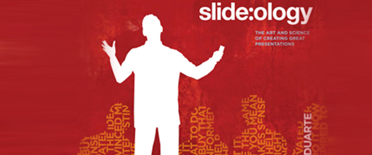
2. “Slide

” by Nancy Duarte

Nancy Duarte’s “Slide

dives deep into the art of visual thinking and design. Duarte offers practical advice on how to make your slides visually compelling while staying true to your core message.

Why It’s a Favorite:

  • Design-Centric: The book offers a masterclass in slide design, with real-world examples and tips.
  • Visual Thinking: Duarte teaches how to use design to communicate ideas more effectively.

Key Takeaway: Good design isn’t just about aesthetics—it’s about communicating your ideas clearly and effectively.


3. “The Naked Presenter” by Garr Reynolds

Another gem from Garr Reynolds, “The Naked Presenter” focuses on the art of live presentation delivery. It covers how to connect with your audience and engage them through storytelling and authenticity.

Why It’s a Favorite:

  • Focuses on Delivery: This book goes beyond slide design and delves into how to effectively deliver a presentation.
  • Encourages Authenticity: Reynolds emphasizes the importance of being genuine and open when presenting.

Key Takeaway: Engaging your audience requires more than good slides—it’s about connecting with them on a personal level.


4. “Resonate” by Nancy Duarte

“Resonate” is all about the power of storytelling in presentations. Duarte breaks down how to craft a narrative that captivates your audience and drives home your key points.

Why It’s a Favorite:

  • Narrative Focused: The book teaches how to structure your presentation like a compelling story.
  • Emotional Connection: Duarte explains how to use emotional appeal to connect with your audience.

Key Takeaway: A strong narrative is the foundation of a memorable presentation.


5. “Beyond Bullet Points” by Cliff Atkinson

In “Beyond Bullet Points,” Cliff Atkinson offers a practical framework for creating presentations that go beyond the typical bullet-point format. The book introduces a three-step method to help structure your presentation effectively.

Why It’s a Favorite:

  • Actionable Framework: Atkinson provides a clear, step-by-step approach to creating more engaging presentations.
  • Breaks the Mold: The book encourages presenters to move away from the conventional bullet-point format.

Key Takeaway: Presentations should tell a story, not just list information. Structure your content to guide the audience through a narrative.


Final Thoughts

These five books offer invaluable insights into both the design and delivery of PowerPoint presentations. Whether you’re looking to improve your slide design, craft a compelling narrative, or connect more effectively with your audience, these books will provide the tools you need to succeed. Incorporate their lessons into your next presentation, and watch your PowerPoint skills soar.

Dr. Seuss’s Five Rules for Fantastic Presentations

audience

Custom Designed Presentations

Dartmouth College

Dr. Seuss

humor

PowerPoint Agency

PowerPoint Design

PowerPoint design experts

PowerPoint specialist

presentation

Presentation Agency

Presentation Company

Presentation Consultation

Presentation Designers

Presentation Firm

Presentations

Theodor Seuss Geisel

Theophrastus Seuss

At some point in his senior year at Dartmouth College, Theodor Seuss Geisel and nine of his friends were caught drinking gin in his room. This was in 1925, during the era of the Prohibition and because of this, the dean put them all on probation.

He was also removed Geisel of his editorship of Jack-O-Lantern, the college’s humor magazine where Geisel published his cartoons. To escape punishment, Geisel began publishing cartoons under pseudonyms including: L. Pasteur, D.G. Rossetti ’25, and Seuss.

Those cartoons were the first time he signed his work under the name, “Seuss.” A couple of years later, Geisel began signing his work under the mock-scholarly title of “Dr. Theophrastus Seuss.”He soon shortened that to  Dr. Seuss. In acquiring his professional pseudonym, he also gained a new pronunciation. Most Americans pronounce the name “Soose,” and not “Zoice” (as it is supposed to be pronounced) and that is how Dr. Seuss came to life.

Arguably, one the most celebrated American author of children’s books, Dr. Seuss published 46 children’s books each with lessons still applicable to working adults today. This is also prevalent in the world of professional PowerPoint presentations. Here are my five favorite Seussian lessons for anyone working on their next professional PowerPoint design:

“Today you are you, that is truer than true. There is no one alive who is youer than you.” >

In short, be yourself. Your presentation should be where you identify and represent yourself in your truest and simplest form. Know what your company does, how it does it, and why. If a child can’t understand your explanation of what you do then you don’t know yourself well enough. Even Einstein agrees with this by saying, “If you can’t explain it simply, you don’t understand it well enough.”

“Why fit in when you were born to stand out?”

Your presentation is where you need to highlight your particular uniqueness and diversity- show how you stand out!  What do you do that is different or better than your competition? Why should I hire or buy from you? These questions are what your audience will be asking themselves as you present. It is better to anticipate them and have them answered in your presentation instead of having them come up as questions. This will show your audience how confident and prepared you are as a presenter.

“Sometimes the questions are complicated and the answers are simple.”

After reading just one of Seuss’s books, one will find that simplicity plays a huge role in a majority of his writing. Given his audience did consist of mostly children, Seuss had to match his stories to a lower reading level, but this did not take away from the fact that he managed to engage, inspire, and educate his readers. With only 236 different words, Seuss managed to make his most famous and influential piece of literature, The Cat in the Hat (1957).

“I meant what I said and I said what I meant.”

It is crucial to be direct in what you say while presenting, chose your words and phrases wisely. Being vague or ambiguous will inevitably hurt you in the long run. Being clear with your audience is the best route to getting long-term and recurring customers and partners.

“Today I shall behave as if this is the day I will be remembered.”

Working by this motto led Seuss to disregard anything but perfection in his writing. He would sometimes spend up to a year on a book, even though they consisted of less than 1000 words. It was common for him to throw out 95% of his material until he settled on a permanent theme. For a writer, he was unusual in that he preferred to only be paid after he finished his work rather than in advance. He did this to motivate himself to work towards perfection—which has has become Seuss’ legacy. Think of what and how you want to be remembered, and let that come across in your presentation.

Fielding the Tough Questions in Presentations

Addressing Opposing Views

ALWAYS

audience

Custom Designed Presentations

Formulating Questions

PowerPoint Agency

PowerPoint Design

PowerPoint design experts

PowerPoint specialist

presentation

Presentation Agency

Presentation Company

Presentation Consultation

Presentation Designers

Presentation Firm

Presentations

presenting

Topic First

The Q&A session has become a staple for almost any subject you will illuminate with a PowerPoint presentation. Oftentimes, this is a warmly welcomed opportunity for the presenter to clear up any points where the audience might be a bit fuzzy while going into more detail where audience members are interested.

However, as we all know or will eventually find out, presentations don’t always go exactly how we want them to, and sometimes we might face some tricky questions that catch us a little off guard, or intentionally antagonistic questions meant to incite an argument.

As the presenter–the person at the front of the room–you, by default, become the situation’s moderator. It’s up to you to keep the order in the room and the conversation civil and on topic. Most importantly, no matter how hard it may sometimes be, you should always strive to be the most mature, level-headed person in the room when you have the audience’s attention.

Stay on Topic

First off, don’t let audience questions derail your presentation. If appropriate for the topic and allotted time, set aside 5 to 15 minutes at the end of your presentation for a Q&A session. If audience members chime in during your presentation, politely ask them to wait until the end of your presentation.

If your audience refuses to listen to reason and grows unruly, we address that here.


Don’t Lose Sight of Your Topic

There may be a million other things you and your audience want to discuss, and they will likely make that apparent when given the opportunity to ask questions, but remember, you’re the one tasked with controlling the flow of the conversation.

Whenever engaging with an audience member, always be working the conversation (as naturally as possible) back toward the main point of your presentation. This way, you’re not wasting the time you’ve allotted to conveying your message.


ALWAYS take the high ground

keep-calm-and-keep-your-coolGetting visibly upset, agitated, or annoyed can strip any credibility you might have built up with your otherwise excellent presentation.

Similarly, even if an audience member really lobs one over the plate for you, don’t embarrass them for asking a stupid question. This may sound like your elementary school guidance counselor here, but although you may get a few laughs, anyone to be taken seriously will see your bullying as a sign of immaturity.


Take a deep breath before answering each question.

It’s common knowledge that our talking pace speeds up significantly when our adrenaline starts flowing, which happens often when we’re speaking in front of a crowd and our nerves are running high. breathe

Because of this, it’s easy for us to begin rambling when asked to speak off the cuff answering questions, so when you’re asked a question, even if it seems as simple as salt, pause, take a deep breath, and allow yourself a brief moment to formulate your response. You’ll find that this short pause will make your responses much more natural and articulate.

References:

“Keith Alexander Can Teach Us About Presenting to a Crowd.” SlideGenius. July 31, 2013.

Aflac Uses SlideGenius to Present a New Data-Heavy Sales Strategy to Its Team

Aflac

Custom Designed Presentations

data

PowerPoint Agency

PowerPoint Design

PowerPoint design experts

PowerPoint specialist

presentation

Presentation Agency

Presentation Company

Presentation Consultation

Presentation Designers

Presentation Firm

statistics

United States

Aflac, a leading provider of supplemental insurance in the United States, is known for its innovation and forward-thinking approach to business. To keep up with evolving market trends, Aflac recently revamped its sales strategy, focusing heavily on data-driven insights to enhance performance and efficiency. With a complex strategy packed with data, metrics, and new initiatives, Aflac needed a presentation that would not only communicate this information clearly but also engage their sales team effectively. For this crucial task, they turned to SlideGenius, a trusted expert in presentation design.

The Challenge: Making Complex Data Digestible

Sales strategies are often packed with numbers, charts, and analysis, and Aflac’s new approach was no exception. The challenge for Aflac was clear: how do you take a data-heavy strategy and present it in a way that is both engaging and easy to understand for a diverse sales team?

The presentation had to strike a balance between delivering detailed insights and keeping the audience’s attention. They needed to ensure that key metrics, trends, and strategic initiatives were communicated effectively without overwhelming the team. The solution? A highly visual, well-organized, and interactive presentation that simplified complex data while keeping it impactful and engaging.

Why SlideGenius?

With a reputation for crafting compelling presentations, SlideGenius was the natural choice for Aflac. As a leader in custom PowerPoint presentation design, SlideGenius has helped numerous companies across industries translate their data, insights, and strategies into clear and visually engaging slides. Aflac knew that SlideGenius had the expertise to create a presentation that could transform raw data into a narrative that resonated with their sales force.

The SlideGenius Approach: Data Simplified Through Design

To help Aflac present its new data-heavy sales strategy, SlideGenius focused on three core elements: visual storytelling, data visualization, and engagement.

1. Visual Storytelling

Aflac’s new sales strategy needed to be more than just a collection of charts and numbers—it had to tell a story. SlideGenius crafted a cohesive narrative that walked the sales team through the data step by step. Each slide was carefully designed to build on the previous one, guiding the audience through key insights and actionable takeaways.

Instead of simply showing numbers, SlideGenius used impactful visuals and graphics to explain the “why” behind the data. This storytelling approach ensured that the sales team not only understood the strategy but also connected with it on a deeper level, seeing how each data point contributed to their overall success.

2. Data Visualization

The heart of Aflac’s sales strategy was data—sales trends, customer demographics, performance metrics, and market insights. Translating this data into an easily digestible format was critical. SlideGenius employed advanced data visualization techniques, such as dynamic charts, infographics, and interactive graphs, to turn raw data into clear, understandable visuals.

Each visualization was tailored to match Aflac’s brand identity, making the presentation not only informative but visually consistent with the company’s image. By focusing on clean and modern design, SlideGenius ensured that the data wasn’t overwhelming but rather complemented the narrative of the strategy.

3. Engagement Through Interactive Elements

To keep the sales team engaged, SlideGenius incorporated interactive elements throughout the presentation. Clickable data points allowed team members to dive deeper into specific metrics or areas of interest without interrupting the flow of the presentation. Interactive timelines and diagrams provided a hands-on way to explore the new sales initiatives in detail.

These interactive elements empowered the sales team to explore the strategy at their own pace, ensuring that each member fully grasped the material before moving forward. This level of engagement is critical in retaining attention during data-heavy presentations.

The Results: A Winning Presentation

Thanks to SlideGenius, Aflac’s sales team was able to fully grasp the new data-heavy sales strategy without feeling overwhelmed by the complexity of the information. The feedback was overwhelmingly positive: the clear visuals, organized flow, and interactive elements kept the team engaged and allowed them to absorb the material effectively.

By breaking down complex data into digestible segments and presenting it in a visually compelling way, SlideGenius helped Aflac ensure that every member of the sales team left the presentation with a clear understanding of the strategy—and the confidence to implement it successfully.

Why Aflac and Other Companies Choose SlideGenius

Aflac’s success story with SlideGenius highlights the importance of expert presentation design when it comes to communicating complex information. Here’s why Aflac and other leading companies trust SlideGenius:

  • Expertise in Data-Heavy Presentations: SlideGenius specializes in transforming dense, data-heavy content into visually engaging presentations that are easy to understand.
  • Tailored Solutions: Each presentation is customized to meet the specific needs of the company and audience, ensuring that the message is communicated effectively.
  • Visual Appeal and Branding: SlideGenius ensures that every presentation aligns with the company’s brand identity, creating a polished and professional look that resonates with audiences.
  • Engagement Focus: With a focus on interactive and dynamic elements, SlideGenius designs presentations that keep audiences engaged from start to finish.

Final Thoughts

For Aflac, presenting their new sales strategy was more than just an information dump—it was about rallying their sales team around a shared vision. SlideGenius’ expertise in presentation design helped them deliver a complex, data-heavy strategy in a way that was clear, engaging, and actionable.

If your business is looking to elevate its presentations—whether for internal teams, clients, or investors—SlideGenius offers the perfect blend of design, strategy, and storytelling to ensure your message hits home. For more information on custom presentation design, visit SlideGenius or explore ready-made templates at SlideStore.

Analyzing the Attention Span of Your Audience

attention span

audience

Custom Designed Presentations

Facebook

PowerPoint Agency

PowerPoint Design

PowerPoint design experts

PowerPoint specialist

presentation

Presentation Agency

Presentation Company

Presentation Consultation

Presentation Designers

Presentation Firm

Twitter

Analyzing the attention span of your audience is crucial for delivering an effective presentation. Attention spans vary by context, but understanding how to manage and engage your audience’s attention can dramatically impact the success of your presentation. Here are key insights and strategies based on attention span research:

1. Understanding the Decline of Attention Span

  • Why it matters: Research indicates that the average human attention span has significantly decreased over the years, from 12 seconds in 2000 to just 8 seconds in 2015, according to a Microsoft study. While this may vary depending on the setting, the decline highlights the importance of capturing and maintaining attention quickly.
  • How to apply: Start your presentation with a strong hook, such as a compelling question, statistic, or visual. Keep your most important points early in the presentation to ensure they’re heard while the audience is still most engaged.

2. Audience Attention Peaks and Lulls

  • Why it matters: Studies have shown that audience attention tends to fluctuate during presentations, often peaking at the beginning and dropping off after 10-15 minutes. However, shorter bursts of attention can be regained with breaks, changes in pace, or interactive elements.
  • How to apply: Break your presentation into 10-15 minute segments. After each segment, incorporate an interactive element, such as a question, discussion, or visual change, to reset audience focus. Transitions between topics should also include clear summaries to reinforce the main points.

3. Incorporating Visuals and Storytelling

  • Why it matters: Research indicates that people retain 65% of information when presented with visuals, compared to only 10% when hearing or reading it alone. Additionally, storytelling helps sustain attention by engaging emotions and making information relatable.
  • How to apply: Use engaging visuals (charts, infographics, videos) throughout the presentation. Pair data with short, relevant stories or examples to help the audience relate to the content and stay engaged.

4. The Role of Engagement and Interaction

  • Why it matters: Engaging the audience actively helps break up the monotony of long presentations and re-engages focus. Research by the University of Washington found that including interactive segments such as Q&A sessions or polls leads to better engagement and higher information retention.
  • How to apply: Ask the audience questions, use live polls, or incorporate breakout discussions to keep their attention focused. These interactive moments can reset attention spans and make your content feel more dynamic and participatory.

5. Varying Presentation Styles and Pacing

  • Why it matters: A monotonous or slow presentation can cause the audience to lose focus, especially after the initial 10-15 minute window. Varying your pace, tone, and style of delivery can help maintain attention throughout.
  • How to apply: Change up your presentation pace periodically, moving from storytelling to data-driven points, followed by questions or videos. Avoid sticking to one delivery method for too long to prevent attention from drifting.

Conclusion

Understanding the limitations of audience attention spans allows you to craft presentations that are more engaging and memorable. By incorporating visuals, storytelling, and interaction, you can maintain the audience’s focus and ensure they retain the most important points of your presentation.

How to Humanize Your Virtual Presentations

audience

body language

Custom Designed Presentations

Powerpoint

PowerPoint Agency

PowerPoint Design

PowerPoint design experts

PowerPoint specialist

presentation

Presentation Agency

Presentation Company

Presentation Consultation

Presentation Designers

Presentation Firm

Virtual presentations

webinar

In the age of remote work and virtual meetings, it’s more important than ever to humanize your virtual presentations. Engaging a remote audience requires extra effort to create a connection and keep viewers engaged. Here’s how to add a human touch to your virtual presentations and make them more interactive and personal.


1. Make Eye Contact with the Camera

In a virtual presentation, eye contact helps create a sense of connection with your audience. While you can’t see your viewers directly, looking into the camera can simulate the feeling of eye contact and make your presentation feel more personal.

Why It’s Important:

  • Creates a Connection: Eye contact builds rapport and makes the audience feel like you’re speaking directly to them.
  • Increases Engagement: When the audience feels seen, they’re more likely to stay focused and engaged.

How to Do It:

  • Position your camera at eye level to maintain natural eye contact throughout the presentation.
  • Avoid looking at your screen too often; focus on the camera as if you’re speaking to an individual.

2. Use Storytelling to Build Empathy

Telling stories is a powerful way to create an emotional connection with your audience. Whether you’re sharing a personal experience, a customer success story, or a relatable challenge, storytelling helps humanize your message.

Why It’s Important:

  • Builds Emotional Connections: Stories resonate with the audience on a deeper level, making your message more memorable.
  • Engages the Audience: Storytelling keeps viewers interested and can help illustrate complex points in a relatable way.

How to Do It:

  • Start your presentation with a relevant story that aligns with your message.
  • Use personal anecdotes or real-life examples to make abstract ideas more tangible.

3. Encourage Interaction with Polls and Questions

Virtual presentations can feel one-sided if the audience isn’t involved. Break up your presentation by encouraging interaction through polls, Q&A sessions, or live chat.

Why It’s Important:

  • Fosters Engagement: Asking questions or conducting polls keeps your audience involved and attentive.
  • Creates a Two-Way Dialogue: Interaction humanizes the presentation, making it feel less like a monologue and more like a conversation.

How to Do It:

  • Use platforms that allow for live polling, like Zoom or Microsoft Teams, to gather audience feedback in real-time.
  • Ask open-ended questions throughout the presentation and invite viewers to share their thoughts in the chat.

4. Be Authentic and Relatable

Virtual presentations can sometimes feel detached. To combat this, embrace authenticity and vulnerability to make yourself more relatable to your audience.

Why It’s Important:

  • Increases Trust: Authenticity builds trust and rapport, making your audience more likely to engage with and trust your message.
  • Humanizes the Experience: Showing your human side helps the audience connect with you on a personal level, even through a screen.

How to Do It:

  • Don’t be afraid to show your personality or admit small mistakes; it makes you more relatable.
  • Use a conversational tone rather than overly formal language to create a more approachable presentation.

5. Personalize the Content

Tailoring your presentation to the specific interests and needs of your audience helps you establish a personal connection. The more relevant your content, the more engaged your audience will be.

Why It’s Important:

  • Keeps the Audience Engaged: Personalizing your content makes it more relevant and engaging for your viewers.
  • Shows Empathy: Tailoring your presentation to your audience’s challenges or interests demonstrates that you understand their needs.

How to Do It:

  • Research your audience in advance and customize examples or stories that align with their industry, challenges, or interests.
  • Use the audience’s feedback or questions to guide your presentation in real-time.

Final Thoughts

Humanizing your virtual presentation is essential for building connections, engaging your audience, and delivering an impactful message. By maintaining eye contact with the camera, using storytelling, encouraging interaction, and being authentic, you can create a virtual experience that feels personal and relatable. These strategies will help you leave a lasting impression, even from a distance.

Ums, Likes, and You-Knows: Avoiding Fillers in Your Presentations

American Idol

audience

Custom Designed Presentations

Fear of Public Speaking

PowerPoint Agency

PowerPoint Design

PowerPoint design experts

PowerPoint specialist

presentation

Presentation Agency

Presentation Company

Presentation Consultation

Presentation Designers

Presentation Firm

Presentations

public speaking

Ryan Seacrest

Simon and Garfunkel

Simon Garfunkel

Using filler words like “um,” “like,” and “you know” can diminish the impact of your presentation and make you appear less confident or prepared. While these words are common in everyday speech, they can become distracting when used excessively in professional settings. Avoiding fillers takes practice, but doing so will make you sound more polished, confident, and credible.

Here are strategies to help you reduce filler words and improve your presentation delivery:


1. Practice, Practice, Practice

One of the primary reasons people use fillers is that they’re unsure of what to say next. Practicing your presentation several times helps you become more comfortable with the content, reducing the need to rely on fillers.

How It Helps:

  • Builds Familiarity: The more familiar you are with your material, the less likely you are to pause and search for words.
  • Boosts Confidence: Practice makes you feel more confident, which reduces nervousness and filler words.

Example: Rehearse in front of a mirror or record yourself delivering the presentation. Review the recording to identify any unnecessary fillers and work on eliminating them.


2. Slow Down Your Speaking Pace

Speaking too quickly is another common reason people resort to fillers. When you rush through your presentation, your brain may struggle to keep up with your speech, causing you to insert “um” or “like” as placeholders.

How It Helps:

  • Gives You Time to Think: Slowing down allows you to think ahead about what you’re going to say next, eliminating the need for fillers.
  • Enhances Clarity: A slower, more deliberate pace makes your words clearer and easier to understand.

Example: Consciously pause between sentences or key points to give yourself time to think. This also helps emphasize important ideas and makes your speech more engaging.


3. Embrace Pauses

Many presenters use fillers because they’re uncomfortable with silence. However, strategic pauses can be far more effective than fillers. Pausing gives your audience a moment to absorb what you’ve said and makes your delivery more impactful.

How It Helps:

  • Adds Emphasis: Pausing before or after key points emphasizes their importance.
  • Breaks the Habit: Consciously using pauses instead of fillers will help you retrain your brain to avoid unnecessary words.

Example: Instead of saying “um” while transitioning between slides, simply pause for a moment. This brief silence can make your presentation feel more composed.


4. Focus on Breathing

When you’re nervous, your breathing can become shallow, leading to rushed speech and fillers. By focusing on deep, controlled breaths, you can keep yourself calm and avoid the need for fillers.

How It Helps:

  • Keeps You Calm: Deep breathing reduces anxiety, helping you maintain control over your speech.
  • Paces Your Speech: Focusing on your breathing naturally slows down your speaking pace, reducing fillers.

Example: Before starting your presentation, take a few deep breaths to calm your nerves. During the presentation, remember to breathe deeply between sentences.


5. Use Transitional Phrases

Often, fillers are used when presenters don’t know how to transition smoothly between ideas. Replacing fillers with well-thought-out transitional phrases will make your presentation flow better and sound more professional.

How It Helps:

  • Smooth Transitions: Instead of using “uh” or “like,” employ phrases such as “Next, I’d like to discuss…” or “To build on that point…”.
  • Keeps You Focused: Using clear transitions ensures that you stay on track and reduce the likelihood of resorting to fillers.

Example: Instead of saying, “Um, so, like, the next point is…,” say, “Now that we’ve covered the introduction, let’s move on to the key findings.”


6. Record Yourself and Take Note of Patterns

Recording yourself while practicing allows you to identify where and how often you use fillers. Once you know your filler patterns, you can actively work on reducing them.

How It Helps:

  • Identifies Triggers: You’ll be able to see when and why you tend to use fillers (e.g., during transitions or when introducing new concepts).
  • Track Progress: Recording yourself multiple times lets you monitor your improvement over time.

Example: Record your practice sessions and note when you say “um” or “like.” Focus on those areas during your next rehearsal and actively work on removing the fillers.


Final Thoughts

Eliminating filler words from your presentations can significantly enhance your delivery and make you appear more confident and professional. By practicing regularly, embracing pauses, slowing down, and focusing on smooth transitions, you can reduce or eliminate fillers and deliver a polished, impactful presentation.

Turning Your PowerPoint into a Video (Part II): Marketing Your Video

Custom Designed Presentations

Email Outreach

Facebook

Hootsuite

how to

Hubspot

LinkedIn

PowerPoint Agency

PowerPoint Design

PowerPoint design experts

PowerPoint specialist

Presentation Agency

Presentation Company

Presentation Consultation

Presentation Designers

Presentation Firm

SlideGenius

Twitter

video

Vimeo

Youtube

In the previous post, I talked about the benefits of turning your PowerPoint presentation into a video and how SlideGenius can do this in the most professional, financially viable way. This post will cover what happens after you get said video into your virtual hands.

As mentioned before, the greatest benefit of having your PowerPoint presentation in a stand-alone, video format is the ability to leverage it by vastly increasing its exposure. The only trick is, how do you reach these new online audiences?

Most of these mediums we recommend pushing your video through will hopefully sound familiar, but having an all-encompassing social media strategy is imperative in order to be effective.

YouTube and Vimeo

Uploading your video to both of these sites is a good first step to ensure your video is easily viewable. Not only does this make your video accessible with an easily sharable link, YouTube and Vimeo have become surprisingly socially active sites.

Especially if you’re new to video sharing, and your YouTube and Vimeo channels don’t have a lot of activity, your videos won’t get many (if any) organic hits from these sites, but like almost any social medium, staying active with these channels will have a rolling effect of attracting audiences to your content over time.

Twitter, Facebook, and LinkedIn

I lump these three commonly used social mediums together because, from a business standpoint, content on each is pushed in a very similar manner. The goal here, with all three of these, is to be mindful of how you present the content, since you’ll be more than likely posting the content as a general status to all your fans, followers, connections, etc., and not to anyone in particular.

Being proactive with social media will help draw traffic to your video presentation.

Not to start a lecture on the basics of social media, but sites like Hubspot and Hootsuite are great for synchronizing your content across these sites. Coordinating and scheduling consistent content across your different social mediums can help to avoid redundancy when pushing your video presentation.

Email Outreach

Plug your video at every chance you get. Interaction with potential or existing clients through email presents a lot of opportunities for you to tag on the video near the bottom of your message. And if you have an automatic reply programmed to go out for potential leads on your website, a link to your professionally made video can’t hurt!

Get Creative

Whatever you do, don’t spend resources on a top-of-the-line video presentation, use it once, then leave it in the corner to collect digital dust. Keep it in the back of your mind, look for openings in online conversations with clients to work it in, post it on an appropriate landing page on your website, or incorporate parts of it into your next presentation.

Carmine Gallo’s Rule of Three: Incorporating the Most Persuasive Number in Communications

audience

Carmine Gallo

Custom Designed Presentations

Herman Cain

PowerPoint Agency

PowerPoint Design

PowerPoint design experts

PowerPoint specialist

presentation

Presentation Agency

Presentation Company

Presentation Consultation

Presentation Designers

Presentation Firm

presenting

Rule of Three

In the world of communication and storytelling, simplicity and clarity are often the keys to success. One of the most powerful tools for achieving this is the Rule of Three—a concept that is deeply rooted in human psychology and communication. Carmine Gallo, a renowned communications coach and author, emphasizes the effectiveness of the Rule of Three in his books and teachings. According to Gallo, incorporating three key points, ideas, or messages is the most persuasive and memorable way to communicate with your audience.

Let’s explore how you can incorporate the Rule of Three into your presentations, speeches, and written communication to make your message more compelling, memorable, and persuasive.

What is the Rule of Three?

The Rule of Three is a writing and speaking principle that suggests that concepts or ideas presented in threes are inherently more satisfying, effective, and memorable. This principle is deeply ingrained in human communication, with examples found in literature, speeches, and marketing.

  • Three is simple: The human brain processes information best in small, manageable chunks. Grouping ideas in threes helps break down complex information into more digestible parts.
  • Three is memorable: People tend to remember three points more easily than four or five. When you present three ideas, your audience is more likely to retain them.
  • Three is persuasive: Whether it’s a marketing message, a speech, or a pitch, delivering information in groups of three often feels more complete and convincing.

Examples of the Rule of Three in Practice:

  • Political Slogans: “Life, Liberty, and the Pursuit of Happiness.”
  • Marketing Campaigns: “Reduce, Reuse, Recycle.”
  • Storytelling: “Beginning, Middle, End.”

In his book The Presentation Secrets of Steve Jobs, Gallo shows how the Apple co-founder frequently used the Rule of Three to simplify and drive home product messaging, making presentations memorable and impactful.

Why Three is the Magic Number in Persuasion

1. Cognitive Ease

The Rule of Three works because our brains are wired to process and retain information in threes. Research shows that humans have a limited short-term memory capacity, and three is the optimal number of items we can process without being overwhelmed. When ideas are presented in threes, they create a natural rhythm that makes them easier to follow and understand.

  • Simplifies Complexity: By breaking down complex ideas into three main points, you make it easier for your audience to grasp and retain your message.
  • Enhances Clarity: It avoids overloading your audience with too much information, helping them focus on the core message.

2. Creates a Pattern

Humans are naturally attracted to patterns, and three creates a sense of completeness and structure in communication. When you present ideas in threes, it feels like a complete, well-rounded argument or story.

  • Triads are Satisfying: Triads (groups of three) create a sense of rhythm and flow, making your communication more pleasant and compelling to listen to or read.
  • Creates Anticipation: When you establish a pattern, such as introducing two points and building toward a third, the audience anticipates a conclusion, making your final point more impactful.

3. Boosts Memorability

The Rule of Three helps your audience remember your key points long after the presentation or conversation ends. This is critical in business communication, where you want your ideas to stick in your audience’s mind.

  • Recall is Higher: Studies show that when people are given three ideas, their ability to recall those ideas is higher compared to when more points are presented.
  • Resonates with Audiences: The Rule of Three resonates with people because it aligns with how we naturally categorize and understand information.

How to Incorporate the Rule of Three in Communications

1. In Presentations

Incorporating the Rule of Three in presentations makes your content more digestible and helps keep your audience engaged. Structure your presentation around three main ideas or sections to create a clear, memorable framework.

  • Three Main Points: Before designing your slides, identify the three most important messages you want your audience to take away. For example, if you’re pitching a product, your three points might be: “Innovative features, market demand, and competitive pricing.”
  • Three Supporting Examples: When making a claim, back it up with three supporting facts, stories, or statistics. This provides enough evidence to be convincing without overwhelming your audience.
  • Three Key Takeaways: Conclude your presentation with three actionable takeaways. This reinforces your message and ensures that your audience leaves with a clear understanding of the most important points.

Example:

In Steve Jobs’ famous iPhone introduction, he used the Rule of Three to unveil the product by saying, “An iPod, a phone, and an internet communicator.” This powerful triad made the audience understand immediately that the iPhone combined three revolutionary functions.

2. In Public Speaking

In speeches, the Rule of Three can add rhythm, cadence, and impact to your words. Whether you’re delivering a keynote or a motivational speech, using triads in your structure makes your points more persuasive and memorable.

  • Three-Part Structure: Begin by outlining your three key points. For example, in a leadership speech, you might structure your talk around “Inspiration, Empowerment, and Action.”
  • Repetition in Threes: Repeat key phrases three times for emphasis. This creates a memorable rhythm and drives home the point. For example, Martin Luther King Jr.’s iconic speech includes the phrase “I have a dream” repeated in threes.
  • Storytelling in Threes: When telling stories or anecdotes to illustrate your points, keep the narrative in three parts: setup, conflict, and resolution.

Example:

In his famous Gettysburg Address, Abraham Lincoln used the Rule of Three in his opening line: “Government of the people, by the people, for the people,” cementing his message in the minds of his audience.

3. In Writing and Marketing

In marketing copy, the Rule of Three simplifies your message and makes it more appealing to consumers. Whether it’s crafting headlines, product descriptions, or campaign slogans, using triads is a highly effective tactic for grabbing attention.

  • Three Key Benefits: When describing a product or service, focus on three main benefits. For example, a fitness app might highlight “Easy tracking, personalized workouts, and real-time feedback.”
  • Three-Part Slogans: Craft slogans and taglines that incorporate three ideas. Slogans like “Just Do It” and “Think Different” have the power of simplicity, but adding a third element can create even more impact, such as “Stop. Think. Decide.”
  • Three Calls to Action: End your marketing content with three clear calls to action. For example, on a landing page, you might direct your audience to “Sign up, Learn more, or Contact us.”

Example:

In a successful Apple marketing campaign, the slogan “Light. Years ahead.” follows the Rule of Three by introducing a triad concept, leaving an impactful message that highlights the product’s innovation.

Final Thoughts

Carmine Gallo’s Rule of Three offers a simple yet incredibly powerful framework for making your communication more effective and persuasive. By organizing your message into three key points, you can simplify complex ideas, enhance clarity, and boost memorability. Whether you’re delivering a presentation, writing a marketing campaign, or speaking to an audience, the Rule of Three helps you cut through the noise and make your message stick.

Incorporating this principle into your communication can transform your ability to persuade and influence, making your message more impactful and ensuring that your audience walks away remembering what matters most.