Sparking Your Imagination for a Great Sales Pitch

creativity

imagination

presentation tips

sales pitch

It’s hard to start a project that isn’t particularly inspiring to do. Much more if you’ve somehow gotten yourself in a creative rut, self-brought or otherwise.
If you find it difficult to come up with a sales pitch, then it’s time to start doing it differently, specifically the planning.
Working on a new project that doesn’t interest you actually feels like it’s taking so much mental energy and focus. Even forcing yourself to do it leaves you feeling tired. When you’re not up to the task of delivering a sales pitch, your lack of enthusiasm will show and affect your performance. Try some of these tips to get your creative juices flowing.

Claim Creativity

Sparking Your Imagination for a Great Sales Pitch: Claim Creativity
Stop thinking you’re not imaginative or artistic. This is self-defeating and counterproductive and will prevent you from performing at your best. People who confidently call themselves creative helps them be more creative. Sound familiar? How about a different—and quite literal—interpretation of “I think, therefore I am” or “You are what you eat”?
Bill Seidel, inventor and CEO of America Invents, starts his class by making sure all his students raise their hands when he asks them if they’re creative.
Negativity and doubt are obstacles you need to get rid of. Gain a new perspective by thinking creatively and believing in yourself.

Take a Break

Sparking Your Imagination for a Great Sales Pitch: Take a Break
Familiarity breeds contempt. For a sales pitch, you might be getting burned out from thinking up of ways—and failing—to make one. Remember the mental tiredness from forcing yourself to create? If you feel that happening, stop for a while. Give yourself a break and move away from everything that reminds you of work. Not only are you resting your body but also your mind. A bit of fresh air or a stroll around the block can do the trick. As long as you distract and detract yourself away from the task, you’ll get that “second wind,” so to speak.
Put yourself in a good mood and focus on feeling positive and relaxed instead. A cool head might be all you need to get back in the game.

Daydream

Sparking Your Imagination for a Great Sales Pitch: Daydream
If you need to imagine yourself having an awesome deck, why not? Staring into space and having your mind wonder and wander about not only serve as mental breaks but are also exercises into alternate realities. Oxymoronic, you say, break and exercise? It’s that paradoxical nature that will get you thinking more and more yet not find yourself stressing out… if you’ll think about it.
There’s a wondrous surprise of liberation when you get your head up in the clouds, conjuring in your mind anything that doesn’t tire you out or pressure you to work or even be an adult. Once that pressure is lifted, who knows, maybe the key you need for that pitch will just come to you. Or you will just suddenly think of something that will make your deck perfect. All because you didn’t force yourself to think of it.

Experience New Things

Sparking Your Imagination for a Great Sales Pitch: Experience New Things
Try new stuff. That’s basically it. Experience something you haven’t before. Haven’t traveled yet? Go ahead. Never tried skiing? Try it for the first time. The point is expanding your horizons. Quite the cliché, right? But the lesson is still there: when you have a wider base of knowledge, you can draw much from your experiences. Insights, parallelisms, and even comparisons that you can use as leverage.
Challenge and go beyond your limits and comfort zone. There’s much to learn beyond what you already know, and depending on your stock knowledge for everything will eventually be unhealthy. You could even discover new loves and passions to add to your schedule and skills to your repertoire. Don’t be afraid.

Allow Room for Mistakes

Sparking Your Imagination for a Great Sales Pitch: Allow Room for Mistakes
The need to be original is your biggest obstacle to being creative. This is too much to consider, when all you really have to do is deliver a sales pitch.
Frame your experience to the present moment, and your anxieties will look much smaller. Overwhelming pressure and fear of the uncertain leads to self-doubt, but no one’s perfect. Cut yourself some slack. There’s no need to bring all those to the table. And no need to bite off more than you could chew. You’ve got your task enough as it is. Never mind the Pygmalion effect. Just go out there and be great.

The Takeaway

Swap the negative thinking with positive thinking to set yourself up for success. Another option is to daydream, imagine different things that can only happen in your head. Once you’ve cleared your mind, come back to making your sales presentation. Or try new things you’ve yet to do. Lastly, don’t force yourself; don’t be the obstacle you’re looking to overcome. Once you’ve got those creative juices flowing, try again. And see the results.

Resources:

Efti, Steli. “10 Steps For Giving A Convincing Sales Pitch.” Forbes. April 18, 2014. www.forbes.com/sites/theyec/2014/04/18/10-steps-for-giving-a-convincing-sales-pitch
Falconer, Joel. “30 Tips to Rejuvenate Your Creativity.” Lifehack. n.d. www.lifehack.org/articles/productivity/30-tips-to-rejuvenate-your-creativity.html
Irwin, Menar. “Creativity Hacks: 9 Ways to Find Inspiration.” Marketing Insider Group. December 16, 2016. www.marketinginsidergroup.com/content-marketing/creativity-hacks-9-ways-find-inspiration
Kotler, Steven. “Hacking Creativity.” The Creativity Post. July 31, 2012. www.creativitypost.com/pop-culture/hacking_creativity
Tartakovsky, MS, Margarita. “One of the Biggest Obstacles to Creativity.” Psych Central. October 1, 2014. blogs.psychcentral.com/everyday-creativity/2015/10/one-of-the-biggest-obstacles-to-creativity
Zetlin, Minda. “9 Seriously Easy Ways to Spark Your Creative Energy.” Inc.com. January 16, 2015. www.inc.com/minda-zetlin/9-seriously-easy-ways-to-spark-your-creative-energy.html
“How to Be Creative: 6 Secrets Backed by Research.” Bakadesuyo.com. December 2015. www.bakadesuyo.com/2015/12/how-to-be-creative

PowerPoint Keyboard Shortcuts for Presenters

Keyboard Shortcuts

Powerpoint tips

presentation tips

Has it ever happened to you that, when crafting slides for a great presentation, you’ve got multiple objects to select, copy, paste, move, etc. And working with your mouse is slowly but surely becoming tedious, exhausting, and time-consuming? To be fair, it’s not limited to just PowerPoint.
In almost every program on desktop, and even the operating systems (Windows and Mac) themselves, there are specific sequences and/or combinations of keyboard presses that correspond to functions and commands, called keyboard shortcuts.
Ever wondered what the keys on the bottom row are for, specifically the Ctrl (Control) and Alt (Alternate) keys? They’re integral to keyboard shortcuts. If it’s not Ctrl plus a key, then it’s Alt plus another key—or both Ctrl and Alt. To give you an example, if you’re a Windows user, then you’re familiar with the desktop shortcut “Alt + Tab” for cascading through different active windows/open programs. There’s “Ctrl + Alt + Del” as well, opening a Securities Options menu where you can choose Task Manager, among other things.
In short, keyboard shortcuts give you access to functions that are usually hard to access by mouse. But they don’t stop there. If efficiency didn’t cross your mind the first time you read the phrase “keyboard shortcuts,” since they make a certain number of functions faster to do, then how about health?
Repetitive strain injury (RSI) has been linked with too much computer mouse use. Although extended keyboard use has also been linked to RSI, an average person uses the mouse more than a keyboard. At least with keyboard shortcuts, you’re balancing your use of both computer accessories with less risks involved.
Now, when creating those enticing slides, what shortcuts are available to you? Check this gifographic to learn what you can train yourself to use and share with your presentation friends. You can bet that experienced presentation designers and public speakers use the hotkeys below to help them go through their PowerPoint files quicker and better.

Knowing Which PowerPoint Keyboard Shortcuts Can Help You Out

Resources:

Jones, Steven C. “Computer Work Postures and Injury: The Stress of Reaching for the Mouse, a Doctor’s Perspective.” Business Know-How. n.d. www.businessknowhow.com/manage/computer-mouse-injuries.htm
Klosowski, Thorin. “Back to Basics: Learn to Use Keyboard Shortcuts Like a Ninja.” Lifehacker. December 20, 2012. www.lifehacker.com/5970089/back-to-the-basics-learn-to-use-keyboard-shortcuts-like-a-ninja
“5 Reasons Why You Should Be Using Keyboard Shortcuts.” Shortcut Keys. n.d. www.shortcutkeys.net/why-use-shortcuts

Pointers for Planning a Successful Webinar

custom powerpoint

pitch deck

presentation tips

Rick Enrico

SlideGenius

webinar

Webinar Presentation

Webinar Tips

Preparation is a critical step in any type of campaign, including hosting webinars. To produce a successful one, you need to lay out all the steps leading to the actual event. It might be tempting to jump straight to the promotion stage, especially if you have a winning topic and a celebrated speaker, but no excuse can justify skipping the planning part. Without a solid plan in place, you may run the risk of delivering a lackluster presentation that will only prove to be a waste of time, effort, and money.

Planning a webinar may seem like a daunting task, but it’s necessary if you want a worthwhile output. Part of the process is creating a checklist that will solidify your strategy. You don’t have to worry about the technicality of it all. With the abundance of tools you have at your disposal, you can plan an online seminar even with limited technological expertise. And besides, every bit of effort you make will be worth the rewards you’ll reap in the end.

Can a Webinar Help Reach Your Business Goals?

You’d think the answer to that question is an unwavering yes, but it actually depends on the goals you aim to achieve. While it’s true that webinars are an effective marketing tool, they only work in certain contexts. So, before planning one, make sure it will leave a positive impact on your business.

What exactly are webinars for? For one, they’re a good training and outreach tool. You can use them to share your expertise to your target audience. Webinars are also effective for getting the word out to your customers when rolling out a new product. When done right, it can help you move customers further down the sales funnel and reposition yourself as an industry thought leader.

Resources:

Berdeal-Skelly, Michelle. “6 Tips to Planning a Successful Webinar.” Find and Convert. October 14, 2014. www.findandconvert.com/2014/10/6-tips-to-planning-a-successful-webinar

Gilbert-Knight, Ariel. “10 Steps for Planning a Successful Webinar.” TechSoup. September 2, 2016. www.techsoup.org/support/articles-and-how-tos/10-steps-for-planning-a-successful-webinar

Sibley, Amanda. “10 Things That Take a Webinar From Good to Great.” HubSpot. January 3, 2014. blog.hubspot.com/marketing/webinar-planning-list#sm.0000w6nx4vstbcwkqnc12umt2kzcx

“15 Tips for a Successful Webinar.” MegaMeeting. n.d. www.megameeting.com/15_Successful_Webinar_Tips_Part1.html

Looking for creative presentations that can leverage your business? Enjoy free PowerPoint templates from SlideStore! Sign up today.

6 Tips to Keep Your Audience Engaged and Interested

audience attention

audience engagement

presentation delivery

presentation tips

public speaking

public speaking tips

Imagine looking intently at your audience ten minutes into your hour-long presentation. Imagine seeing, instead of eager faces, a sea of spectators wearing I-don’t-want-to-be-here looks. Some of them are yawning; others are glancing at the time. You also spot a few snoozing in plain view, as though daring for you to call them out. Any speaker facing this situation would undoubtedly be unnerved. After all, no one wants to feel like they’re imposing themselves to others.

The scenario you’ve just played out in your mind is a proof that presentations aren’t just about content. The way you say something is just as important as what you have to say, if not more so. No matter how unique and valuable your content is, it’s useless until you present it in an interesting manner.

The thing about presentation delivery is that it’s not a “one time, big time” deal. It’s not something you can apply only at the start and end of your speech. Building momentum isn’t enough; you need to be able to sustain it throughout the presentation. Since this is harder than it seems, we’re giving away some tips to help you with this ordeal.

Keeping Your Audience Hooked from Start to Finish

There’s a certain stigma that pervades presentations: boredom. Many people perceive speeches as nothing but a waste of resources. The time is ripe for you to join the few great presenters who aim to eradicate this stigma by delivering presentations that are interesting from start to finish.

1. Tell them outright why they should listen.

Your chosen topic should be something that the audience is interested in. If you want them to listen, give them a reason to lend you their ears. Unless you make the talk about them, it’s unlikely that they’ll care at all about what you have to say.

2. Give them enough mental challenge.

Presentations are neither about spoon-feeding your audience with information nor baffling them with incomprehensible data. To keep them hooked, you should provide them with enough mental challenges that will keep them occupied without straining their mental faculties. Dispose of anything that will either underchallenge (e.g. bullet points) or overchallenge (e.g. complicated graphs) them.

3. Turn your speech into a two-way discourse.

An effective way to engage your audience is to include them in the presentation. Cook up some strategies to switch the limelight from them to you. Audience interaction doesn’t come by accident; as the speaker, you need to be the ringleader of the action. By framing the presentation in a way that encourages participation, you’ll be able to keep your audience’s minds from wandering off.

One way to elicit engagement is to embolden people to ask questions. Getting their opinions will not only bring variety to the table but also deepen the conversation. You can also post interesting questions that will get them thinking from beginning to end. Also, leveraging social media by inviting your audience to tweet or blog about your presentation can go a long way in achieving interaction. If you only want minimal engagement, however, you can just poll your audience as a group. Ask them to raise hands or stand to show agreement or dissent.

4. Grab their attention with any kind of change.

Uniformity fosters boredom, so you should veer away from any predictable patterns of speech. Add any kind of nuance, however small, to draw your audience’s minds back to the presentation. There are a lot of aspects that you can modify in a speech. For example, you can change your style of delivery depending on the type of content you share. State facts with a deliberate tone and tell stories in an animated manner. You can also change the inflection of your voice to emphasize the differences between strong and trivial statements. By varying your vocal inflections, you can add emotional layers to your words.

Another thing you can modify is the type of media you use. For instance, you can shift from a PowerPoint slide deck to a whiteboard presentation. By incorporating these small changes in your presentation, you can recapture the audience’s attention every time their minds drift away.

Audience Attention Tips: Schedule Breaks Between Sections

5. Vary the types of content you share.

Don’t limit yourself to one type of content. While it’s true that facts and data are essential in business presentations, you shouldn’t let your speech turn into a lecture just because you can’t find creative ways to present your content. As much as possible, blend in some stories into your presentation. People are hard-wired to love narratives, so they’ll be more interested to hear what you have to say when you package your content that way. You can also use metaphors to illustrate a point, or draw from a personal experience to make an example.

There are other types of content you can add to your speech. For instance, a mind map can work for organizing your thoughts. Visual elements are also good for spicing up your presentation. If you can apply humor prudently, it can also be useful in lifting the boredom and energizing your audience.

6. Schedule breaks between sections.

Don’t underestimate the rejuvenating effects of a short break. Give your audience ample time to walk around, refill their drinks, take a breath of fresh air, and get the blood flowing through their legs once again with a quick stretch. These small activities will revive your audience and keep them from dozing off halfway through your speech. Schedule breaks where they apply and see an immediate improvement in the mood of your spectators.

When you feel inclined to settle for a mediocre presentation that will no doubt bore your listeners, just remember that having a ready audience to listen to you is a privilege. It’s an honor you can earn by devoting enough resources to make your presentation worth everyone’s time and effort. Apply the tips we’ve provided, and you’ll be taking a step in the right direction. Good luck!

Resources:

Belknap, Leslie. “How to Find a Story to Enhance Your Public Speaking Presentations.” Ethos 3. November 6, 2015. www.ethos3.com/2015/11/how-to-find-a-story-to-enhance-your-public-speaking-presentations

Brownlow, Hannah. “10 Ways to Keep Your Audience’s Attention.” Bright Carbon. June 18, 2015. www.brightcarbon.com/blog/10-ways-to-keep-your-audiences-attention

DeMers, Jayson. “10 Presentation Tricks to Keep Your Audience Awake.” Inc. August 11, 2015. www.inc.com/jayson-demers/10-presentation-tricks-to-keep-your-audience-awake.html

Grissom, Twila. “How to Make a Presentation: The Importance of Delivery.” CustomShow. November 27, 2014. www.customshow.com/giving-great-presentation-importance-delivery

Hedges, Kristi. “Five Easy Tricks to Make Your Presentation Interactive.” Forbes. January 28, 2014. www.forbes.com/sites/work-in-progress/2014/01/28/five-easy-tricks-to-make-your-presentation-interactive/#223ff6ae2586

Martinuzzi, Bruna. “How to Keep Your Audience Focused on Your Presentation.” American Express. September 14, 2012. www.americanexpress.com/us/small-business/openforum/articles/how-to-keep-your-audience-focused-on-your-presentation

Mitchell, Olivia. “7 Ways to Keep Audience Attention During Your Presentation.” Speaking About Presenting. n.d. www.speakingaboutpresenting.com/content/7-ways-audience-attention-presentation

Patel, Neil. “When, How, and How Often to Take a Break.” Inc. December 11, 2014. www.inc.com/neil-patel/when-how-and-how-often-to-take-a-break.html

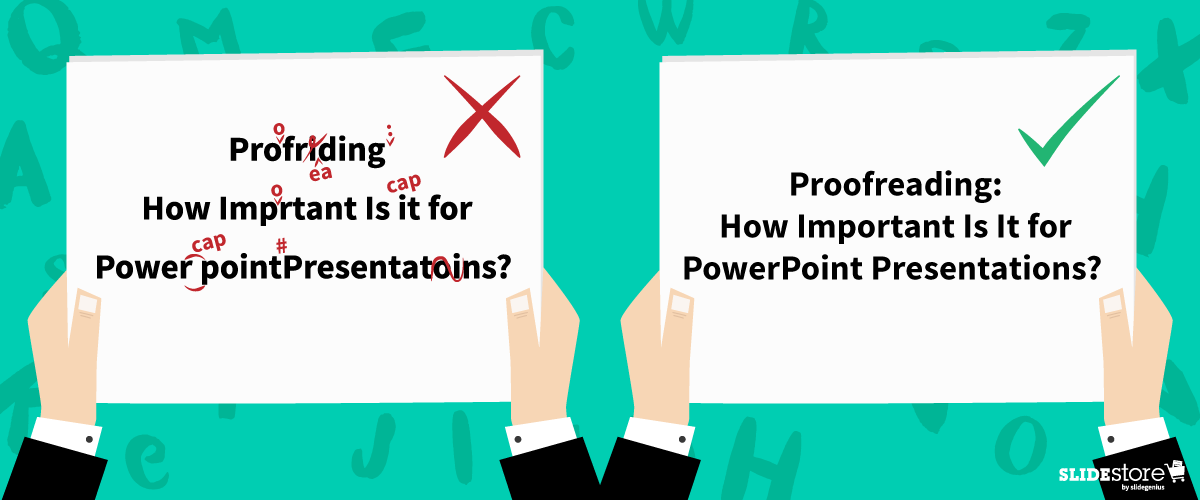
Proofreading: How Important Is It for PowerPoint Presentations?

content tips

Powerpoint tips

presentation design

presentation tips

proofreading tips

When reading, isn’t it bothersome to see a typographical error that distracts you from peacefully enjoying the piece? There’s the nagging feeling that “teh” should be “the,” that “your” should be “you’re,” or that “should of” is completely wrong. If tenses are all over the place or the subject-verb agreement isn’t correct, then that impression of the mistake gives way to disappointment and silent rage. Typos are distracting, to say the least.

To curb typographical errors, the responsibility of proofreading content falls squarely upon your shoulders. Be it a blog post, a book waiting to be published, or even a social media update, any piece of content should be proofread before publishing and publicizing, lest you be subject to the anger-inciting asterisk.

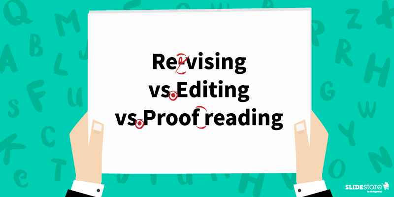
“But wait,” you may probably say. “What’s the difference between proofreading and editing? And there’s revision, too.” It’s time to contrast.

Revising vs. Editing vs. Proofreading

Revising entails the “re-visioning” of the whole piece; you gauge and, if ever, change how you approach your topic. Some of the main questions you need to consider when revising are, “Did the last draft fail to answer important questions, and does the recent one succeed?” and “Is the argument clear and understandable?”

Editing is done so that the whole piece is coherent and unified. You check the flow from one sentence to another and the logic from one paragraph to the next to discern whether the transitions are clear and smooth. If not, then rearrange paragraphs, rewrite sentences, and make the according edits.

Proofreading, the lightest of the three, is where you look for misspelled words, misused punctuation marks, and improper verb tenses and subject-verb agreements to fix them. This is the last step you should do before posting your content.

You must also check your PowerPoint presentation to ensure it doesn’t have any errors (and if it does, edit). Other than showing that you took the time to perfect your slide, it also implies the following notions:

Clarity

Apart from the fact that typographical errors and grammatical mistakes are distracting (diverting your reader’s attention to the typo itself), they take focus away from the message of your presentation in PowerPoint. There are more possible misinterpretations of a line missing a word, a missing letter crucial to the intended definition of the word (think “pubic” instead of “public”), or inconsistent tenses.

While it may be said that the human mind internally corrects the mistake, it’s still an unnecessary mental activity for the reader. Instead of focusing on and absorbing your piece, they’re looking out for mistakes just to satisfy the feeling that what they’re reading is clean and error-free—if they even decide to keep reading your piece.

Instead of muddling and muffling your piece’s flow of information because of errors, make sure your copy is clean and polished. Take the time to think about how your audience reads your article. When you see a typo, correct it right away.

Professionalism

Often, if you read content rife with grammatical and typographical errors, your judgment on it is, “This must have been done by an amateur.” Contrast that with well-proofread copies, and the stigma of unprofessionalism is gone.

Careless mistakes are always a show of unprofessionalism. It can imply that you weren’t fully prepared with your slides or that you crammed your PowerPoint presentation. It can mean that you never bothered to check for mistakes after your first draft or that you didn’t organize everything effectively and efficiently.

This is why there is a practice in any printed publication to correct any factual or typographical errors that made it past layers of editing, albeit in the next edition. Unfortunately, this doesn’t hold as true for digital copies even though editing them is easier to do. Make sure you don’t fall into the same trap.

Consistency

Which do you go for: “toward” or “towards”? “Color” or “colour”? If you’re not careful, you might end up using two kinds of English in a single piece.

Having a consistent voice and tone is a must, if not for regional differences then for establishing yourself as a proficient English speaker and communicator. If you use American English, then keep it that way throughout your piece; if you’re going for British, then make your spelling and idiom use consistent. It may sound traditionalist, but there are critics of this kind of inconsistency. Plus, it helps define your target market without alienating the other party.

All in all, keep your content error-free. It’s a secret to crafting great copies. Even in school, you were trained to submit perfect essays and reports since having typos usually meant markdowns. It’s the same when it comes to business, only with far-reaching consequences. When you’re in front of a crowd whose decision could shape your life and/or career, you wouldn’t want to risk making the kind of mistake.

Writers live by a general rule, and it’s a good exercise of their English and organizational skills. “Write in white heat; revise/edit in cold blood.” Any word work you do falls under this rule. There are no exceptions. Not even your slides. The task of proofreading falls upon you, the content creator, and definitely not a PowerPoint presentation designer.

Resources:

Scocco, Daniel. “The Impotence of Proofreading.” Daily Writing Tips. n.d. www.dailywritingtips.com/the-impotence-of-proofreading

Wasielewski, Jarek. “The Importance of Proofreading Your Webinar.” Webinar Tips Blog. September 25, 2015. blog.clickmeeting.com/the-importance-of-proofreading-your-webinar

Wright, Catharine. “Revision, Editing and Proofreading: What’s the Difference?” Peer Writing Tutors & FYS Mentors. February 14, 2011. sites.middlebury.edu/peer_writing_tutors/2011/02/14/revision-editing-and-proofreading-what%E2%80%99s-the-difference

Wroblewski, M.T. “The Importance of Proofreading in the Workforce.” Chron. n.d. smallbusiness.chron.com/importance-proofreading-workforce-36110.html

Zimmer, John. “Five Typographical Errors to Avoid on Your Slides.” Manner of Speaking. November 6, 2010. www.mannerofspeaking.org/2010/11/06/five-typographical-errors-to-avoid-on-your-slides

“How Proofreading Services Can Make Your Next Presentation a Success.” Re:word. n.d. www.reword.ca/how-proofreading-services-can-make-your-next-presentation-a-success

Working with an Awful-Looking PowerPoint Template

Powerpoint

powerpoint template

Powerpoint tips

presentation design

presentation tips

Corporate PowerPoint templates are notorious for their impracticality and ineffectiveness. This is because they’re usually created by people with limited knowledge or experience in design. If you are guilty of this sin, then you should hire a slide design professional who can amp up your template’s look and feel. The aesthetics of your presentation can reflect the amount of dedication you put in it, so make sure you create a template that is engaging and attractive.
The general goals of a presentation are to communicate a message, make a point, and sell an idea. A bad template can undermine these goals and inhibit you from delivering an effective presentation. Here are some of the most common components of an awful-looking presentation template, alongside some tips on how to rectify them.

6 Elements of a Bad PowerPoint Template and How to Fix Them

What do bad presentation templates have in common? They all lack a unifying idea that marries content and design. Awful-looking presentations are ambiguous, and from this major flaw springs others. Although the following elements seem inconsequential, they can still leave a great impact on your template’s final look, usability, and effectiveness.
PowerPoint Template Mistakes: Inadequate Features

1. Inadequate features

A good presentation template should be flexible enough to meet the company’s needs. Otherwise, it will be of no use. Include the fundamental features in your template, but don’t stop there. Make sure you include not only an opening and ending slide but also transition slides, master slides, and other standard slides that can enhance your message. Apart from this, you should also provide a guidebook that will instruct and direct the presenters as to the proper uses of the template. Provide demonstration videos and actual presentation samples if necessary.

2. Lack of visual elements

One of the worst things you can do to a presentation template is to deprive it of an emotional element. Templates that are riddled with unnecessary bullets and large walls of text do nothing but insult the audience’s time and attention. Don’t encourage presenters to bombard their presentations with lengthy passages. Set presentation guidelines that limit ideas to one per slide. To add an emotional trigger, encourage the use of visual tools like graphics and videos. Let the presenters bring their ideas to life through emotive and photographic elements.
PowerPoint Template Mistakes: Poor Color Contrast

3. Weak color palette with poor contrast

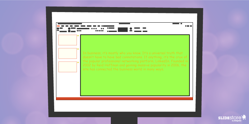
Many things can go wrong with your chosen palette. For instance, you might choose a color theme that may not reflect your brand. The colors may not be appropriate to the image you want to project and the message you want to communicate. Another thing that may go awry is the color contrasting of the fonts and backgrounds. As you know, weak contrast results to poor readability, which will render your text invisible, and thus, worthless. To avoid this problem, always calculate the effect of a certain font color on the background. Finally, be careful about the inclusion of weak and/or daring colors in your theme. Weak colors can weaken your design, and daring colors can disorient your audience.

4. Unreadable typography

Typography is one of the most important elements of a presentation since it can set the stage for the content. There are two important aspects of typography: size and style. You need to get these two right to achieve an effective presentation. Make sure the standard font size you set is not lower than 44 points. This size is large enough to command attention but not too large that it looks ludicrous. You also need to consider the font style. Traditional serif fonts look formal and professional while sans serif fonts are more modern and clean-looking. Use what’s appropriate for your presentation.
When you use custom fonts, make sure they’re installed in external computers. The thing about custom fonts is that they can mess up the layout of your slides if the computer you’re using doesn’t support them. Embed the true type fonts into the presentation to avoid this fiasco.
PowerPoint Template Mistakes: Use of Clip Art

5. Cheesy effects

Perhaps the biggest PowerPoint nightmares are the cheesy effects, which include transitions, sound effects, and animations. It’s understandable if you want to spice up your template, but find better ways to do that other than adding inappropriate effects to your presentation. However, if you feel like you need to use the said effects because they offer a functional purpose, make sure to use them sparingly. Instead of the default sound effects from the PowerPoint library, embed background music from external resources. As for animations and transitions, make sure they add value to your content. Use only what’s absolutely crucial for the presentation.

6. Use of clipart and stock photos

Visual elements are generally good, but there are certain design taboos that you should avoid. We’re talking about clipart and clichéd stock photos. No matter how hard you try, you won’t find a reason compelling enough to justify the use of clipart in your deck. Nothing screams “lame” louder than mediocre symbols in a modern corporate presentation. The same thing goes for stock images. There are many staged and cringeworthy photos that will only lessen the value of your template if you’re careless enough to use them. If you’re going to use photos, go for genuine-looking ones that can trigger emotional reactions from the audience.
If you address these bad design habits that plague many PowerPoint presentations today, you will save your company major headaches. Fix these problems and watch as your presentation templates reach a different level of beauty, usability, and effectiveness.

Resources:

Chibana, Nayomi. “Color Theory for Presentations: How to Choose the Perfect Colors for Your Designs.” Visme. December 28, 2015. blog.visme.co/how-to-choose-a-color-scheme
Godin, Seth. “Really Bad PowerPoint.” Type Pad. January 29, 2007. sethgodin.typepad.com/seths_blog/2007/01/really_bad_powe.html
Hristov, Boris. “Reality Check: Is Your Company’s PowerPoint Template Bad?” Medium. January 19, 2016. medium.com/@borishristov/reality-check-is-your-company-powerpoint-template-bad-bf6ff82780ef#.4kkk8wijb
Mancini, Sunday. “4 Common PowerPoint Template Mistakes.” Ethos 3. May 26, 2016. www.ethos3.com/2016/05/4-common-powerpoint-template-mistakes
Panzironi, Michelle. “7 PowerPoint Mistakes That Make You Look Old.” Forbes. January 16, 2016. www.forbes.com/sites/propointgraphics/2016/01/16/7-powerpoint-mistakes-that-make-you-look-hella-old/#41da1a5234e7
“10 Tips for Designing Presentations That Don’t Suck: Part 1.” Work Front. February 2, 2017. resources.workfront.com/project-management-blog/10-tips-for-designing-presentations-that-dont-suck-part-1
“10 Ways to Spot a Lame Corporate PowerPoint Template.” PowerPoint Ninja. n.d. www.powerpointninja.com/templates/10-ways-to-spot-a-lame-corporate-powerpoint-template
“Choosing the Right Fonts for Your PowerPoint Presentation.” Documents with Precision. March 10, 2016. www.documentswithprecision.com/choosing-right-fonts-powerpoint-presentation

3 Ways Animation Can Make or Break Your Presentation

animation

PowerPoint animation

presentation design

presentation tips

Ever since the birth of Microsoft PowerPoint, presentations have taken a turn for the better: user-friendly interface, easy-to-use buttons, and simple settings to name a few, rendering the whole task of creating presentations simpler and less time-consuming. Best of all is how the software gives you extras and bonuses to liven up to your slides with a few clicks and adjustments.
Like the other elements of a visual aid, and especially with PowerPoint, animations can mean the difference between bland slides and zesty ones. Proper use of transitions can arrest attention and provide suspense. Effects can highlight and emphasize points. Motion paths in action can guide viewers’ eyes to where they should be looking next. There are many upsides to using animations.
However, as with any upside, there are bound to be repercussions—two sides of the same coin, if you will. In this case, there are cons to using animation, ones that have a lasting impact even after your talk.
Animations make or break your PowerPoint. They can be the wowing element or the disappointment that makes your audience members shake their heads. Before you pepper your slides with too many special effects, ask yourself the three following questions:

PowePoint Presentation Animation: Important or Whimsical

Important or Whimsical

Do you have a point to emphasize or a concept you wish to illustrate beyond just showing an image? Or do you want your text to sparkle or your object zoom in and out? Perhaps you want a “breaking glass” effect every time you go to the next slide?
If you answered affirmatively on the first question, then you know how to use animation to your advantage. Using it when and because it’s necessary is the first step to acknowledging the fact that it’s more than just for dramatic flair. When employed correctly, it makes certain points stand out among the rest of your content.
If you’re of the last two questions, though, then it’s time to rethink how you approach animation. Any excess for no reason is detrimental not just to your slide but also to your whole presentation. You risk looking amateurish when you try to retain your audience’s attention with special effects instead of wowing them with your message, content, and/or design.

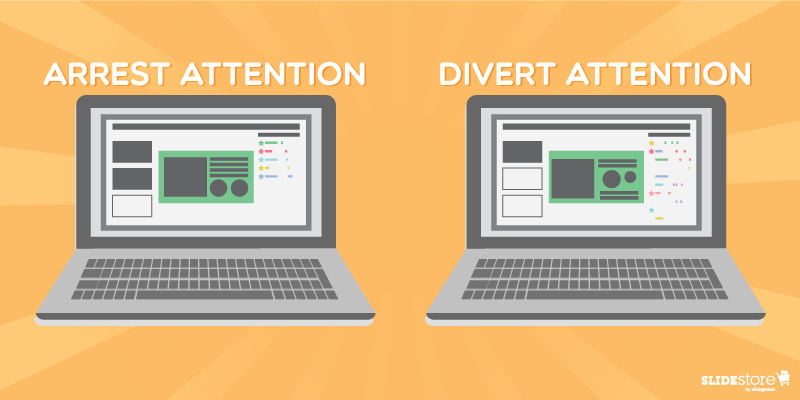
PowePoint Presentation Animation: Arrest or Divert Attention

Arrest or Divert Attention

New PowerPoint users tend to be excessive on the animations. But just because they think it’s great doesn’t mean their audiences will do too. The worst-case scenario is that you turn off your viewers with the sheer number of animations and stop listening.
This point is very much aligned with the one above, only this one tends to encompass a more focused area: does it draw and retain attention on the objects that need to be emphasized? If yes, then the animation served its function. If it doesn’t, then consider changing the animation settings or, as is often recommended, simply avoid it.
In relation to animations on your presentations, the speaker, to whom the audience should pay attention, bears the greater weight when the special effects work or not. Your presentation is not a crutch, so if it draws away the audience’s attention from you, then your talk is compromised. The message is not effectively communicated. They’re reading—or reeling or wondering why you used that transition or fade effect—when they should be listening. In that short period, their attention drifted; their focus changed. The best way to avoid that is simplifying the prevailing thought of your animation use.

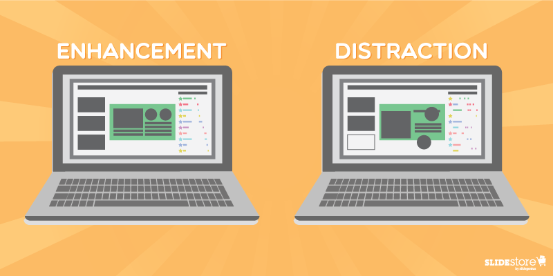
PowePoint Presentation Animation: Enhancement or Distraction

Enhancement or Distraction

Overall, the main question you want to answer before putting animations on your slides is, “Will my animations enhance the audience’s experience or distract them from the main point?” If every element you have becomes a waiting game for you and your audience, then your slides, if not your whole visual aid, take away from the whole experience—and possibly diminish it. They can’t concentrate on your message, and they may feel they just wasted their time.
On the other hand, if you used animations smartly and properly, carefully planning what effects to put on major points and objects and properly executing the appropriate animation, then your audience will more likely remember your talk because it’s memorable. It informed them and sparked their genuine interest.
All in all, PowerPoint animations are powerful tools; like any other, depending on the speaker (or the presentation design agency), it can be used in a good way or a bad way. If the animations work well in conjunction with the other elements of your slides—the perfect harmonization of your content, design, effects, and skills as a speaker—then you’ve got on your hands a powerful visual aid. You educate people more efficiently and more effectively. And that’s one of the best goals a public speaker could have.

Resources:

Cournoyer, Brendan. “PowerPoint Animation Tips: Dos and Don’ts for Business Presentations.” Brainshark. March 7, 2012. www.brainshark.com/ideas-blog/2012/March/powerpoint-animation-tips-for-business-presentations
Newbold, Curtis. “Top 12 Most Annoying PowerPoint Presentation Mistakes.” The Visual Communication Guy. September 24, 2013. www.thevisualcommunicationguy.com/2013/09/24/top-12-most-annoying-powerpoint-presentation-mistakes
Noar, Adam. “10 Essential PowerPoint Hacks for More Exciting Presentations.” PresentationPanda.com. July 4, 2016. www.presentationpanda.com/blog/essential-powerpoint-hacks
Russell, Wendy. “PowerPoint Presentations – the Good, the Bad and the Ugly.” ThoughtCo. February 18, 2016. www.thoughtco.com/powerpoint-presentations-good-and-bad-2767094
Sartain, JD. “PowerPoint Animation Tips: Don’t Be That Person Whose Slides Are Deathly Boring.” PCWorld. February 10, 2015. www.pcworld.com/article/2859249/powerpoint-animation-tips-dont-be-that-person-whose-slides-are-deathly-boring.html
Vanderlee, Carly. “The Seven Deadly Sins of PowerPoint.” Bridgeable. August 20, 2014. www.bridgeable.com/the-seven-deadly-sins-of-powerpoint
“Animation–Help or Entertainment?” Training Zone. August 23, 2001. www.trainingzone.co.uk/develop/talent/animation-help-or-entertainment

Top Problems Presenters Face (And How to Avoid them)

custom powerpoint

pitch deck

powerpoint presentation

Powerpoint tips

presentation design

presentation problems

presentation tips

Presenter Problems

Rick Enrico

SlideGenius

Presenting can be a nerve-wracking experience, especially when faced with common challenges that can disrupt the flow of your presentation. From technical difficulties to audience engagement issues, these problems can derail even the most well-prepared presenter. Fortunately, with a little preparation and foresight, many of these issues can be avoided.

Here are the top problems presenters face and how to avoid them:


1. Technical Difficulties

One of the most common problems presenters face is technical issues, such as malfunctioning equipment, incompatible file formats, or connection problems. These can cause delays, stress, and a loss of audience attention.

How to Avoid It:

  • Test Equipment Ahead of Time: Arrive early to test the projector, microphone, and any other equipment. Ensure your laptop connects properly to external displays and that sound and video work as expected.
  • Have Backups: Always have a backup of your presentation on a USB drive and email a copy to yourself. This ensures that you have access to your presentation even if your primary device fails.
  • Bring Necessary Cables/Adapters: If you’re presenting in a location with different equipment, bring any necessary adapters (HDMI, VGA, etc.) to ensure compatibility.

Example: Before presenting at a conference, test your laptop’s connection to the projector and sound system, and have a backup copy of your slides saved in multiple locations.


2. Losing Audience Attention

Another common challenge is losing the attention of your audience, especially during longer presentations. People tend to zone out if a presentation becomes monotonous or lacks engagement.

How to Avoid It:

  • Engage with the Audience: Ask questions, invite participation, or incorporate live polls to keep the audience engaged and make them feel involved in the presentation.
  • Use Visuals: Incorporate images, videos, and infographics to break up long stretches of text and keep the presentation visually stimulating.
  • Keep It Dynamic: Change your tone, pace, and energy levels throughout the presentation to maintain interest.

Example: During a 30-minute sales pitch, ask the audience for their thoughts on a key point, or incorporate an engaging video that illustrates your message.


3. Running Over or Under Time

Presenters often struggle with managing their time, either running over and having to rush through the final points, or finishing too quickly, leaving awkward gaps.

How to Avoid It:

  • Time Your Rehearsals: Practice your presentation multiple times and time yourself to ensure you stay within the allotted time. Adjust your content accordingly if necessary.
  • Use a Timer: Use a timer or a clock (such as the one available in Presenter View in PowerPoint) to keep track of time as you present. This helps you stay on pace.
  • Prioritize Key Points: If time starts to run out, make sure you know which points are the most important and focus on them, skipping or shortening less crucial sections.

Example: If you’re scheduled for a 15-minute presentation, time yourself during rehearsal and trim content to ensure you can comfortably cover everything within that time frame.


4. Nervousness and Stage Fright

Many presenters experience anxiety, stage fright, or nervousness, which can negatively impact their performance. Nervousness may lead to filler words, shaky hands, or a quavering voice.

How to Avoid It:

  • Practice Relaxation Techniques: Practice deep breathing exercises before your presentation to calm your nerves. Visualization and positive affirmations can also help reduce anxiety.
  • Practice Your Presentation: The more familiar you are with your material, the less nervous you’ll feel. Practice in front of friends, family, or a mirror until you feel confident.
  • Start with a Smile: Smiling at the beginning of your presentation can help you feel more relaxed and confident, and it sets a positive tone with your audience.

Example: Before stepping on stage, take a few deep breaths and visualize yourself successfully delivering the presentation. Smile as you begin to set a confident tone.


5. Overloading Slides with Information

Some presenters try to cram too much information into their slides, resulting in cluttered, text-heavy slides that are difficult to follow. This can overwhelm the audience and make it hard for them to focus on key points.

How to Avoid It:

  • Stick to Key Points: Use bullet points or short phrases to highlight the key takeaways on each slide. Avoid adding large paragraphs of text.
  • Use White Space: Ensure your slides have enough white space to avoid looking cluttered. This makes your presentation look cleaner and more professional.
  • Explain, Don’t Read: Your slides should act as visual aids, not scripts. Avoid reading directly from your slides, and instead use them to supplement your spoken words.

Example: Instead of a slide with a long paragraph of text, break it into three concise bullet points and explain the details verbally while using the slide as a visual cue.


6. Handling Difficult Questions

Presenters may face difficult or unexpected questions from the audience, which can throw them off if they aren’t prepared. Mishandling questions can diminish your credibility.

How to Avoid It:

  • Prepare for Common Questions: Anticipate possible questions the audience might have and prepare answers for them in advance. This will make you feel more confident during the Q&A session.
  • Take Your Time: If you’re unsure of how to answer a question, it’s okay to take a moment to think. If you don’t know the answer, offer to follow up after the presentation.
  • Stay Calm and Polite: Even if faced with tough or critical questions, maintain a calm and polite demeanor. This helps you maintain control of the room and preserves your professionalism.

Example: After presenting a new product, you might be asked about a feature that hasn’t been fully developed yet. Acknowledge the question, and offer a general timeline for when more information will be available.


Final Thoughts

Presenters face a range of challenges, from technical difficulties to managing time and nerves. However, with proper preparation, practice, and foresight, you can avoid these common pitfalls and deliver a smooth, confident presentation. By focusing on audience engagement, using technology effectively, and preparing for potential obstacles, you’ll set yourself up for success.

Crafting Engaging Content for Your Presentation

content

presentation content

presentation message

presentation tips

Good content is a key ingredient to a great presentation. Your audience is entitled to it, and it’s your duty as a presenter to grant them this right. When crafting content, keep in mind that you’re not bound by words alone. Content is about communication. It’s about conveying information, sharing your knowledge, and telling stories. It goes beyond the superficiality of letters and symbols and aims to produce meaning that can be easily understood and widely appreciated.

The way content is presented is also important. You can dress up your presentation through design and layout. However, you must remember that when all’s said and done, nothing—not even first-rate aesthetics—can compensate for bad content. Make sure to use content primarily to put your message across and inspire your audience into action.

Here are some tips to help you craft great content for your presentation:

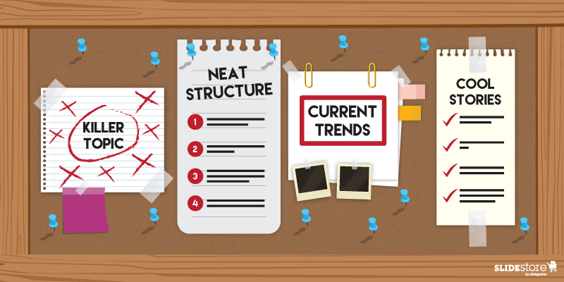
1. Pick a relevant and interesting topic.

Every presentation must contain a core message. You can offer that message as a kind of takeaway that the audience can bring home after the presentation. Every idea you weave into the content should circle back to the core message. Otherwise, it needs to go.

2. Involve your audience from start to finish.

Professional speakers will tell you that content needs planning. The difference between a comprehensible presentation and a confusing one is that the former is well-planned and neatly outlined while the latter is just a hodgepodge of mismatched ideas. So, before you rush to a speaking commitment, take time to brainstorm and write ideas down. Establish your structure and decide on the flow and direction of your speech.

Needless to say, you can only plan your content if you know your audience thoroughly. You should tailor your presentation to their needs if you’re going to keep them engaged in every turn. They will only listen to you through the end if you make your presentation relevant, useful, and relatable.

3. Leverage current trends to spark interest.

People crave hot and popular trends. If you jump into the bandwagon and exploit trends while they’re still funky, your audience will be more inclined to advocate your brand. Find out what their tickle spot is and what gets them excited, then incorporate it into your content to maximize engagement.

4. Relay a story to create an emotional bond.

Stories are among the most engaging types of content. In contrast to facts and statistics, they can liven up your presentation and make it more memorable. The problem with hard data is that they’re difficult to comprehend because of their abstraction. They’re meaningless unless you make them about the audience. Stories, on the other hand, can carry an emotional weight that you can use to connect with your spectators, consequently keeping them hooked through the end.

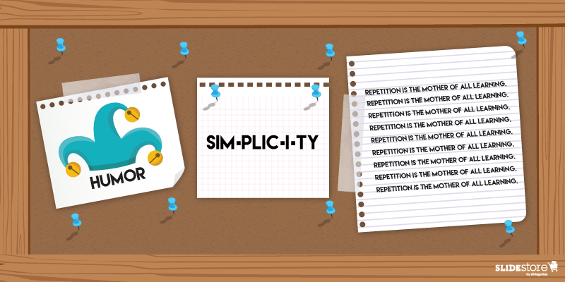
Humor, Simplicity and Repetition for Your Presentation

5. Play on humor when appropriate.

When used properly, humor can be a powerful communication tool. It can help underscore your point, ease tension, and build rapport with your audience. However, you also need to be careful when using it lest it backfires. The thing about humor is that it can’t be forced. If you work too hard trying to incorporate it to your content, you may appear frivolous, or worse, desperate for attention. When that happens, your credibility might become tarnished and your presentation might sink.

Make sure you use humor spontaneously. The best kind of humor springs as anecdotes from personal experiences. What’s good about anecdotes is that they’re easy to tell because you’ve either experienced or witnessed them firsthand. The audience are more likely to relate with them because they’re genuine and personal.

6. Use simple words instead of jargon.

It doesn’t take a literary genius to craft good content. In fact, when it comes to presentations, simplicity is preferred over complexity. It may actually be quite rude to use big words when communicating a simple idea. Do your audience a favor and talk to them in a conversational tone. Avoid corporate lingo unless you’re speaking to a certain group who can understand industry-specific language. You can achieve better results if you speak in words that resonate with the audience. Watch your diction and make sure that everything you say is easily understandable.

7. Ingrain your message by repetition.

According to two Indiana University studies, a chunk of information remains in a person’s short-term memory for only eighteen seconds. To ensure that your audience remembers your core message, repeat keywords and phrases that highlight it. Draw their attention until the end so that they won’t be distracted from your content. Just be creative when doing so to avoid frustrating them.

A good content is easy to distinguish from a bad one. When your spectators find how useful and interesting your presentation is, they’ll appreciate the extra time and effort you spent to refine it. As a result, they’ll be more willing to share your content and spread your message.

Resources:

Daisyme, Peter. “5 Ways to Create Engaging Content Your Audience Will Share.” Entrepreneur. October 14, 2015. www.entrepreneur.com/article/251616

Mazur, Michelle. “Craft Presentation Content That Wows.” Communication Rebel. October 14, 2012. www.drmichellemazur.com/2012/10/craft-presentation-content-that-wows.html

Noar, Adam. “How to Write Engaging Content for Your Slides: 15 Simple Presentation Tips.” Presentation Panda. n.d. presentationpanda.com/blog/how-to-write-engaging-content-for-your-slides-15-simple-presentation-tips

“Presentation Skills: Using Humor Effectively.” The Total Communicator. n.d. totalcommunicator.com/vol2_2/funnymeeting.html

“Repetition: Making Prospects Remember Your Key Messages.” Freestyle. September 2, 2016. www.freestyleservices.com/single-post/2016/10/04/Repetition-Making-Prospects-Remember-Your-Key-Messages

A Recipe for Cooking Presentation Ideas: Important Questions to Ask

creativity

presentation creativity

presentation ideas

presentation tips

Everything starts with an idea. Writers invoke Muses for inspiration; scientists gather data to make a breakthrough; and speakers brainstorm before preparing a presentation. This all sounds so simple in writing, but when you’re faced with the actual task of coming up with ideas, you might find yourself in a barren and lonely land. All too often, creative people struggle against creative block, a seemingly dead-end state that leaves them high and dry.
When you’re stuck in this state, things can get ugly, especially since you can do nothing to nudge your presentation forward. You can neither start structuring your outline nor begin designing your pitch deck. Without that elusive idea, you have no topic. You have nothing to work with—and this can discourage you and force you to drop your speaking engagement right there and then.

Overcome Creative Block and Get Your Ideas Flowing

Presentation Ideas: Overcome Creative Block
Fortunately, there is an antidote to creative block. But before you solve this problem, you need to acknowledge its three main causes first: high expectations, fear of failure, and the pressure of unrealistic deadlines. Once you understand its triggers and the proper ways to address them, all you have to do is wait for fresh ideas to bubble up from the depths of your mind.

Here are some of the things you can do to overcome creative block:

  • Get up early to brainstorm. According to an infographic posted on Ragan, 55 percent of writers who write early in the morning overcome writer’s block. The same can be said about presenters who brainstorm earlier during the day. Mornings can inspire you to be proactive and productive for the rest of the day, so get up early to rack your brain for ideas.
  • Remove all distractions. The same infographic also found that 47 percent of people who removed distractions like gadgets were able to improve their concentration and creativity. When brainstorming, make sure you give yourself enough time and space, with no one and nothing around to interrupt your thoughts.
  • Do other creative exercises. When you’re stuck inside your head, you can’t just sit around and do nothing. You need to do something else—something that’s not related to the presentation you’re working on. You can go and write a poem, watch TV, sing, dance, or cook. Do anything that freshens you up, and sooner or later, you’ll be able to tap into that well of ideas that’s lying dormant in your mind. 
  • Cut yourself some slack. High expectations and the pressure to succeed can bar your thought factory. You might involuntarily shut your brain off if you’re too afraid to come up with a mediocre idea. There’s only one way to fix this, and that is to take the pressure off of yourself. Remember, you’re still in the brainstorming phase—nothing you come up with on this stage is final.

Questions to Kick Off the Brainstorming Process

Presentation Ideas: Questions to Kick Off the Brainstorming Process
Once you overcome your creative block, it’s time to kick off the brainstorming process. While it’s true that anything goes during this stage, it’s still important to acknowledge the issue the right way. Here are some of the most crucial questions to ask when conjuring ideas for a presentation:

1. What do you have that you can share?

Always keep your knowledge and passion in mind. Select a subject matter that you’re familiar with and that you like. This will help cut down your research time and allow you to focus more clearly on your message. If you know what you’re talking about, your credibility will soar into new heights. Knowledge about the topic will allow you to satiate the audience’s desire to learn. Likewise, if you like what you’re talking about, your confidence will rise. The audience can pick up enthusiasm, so when they sense that you’re excited about your talk, they will be excited too. 

2. How can you improve the audience’s lives?

The audience is the star of the presentation, so make sure you consider how your talk can be relevant to them. Ask yourself, what pain point am I trying to target? How can my proposed solution fit into the audience’s lives? Does my message resonate with them? How are they likely to respond and react to my talk? Answering these questions will lead you to the right direction.

3. What is the outcome you desire?

From the start, you need to make your goals clear. Identify the purpose of your presentation and the aims it tries to achieve. Spell out your call to action—don’t just leave it for the audience to guess.

4. Which perspective can make you a thought leader?

Make your presentation worthwhile by differentiating yourself from the crowd. Blaze new paths with your speech, and make sure that the audience can clearly see what makes you unique. As a thought leader, you’ll be able to add value to your industry. You’ll be an important asset that consumers and entrepreneurs alike will respect and uphold. 

5. Can you structure your topic as a narrative?

Ideally, the topic you choose should be narrative-driven since presenters are expected to be master storytellers. People are more responsive to stories because they make presentations more memorable. They create an emotional bond that allows the audience to get to the heart of the message.

6. Can you simplify the message without sacrificing its value?

Finally, ask yourself, can I condense this thought into a shorter presentation? Can I make it more concise without losing the core message? To make your talk as brief as it can be, make sure you only have one focus. Cut anything that’s not related to the core idea.
Before jumping with both feet into a speaking engagement, make sure that you have a strong idea in your arsenal. That idea is the cornerstone of your presentation—without it, you’re stuck with nothing. Take the aforementioned tips so you can craft a speech that’s grounded on a worthwhile concept.

Resources:

Anderson, Meghan Keaney. “The 5 Questions You Should Ask to Nail Your Product Messaging.” Hubspot. December 27, 2012. blog.hubspot.com/blog/tabid/6307/bid/33981/The-5-Questions-You-Should-Ask-to-Nail-Your-Product-Messaging.aspx#sm.0000w6nx4vstbcwkqnc12umt2kzcx
Azzarello, Patty. “A Guide to Brief and Effective Workplace Communication.” Ragan. October 15, 2015. www.ragan.com/WritingEditing/Articles/50282.aspx
Bates, Claire. “Blanking Out: How Stress Can Shut Down the Command Center in the Brain.” Daily Mail.  April 11, 2012. www.dailymail.co.uk/sciencetech/article-2127686/How-stress-shut-command-centre-brain.html
Dixon, George. “How to Choose Your Presentation Topic.” Presentation Magazine. January 2, 2012. www.presentationmagazine.com/how-to-choose-your-presentation-topic-10871.htm
Dlugan, Andrew. “The Secret of Choosing Successful Speech Topics.” Six Minutes. October 25, 2010. sixminutes.dlugan.com/speech-topics
Long, Kristin. “Infographic: The Most Effective Ways to Beat Writer’s Block.” Ragan. October 9, 2015. www.ragan.com/WritingEditing/Articles/50255.aspx
Mitchell, Olivia. “9 Ways to Edit Your Presentation.” Speaking About Presenting. n.d. www.speakingaboutpresenting.com/content/edit-presentation
Parker, Roger. “Mark Twain’s Advice for Authors Writing Brand-Building Books.” Personal Branding Blog. May 18, 2011. www.personalbrandingblog.com/mark-twains-advice-for-authors-writing-brand-building-books
Sambuchino, Chuck. “7 Ways to Overcome Writer’s Block.” Writer’s Digest. May 5, 2013. www.writersdigest.com/editor-blogs/guide-to-literary-agents/7-ways-to-overcome-writers-block