3 Ways to Overcome Presentation Failures [Infographic]

overcome failures

presentation anxiety

presentation tips

SlideGenius

Nobody wants to make decisions that’ll endanger not only their lives but also others’. Similarly, no presenter wants to come short of an audience’s expectations. Still, we’ve all made poor choices in the past, encountered unexpected stumbling blocks, or messed up our performances. These incidents may be humiliating, but nevertheless, the journey continues.

When faced with a difficult and life-altering decision, how do you respond? Will you look backward, or will you choose to move forward?

Presentation trainer Ellen Finklestein identifies decision-making as an important factor in presentations. You won’t be able to achieve your objectives and reach a conclusive decision without assessing the situation. So before you act, you need to analyze the current circumstances to figure out your next move.

Picture the ProblemPicture the Problem, walking dead: scared

Failures are like zombies that eat up your courage, draining your energy, and sapping away all hope. They may end up killing you from the inside out, but you shouldn’t give in to panic. You should view danger from a different perspective and overcome your nerves.

If your previous pitch has left you disappointed, it’s for you to decide whether you want to look at it positively or negatively. Problems may continue to arise if you let panic and anxiety take over. This is why you need to identify these possible challenges before you set out. With preparation, you’ll devise a solution that’ll lead you to fulfilling your goals decisively.

Once you’ve made the decision to continue, don’t get distracted by your surroundings and start focusing on what lies ahead. Drive out the negative emotions and motivate yourself with these three tips: Start psyching yourself up for your pitch minutes before you start. Do some breathing exercises and other warm-ups that will calm you down and let you collect your thoughts.

1. Gather Your Couragewalking dead: Show courage

Thinking or speaking negatively about yourself isn’t helpful. This sabotages not only your own self-esteem but also your audience’s perception of you. Positive self-talk reveals your worth and boosts your confidence. A positive outlook gives you the strength to come up with the best results despite all of the challenges you’re facing. Boost your self-esteem through positive self-talk and awareness. Redirect your attention from internal fears to your outer responsibilities. Doing so will distract you from presentation anxiety.

Remind yourself constantly that you can do all things you set your mind on.

2. Keep Movingsetting your goal

There will always be some audience members that won’t agree with your sales presentation. However, this shouldn’t discourage you from going out there and gutting it out with grit and determination. Remember, once you’re in, there’s no turning back.

Instead of thinking about where you would go wrong, focus on organizing your content’s points from the most to the least important. Then convince yourself that you can pull off a better pitch this time around. Also consider the possibility that even if you present your ideas well, disagreement between you and some of your audience will happen. Don’t shut out your critics entirely and deflect feedback that goes against your own opinions. Encourage comments, whether good or bad, to identify what areas you’re doing well in and what you need to work on. Answer any inappropriate remarks calmly without losing your cool. Ask them to expound and clarify their questions so you can come up with a better response. As the speaker, it’s your job to keep a professional and credible image throughout your presentation.

As a professional speaker, you need to stay focused to survive your pitch and avoid delaying your success. Drop what’s holding you back and face everything with courage.

3. Focus on Your Goalwalking dead: braveness, eagerness self motivated

Shake off any doubt you may still have and start concentrating on what you want to achieve. Plan ahead to avoid distracting the crowd with unnecessary and unrelated ideas during your pitch. Aside from prompting audience feedback, establish your credibility by sticking to your main points. Avoid telling unrelated anecdotes or elaborating on unnecessary information.

Failure isn’t an option. When you stumble, stand up and keep moving forward. Exert even more effort to improve your chances and excel at what you do best. Concentrate on the key reasons why you went onstage in the first place to stay on topic.

Never Give Up!walking dead: fight back

These points explain why it’s important to prepare before your presentation. Finish your deck and content a few days early so you can practice how you’ll be presenting them.

A presentation mishap can take a toll on your confidence, but don’t let it eat you up forever. Bounce back from past errors and handle yourself gracefully when facing a new pitch. Mistakes are there to help you grow, so don’t be too bent on being perfect. Even the best speakers had their slip-ups.

Your future as a presenter depends on the seed of decisions that you choose to plant now. Make a decisive effort to gather your courage,  keep moving, and focus on your goal to guide you along the way.

When failures haunt you, overpower them with positive thoughts, telling them that you’re a great and professional presenter.

Failure is a frame of mind. Don’t let it get the best of you. Check out our infographic to overcome and combat these presentation failures.

Check out and share our infographic about moving on from presentation failures!

https://www.slideshare.net/SlideGenius/no-turning-back-3-ways-to-overcome-presentation-failures

References

Finkelstein, Ellen. “Using Presentations for Decision-Making.” Ellen Finkelstein, www.ellenfinkelstein.com/pptblog/using-presentations-for-decision-making
“The Four Keys to Overcoming Negative Thinking…For Good.” Mrs. Mindfulness. www.mrsmindfulness.com/the-four-keys-to-overcoming-negative-thinkingfor-good

Presentation Tips: 5 Quick Steps to Audience Engagement

audience

audience engagement

audience interaction

audience participation

presentation tips

When delivering presentations, nothing is more important than connecting with your audience.

It doesn’t matter if you’re trying to close in on a deal or proposing a new project to the higher-ups. You can’t say that your ideas have been well-received if the audience can’t engage with your pitch. It’s not enough to pique their interest with a few video clips or anecdotes.

Before focusing on the spectacle, you must ensure your presentation is perfectly executed. Your ability to present with clarity and certainty is essential to audience engagement.

Need a Presentation Designed?
Click Here To View Our Amazing Portfolio!

Here are quick presentation tips to make sure your audience has an engaging experience:

Learn your presentation inside and out

I’m sure you’ve sat through a presentation where the speaker constantly stammered through their speech, trying hard to remember what to say next. No matter how attractive their material was, the uncertainty in their delivery probably proved to be distracting. To avoid being in a similar situation, you must learn every detail of your presentation.

Audience engagement rests in your ability to command attention. You can’t do that if you’re reading from your slides or fidgeting with note cards. The audience needs to see that you know what you’re saying. Take the time to rehearse your presentation as much as you can. You can also try the memory palace technique to memorize your key points.

Condense your PowerPoint deck

By now, we’re all familiar with “death by PowerPoint.” There’s no easier way to disengage an audience than by presenting them with slides loaded with too much information. If your slides are complete with indecipherable charts and text, take a step back and focus on your visuals.

Instead of filling your PowerPoint deck with bullet points and text, try to illustrate your points. Use images and other multimedia elements to articulate your ideas.

When dealing with data, you must decide which ones are the most relevant to your core message. Several online tools can help you with data visualization.

Tailor your presentation to the audience

Very few presenters consider the perspective of their audience. Their presentations often sound like generic spiels because of this.

How do you connect with something you’ve heard a million times before?  To stand out, you need to remember that the audience isn’t a homogeneous group. The people sitting in your audience are individuals with unique perspectives and opinions. In other words, audience engagement relies on your ability to personalize your message.

To get inside their heads, you need to ponder four important questions. Answering these will give you the necessary context to create a presentation that will pull your audience in:

  • Who are they?
  • Why are they coming?
  • What action do you want them to take?
  •  Why might they resist your message?

Keep everyone interested by creating soft breaks.

Audience engagement would be much easier if it weren’t for our short attention spans. With so many tasks begging for attention these days, it’s no surprise the average adult’s attention span is only a few minutes short.

As hard as you try to simplify your message and learn more about the audience, it’s hard to contend with everyone’s shifting attention.

That’s why presentation expert Carmine Gallo emphasized the importance of the 10-minute rule. If you lose the attention of your audience, you can re-engage them by creating “soft breaks” after every 10 minutes or so. Give them a chance to pause and digest new information by incorporating videos, demonstrations, and other activities.

Try to create an interactive environment by posing questions they can answer through polls or a show of hands. If you want to, you can also call up other people from your team to share a new perspective with the audience.

Deliver your presentation with passion and enthusiasm

Finally, lead by example. If your presentation delivery falls flat, your audience will quickly pick up on that. You can’t expect them to feel enthusiastic about the ideas you’re sharing if you’re mumbling through your presentation.

You need to show how passionate you are about your subject matter. That’s the only way to deliver a message that will make others feel the same way.

It isn’t hard to deliver a presentation that engages and connects with an audience. In five easy steps, you can easily ensure that your message sticks and stays with everybody.

Need a Presentation Designed?
Click Here To View Our Amazing Portfolio!

Featured Image: Steven Lilley via Flickr

10/20/30: Why the Rule Should Be Used in Presentations

10-20-30 Rules

presentation tips

Are you familiar with the 10/20/30 rule? It states that a presentation should have 10 slides, last no more than 20 minutes, and should not have a font sizes less than 30 pt. 

This rule was made due to the gradual decrease of people’s attention spans. Making presentations concise and straightforward will save time while still getting the core message across. 

Let us elaborate.

10 Slides 

It can be quite a challenge to comprehend more than 10 concepts during a meeting. 

The 10/20/30 rule suggests using 10 slides to discuss your core message, and provides the following example flow of topics for investor proposals and venture capitalist presentations:

  • Problem 
  • Your solution 
  • Business model 
  • Underlying magic/technology 
  • Marketing and sales 
  • Competition 
  • Team 
  • Projections and milestones 
  • Status and timeline 
  • Summary and call-to-action 

Remember these if you want to get your point across in a concise and straightforward way. Depending on the type of presentation you’re giving, you can tweak these to fit your purpose, but try to keep your slides to a 10 slide minimum, with a visible flow like the one above.

20 Minutes 

Ideally, a 10-slide presentation would only take 20 minutes to finish. Beyond that and you’ll start losing your audience’s attention. 

Keep your presentations short so you can address questions and other concerns at the end. 

30pt Font Size 

People usually use smaller font sizes to cram chunks of information into their slides. Doing so might distract your audience from listening to you and leave them unable to focus or retain the information you present. They may also question whether you are familiar with your own material. A straightforward presentation will assure the audience that you know the topic well enough to explain it in a way that they will understand, especially if they’re new to the concept. 

Use a larger font and remove the unnecessary details. Remember, your presentation shouldn’t do the talking for you, but instead, be there to guide your audience. 

Use the 10/20/30 rule as a consistent baseline to keep your audience engaged during your next presentation. Working within its boundaries will push you to craft a more refined presentation that focuses purely on the essentials, leaving out any distractions for your audience. It’s important to remember that people naturally have a limit to their attention span. This simple and effective rule is meant to guide you in creating a presentation that fits fully within the peak time of your audience’s attention. It’s at that point when your message is most effective and will lead to a more memorable experience for all.

Effective Business Presentations from Home

COVID-19

presentation tips

Delivering an immaculate business presentation no matter the circumstance is an essential skill. But COVID has drastically changed the world. Whether you’re trying pitch new creative ideas to your partners or hoping to land more investors, your abilities as a presenter are more vital than ever to your business. 

Executing your pitch has become a completely different ball game. The pandemic has forced many businesses to start working remotely, essentially erasing any chance of having face-to-face meetings. The “normal” pitch setting these days has moved from boardrooms into living rooms. It’s a circumstance we have little control over but must adapt to in order to keep things running smoothly.  

While the situation may be challenging, there are ways to keeping your pitch as effective as ever… even as you deliver it virtually. In this article, we’ll tackle some of the best methods of delivering presentations from your home.  

Appear Worthy of Your Business Presentation  

Appearances go a long way in pitches. But just because you’re working form home, it does not mean you can take your looks lightly. When it comes time for the big pitch, pick an outfit that you’d wear as if you were delivering the presentation in person. This speaks volumes about your sense of professionalism.  

The next step, however, is something plenty of people still overlook. In video call settings, remember to always tidy up your background. It does not necessarily need to be a blank space behind you, it just needs to look clean and professional. Find a good spot in your home that looks simple and uncluttered. The last thing you want is your audience being distracted by whatever is going on behind you, whether it be a fancy looking painting or children’s toys sprawled all over the floor.  

Looking for a game changer in making your video pop? Good lighting makes your video crisp, naturally attracting more attention. Even if you are not onscreen very long, making good first and last impressions are essential to delivering a successful pitch.   

Rehearse, Rehearse, Rehearse 

Preparations are more important than ever in virtual settings. While many apps and services have adapted to make your online business presentation easier, there are still a lot variables that can go wrong at any moment. Whether its your mic going on the fritz or your internet connection getting spotty, be prepared for everything that could possibly go wrong. Test your set up several times beforehand to make sure everything is works as it should be.  

On top of all that tech prep work, there’s still the act of delivering the presentation that you need to prepare for. Keep in mind, your voice comes off differently through a mic. Use your tests to see if your delivery comes off clearly given the equipment you have to work with. Much like delivering pitches in person, making these run throughs will help you iron out all the kinks beforehand.  

Engage Your Audience DURING the Business Presentation  

Audience attention span is your biggest enemy in online presentations. You may be able to control everything within your environment, but you can do very little about what your audience has around them. Success rests on engaging your audience throughout the presentation. Actively raise questions for your audience throughout the presentation. This will strike a more conversational tone to your pitch and keep your audience focused on the discussion.  

Picking up on your audience’s body language is much harder online. Be on the lookout for different cues. Take note if their attention is drifting off screen. That is a cue to pull them into conversation. This will help you keep things on track while also assisting your audience in properly internalizing everything that’s been talked about so far.  

SlideGenius is Your Presentation Expert 

As a start-up presentation design company since 2012, we’ve created almost every kind of presentation you can imagine. We’re a worldwide team, with four difference offices spread across the US and Philippines. Meaning, we’re also experts on working “remotely” for close to a decade now. These barriers have become normal for us, but we’ve always learned to adapt and overcome. What pulls us together is our shared passion for helping our clients succeed. From our artists, writers, web developers, animators, and project managers, we utilize our expertise in presentation design to spark invaluable growth.  

At SlideGenius, we are eager to be a valuable partner to all who needs our services during this challenging time. Contact us today for all your presentation needs! 

Contact us today! 

The Hows of Concise Presentations

presentation tips

sales pitch

slide design

Technology gives easy access to information and a more convenient way of living.

These benefits, however, have disadvantages, including impatience, shorter attention spans.

As the average attention span gets shorter, you should capture and hold their focus. One way is to ensure that those blocks of text are condensed and concise.

Let’s look at the following principles according to the Writing Center of the University of Wisconsin-Madison and the Writing Center of the University of North Carolina at Chapel Hill:

Make It Action-Packed

Make your PowerPoint slide design more engaging by transforming your sentences from having a passive voice to a more active voice. This minimizes the confusion and frustrations.

Trim the Fat

Delete unnecessary words. And start with phrases.

Instead of “we are able to” change it to “we can.” Remove length and keep its meaning.

Positivity Is Key

According to Strunk and White’s The Elements of Style, another tip to make your language more precise is by changing a negative sentence into an affirmative one. Inserting positivity in your sentence makes it assertive and shows the speaker knows what they are talking about.

Quoting The Elements of Style, “…the reader is dissatisfied with being told what is not; he wishes to be told what is.”

Keep It Simple

Another way for people to keep their attention to what you’re saying and showing is by using simple vocabulary to convey your point.

The best practice is to make sure that you keep things as simple as possible for your target audience. Don’t confuse them. For example, you can substitute “use” for “utilize” or “help” for “facilitate.” Be direct and avoid fluff.

Be Clear

Avoid using vague ideas in your paragraphs. It’s better to go straight to the point since you’re trying to give your point before the audience’s attention wanders.

“Sugar is an important factor to consider when losing weight.”

“To lose weight, cut back on sugar.”

The first sentence meanders while the second one is compact and straight to the point.

Once you have your content pat down, you may now format your slides for a cleaner look.

Make Your Presentation the Best

You may even get in touch with businesses that build custom PowerPoint slides. At SlideGenius, we’ve been helping people create captivating presentations since 2012. We’ve helped our clients raise more than $500 million dollars over the years.

For thousands of clients, we have proven to be the masters of storytelling and vivid imagery. If you’re eager to make sure your PowerPoint presentation is the best, reach out to us and find out how we can help you make sure you are showing the world your value.

Public Speaking 101: Should You Read from a Script or Not?

presentation tips

public speaking

public speaking tips

scripts

There are four ways to deliver a speech: reciting it from memory, learning it by heart, using notes for reference, and reading it from a script word for word. The method you should use will depend on the type of speaking engagement and the personal circumstances you find yourself in.

Memorizing your speech is rarely a good idea because the artificiality of it makes your delivery sound stilted. You may risk sounding monotonous when the natural inflection of your voice disappears. Also, it’s not a guarantee that you’ll deliver a seamless presentation because your focus is shifted from getting the message across to getting the words right.

Learning your speech by heart and trying to wing it without notes can work. However, it can be risky because when you lose your train of thought, you’ll have nothing to rely on to get you back on track. The best method is to use notes because at least you have something to fall back on when you lose your footing. It can also help you transition from one idea to the next.

While learning all this is good, we’re not really here to talk about the three ways of delivering a presentation. Instead, we’re here to understand the fourth: reading directly from a script. Script reading is a practice that is highly discouraged, unless you’re a person of politics who needs to deliver a speech exactly as it’s written. If you’re a student delivering a report or a business executive making a pitch, there’s no excuse for you to read from your notes at all. This is a basic public speaking convention that you should know by default.

Why Reading from a Script Is Discouraged

You may be tempted to bring a script to your next public speaking gig and read it word for word. It’s luring because you don’t have to memorize or learn your speech by heart anymore. Everything you have to say is literally in your hands. It makes you feel secure because, in theory, you can’t lose your train of thought. It’s effortless preparation-wise. So, if it’s so reassuring, why do professionals advise against it? There are plenty of reasons, and we’ll explain three of them:

  • A written speech rarely translates to an oral discussion. We don’t speak the same way as we write. Words that are written for the eye (i.e. grammatical, syntactic, generally well-structured) don’t always sound well to the ears. If you want to sound conversational, you need to write the same way as you talk.
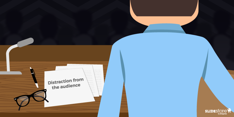
  • A script shifts attention from the audience. Reading from a script requires you to look at your notes, and this shifts your gaze away from the audience and limits your interaction with them. As a result, your delivery loses the personal touch it needs. You’re basically just standing there aloof, with your audience feeling left out. They feel like they’re listening to a monologue rather than taking part in a dialogue in which their opinions matter.
  • Your words and actions are measured and limited. A script limits both your words and actions. You’re not free to use whatever manner of delivery you like because you’re corralled into the four edges of your cheat sheet. Aside from this, reading from a script can add a physical barrier between you and the audience: a lectern. This barrier will only fortify the walls you’ve built, ultimately resulting to a disconnect.

Planning for the Inevitable: Tips When Reading Your Speech

Without a doubt, no matter how many times you’re warned, you’ll always find an excuse to deviate from what’s recommended. So, to help you minimize the repercussions of reading from a script during a public speaking engagement, here are four tips for you to apply:

1. Employ the scoop-and-speak technique

For this to work, you need to print your notes in large font and have them written on the top portion of a document so that your eyes don’t have to stray down too far. Every time you pause, look at your notes, and before reciting what you’ve scooped, look at the audience again. Eye contact is crucial in public speaking. When reading from your notes, you don’t have to keep it a secret and act surreptitiously. Just chill out and act natural.

2. Draft a dialogue, not a declaration

Even if you’re reading from a script, you should try to not look like it. When drafting your speech, make sure to use common conversational words that sound natural when spoken. Use informal language; otherwise, you’ll just sound foreign and distant. Be mindful of the natural cadences and rhythms of spontaneous speech, and make sure to apply them throughout your presentation. To improve your vocal variety, you can adjust your facial gestures to match your words.

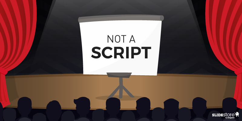
3. Don’t use your slide deck as a script

Your PowerPoint presentation is not a script, so don’t treat it as such. Instead, make separate notes that you can use as guide. You can also use the Notes feature in PowerPoint. It has a Presenter’s View that can let you see your notes for a selected slide without the audience seeing them. Just make sure to practice using your script beforehand so that you won’t get lost in the middle of the presentation.

4. Mind the structuring of your text

Break long blocks of text by using headings, subheadings, line breaks, and pauses. Use signals to help you break down the text and cue you as to where to begin and end, or what to stress and blend. You can even add instructional annotations along the margins to make everything crystal clear.

When you’re in a pickle and you have no choice but to read from a script, follow the tips above. However, in any other situation, try to explore other ways of delivering your presentation. Don’t limit yourself to the four edges of a page. Instead, allow your mind to roam free without straying too far from your core message. This is, after all, what being an effective public speaker means.

Resources:

Dlugan, Andrew. “How to Make Reading a Speech Not Like Reading a Speech.” Six Minutes. December 7, 2011. sixminutes.dlugan.com/reading-your-speech

Marshall, Lisa B. “Read, Memorize, or Use Notes.” Quick and Dirty Tips. September 23, 2010. www.quickanddirtytips.com/business-career/public-speaking/read-memorize-or-use-notes

Matthews, Alan. “Pros and Cons of Using a Script When Speaking.” Alan Matthews Training. May 13, 2015. alanmatthewstraining.com/2015/05/pros-and-cons-of-using-a-script-when-speaking

Wyeth, Sims. “Do You Read from a Script? Should You” Presentation Guru. April 20, 2017. www.presentation-guru.com/do-you-read-from-a-script-should-you

What Makes a Successful Finance Presentation?

Finance

PowerPoint Experts

presentation design

presentation tips

public speaking

storytelling

When conducting a business presentation that revolves around finance, it’s important that the data resonates with the audience without it being too much to take in. While you want to be transparent and show them the big picture, you wouldn’t want to exhaust them by going over every figure.
[sg-blog-modules module=one]
Here are ways to make your financial presentation effective and understandable:

Clarify your objectives

Make sure you know what your presentation is for. Clarify what you want to achieve by talking about finance in a room full of people. For example, if you want to talk about yearend revenues, your objective could revolve around how this affects your company in the present and in the upcoming year.

As part of custom PowerPoint presentation planning, set an agenda, as this makes it easier for the audience to follow the flow of your discussion—it organizes your content into sections. With a sound agenda, you can set the financial scene and work toward the reveal of important data.

Having a clear agenda helps your audience save questions for the appropriate sections, which in turn benefits you in maintaining your momentum.

Don’t just show data—tell a story.

You can’t just project numbers and graphs on the screen and expect your audience to what it is and what it’s about—you need to go into detail and tell the story behind the data. This is where you can provide insight and share your business goals with your audience—you’ll want to discuss why these numbers are important to the company.

Pro tip: follow the three-part story structure and divide your narrative into three parts—the beginning, middle, and end.

Start by describing things as they are. That way, you create rapport with your audience and if you share an idea they are already familiar with, then that will engage them more.

Once you’ve laid all the facts, show them how things could change. Make sure that you cite reliable sources to increase your credibility as a speaker.

When it comes to the conclusion, make it inspiring—or as Nancy Duarte calls it, “new bliss.” This concept refers to telling the audience about how much better their world will be if they adopt your ideas.

Go beyond charts and graphs.

Presentation design helps make your topic become more understandable. Charts and graphs are great for representing important figures, including market shares and revenue for the quarter or fiscal year.

To win the hearts of your audience, however, simple graphics are not going to cut it—try experimenting with data visualization to communicate financial messages more efficiently.

Make your presentation a two-way conversation.

When your presentation becomes a monologue, your audience becomes less engaged—less involved—with your discussion.

Make your audience’s financial priorities a topic for discussion at some point in your presentation. Asking them questions and for their feedback helps them retain information better because they become directly involved.

How you communicate data has a significant effect on how your audience will perceive it. Discussing financial information is a hit or miss, especially when figures and complex data are flashed on the screen, which is why you need to present details in a manner they can relate to.

Lastly, remember not to dump data on your slides—stand back and think about what you need to include. Your custom PowerPoint presentation should only contain key financial statements and talk around them in detail later in the discussion.
[sg-blog-modules module=two]

References:

Duarte, Nancy. “Structure Your Presentation Like a Story.” Harvard Business Review. October 31, 2012. hbr.org/2012/10/structure-your-presentation-li

Ashe-Edmunds, Sam. “How to Give a Presentation on the Financial Information of a Company.” Chron. n.d. smallbusiness.chron.com/give-presentation-financial-information-company-61420.html


Bullet Points and Why They Matter to Your Presentation

content

Powerpoint

presentation tips

Many articles online provide profound insights on how to charm your audience, retain attention when speaking in public, or create the best presentation for the right purpose. And for the most part, there have been similarities that can be seen in almost every piece. One of the many from presentation experts is: “Don’t ever use bullet points. You don’t need them.”

What warranted the general avoidance? Is it because it’s primarily considered the reason for death by PowerPoint (DbP)? If you consider bullet upon bullet in different slides, then sure, you can call the whole thing as walls of text. Given that humans favor the visual over the textual, audiences will be bored by all the reading.

But did you know “death by bullet points” exists? Symptomatic, not synonymous, to DbP, overuse and misuse of bullet points have always been every audience member’s nightmare. And it has happened more than once, much to the annoyance of the crowd. Does that mean that bullet points should be avoided?

Not necessarily. Bullet points are useful in specific situations, and in the proper context, they’re your best tool. Here are a few reasons why they matter.

Optical Break Bullet Points

Optical Break

Reading can be strenuous for the eyes, especially when you have a big block of text in one slide. While seeing this word wall can be intimidating for some, others would just outright not read it. Those who attempt will find themselves blinking more since their eyes dry out from, unsurprisingly, not blinking (because they’re reading).

Bullet points put line breaks on long passages, not just with the negative space from the background but also with clear markers on where a specific item begins and ends. Shorter bits of text are more welcome since they’re easier to understand, digest, and remember. Any form of relaxation is pleasant for your eyes.

Organizing information | Bullet Points

Organized Information

In the same way that your eyes need a break, your brain also needs a breather when trying to comprehend a long paragraph—much less a lengthy sentence. This is where bullet points shine.

Dissect the text, then separate and summarize the main points. Those summations can then be what you can put on your bullets. That brevity is already a big plus; how much more if they’re fascinating?

Think of bullet points as the “too long; didn’t read” (TL;DR) version, the abridged edition, of your long paragraph. By bulleting the main points, you can shorten a sixty-word section to merely a fraction of that, saving your audience’s time. Plus, they get to listen to you more.

Overall readability | Bullet Points

Overall Readability

Which would you rather see: a big block of words or a bulleted list? Which of the two is cleaner and easier on the eyes and is therefore more readable? Most, if not all, would say the latter, especially when the layout is planned properly. With the former, you risk instances of misreading since there are too many words and lines all bunched up in one place.

Keep your slides neat and tidy by having few words—and relatively fewer bullet points—in them. Prevalent enough is the 6×6 rule, stating that you should have no more than six bullets with six or fewer words each in a slide. There’s also the “three words and four bullets per slide” rule.

The Last Bullet Point

There’s a reason why bullet points are overused, and consequently are now being mistreated for it. Just like the Comic Sans fiasco, most people are tired of seeing bullets in almost every presentation they attend. However, that’s not a reason to ignore and neglect the importance and benefits of using this tool.

Of course, you should always exercise moderation; there is such a thing as death by bullet points. A good way to avoid that is by not overloading your slides with bullets, which can be just as bad as a wall of text. In short, know when and when not to use them.

Your slides are your visual aid, so making them clean is on you—and for your audience.

Resources:

Bruce, Robert. “8 Quick Tips for Writing Bullet Points People Actually Want to Read.” Copyblogger. February 7, 2012. www.copyblogger.com/writing-bullet-points

Clark, Brian. “Little Known Ways to Write Fascinating Bullet Points.” Copyblogger. October 23, 2006. www.copyblogger.com/little-known-ways-to-write-fascinating-bullet-points

Crerar, Paula. “PowerPoint Bullet Points: Do We Need Them?” Brainshark. January 24, 2012. www.brainshark.com/ideas-blog/2012/January/powerpoint-bullet-points-do-we-need-them

Paradi, Dave. “How to Write Powerful Bullet Points.” Think Outside the Slide. n.d. www.thinkoutsidetheslide.com/how-to-write-powerful-bullet-points

“10 Ways to Avoid Death by Bullet Points.” Presentitude. March 4, 2015. www.presentitude.com/10-ways-avoid-death-bullet-points

“Comic Sans: Why All the Hate?” Snapily. January 8, 2013. www.snapily.com/blog/comic-sans-why-all-the-hate

Crafting a Presentation that Ends with a Bang

presentation

Presentation Agency

presentation tips

public speaking

Rick Enrico

SlideGenius

It’s almost time for a new year, for a new beginning. Looking back, you see how well you did and where you need to improve. From an optimistic viewpoint, a great year-ender is appreciating deeds and being inspired to make the next one better.

A year well-ended can be a great drive to improve. It can be the cornerstone of a pleasant beginning. The charisma of great things has the power to move. Spectacular presentation endings—especially ones that strike a chord in the heart—can inspire people to do generous acts.

Crafting a Presentation: Marching band

Where to Begin Your Presentation

Although, yes, it’s the season for holiday gimmicks such as festive shows and productions, many presenters will tell you that one doesn’t simply chorus his way to winning an investment or donation.

Curation is necessary when crafting a pitch. Relevant and influential data are what you need when choosing the right content for your pitch.

Even crafting PowerPoint Presentations have dos and don’ts. Let the 4-by-5 rule guide you in using words sparingly and curating only the essentials for your pitch.

Visuals can also be charming additions to a presentation. Not only are they entertaining, but they are also powerful storytellers.

Your choice of presentation content must, at all times, not only be largely influenced by the interests and preferences of the audience; but also primarily benefits your cause or proposition.

A polished PowerPoint Presentation takes one far but presenting them confidently will get one further.

Your confidence level should always rule your audiences. They may not know how prepared you are with your presentation but they can easily pick up that you are poised enough to show them you are.

Take command of your pitch. Know where the good stuff should fall and make sure you strut them when there’s a chance.

Crafting a Presentation: Exit

How to Get There

The content that comes before a conclusion plays crucial roles in supporting a proposition.

Other parts of a pitch add depth to a presentation ending, and vice versa. How well you build your presentation to your audience has a great effect on whether the ending makes it or breaks it.

Interesting opening remarks and clear introductions help set a good first impression for audiences. Data that are laid out and presented in an organized manner will highlight your first objective: to be remembered.

Before you reach the end of your presentation, make sure that attention is developed and maintained from start to finish.

Lastly, create a strategy on how you project a smooth transition when it’s time for an epic ending. Make way for the remarkable close.

As Brian Tracy advices, pick up your tempo as you approach the end. Add some energy on your voice and fire up your expressions when referring to highlights and interesting details.

Crafting a Presentation: Wizard

Call to Action

From delivering up to 5,000 seminars to more than 5 million people in different countries, in his own video presentation, Brian Tracy shares four awe-inspiring ways to end pitches.

The renowned speaker said that “A call to action is the best way to wrap up your talk with strength and power.”

Not only does it vividly imply that there’s an option for the audience to take steps but it also signals that, based on your justification, there is a need for action.

There are many ways to end with a call to action when giving a pitch. Knowing which ones effectively influence audiences, instead of abruptly asking, is the way to go.

The call to action often comes in the first or the final part of a presentation.

In a challenging close, audiences were asked to recall the presentation and were also asked to apply what they have learned just to see if it works for them. Challenging the audience triggers curiosity on whether they can do something or not.

Feed that curiosity when you get the chance. It is one of the hardest things to resist.

Crafting a Presentation: Fireworks display

Quick Summary

Summarizing after pitching is a common way to signal an audience that a presentation will be over soon.

Again, why are you agreeable? Remind them of your key points. Summarized presentations make it easier to internalize the thoughts in a presentation.

With a bookend close, you refer back to the earlier parts of your presentation to show that you have arrived at the same final point where you began. A title close similarly does the same technique except that the title conveys the main message.

When there’s a pile of slides to remember, it’s hard to make an impact on an audience. These types of closes are ideal when points-to-remember require a list.

Crafting a Presentation: Once upon a time

Closing Story

“Tale as old as time, true as they can be.”

Not all stories are real, but the point is, those that have morals are true enough to guide people with the ups and downs of life.

One would prefer to spend five minutes hearing a short but meaningful story than another load of data. Stories serve as breathing room for audiences, especially when the presentation is quite technical.

Also, stories can be charismatic enough to improve the way an audience perceives. Relating with audiences gives you more power to convince and to convert.

Crafting a Presentation: Closing story

Inspirational Excerpt

Brian Tracy believes that hope is the great religion of mankind.

Sometimes, audiences, especially the anxious ones, are just an inspiration away. Some may see trusting you as a risk, but let inspiration pull them up and lead them to their first step of action.

A feel of familiarity takes out anxiety among audiences. Sharing thoughts or insights they can relate to eases out tension between them and the unfamiliar person onstage, you.

No matter what age, inspirational excerpts help when your audience need a little soothing. Quotations from books or songs are some of the most popularly used. They have a nostalgic characteristic that people can relate to apart from the timeless morals they share.

Or, you can use a third party close. Here, a quotation is used as a premise to frame the whole presentation and at the same time, to wrap it up.

Conclusion

Audiences base decisions on how a proposition is presented.

Do you manage content and take audience presence seriously? It’s necessary to know which data fits the puzzle, making sure that they count.

Presentation maneuvers have the power to kick start the pounding of your audience’s hearts. Preparing for the arrival of a great presentation ender has a great impact on the next steps that your audience will take after the presentation.

Lastly, be compelling when you say they need to act yet observe genuineness when you bid them well, especially on their new year. Let a pleasant final impression be the last thing they remember from you before the year ends.

[sg-blog-modules module=one]

Resources:

Tracy, Brian. “4 Ways to End a Speech With a Bang.” YouTube. July 14, 2015. www.youtube.com/watch?v=EucZKuqaVEE&feature=youtu.be.

Jeff, Peter. “10 Ways to End Your Speech With a Bang.” Six Minutes. October 12, 2009. www.sixminutes.dlugan.com/10-ways-to-end-your-speech

Looking for creative presentations that can leverage your business? Enjoy free PowerPoint templates from SlideStore! Sign up today.

4 Ways to Boost Your Likeability in Business Presentations

audience engagement

building professional image

establishing credibility

presentation tips

Rick Enrico

SlideGenius

A likeable image has nothing to do with physical beauty. Looking the part might give you a charismatic appeal, your characteristics as a speaker are what actually attract interest, and engage your listeners.

Make a winning impression and boost your business relationships by working on what keynote speaker Tim Sanders calls the likeability factor. Presentation trainer, Cath Daley presents a list of questions that can help you determine your scale of likability. This involves aspects of your personality such as friendliness, relevance, empathy, and realness.

Here’s how you can enhance your innate traits to become a more likeable individual and more effective speaker:

Show Genuine Friendliness

The simple acts of smiling and disclosing some personal information make you look approachable and interesting. While a neutral face may sometimes be more appropriate in formal occasions, showing some emotion where needed connects your audience further to you. Communicate appreciation with small courtesies such as saying “thank you.”

Maintaining a professional reaction towards negative feedback also adds a more congenial feel to your business presentations.

Make Yourself Relatable

“Listening is an art that requires attention over talent, spirit over ego, others over self. “ – Dean Jackson

The skills to listen and to engage are not only essential in achieving life success, but also in attaining business growth. Demonstrating responsiveness during your pitch creates room for audience participation.

Express your willingness to understand their comments and observations about your presentation.

Express Passion and Compassion

If there’s one thing that Steve Jobs taught us about doing great work, it’s to love what you do. Business deals are closed when potential clients feel that you can offer them benefits. This is why your passion to inform your audience makes you a more likeable presenter.

Signify your intent by acknowledging your audiences’ needs and providing information that is designed to help them without difficulty.

Embrace Authenticity

Combine humility and positive vulnerability with your expertise to create authenticity. Show your listeners that you’re a human being with a sincere message. Share a personal experience that’s directly related to your pitch to add a human touch to the hard data you may be presenting.

Being confident without being arrogant makes you closer to your audience.

Conclusion

Become a likeable presenter to attract and engage your audience effectively. Increase your likeability factor to create meaningful connections that boost your business success.

Looking for pitch perfect slide presentations? Give us a call at 1-858-217-5144 or request a free quote from Slide Genius today.

[sg-blog-modules module=two]

References

“Are You a Likeable Presenter? Which of These 10 Key Characteristics Apply to You?” CathDaley. Accessed July 30, 2015.
Body Language: Signify Intent with Movement.SlideGenius, Inc. October 20, 2014. Accessed July 30, 2015.
The Likeability Factor.” Tim Sanders. Accessed July 30, 2015.
Three Powerful Ways to End Your PowerPoint Presentation.SlideGenius, Inc. May 18, 2015. Accessed July 30, 2015.