The Path to a Perfect Prezi Story

non-linear transitions

path tool

presentation design

Presentations

prezi

Prezi Feature of the Week

Prezi Path Tool

Creating a compelling and engaging story in a Prezi presentation can make a world of difference when it comes to captivating your audience. Prezi’s dynamic, non-linear format is perfect for storytelling, as it allows you to present information in a more visually stimulating and fluid way than traditional slide-based presentations. However, constructing a powerful narrative with Prezi requires careful planning and strategic design choices to ensure your story flows seamlessly and resonates with your audience.

Here’s the path to creating the perfect Prezi story:


1. Define Your Core Message

Every great story starts with a clear and impactful core message. Before diving into the design of your Prezi, ask yourself: What is the one thing I want my audience to remember after this presentation? Defining your core message early on helps shape the rest of your content and ensures that your presentation stays focused.

Why It’s Important:

  • Sets the Direction: A well-defined core message acts as the foundation of your story, guiding your narrative and helping you stay on track.
  • Enhances Clarity: A clear message makes it easier for your audience to understand and retain the information you’re presenting.

How to Do It:

  • Write down the single key idea you want your audience to take away from the presentation.
  • Keep your core message simple and concise, so it’s easy to convey and remember.

Example: If you’re presenting a new product, your core message could be: “This product will revolutionize the way we work by simplifying complex tasks.”


2. Outline Your Story Structure

Once you’ve defined your core message, outline the structure of your story. Think of your Prezi as a narrative journey, with a beginning, middle, and end. Organizing your content into a logical flow helps your audience follow along and keeps them engaged throughout.

Why It’s Important:

  • Creates Flow: A clear structure ensures that your story progresses logically, preventing confusion and maintaining engagement.
  • Helps the Audience Navigate: Structuring your Prezi in a way that is easy to follow helps your audience absorb information without feeling overwhelmed.

How to Do It:

  • Break your story into three parts: the introduction (set the stage), the body (present the main content), and the conclusion (wrap up and reinforce the key message).
  • Ensure each section flows naturally into the next, using Prezi’s zooming and panning features to create smooth transitions.

Example: In a presentation on business growth, start by introducing the challenge, move into key strategies for overcoming it, and end with a success story or projection for the future.


3. Leverage Prezi’s Non-Linear Format

One of Prezi’s unique advantages is its non-linear format, which allows you to present information in a more dynamic, flexible way than traditional linear slide presentations. Take advantage of this feature by structuring your story in a way that moves around key ideas, zooming in and out of details, rather than moving slide-by-slide.

Why It’s Important:

  • Engages the Audience: A non-linear flow keeps the audience interested and engaged, offering a break from the predictable slide transitions of PowerPoint.
  • Emphasizes Key Points: Zooming in and out of key content highlights important information and reinforces your story.

How to Do It:

  • Use Prezi’s zooming feature to transition between big-picture ideas and detailed explanations, giving your audience a sense of movement and depth.
  • Arrange content elements spatially to create visual relationships between different parts of your story.

Example: For a product launch presentation, you could start with a zoomed-out view of the market landscape, then zoom in on specific customer pain points, and finally zoom in further to show how your product addresses those needs.


4. Make Use of Visual Metaphors

Visual metaphors are an effective way to enhance your Prezi story by making complex ideas more relatable and easier to understand. Prezi’s dynamic canvas allows you to represent abstract concepts using metaphors like pathways, trees, or mountains, adding depth and creativity to your narrative.

Why It’s Important:

  • Simplifies Complex Ideas: Visual metaphors break down complex information into easily digestible and relatable concepts.
  • Creates Memorable Visuals: Metaphors leave a lasting impression, helping your audience remember key points long after the presentation is over.

How to Do It:

  • Choose a metaphor that aligns with your core message. For example, a roadmap can symbolize a journey to success, while a tree can represent growth and branching out.
  • Integrate your metaphor into the overall layout of your Prezi, using the zooming feature to navigate through different parts of the metaphor.

Example: For a project timeline presentation, use a road or pathway as the central visual metaphor, with different milestones marked along the way. Zoom in on each milestone to provide more detail.


5. Use Storytelling Techniques

Crafting a compelling Prezi story goes beyond just organizing your content—it’s about creating an emotional connection with your audience. Use traditional storytelling techniques such as conflict, resolution, and a call to action to make your presentation more engaging and persuasive.

Why It’s Important:

  • Builds Emotional Engagement: Storytelling techniques tap into emotions, making your presentation more memorable and impactful.
  • Encourages Action: A well-told story not only informs but also inspires action, motivating your audience to take the next step.

How to Do It:

  • Introduce a problem or conflict early on to grab the audience’s attention.
  • Present your solution or idea as the resolution to the conflict.
  • End with a clear call to action, encouraging your audience to act on the information you’ve provided.

Example: If you’re pitching a new marketing strategy, start by outlining the current challenges your company faces, then present your strategy as the solution. Conclude with a call to action, such as implementing the new strategy.


6. Keep It Visually Engaging

While storytelling is important, the visuals you use in Prezi are equally crucial to maintaining audience attention. Avoid overwhelming your audience with too much text or clutter. Instead, rely on visuals like images, icons, and videos to support your narrative.

Why It’s Important:

  • Keeps the Audience Focused: Visuals are more engaging than text-heavy slides and help keep the audience focused on the key points.
  • Simplifies Complex Data: Charts, graphs, and images can help simplify complex information, making it easier for the audience to understand.

How to Do It:

  • Use high-quality images and icons to illustrate your story without overcrowding the presentation.
  • Break up large blocks of text with visuals that support the key points, such as data visualizations or case studies.

Example: In a presentation on company performance, replace text-heavy slides with charts that visually represent growth metrics, and use icons to represent key performance indicators (KPIs).


7. End with a Powerful Conclusion

The conclusion of your Prezi should bring your story full circle, reinforcing your core message and leaving the audience with a clear takeaway. It’s your final opportunity to make an impact and inspire action.

Why It’s Important:

  • Reinforces the Main Idea: A strong conclusion ensures that your audience leaves with a clear understanding of your core message.
  • Calls the Audience to Action: Ending with a call to action encourages your audience to engage with your message beyond the presentation.

How to Do It:

  • Summarize the key points of your presentation, tying them back to your core message.
  • End with a clear call to action, whether it’s adopting a new idea, investing in your product, or taking the next step in a project.

Example: Conclude your presentation with a zoomed-out view of your entire Prezi, summarizing the journey you’ve taken the audience on, and finish with a call to action like “Let’s take the next step together.”


Final Thoughts

Creating a perfect Prezi story is about combining dynamic visuals, non-linear navigation, and classic storytelling techniques to craft a presentation that captivates and inspires your audience. By defining your core message, organizing your content, leveraging visual metaphors, and using Prezi’s unique features effectively, you can build a presentation that is both engaging and memorable. Follow this path, and you’ll be well on your way to delivering a powerful Prezi story that leaves a lasting impact.
Prezi Feature of the Week: Present the Big Picture with a Mind Map

mind map

mind mapping

prezi

Prezi Feature of the Week

When presenting, it’s important to show the big picture, as well as its minute details. For this week’s “Prezi Feature”, learn how you can create a mind map to do just that.

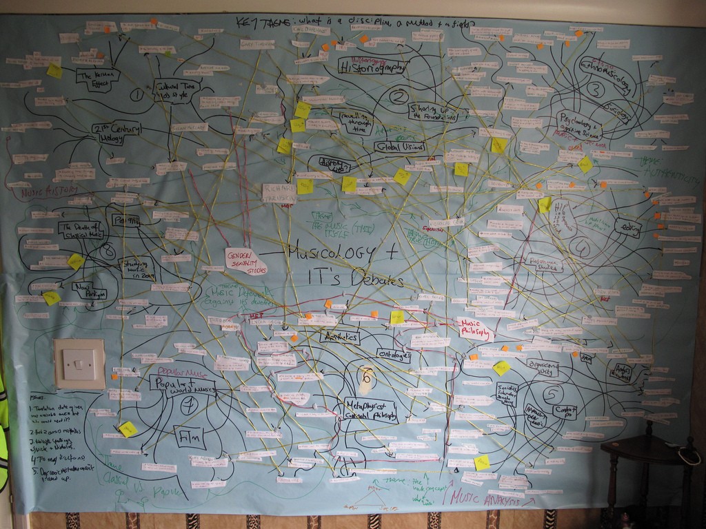
Ideas usually come to us in clusters, and it’s hard to separate one from the other. When we’re brainstorming, we can come up with a whole web of ideas from just a single concept. One idea will branch out to a new one, and two more will branch out from that. Before you know it, you have a complicated map of interlocking chains of thought. It’s usually chaotic, but it also perfectly shows how ideas are related to each other.

chaotic mind map sample
A chaotic end to brainstorming. (Image: Flickr/Tim Regan)

When it’s time to turn your ideas into a presentation deck, it can be hard to trim the big picture. Do you focus on a single line of thought? Which one? What happens when an idea overlaps with something else? How do you turn creative chaos into a neat, linear narrative? Sometimes, you don’t have to. Visualize how a single topic can branch out into a web of ideas by creating a mind map with Prezi.

Finding order in the chaos

The challenge to mind mapping is that complex topics can easily turn into a huge, dizzying mess. To create some order, you’ll need to practice a bit of discipline. Your main goal is to make sure your mind map remains concise, while keeping all the important details. In other words, you’ll need to do some revisions.

As you would when building a slide deck, start with an analogue approach. Grab a notepad and draft your mind map first. Start by writing down your main topic, and then let your ideas branch out across the page. Once you’ve written everything down, condense each idea into key concepts. This step is similar to how you’d create a presentation storyboard. Let the ideas flow freely first, and then edit out excessive and repetitive details.

Creating a mind map in the Prezi canvas

Once you’ve condensed your draft, it’s time to turn your ideas into a free-flowing presentation deck. Mind mapping involves combining colors, shapes, and images, plus the strategic arrangement of all these elements. Prezi is the perfect canvas for that. You’re free to move around each element and create a layout that suits the flow of your ideas. To accurately visualize your topic, take note of these tips when arranging your mind map:

1.) Use different frame types to organize your mind map
prezi mind map tutorial 01

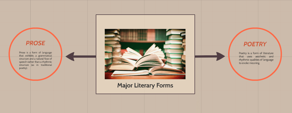
You can make use of different frame types to show how your ideas progress into different “levels”. In this example, the main topic is contained inside a rectangle frame. The two diverging ideas that branch out from there are inside a circle frame.

2.) Create hierarchy by manipulating frame size and changing arrow width
prezi mind map tutorial 02

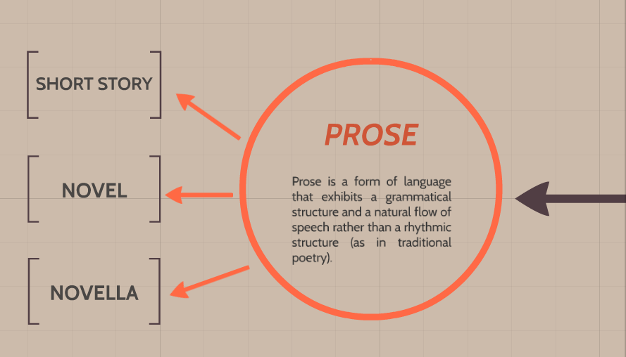
You can also represent  hierarchy in your mind map by manipulating the size of your frames. The farther you are from the center, the smaller your frames should be. Do the same thing with your arrows. Decrease thickness as you branch out across the canvas.

3.) Group specific parts or branches with an invisible frame
prezi mind map tutorial 03

prezi mind map tutorial 04

Add an invisible frame to group certain parts of your mind map together. This is useful if you want to focus on a specific branch before discussing each idea.

4.) Set the path carefully
prezi mind map tutorial 06

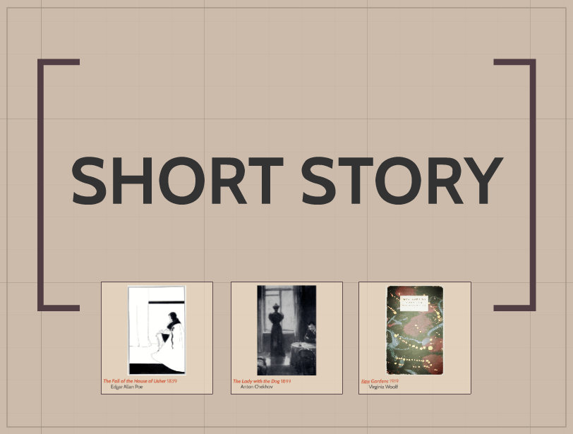
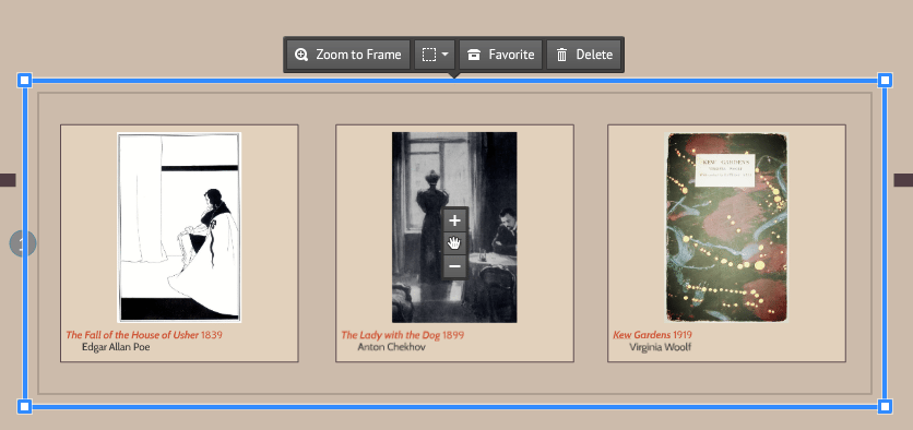
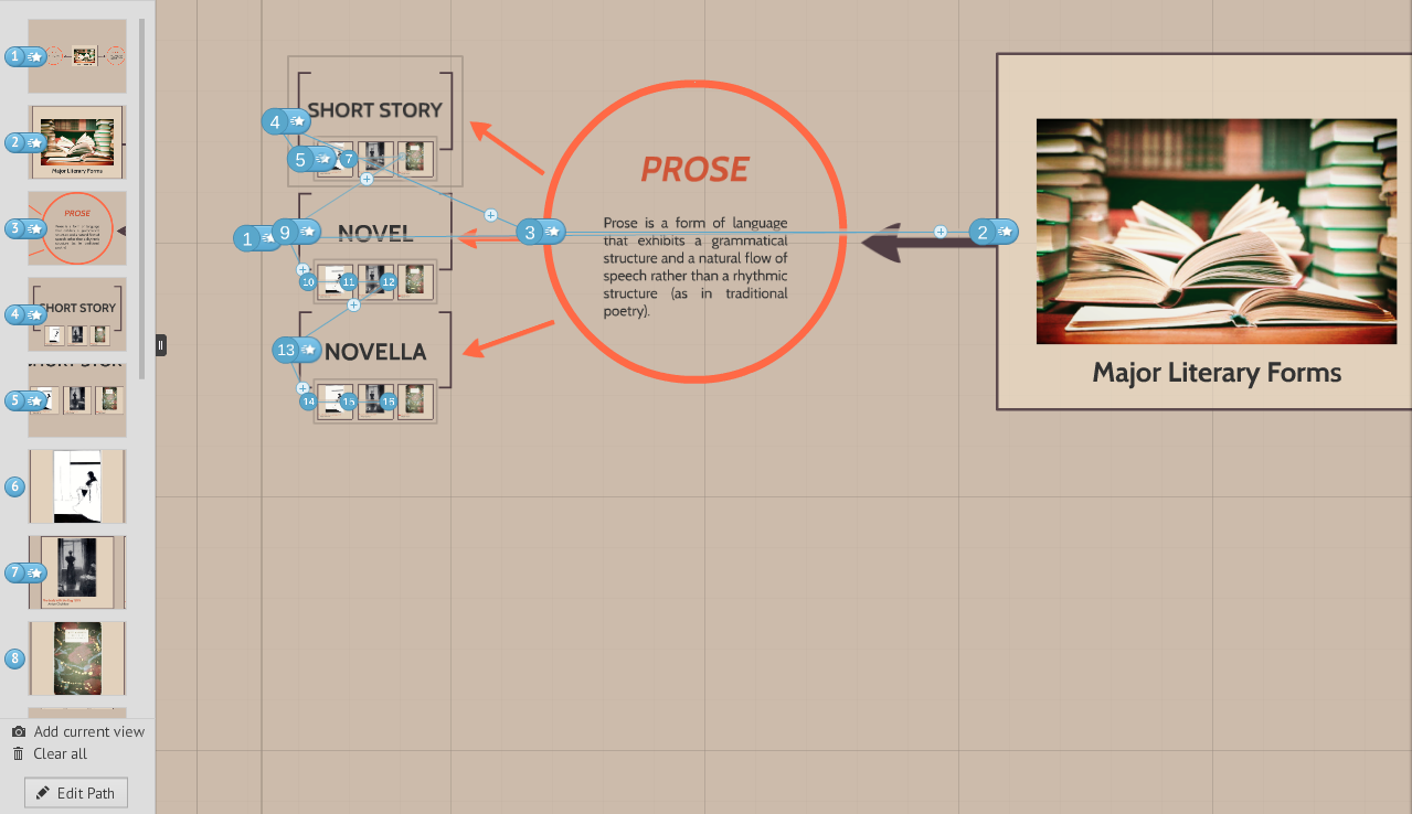
The final look will depend on how you set the path. Once you’ve completed building the mind map, set a path that will allow the audience to see how everything works together. Give the full view at the start of your presentation, then make use of the zoom tool to focus on specific details. To illustrate, click here to view a mind map of a previous blog post called “3 Ways to Creativity“.

Conclusion

The flexibility of Prezi’s canvas allows you to create presentations that defy the usual one-track narratives. You can present the big picture and pan through the entire landscape.

Show your audience how the core message relates to your main points by creating a mind map.


Featured Image: Featured Image: Death to the Stock Photo / Prezi logo via Wikimedia Commons

Prezi Feature of the Week: Getting Started

powerpoint alternative

presentation software

prezi

Prezi Feature of the Week

prezi tutorial

Creating a compelling and engaging story in a Prezi presentation can make a world of difference when it comes to captivating your audience. Prezi’s dynamic, non-linear format is perfect for storytelling, as it allows you to present information in a more visually stimulating and fluid way than traditional slide-based presentations. However, constructing a powerful narrative with Prezi requires careful planning and strategic design choices to ensure your story flows seamlessly and resonates with your audience.

Here’s the path to creating the perfect Prezi story:


1. Define Your Core Message

Every great story starts with a clear and impactful core message. Before diving into the design of your Prezi, ask yourself: What is the one thing I want my audience to remember after this presentation? Defining your core message early on helps shape the rest of your content and ensures that your presentation stays focused.

Why It’s Important:

  • Sets the Direction: A well-defined core message acts as the foundation of your story, guiding your narrative and helping you stay on track.
  • Enhances Clarity: A clear message makes it easier for your audience to understand and retain the information you’re presenting.

How to Do It:

  • Write down the single key idea you want your audience to take away from the presentation.
  • Keep your core message simple and concise, so it’s easy to convey and remember.

Example: If you’re presenting a new product, your core message could be: “This product will revolutionize the way we work by simplifying complex tasks.”


2. Outline Your Story Structure

Once you’ve defined your core message, outline the structure of your story. Think of your Prezi as a narrative journey, with a beginning, middle, and end. Organizing your content into a logical flow helps your audience follow along and keeps them engaged throughout.

Why It’s Important:

  • Creates Flow: A clear structure ensures that your story progresses logically, preventing confusion and maintaining engagement.
  • Helps the Audience Navigate: Structuring your Prezi in a way that is easy to follow helps your audience absorb information without feeling overwhelmed.

How to Do It:

  • Break your story into three parts: the introduction (set the stage), the body (present the main content), and the conclusion (wrap up and reinforce the key message).
  • Ensure each section flows naturally into the next, using Prezi’s zooming and panning features to create smooth transitions.

Example: In a presentation on business growth, start by introducing the challenge, move into key strategies for overcoming it, and end with a success story or projection for the future.


3. Leverage Prezi’s Non-Linear Format

One of Prezi’s unique advantages is its non-linear format, which allows you to present information in a more dynamic, flexible way than traditional linear slide presentations. Take advantage of this feature by structuring your story in a way that moves around key ideas, zooming in and out of details, rather than moving slide-by-slide.

Why It’s Important:

  • Engages the Audience: A non-linear flow keeps the audience interested and engaged, offering a break from the predictable slide transitions of PowerPoint.
  • Emphasizes Key Points: Zooming in and out of key content highlights important information and reinforces your story.

How to Do It:

  • Use Prezi’s zooming feature to transition between big-picture ideas and detailed explanations, giving your audience a sense of movement and depth.
  • Arrange content elements spatially to create visual relationships between different parts of your story.

Example: For a product launch presentation, you could start with a zoomed-out view of the market landscape, then zoom in on specific customer pain points, and finally zoom in further to show how your product addresses those needs.


4. Make Use of Visual Metaphors

Visual metaphors are an effective way to enhance your Prezi story by making complex ideas more relatable and easier to understand. Prezi’s dynamic canvas allows you to represent abstract concepts using metaphors like pathways, trees, or mountains, adding depth and creativity to your narrative.

Why It’s Important:

  • Simplifies Complex Ideas: Visual metaphors break down complex information into easily digestible and relatable concepts.
  • Creates Memorable Visuals: Metaphors leave a lasting impression, helping your audience remember key points long after the presentation is over.

How to Do It:

  • Choose a metaphor that aligns with your core message. For example, a roadmap can symbolize a journey to success, while a tree can represent growth and branching out.
  • Integrate your metaphor into the overall layout of your Prezi, using the zooming feature to navigate through different parts of the metaphor.

Example: For a project timeline presentation, use a road or pathway as the central visual metaphor, with different milestones marked along the way. Zoom in on each milestone to provide more detail.


5. Use Storytelling Techniques

Crafting a compelling Prezi story goes beyond just organizing your content—it’s about creating an emotional connection with your audience. Use traditional storytelling techniques such as conflict, resolution, and a call to action to make your presentation more engaging and persuasive.

Why It’s Important:

  • Builds Emotional Engagement: Storytelling techniques tap into emotions, making your presentation more memorable and impactful.
  • Encourages Action: A well-told story not only informs but also inspires action, motivating your audience to take the next step.

How to Do It:

  • Introduce a problem or conflict early on to grab the audience’s attention.
  • Present your solution or idea as the resolution to the conflict.
  • End with a clear call to action, encouraging your audience to act on the information you’ve provided.

Example: If you’re pitching a new marketing strategy, start by outlining the current challenges your company faces, then present your strategy as the solution. Conclude with a call to action, such as implementing the new strategy.


6. Keep It Visually Engaging

While storytelling is important, the visuals you use in Prezi are equally crucial to maintaining audience attention. Avoid overwhelming your audience with too much text or clutter. Instead, rely on visuals like images, icons, and videos to support your narrative.

Why It’s Important:

  • Keeps the Audience Focused: Visuals are more engaging than text-heavy slides and help keep the audience focused on the key points.
  • Simplifies Complex Data: Charts, graphs, and images can help simplify complex information, making it easier for the audience to understand.

How to Do It:

  • Use high-quality images and icons to illustrate your story without overcrowding the presentation.
  • Break up large blocks of text with visuals that support the key points, such as data visualizations or case studies.

Example: In a presentation on company performance, replace text-heavy slides with charts that visually represent growth metrics, and use icons to represent key performance indicators (KPIs).


7. End with a Powerful Conclusion

The conclusion of your Prezi should bring your story full circle, reinforcing your core message and leaving the audience with a clear takeaway. It’s your final opportunity to make an impact and inspire action.

Why It’s Important:

  • Reinforces the Main Idea: A strong conclusion ensures that your audience leaves with a clear understanding of your core message.
  • Calls the Audience to Action: Ending with a call to action encourages your audience to engage with your message beyond the presentation.

How to Do It:

  • Summarize the key points of your presentation, tying them back to your core message.
  • End with a clear call to action, whether it’s adopting a new idea, investing in your product, or taking the next step in a project.

Example: Conclude your presentation with a zoomed-out view of your entire Prezi, summarizing the journey you’ve taken the audience on, and finish with a call to action like “Let’s take the next step together.”


Final Thoughts

Creating a perfect Prezi story is about combining dynamic visuals, non-linear navigation, and classic storytelling techniques to craft a presentation that captivates and inspires your audience. By defining your core message, organizing your content, leveraging visual metaphors, and using Prezi’s unique features effectively, you can build a presentation that is both engaging and memorable. Follow this path, and you’ll be well on your way to delivering a powerful Prezi story that leaves a lasting impact.
Presentation Software Showdown: PowerPoint vs. Prezi

Powerpoint

powerpoint alternatives

PowerPoint vs Prezi

prezi

There are plenty of presentation software to choose from, but PowerPoint remains to be the top choice for most people. (Including you!) It’s been around since the 90s, and you’ve grown familiar with its classic and user-friendly interface. Still, you feel like trying something new for your next presentation, and you heard that Prezi is a great alternative.

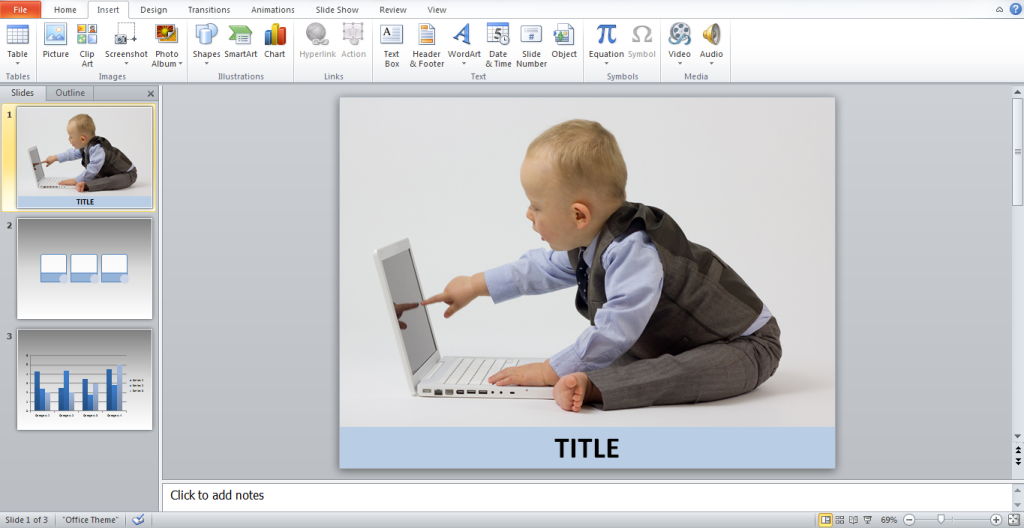
Like PowerPoint, Prezi is a presentation software that allows you to create and design slideshows. But instead of the all-too-familiar templates and linear slide layouts, it gives you nifty animations and non-linear slide transitions.

You know that good presentation design can make a positive impact on audience participation. So, do you make the full transition to Prezi from PowerPoint? Before you decide, we’ve gone through some things you should know about these two presentation programs.

The Defending Presentation Software Champion: PowerPoint

PowerPoint vs Prezi

You might have come across the term “Death by PowerPoint”. You might have even experienced it yourself when you had to sit through a PowerPoint presentation that seemed to last for hours. But as we’ve made clear previously, this isn’t the fault of the software program.

If you learn the many tools and functions of PowerPoint, you’ll see why 500 million users patronize it. PowerPoint offers plenty of opportunity for you to be creative with your presentation design. You can customize templates, edit images, and use SmartArt graphics to easily present data.

The Presentation Software Underdog: Prezi

PowerPoint vs Prezi

When it comes to managing the content of your presentation, Prezi isn’t all that different from PowerPoint. You can easily add text, images, videos, and animations. What truly attracts users to this presentation software is the zooming animation.

Instead of asking you to work on a progression of slides, Prezi gives you a big canvas where you can layout different ideas. When viewing the finished product, your audience seamlessly flows from the bigger picture into the specifics of your presentation. This zooming action adds an interesting visual dimension.

Another upside to using Prezi is the fact that it’s a cloud-based program. You can make presentations as long as you have an internet connection.

The Verdict

Effective and engaging presentations are made by people, not the presentation software they choose to use. Whether you decide to use PowerPoint or Prezi depends on your content and who your audience is.

When Does PowerPoint win?
Make use of PowerPoint if you’re presenting a simple and linear story. It’s also useful if you’re going to add a lot of quantitative data in your presentations. Because of its more classic feel, it will work best for presentations in more formal settings, such as business meetings and academic lectures.

When Does Prezi Win?
Prezi is perfect for presentations that need to be visually engaging. Utilize its zooming animation to show how parts of your presentation correlate, and if you want to move freely from one part to another. Because its design is non-traditional, using Prezi is perfect for presentations in casual settings. However, you should also consider the fact that it makes use of animations that may cause motion sickness to some people.

Whatever you decide to choose between these 2 presentation software, just keep in mind that effective presentation design is up to you.

Featured Image: Angelo DeSantis via Flickr