3 Reasons You Should Hire a PowerPoint Specialist

design

Graphic Design

pitch deck

PowerPoint specialist

presentation design

presentation specialist

Rick Enrico Blog

SlideGenius

In the digital age, the way we share and develop knowledge has been revolutionized. Presentation design is no exception. While a DIY mindset is admirable, there are compelling reasons to seek expert advice for your presentation pitch deck.

At SlideGenius, we specialize in redesigning PowerPoint presentations. Get your free quote today and elevate your presentation to professional standards.

Here are three crucial reasons to hire a PowerPoint specialist:

1. They Can Tell Your Story

Many companies allow their sales associates to design presentations, often leading to inconsistencies in the brand story. Audiences value presentations that consistently reflect the brand’s identity.

Professional Designers: PowerPoint specialists create decks that stay true to your core identity, ensuring your audience receives a coherent message. Mismatched visuals and speech can confuse and disengage your audience. For high-class brands, cluttered slides with poor color choices can damage your credibility. A unified brand story and presentation deck effectively convey your message.

Streamlined Narrative: Struggling to define your company’s narrative? Experienced marketing specialists can refine your brand story to better reflect your core values and identity.

2. They Can Wow Your Audience

PowerPoint specialists deliver eye-catching, engaging presentations that captivate audiences. Their expertise ensures your presentation meets all your needs and more.

Striking Visuals: Whether you need impressive visual design, animated logos, or custom videos, a PowerPoint specialist can create them for you. A design that complements your purpose helps convey your message more effectively.

Engagement: Consistent and uniform content makes your audience feel confident in your knowledge and increases the likelihood of converting interest into positive action.

3. They Can Boost Your Confidence

A well-designed PowerPoint presentation serves as a powerful visual aid. It allows you to focus on delivering your message confidently without worrying about the design.

Increased Trust: A professionally designed pitch deck enhances customer trust and engagement, making your job easier and your goals more achievable.

Efficiency: With a polished presentation, you can focus on other aspects of your service, improving both your product and delivery. This creates a positive feedback loop that starts and ends with excellent service.


Creating an effective presentation involves unifying your brand, core message, and purpose. If your brand deserves the best, you need the expertise of true presentation professionals.

Reach out to SlideGenius and get started on the pitch deck your brand deserves!

References

3 Reasons Why You Need a PowerPoint Presentation Specialist.SlideGenius, Inc. August 1, 2013. Accessed May 19, 2015.
3 Additional Perks of Getting a PowerPoint Presentation Specialist.” SlideGenius, Inc. Accessed May 19, 2015.
4 Ways to Gain Self-Esteem Like a Presentation Expert

building self-esteem

presentation anxiety

public speaking

Rick Enrico Blog

SlideGenius

speech skills

As a presenter, you must speak confidently no matter how large your audience is. Self-esteem is how you feel about yourself.

It not only gives higher levels of confidence, enhanced initiative, but also overall pleasant feelings—all essential for a successful marketing presentation.

If you don’t feel up to the task every time you have a pitch, here are four ways to improve your self-esteem like a presentation expert:

[sg-blog-modules module=one]

Engage in Self-Affirmation

You won’t get far if you continuously bring yourself down. Instead, highlight your strengths and recall your positive qualities.

It’s healthy to remind yourself of your successes, big or small. Inevitably, you might self-criticize and blame yourself for past failures. You can’t erase these experiences, but you can learn to handle them positively.

Focus on how much you’ve changed or are willing to change to improve yourself.

Seek Out Nurturing People

Seek out people who make you feel good about yourself. Build on their optimism and ask for their constructive advice for self-improvement. Avoid people who find fault in everything.

Disassociate with people who compare themselves with others. You won’t achieve your best with unfair comparisons. Look for people who support you and appreciate your skills as a better gauge of your worth.

Set Realistic Expectations

Being successful, even with minor tasks, builds self-esteem. Holding yourself to ridiculously high standards only leads to disappointments and lowers your confidence. A project’s failure is not your failure as a person.

Treat these moments as opportunities for further self-improvement.

Even successful people have experienced failure. Look at failures positively and constructively instead of as excuses to never try again.

It’s Okay Not to Be Loved by All

It’s a common error to assume that successful people are universally loved.

It wrongly makes you pander to everyone, when not everyone can possibly like you.

There’s no person in the world who’s loved by everyone. In a large enough group of people, you’ll inevitably meet someone who thinks differently from you or dislikes you. This is perfectly acceptable.

The longer you’ve been struggling, the harder it is to kick the habit. But with enough dedication and patience, it’s perfectly doable.

A professionally-designed PowerPoint gets the best out of your marketing presentation.

Contact our PowerPoint specialists and we can offer you a free quote.

[sg-blog-modules module=two]

References

Baumeister, R. F., J. D. Campbell, J. I. Krueger, and K. D. Vohs. “Does High Self-Esteem Cause Better Performance, Interpersonal Success, Happiness, or Healthier Lifestyles?Psychological Science in the Public Interest 4, no. 1 (2003): 1-44.
Dig into Your Presentation Audience’s Key Learning Styles.” SlideGenius, Inc. May 8, 2015. Accessed May 18, 2015.

Three Powerful Ways to End Your PowerPoint Presentation

communication

presentation delivery

presentation ending

public speaking

Rick Enrico Blog

SlideGenius

How you end your PowerPoint presentation is as powerful as the first few minutes of your speech.

Calls-to-action let you leave the room on a high note, but as leadership trainer Bruna Martinuzzi suggests, there are other ways to close your discussion with a bang.

[sg-blog-modules module=one]

Most presenters end a PowerPoint with a “Questions” slide, adding unnecessary length to your deck. Instead of doing that, consider these to create an effective final statement:

Cite a Quote

Cite a relevant quote that resonates with your key message. Never underestimate a quotation’s ability to positively reinforce your audience. To motivate your listeners, consider specific industries and appropriate personalities when quoting. Turning to quotes that aren’t suited for your pitch might dampen your credibility.

For example, something on marketing efforts can come from a notable business person.

An example of an appropriate statement for such a presentation would be: “‘Word-of-mouth marketing has always been important. Today, it’s more important than ever because of the power of the Internet,’ according to content marketing pioneers, Joe Pulizzi and Newt Barrett.” But a similar quote from actor-turned-politician Arnold Schwarzenegger would sound out-of-place.

Choosing to end on a quote can either move your audience or tune them out, depending on what you use and who you cite.

Use Videos

We can’t deny the power of videos in effectively engaging audiences. They’re ideal for highlighting a reel that demonstrates who you are, what you do, and how you can make their lives easier. This creates a strong connection and immediate impact, especially for viewers who prefer visual data.

A combination of audio and visuals also contribute to better information retention, getting your message across, and wrapping up your pitch in an interactive way. You get to take a break from the discussion’s information-heavy part.

Practice Humility

A touch of humility works well in influencing your audience. It ties back the points you’ve made in your PowerPoint slides while generating sympathy from your audience.

When you make an outstanding claim, contrast it with humility for a good ending.

Your audience’s positive response relies on a dramatic ending statement. Pick a strategy that creates a huge difference in your presentation’s overall impact and success.

Whether it’s citing a quote, using videos, or practicing humility, the choice is all yours.

As presentation design experts, SlideGenius can help you achieve the perfect pitch that leverages your message from beginning to end. Check out our portfolio for some of our recent projects.

[sg-blog-modules module=two]

References:

Frank Sinatra: Make Your PowerPoint Presentations Sing.” SlideGenius, Inc. May 12, 2015. Accessed May 18, 2015.
How to Spend the First 3 Minutes of Business Presentations.” SlideGenius, Inc. May 6, 2015. Accessed May 18, 2015.
Martinuzzi, Bruna. “12 Ways To Nail Your Presentation In The Last 30 Seconds.” American Express. Accessed May 18, 2015.

Using Inclusive Words to Connect During Sales Presentation

audience engagement

communication

inclusive words

presentation tips

public speaking

Rick Enrico Blog

SlideGenius

speech training

Apart from creating an effective PowerPoint sales presentation, a powerful way to connect with your audience is to use inclusive words. More than content, visuals, and performance, your listeners want you to show that you care about them.

[sg-blog-modules module=three]

According to keynote speaker Kristin Arnold’s book, Boring to Bravo, inclusive pronouns such as “we,” “our,” and “us” create a lasting connection with your audience, making them feel included in your speech. Instead of using “you” and “your,” incorporate inclusive words to indicate that they’re part of your presentation.

Turning “You” into “We”

Help your audience understand that your goal is to connect with them. As public speaking consultant Steven D. Cohen suggests, “You must solve this problem” differs from “We must solve this problem.”

The former indicates that your audience is solely accountable while the latter signifies that both you and your audience are responsible, making them realize that you can work things out together.

It’s All About Them

It’s normal to worry about how you look while performing or how your pitch will compel audiences to purchase your product.

The entire speaking engagement isn’t about you. It’s all about them. They must know if you’re addressing their needs rather than your own. Make them see that you’re not selling at all.

Understanding Their Beliefs and Interests

Before writing your speech, learn your audience’s background and culture. This is why audience analysis is important. Your pitch’s content should be relatable to each group of individuals.

Make your pitch sound more conversational and add a personal touch to capture their attention faster. Telling your own stories helps them relate to what you’re saying, making them more interested in your speech.

Listen and Adjust

To show that you care about your audience’s needs, observe their behavior while delivering your speech.

Since you’re in control of the entire presentation, focus on your audience rather than yourself. If you take

If you take time to listen, you can adjust your technique while speaking, depending on your audience’s reactions. This prevents you from losing their interest and ending your performance ineffectively.

Inclusive words make your presentation more powerful and engaging, connecting you with your audience in a way that keeps them interested and convinces them that you value them more than anyone else.

If you want to learn more about making appealing presentations, SlideGenius can help you out to address this concern.

[sg-blog-modules module=two]

References:

4 Types of Audience Members You Need to Present For.” SlideGenius, Inc. 2013. Accessed May 18, 2015.
Arnold, Kristin J. Boring to Bravo: Proven Presentation Techniques to Engage, Involve and Inspire Your Audience to Action. Austin, TX: Greenleaf Book Group Press, 2010.
Cohen, Steven D. “It’s All About the Audience.” University of Balitmore. Accessed May 18, 2015.

Craft Your Corporate Presentations into a Great Story

classic story structure

presentation story

Rick Enrico Blog

SlideGenius

storytelling

“People have forgotten how to tell a story. Stories don’t have a middle or end anymore. They usually have a beginning that never stops beginning.” – Steven Spielberg

Since stories and narratives make up most of our daily interactions, why not treat your presentation as a story?

For communication coach Nick Morgan, there are several ways to structure your presentation, but if you’ve got a story tell, it’s best to go with the Classic Story structure.

Craft your speech with story patterns that your audience recognizes from novels, books, and movies: with a beginning, middle, and an end.

[sg-blog-modules module=three]

Begin with a Hook

Main characters are commonly introduced in the beginning, giving the reader an idea of the world they’re living in and the possible conflict that moves the story forward. This establishes a connection between people and ideas, making a tangible impact on the story’s flow.

“The beginning is the most important part of the work,” Plato said.

It’s impossible to capture your audience’s attention without a strong introduction. Crafting an effective and compelling beginning can hook them to your pitch. Establish a good start that communicates your ideas to leave a dramatic effect on your audience.

Develop the Middle

Screenwriters are great at bringing suspenseful conflicts in stories. Emotions run high in this segment. The midpoint depicts progression from the rising action, causing problems for the main character, leading to either their demise or fall.

In presentations, the middle builds your audience’s interest, strengthening your brand image and highlighting your main idea. State the problem as if introducing a villain, then provide a solution by revealing yourself as the conquering hero.

End with a Call-to-Action

Versatile writers provide varying conclusions: happy, tragic, or unresolved. No matter how the story ends, readers always take away something from it.

Your presentation’s ending must be as alluring as the beginning. Attract your audience, then turn them into possible clients. The best way to end a discussion is by providing a call-to-action. Clearly state what you can offer while assuring that you can meet their needs.

Conclusion

A presentation based on a story structure gives your message a natural kick.

Incorporate the three elements of this story pattern to influence your audience the way writers influence their readers.

If you need presentation ideas with screenwriter twists, then book a meeting with our presentation experts now!

[sg-blog-modules module=two]

References

Morgan, Nick. “5 Quick Ways To Structure A Presentation.” Forbes. February 2, 2011. Accessed May 15, 2015.
Steve Jobs: Use Heroes and Villains in Your Business Presentations.” SlideGenius, Inc. May 8, 2015. Accessed May 15, 2015.

Ad Agency Tricks: Outsell Competitors in Sales Presentations

ad agency tricks

outsell competitors

presentation tips

Rick Enrico Blog

SlideGenius

Advertising is a daily part of our lives. This applies to presenters and their PowerPoint decks. During sales presentations, you’ll compete against at least three other teams, each with their own pitch.

[sg-blog-modules module=three]

How do a selected few make their voices heard from the chorus of companies selling their products?

Simple, they offer what their competition doesn’t.

How It Works: Look to Yourself and Your Competition

According to ad veteran Luke Sullivan, to know the competition, look at what your company offers and compare it with the competition. Take some advice from Jim Aitchinson’s Cutting Edge Advertising: Are you currently running second like Avis? Are you as innovative as Nike Shox? Or are you looking to shock people like XO Beer?

Is your pitch strong enough to challenge the competition, or do you want to highlight your strengths? After answering these questions, you can start building on your sales presentation’s main idea.

Describing Your Products & Services

Simplifying your offer is a presentation technique that defines exactly what you want to show. Brands contribute to advertising clutter. Clients go through the same thing, sitting through pitch after pitch. Strip your idea down into one core message. Don’t read from your slides and drone on it—go straight to your proposal.

Build up the moment before revealing it, or pose a challenge to your clients. This makes your message stick in your clients’ minds longer.

The Reality Distortion Field

Once you’ve hooked clients with your pitch, support their curiosity with facts.

Use what brand communications expert Carmine Gallo calls the “reality distortion field,” which is to convince anyone of practically anything. Propose a challenge to highlight your strengths as with the Nike Shox TV ad, or doing an unconventional but effective stunt like XO Beer.

You can also present an opportunity to change, like when Steve Jobs asked John Sculley, the then-president of PepsiCo, to join Apple in 1983.

Challenge the Status Quo

Aitchison describes a sales pitch as a chance to dismantle the current status quo and establish something new. This applies not just to your clients but also to your competition.

After defining what your company offers, your pitch will soon be built around what it does, what it can offer, and what you do differently from others.

[sg-blog-modules module=two]

References:

2000 Vince Carter Nike SHOX Commercial/Jumping Over Gary Payton. YouTube. Accessed May 15, 2015.
Aitchison, Jim. Cutting Edge Advertising: How to Create the World’s Best Print for Brands in the 21st Century. Singapore; New York: Prentice Hall, 2004.
Gallo, Carmine. The Presentation Secrets of Steve Jobs: How to be Insanely Great in Front of Any Audience. New York: McGraw-Hill, 2010
Reduce and Simplify Like a PowerPoint Professional.” SlideGenius, Inc. May 25, 2015. Accessed May 15, 2015.
Sullivan, Luke. Hey, Whipple, Squeeze This: A Guide to Creating Great Ads (3rd Ed.). Hoboken, N.J.: John Wiley & Sons, 2008.
XO Beer. Neil French. Accessed May 15, 2015.

Using Neutral Facial Expressions in Professional Presentations

appropriate situations

body language

handling presentations

Kathy Reiffenstein

neutral face

Rick Enrico Blog

Neutral facial expressions are an essential tool in professional presentations, as they help convey calmness, authority, and approachability without overwhelming your audience with emotion. Here’s why and how neutral expressions can benefit your delivery:

  1. Maintain Professionalism:
    • Why it works: A neutral facial expression signals that you are in control and focused on delivering your message. It helps balance the emotional tone of the presentation and ensures you come across as professional.
    • How to apply: Use neutral expressions during formal or serious parts of the presentation, particularly when discussing data, findings, or sensitive topics. This reduces distractions and keeps the audience focused on your message, not your emotions.
  2. Avoid Misinterpretation:
    • Why it works: Overly expressive facial movements may sometimes be misinterpreted, especially in cross-cultural settings. Neutral expressions provide a blank slate that minimizes confusion or unintended emotional signals.
    • How to apply: When presenting to diverse audiences or in situations where interpretation is key, maintaining a neutral expression allows the audience to focus on the content without being influenced by emotional cues.
  3. Balance with Natural Variations:
    • Why it works: Although neutral expressions are useful, it’s also important to blend them with moments of positive expression, like a smile or nod, to show engagement and warmth.
    • How to apply: Use a neutral expression during transitions, when discussing technical points, or during audience questions. Pair this with brief, appropriate smiles when welcoming the audience or emphasizing a key takeaway.

Use Two Types of Charts for Business Presentations

flowchart

organizational chart

Rick Enrico Blog

Explaining how your company is organized and how you do business is tedious because there’s a lot on the list.

Keep them engaged by organizing ideas into easy-to-follow flowcharts and diagrams. These are more visual in nature, holding their interest long enough for you to get your point across.

[sg-blog-modules module=three]

Supplementing your business presentation with visuals is the key to simplifying an otherwise long and boring topic.

In this article, we cover the benefits of organizing your ideas into charts and diagrams to make your business presentation easier to understand.

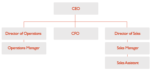
The Organizational Chart

An organizational chart is used to explain relationships between members of a group.

However, don’t just list down respective teams’ leaders to explain to your company’s organizational structure. Use this chart to show direct and indirect relationships between staff, managers, and executives.

With the organizational chart, information is displayed in a top-to-bottom format, usually with the CEO at the top. The chart branches out to show all the other people below the organization’s head. This gives everyone a clear picture of who reports to whom and who is responsible for what.

business presentation chart
Image Source: http://www.typesofgraphs.com/organizational.html

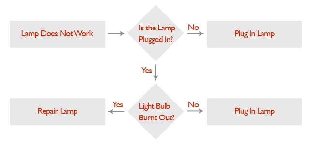
The catch is that organizational charts explain structure but not how a company operates. If you want to explain the how in your company operations, use flowcharts.

The Flowchart

Compared to an organizational chart, the flowchart can be linear, and sometimes circular in form.

It’s best for explaining processes, especially during business presentations. The flowchart builds a clear picture of where something begins, what happens in between and where it ends.

Start with your process’s beginning. When an order comes in, what step follows next? Is there a step where the request is evaluated?

Lay out your steps sequentially, then add if-and-then statements if something goes wrong with that step.

The more complicated a process is, the harder it is to illustrate with a flowchart. Stick to the basics and keep your illustrations simple.

business presentation
Image source: http://www.typesofgraphs.com/flow.html

These two charts are the most common ways to explain how a business is organized and how it operates.

Microsoft Office applications can easily render these charts which are often used for internal company orientations and business-to-business pitches. These conveniently illustrate structures and processes instead of talking about them with a wall of text.

Each chart has strengths and weaknesses, but you can rely on any of these types to simplify text-heavy explanations by visualizing the information.

[sg-blog-modules module=two]

References:

Types of GraphsAccessed May 14, 2015.
The Art of Graphs and Charts.” SlideGenius, Inc. April 21, 2014. Accessed May 14, 2015.

3 Overused Verbal Tricks That Harm Business Presentations

avoid cliche

business jargon

filler terms

overused terms

Rick Enrico Blog

It’s challenging to plan for business presentations. You need to sound credible while still sounding persuasive and approachable. You must adapt to effectively communicate with your diverse audience.

In our desire to find a middle ground for these opposing needs, we commit mistakes that do more harm than good for our presentations. Whenever you mean business, omit the following words or phrases from your pitches:

[sg-blog-modules module=one]

Impenetrable Jargon

Jargon are words or phrases that only make sense to certain people. Though these can make you sound like an expert in your field, audiences who aren’t as familiar with your terms might not understand you.

For example, not everyone might know what the acronym WYSIWYG stands for. Only a few may know that it means: “What you see is what you get.”

According to MySay’s Max Mallet, Brett Nelson, and Christ Steiner, jargon masks real meaning. Using industry-specific terms doesn’t automatically exude competence. Use only the simplest words to clearly convey your message.

Unbearable Clichés

People copy whatever works, which results in clichés.

These tired metaphors are lazy and distracting.

For example: “At the end of the day, we go the extra mile to give you our 110% because we think out of the box as proven by of our track record for success.” might sound overloaded and overused.

Clichés sound inappropriate and insincere. Instead of stalling with these filler terms, get straight to the point and say what you mean. But that doesn’t mean your presentation has to be plain. Spice up your pitch in other ways, like inserting a good anecdote or a personal story that’s related to your topic.

Overbearing Verbiage

Never underestimate the value of keeping things simple. Big and intimidating words don’t automatically make you sound important and clever.

They actually show that you’re compensating for incomplete data. Worse, you might look arrogant and pretentious, causing audiences to promptly tune out.

A few of these terms include “Recycled human refuse”, which is simply “garbage”, and “performance-based compensation package” which are just “bonuses.”

Focus on expounding on what matters in your pitch instead, and make sure to explain it in terms that you understand enough to talk about. Chances are if you’re not sure about what you’re saying, your audience won’t get it either.

Your goal is always to effectively communicate with your audience. You can’t achieve this by using clichés and jargon, which only obscure your meaning rather than clarify it.

Watch out for these common mistakes and constantly practice to wean them out of your personal language.

End these habits before they become a major hindrance to your presentations.

[sg-blog-modules module=two]

References:

Presentation Success: The Top Ten Clichés to Avoid.” Presentation Magazine. Accessed May 13, 2015.
Mallet, Max. Brett Nelson, and Chris Steiner. “The Most Annoying, Pretentious And Useless Business Jargon.” Forbes. January 26, 2012. Accessed  May 13, 2015.
Why Simplicity Wins When It Comes to PowerPoint Slides.” SlideGenius, Inc. January 07, 2015. Accessed May 13, 2015.

Frank Sinatra: Make Your PowerPoint Presentations Sing

Frank Sinatra

performance skills

Powerpoint

presentation tips

public speaking skills

Rick Enrico Blog

You don’t have to be a singer to make your PowerPoint presentations sing. Just hone your public speaking skills to go with your deck, and you’re set for a winning performance. Emulating famous artists can teach you how to better influence people.

In one of his articles, public speaking guru Garr Reynolds cites Frank Sinatra, one of the greatest entertainers of the twentieth century, as an example of somebody we can learn from for pitching techniques.

[sg-blog-modules module=three]

When asked in The Playboy Interview: Music Men what his secret towards successful performances was, Sinatra says, “I think it’s because I get an audience involved, personally involved in a song—because I’m involved myself.” Sinatra believed that getting an audience requires reaching out with total honesty, humility, and adaptability to changes, and he put it into action in his performances.

Let’s dig more into these virtues and how you can use them to enhance your sales pitch.

Present with Genuine Honesty

According to Reynolds, Sinatra’s authenticity attributed his success to the music industry.

Frank Sinatra’s simpatico image is his key for developing rapport with his listeners. When he performs, he sings with his heart—his emotions genuinely reflecting the song’s meaning.

We can’t build relationships without honesty. As a speaker, establish credibility to capture your audience’s attention. A truthful and authentic presentation approach moves your audience and lets them savor your message’s every nuance.

Deliver with Unassuming Humility

It’s important to depict confidence while presenting, but humility also goes a long way. This doesn’t require you to sound clever. It only takes a few humble acts to suggest maturity and professionalism.

In Frank Sinatra’s case, he kept himself collected and confident without going overboard. In his live performances, he used simple movements and natural body language to amuse his audience. Notice his cool reactions when his friends tried to mock him offstage. Now that’s humility.

Body language exudes confidence and project an image that your audience can relate to.

Adapt to Changing Times

Another factor that made Sinatra a remarkable artist was his ability to successfully adapt his music to changing times.

Despite the post-war changes brought by World War I and World War II, he was able to create music that remained relevant to the times. He even changed his singing style to keep up with the changing world of music.

This same principle applies in today’s business, specifically when it comes to giving presentations. You have to adapt to technological advancements and newest trends to satisfy your audience’s needs. Since majority of people now are visual learners, giving them eye-catching visuals like infographics and videos is a great way to make information more digestible.

If you need a model for getting involved with your audience, look no further.

Let Frank Sinatra’s authentically honest and humble performance skills guide you while you craft your PowerPoint presentation and deck.

Involving yourself and your audience with your speech is a good start to building trust. Express yourself with authenticity and honesty to establish an emotional and intellectual rapport. Maintain humility and keep confidence in perspective to constantly impress people. Keep up with the world’s many changes to make your content fit your audience.

Follow these tips and you’re sure to get presentations that’ll have your audience singing praises.

[sg-blog-modules module=two]

References:

Communication lessons from Frank Sinatra, 1963.” Presentation Zen. October 2, 2014. Accessed May 8, 2015.
Enrico, Rick. “Go Visual: Use Infographics to Give Your Business Pitch Maximum Impact.” Piktochart Infographics. October 1, 2015. Accessed May 8, 2015.
“Longform Reprints: Playboy Interview: Frank Sinatra by Joe Hyams.” Longform. Accessed May 8, 2015.
Sinatra Live You Make Me Feel So YoungYouTube. Accessed May 8, 2015.

Featured Image: “The Frank Sinatra Show” from Wikipedia